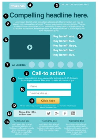
The keys to an awesome 
landing page 
www.inboundexperts.com.au
LINK ONE | LINK TWO | LINK THREE 
Compelling headline here. 
Lorem ipsum dolor sit amet, consectetur adipiscing elit. Duis fermentum sem vitae leo 
aliquam, quis malesuada urna feugiat. Praesent pellentesque rutrum consectetur. Vivamus 
eu elit accumsan, ullamcorper mi non, mattis tortor. Integer metus odio, dapibus non dui 
ut, faucibus iaculis ipsum. Pellentesque lacus elit, feugiat at ultricies ut, rutrum eget purus. 
Nunc nec sodales purus. 
• Key benefit one. 
• Key benefit two. 
• Key benefit three. 
• Key benefit four. 
• Key benefit five. 
AS USED BY: 
Call-to action 
Lorem ipsum dolor sit amet, consectetur adipiscing elit. Ut dignissim 
luctus turpis a viverra. Maecenas convallis aliquam nibh quis. 
*We take online privacy very seriously and we will never share your information with a third-party. 
Read our privacy policy here. 
Share this offer 
with others: 
13 
Lorem ipsum dolor sit amet, 
consectetur adipiscing elit. 
Vestibulum mollis auctor convallis. 
Morbi vitae egestas neque. 
Morbi id nisi eu nequ Nullam 
sollicitudin pretium. 
Lorem ipsum dolor sit amet, 
consectetur adipiscing elit. 
Vestibulum mollis auctor convallis. 
Morbi vitae egestas neque. 
Lorem ipsum dolor sit amet, 
consectetur adipiscing elit. 
Vestibulum mollis auctor convallis. 
Morbi vitae egestas neque 
volutpat at purus. Nullam elit, 
varius faucibus. 
Name 
Email address 
Testimonial One Testimonial One Testimonial One 
1 
2 
6 
7 
5 
4 3 
8 
9 
10 
11 
12 
14 
YOUR LOGO
www.inboundexperts.com.au 
1 
2 
3 
4 
5 
HEADLINE 
Crafting a great headline is a skill unto itself. The most important thing is to develop a 
headline that is clear, engaging and encourages the reader to keep reading. It should 
instantly confirm to the reader that they have arrived in the right spot. 
If that wasn’t enough it should also be written with consideration to commonly 
searched for keyword phrases and if there are pay-per-click ad campaigns sending 
traffic to these pages, then this headline should also correlate with the headline of 
the ads (for improved conversion rates). 
INTRODUCTORY TEXT 
This text should effectively sell the proposition to the reader in a clear and concise 
manner. Try to write in a very honest ‘voice’. Writing in an authentic and honest tone 
creates a far higer level of trust and confidence from potential customers than using 
hyperbole and ‘over-selling’. 
Try to sum up what the offer is and the key features in no more than one or two 
paragraphs. Brevity is a winning feature of good copy. 
LINKS TO OTHER PAGES 
We recommend including links to other pages on your site, however rather than 
replicating your main menu, consider installing a reduced menu that foccuses on 
pages that might assist with the goals of this landing page (i.e conversions). 
Think about other pages on your site that might provide extra details or add credibiity 
to what your offer. Example: ‘About Us’, ‘Case Studies’ or ‘FAQ’. 
YOUR LOGO 
It should go without saying, but don’t forget to include your company logo on the 
page so that people know who is behind the landing page. The logo should click 
through to the homepage of the site. If someone arrives on the landing page from an 
external source by accident, at least there is an opportunity to find out more about 
the company (and other offers you may have). 
KEY BENEFITS 
People often scan a page before committing to reading it, this is especially true 
online. They do this to determine if the content is revelent to them. Your aim should 
be to have some areas of your landing page that draw the eye, are easy to read and 
have a clear message. 
Listing 3-6 key benefits in a large, easy to read font is one of these opportunities (the 
headline is the other key one). 
For these key benefits to be effective, think about the target audience for which 
your offer has been developed. What problem or pain-point do they have that this 
offer provides a solution for? What should the reader expect to gain from the offer 
(emotional benefits are alwys more powerful than rational benefits). 
Again, aboid over-hyped promised that look too ‘sales’ and untrustworthy.
www.inboundexperts.com.au 
6 
7 
8 
9 
10 
IMAGE OR VIDEO 
It’s important to have a quality image on the landing page to give peole a visual 
reference and add credibility to the offer. It could simply be a picture of the product, 
your service in action, the front cover of the ebook or even just a picture of yourself 
or key staff. 
Of course, to take it up a notch again, this is the perfect spot to place a short 
(15-30sec) video such as a product demonstration or a face-to-camera from the 
company director explaining the offer and the key benefits to the viewer. 
PROOF 
Unless you are a well known national brand, it’s likely that many of the visitors to the 
landing page will be looking to establish the credibility of your offer and the company 
behind it. 
Consider ways that you can add credibility to your landing page by including the 
logos of other customers who have taken up the offer, list any industry awards you 
might have one, or any media outlets who might have written about your business. 
CALL-TO-ACTION HEADLINE 
If the above content has done it’s job, then the visitor will be ready to take up your 
offer. The aim of the ‘call-to-action’ headline is to make it very clear to the viewer 
what it is they need to do. Some CTA examples include: ‘Sign-up here’, ‘Download 
now’, ‘Place your order’, ‘Register now’ etc. 
Try to keep this headline ‘above-the-fold’. This means that where possible try to 
keep the call-to-action easily visiable to the user when they land on the page without 
needing to scroll down to see it. 
CALL-TO-ACTION COPY 
The aim of this copy is to provide futher instructions for the action you want them to 
take and what they can expect to happen as a result. 
An example might be ‘To receive monthly updates of all our latest travel deals, enter 
your details below and you will imediately receive our top 10 holidays list straight to 
your inbox’. 
THE FORM 
If the action you want to the user to take includes the completion of a form, try to 
limit the form to just a few fields. Instead of putting mandatory and optional fields, 
we recommend just leaving optional fields out altogether. Sure it’s nice to have 
extra information about people in your database, but what is even better is a large 
database of prospects. 
You will find the less fields you provide, the more people will complete the form.
www.inboundexperts.com.au 
11 
12 
13 
14 
THE BUTTON 
It’s important that the user can easily find the all-important submit button. Make it 
large and of a contrasting colour to other items sorrounding it. 
For those visitor to your landing page who might be a little on the ermm... slow side, 
put some text on the bottom that once again tells them what they need to do. 
Reference your call-to-action headline. Examples: ‘Submit’, ‘Click here’, ‘Download’. 
PRIVACY POLICY 
It can be beneficial to place a small line of text underneath the button that in some 
ways reassures the user that you aren’t going to sell their data off to the highest 
bidder who will then send them spam on an hourly basis. 
For some people online they are very hesitant to give over their personal details, 
especially to a faceless form on the internet. Try writing a simple message that 
elivates their fears and links to a privacy page with more details. 
SOCIAL SHARING TOOLS 
Some visitors to your landing page might instantly recognise how your offer can 
benefit somebody else that they know. Adding in tools that give the viewer the 
opportunity to share your offer with others is a fantastic way to attract new prospects 
to your site. 
A recommenation of your offer from one friend to another is the most poweful form 
of marketing you can ever achieve, the opportunity is too good to leave these social 
sharing tools off your landing page. 
SUPPORTING TESTIMONIALS 
This one is optional, but it can be a good idea to add some extra credibility to the 
page with some customer testimonials at the bottom. 
Often the problem with testimonials is that they are general and over-glowing with 
praise for the company, product or service. They sound suspiciously like they have 
been written by the company and do little to create trust with the propspect. Usually 
quite the opposite. 
For your landing page, you should attempt to include testimonials that directly relate 
the objection that a visitor might be having whilst they are on your page. 
If you know of anyone who receive genuine value from your offer, don’t just ask 
them to send you a testimonial. Instead call them up and ask them if they remember 
having any doubts about the offer when they were considering taking it up. 
Then ask them how the offer was ultimately able to counteract this objection. This is 
the sort of testimonials you are looking for. Something specific to the offer and that 
addresses some of the most common reasons that vistitors to your landing page 
might not take it up.

landing_page

  • 1.
    The keys toan awesome landing page www.inboundexperts.com.au
  • 2.
    LINK ONE |LINK TWO | LINK THREE Compelling headline here. Lorem ipsum dolor sit amet, consectetur adipiscing elit. Duis fermentum sem vitae leo aliquam, quis malesuada urna feugiat. Praesent pellentesque rutrum consectetur. Vivamus eu elit accumsan, ullamcorper mi non, mattis tortor. Integer metus odio, dapibus non dui ut, faucibus iaculis ipsum. Pellentesque lacus elit, feugiat at ultricies ut, rutrum eget purus. Nunc nec sodales purus. • Key benefit one. • Key benefit two. • Key benefit three. • Key benefit four. • Key benefit five. AS USED BY: Call-to action Lorem ipsum dolor sit amet, consectetur adipiscing elit. Ut dignissim luctus turpis a viverra. Maecenas convallis aliquam nibh quis. *We take online privacy very seriously and we will never share your information with a third-party. Read our privacy policy here. Share this offer with others: 13 Lorem ipsum dolor sit amet, consectetur adipiscing elit. Vestibulum mollis auctor convallis. Morbi vitae egestas neque. Morbi id nisi eu nequ Nullam sollicitudin pretium. Lorem ipsum dolor sit amet, consectetur adipiscing elit. Vestibulum mollis auctor convallis. Morbi vitae egestas neque. Lorem ipsum dolor sit amet, consectetur adipiscing elit. Vestibulum mollis auctor convallis. Morbi vitae egestas neque volutpat at purus. Nullam elit, varius faucibus. Name Email address Testimonial One Testimonial One Testimonial One 1 2 6 7 5 4 3 8 9 10 11 12 14 YOUR LOGO
  • 3.
    www.inboundexperts.com.au 1 2 3 4 5 HEADLINE Crafting a great headline is a skill unto itself. The most important thing is to develop a headline that is clear, engaging and encourages the reader to keep reading. It should instantly confirm to the reader that they have arrived in the right spot. If that wasn’t enough it should also be written with consideration to commonly searched for keyword phrases and if there are pay-per-click ad campaigns sending traffic to these pages, then this headline should also correlate with the headline of the ads (for improved conversion rates). INTRODUCTORY TEXT This text should effectively sell the proposition to the reader in a clear and concise manner. Try to write in a very honest ‘voice’. Writing in an authentic and honest tone creates a far higer level of trust and confidence from potential customers than using hyperbole and ‘over-selling’. Try to sum up what the offer is and the key features in no more than one or two paragraphs. Brevity is a winning feature of good copy. LINKS TO OTHER PAGES We recommend including links to other pages on your site, however rather than replicating your main menu, consider installing a reduced menu that foccuses on pages that might assist with the goals of this landing page (i.e conversions). Think about other pages on your site that might provide extra details or add credibiity to what your offer. Example: ‘About Us’, ‘Case Studies’ or ‘FAQ’. YOUR LOGO It should go without saying, but don’t forget to include your company logo on the page so that people know who is behind the landing page. The logo should click through to the homepage of the site. If someone arrives on the landing page from an external source by accident, at least there is an opportunity to find out more about the company (and other offers you may have). KEY BENEFITS People often scan a page before committing to reading it, this is especially true online. They do this to determine if the content is revelent to them. Your aim should be to have some areas of your landing page that draw the eye, are easy to read and have a clear message. Listing 3-6 key benefits in a large, easy to read font is one of these opportunities (the headline is the other key one). For these key benefits to be effective, think about the target audience for which your offer has been developed. What problem or pain-point do they have that this offer provides a solution for? What should the reader expect to gain from the offer (emotional benefits are alwys more powerful than rational benefits). Again, aboid over-hyped promised that look too ‘sales’ and untrustworthy.
  • 4.
    www.inboundexperts.com.au 6 7 8 9 10 IMAGE OR VIDEO It’s important to have a quality image on the landing page to give peole a visual reference and add credibility to the offer. It could simply be a picture of the product, your service in action, the front cover of the ebook or even just a picture of yourself or key staff. Of course, to take it up a notch again, this is the perfect spot to place a short (15-30sec) video such as a product demonstration or a face-to-camera from the company director explaining the offer and the key benefits to the viewer. PROOF Unless you are a well known national brand, it’s likely that many of the visitors to the landing page will be looking to establish the credibility of your offer and the company behind it. Consider ways that you can add credibility to your landing page by including the logos of other customers who have taken up the offer, list any industry awards you might have one, or any media outlets who might have written about your business. CALL-TO-ACTION HEADLINE If the above content has done it’s job, then the visitor will be ready to take up your offer. The aim of the ‘call-to-action’ headline is to make it very clear to the viewer what it is they need to do. Some CTA examples include: ‘Sign-up here’, ‘Download now’, ‘Place your order’, ‘Register now’ etc. Try to keep this headline ‘above-the-fold’. This means that where possible try to keep the call-to-action easily visiable to the user when they land on the page without needing to scroll down to see it. CALL-TO-ACTION COPY The aim of this copy is to provide futher instructions for the action you want them to take and what they can expect to happen as a result. An example might be ‘To receive monthly updates of all our latest travel deals, enter your details below and you will imediately receive our top 10 holidays list straight to your inbox’. THE FORM If the action you want to the user to take includes the completion of a form, try to limit the form to just a few fields. Instead of putting mandatory and optional fields, we recommend just leaving optional fields out altogether. Sure it’s nice to have extra information about people in your database, but what is even better is a large database of prospects. You will find the less fields you provide, the more people will complete the form.
  • 5.
    www.inboundexperts.com.au 11 12 13 14 THE BUTTON It’s important that the user can easily find the all-important submit button. Make it large and of a contrasting colour to other items sorrounding it. For those visitor to your landing page who might be a little on the ermm... slow side, put some text on the bottom that once again tells them what they need to do. Reference your call-to-action headline. Examples: ‘Submit’, ‘Click here’, ‘Download’. PRIVACY POLICY It can be beneficial to place a small line of text underneath the button that in some ways reassures the user that you aren’t going to sell their data off to the highest bidder who will then send them spam on an hourly basis. For some people online they are very hesitant to give over their personal details, especially to a faceless form on the internet. Try writing a simple message that elivates their fears and links to a privacy page with more details. SOCIAL SHARING TOOLS Some visitors to your landing page might instantly recognise how your offer can benefit somebody else that they know. Adding in tools that give the viewer the opportunity to share your offer with others is a fantastic way to attract new prospects to your site. A recommenation of your offer from one friend to another is the most poweful form of marketing you can ever achieve, the opportunity is too good to leave these social sharing tools off your landing page. SUPPORTING TESTIMONIALS This one is optional, but it can be a good idea to add some extra credibility to the page with some customer testimonials at the bottom. Often the problem with testimonials is that they are general and over-glowing with praise for the company, product or service. They sound suspiciously like they have been written by the company and do little to create trust with the propspect. Usually quite the opposite. For your landing page, you should attempt to include testimonials that directly relate the objection that a visitor might be having whilst they are on your page. If you know of anyone who receive genuine value from your offer, don’t just ask them to send you a testimonial. Instead call them up and ask them if they remember having any doubts about the offer when they were considering taking it up. Then ask them how the offer was ultimately able to counteract this objection. This is the sort of testimonials you are looking for. Something specific to the offer and that addresses some of the most common reasons that vistitors to your landing page might not take it up.