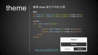
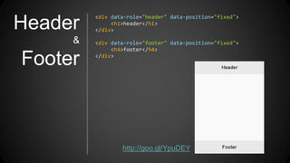
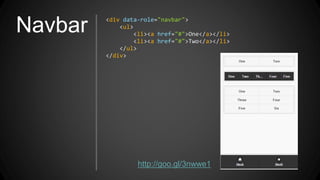
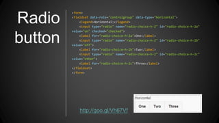
框架介紹
www.ezoui.com
jQuery Mobile 是什麼?
2
jQuery + Mobile
jQuery Mobile
=
這麼簡單,大家都知道呀!
但是 jQuery Mobile 到底是什麼?能吃嗎?
jQuery Mobile 的特色
支援響應式網頁
使用 jQuery 建構
具備完整的 UI 畫面
支援 HTML5
支援各種平台裝置
多樣的效果和變化
更簡捷的語法與輕量化的大小
精簡觸控和滑鼠事件
可是我聽說 jQuery Mobile 很 肥
jQuery Mobile 現在的版本是 Version 1.4.3
效能比以往大幅提升
感受一下 jQuery Mobile
http://demos.jquerymobile.com/1.4.2/
5
認識了 jQuery Mobile 之後就讓我們開始吧!
<link rel="stylesheet" href="jquery.mobile.min.css" />
<script src="jquery.min.js"></script>
<script src="jquery.mobile.min.js"></script>
jQuery Mobile 預載的程式
<head>
<title>jQuery Mobile</title>
<link rel="stylesheet" href="http://code.jquery.com/mobile/1.0a1/jquery.mobile.min.css" />
<script src="http://code.jquery.com/jquery-1.4.3.min.js"></script>
<script src="http://code.jquery.com/mobile/1.0a1/jquery.mobile.min.js"></script>
</head>
<body>
<div data-role="page">
<div data-role="header">
<h1>header</h1>
</div>
<div class="ui-content">
<p>content</p>
</div>
<div data-role="footer">
<h4>footer</h4>
</div>
</div>
</body>
起
手
式
<div id="page1" data-role="page">
<div role="main" class="ui-content"></div>
</div>
<div id="page2" data-role="page">
<div role="main" class="ui-content"></div>
</div>
<div id="page3" data-role="page">
<div role="main" class="ui-content"></div>
</div>
一個 jQuery Mobile 通常會有多個 page
不過,只會顯示其中一頁
page 必須使用 id 進行區隔
page
page 使用 EZoApp 來體驗一下 page
http://goo.gl/EmXUY9
★ 使用 href ,直接切換到指定的 Page Id
★ 使用 data-transition 設定切換效果
★ 設定 data-rel=”back” 用同樣效果返回
page
切換效果
<a href="#pageID" data-transition="效果"></a>
★ 也可以使用 javascript 來做切換
★ $.mobile.changePage('#PageID');
★ $.mobile.changePage('#PageB' , {'transition':'效果'} );
● default:預設值 ( fade )
● fade:淡入淡出 ( 預設值 )
● flip:翻轉
● flow :流動切換效果
● pop:彈出窗口顯示
● slide:左右滑動切換
● slidefade:左右滑動 + 淡入淡出切換
● slideup:由上而下滑動切換
● slidedown:由下而上滑動切換
● turn:轉向下一頁
● none:直接切換
page
切換效果
<a href="#pageID" data-transition="效果"></a>
範例:
http://goo.gl/xwIR0F
Button <a href="#" class="ui-btn">Anchor</a>
<button class="ui-btn">Button</button>
使用 class 產生按鈕樣式
<a href="#" class="ui-btn ui-btn-inline">Anchor</a>
<button class="ui-btn ui-btn-inline">Button</button>
Button
ICON
使用 class 產生按鈕 icon
<button class="ui-btn ui-btn-icon-left ui-icon-action">action</button>
<button class="ui-btn ui-btn-icon-left ui-icon-alert">alert</button>
<button class="ui-btn ui-btn-icon-up ui-icon-arrow-d">arrow-d</button>
<button class="ui-btn ui-btn-icon-right ui-icon-arrow-d-l">arrow-d-l</button>
<button class="ui-btn ui-btn-icon-bottom ui-icon-arrow-d-r">arrow-d-r</button>
<button class="ui-btn ui-btn-icon-left ui-icon-arrow-l">arrow-l</button>
範例:
http://goo.gl/TQxnvm
Grid <div class="ui-grid-b">
<div class="ui-block-a">Block A</div>
<div class="ui-block-b">Block B</div>
<div class="ui-block-c">Block C</div>
</div>
使用 class 產生 Grid,Grid 裡頭還可以放 Grid
ui-grid-a : 兩格,ui-grid-b:三格
ui-grid-c:四格,ui-grid-d:五格 ( 最多五格 )
http://goo.gl/AizA2f
Input
<div class="ui-field-contain">
<label for="#text_id">Title</label>
<input type="text" name="" id="#text_id">
</div>
<div class="ui-field-contain">
<label for="#textarea_id">Title</label>
<textarea name="" id="#textarea_id"></textarea>
</div>
<div class="ui-field-contain">
<label for="#search_id">Title</label>
<input type="search" name="" id="#search_id">
</div>
http://goo.gl/XOXJPH
theme 使用 class 產生不同的主題
按鈕:
<a href="#" class="ui-btn ui-btn-a">Theme A</a>
<a href="#" class="ui-btn ui-btn-b">Theme B</a>
navbar:
<div data-role="navbar">
<ul>
<li><a data-theme="a">Theme A</a></li>
<li><a data-theme="b">Theme B</a></li>
</ul>
</div>
http://goo.gl/E8QcW9
由上面幾個例子就可以看出
jQuery Mobile 裡頭
class 扮演舉足輕重的地位
你一定會認為
當然不是呀!
第二個也非常重要的就是:data attribute
2
什麼是 data attribute 呀?
HTML 5 當中,使用 "data" 屬性來自定義屬性
使用者可以使用 Javascript 或 CSS 來控制
比較嚴謹的格式為 "data-*"
完整的 jQuery Mobile data attribute
http://api.jquerymobile.com/data-attribute/
Header
&
Footer
<div data-role="header" data-position="fixed">
<h1>header</h1>
</div>
<div data-role="footer" data-position="fixed">
<h4>footer</h4>
</div>
http://goo.gl/YpuDEY
Navbar <div data-role="navbar">
<ul>
<li><a href="#">One</a></li>
<li><a href="#">Two</a></li>
</ul>
</div>
http://goo.gl/3nwwe1
Radio
button
<form>
<fieldset data-role="controlgroup" data-type="horizontal">
<legend>Horizontal:</legend>
<input type="radio" name="radio-choice-h-2" id="radio-choice-h-2a"
value="on" checked="checked">
<label for="radio-choice-h-2a">One</label>
<input type="radio" name="radio-choice-h-2" id="radio-choice-h-2b"
value="off">
<label for="radio-choice-h-2b">Two</label>
<input type="radio" name="radio-choice-h-2" id="radio-choice-h-2c"
value="other">
<label for="radio-choice-h-2c">Three</label>
</fieldset>
</form>
http://goo.gl/Vh67Vf
Check
box
<form>
<fieldset data-role="controlgroup">
<legend>Vertical:</legend>
<input type="checkbox" name="checkbox-v-2a" id="checkbox-v-2a">
<label for="checkbox-v-2a">One</label>
<input type="checkbox" name="checkbox-v-2b" id="checkbox-v-2b">
<label for="checkbox-v-2b">Two</label>
<input type="checkbox" name="checkbox-v-2c" id="checkbox-v-2c">
<label for="checkbox-v-2c">Three</label>
</fieldset>
</form>
http://goo.gl/x7vfGr
Flip
switch
<form>
<label for="flip-2">Flip toggle switch:</label>
<select name="flip-2" id="flip-2" data-
role="flipswitch" data-theme="b">
<option value="off">Off</option>
<option value="on">On</option>
</select>
</form>
http://goo.gl/83Mn0z
Listview <ul data-role="listview" data-inset="true"
data-divider-theme="a">
<li data-role="list-divider">Mail</li>
<li><a href="#">Inbox</a></li>
<li><a href="#">Outbox</a></li>
<li data-role="list-
divider">Contacts</li>
<li><a href="#">Friends</a></li>
<li><a href="#">Work</a></li>
</ul>
使用 data-role 輕鬆製作 listview ( filter )
http://goo.gl/XjmWug
Popup
<a href="#popupID" data-rel="popup" class="ui-btn" data-
transition="pop">Popup</a>
<div data-role="popup" id="popupID">
<p>popup 內容</p>
</div>
製作彈出式視窗
http://goo.gl/V2Zhxj
Table
<table data-role="table" id="table-column-toggle" data-
mode="columntoggle" class="ui-responsive table-stroke">
<thead>
內容省略
</thead>
<tbody>
內容省略
</tbody>
</table>
http://goo.gl/pMJlkP
建立表格 (columntoggle / Reflow)
Slide
Panel
<div id="left-menu" data-role="panel" data-position="left">
從左側展開的內容
</div>
<div id="right-menu" data-role="panel" data-
position="right">
從左側展開的內容
</div>
跟 App 一樣的選單表現方式
參考文章:
http://goo.gl/QajnSU
範例:
http://goo.gl/8KlhuF
該如何讓 jQuery Mobile 運作呢?
事件
頁面事件
(function (){
$(document).on( "pageinit" , "#pageID" , function(){
//頁面第一次載入會執行
});
})()
(function (){
$(document).on( "pageshow" , "#pageID" , function(){
//頁面顯示後會執行
});
})()
(function (){
$(document).on( "gkComponentReady" , function(){
//GK 元件初始化完成會執行
});
})()
http://goo.gl/0Zwgnd
$('#id').on('tap', function () {});
$('#id').on('taphold', function () {});
$('#id').on('swipe', function () {});
$('#id').on('swipeleft', function () {});
$('#id').on('swiperight', function () {});
五種頁面觸控事件 ( 手勢與滑鼠均適用 )
http://goo.gl/S5bJNq
事件
觸控事件
$(window).on('orientationchange', function (event) {});
偵測行動裝置的旋轉事件
http://goo.gl/HnE1Fe
事件
旋轉事件
經過了剛剛一系列的的介紹
大家應該稍微明白了 jQuery Mobile 了吧
看一些 jQuery Mobile 的範例
範例 1 :
利用滑動桿,改變文字大小
http://goo.gl/4bVDt4
http://goo.gl/DjPh9q
範例 2 :
調色盤
http://goo.gl/wiJ2BX
範例 3 :
訂飲料系統
範例 4 :
EZoApp 地圖應用
http://goo.gl/qaIYp8
範例 5 :
高雄市好吃好玩
http://goo.gl/4w2iAl
測試時瀏覽器須跨域:--args --disable-web-security
以上就是 jQuery Mobile 的基本介紹
如有興趣,可以上 jQuery Mobile 官網了解更多
http://jquerymobile.com/
更多精彩的應用,等待你我去發掘
或直接使用 EZoApp 體驗
http://jqmdesigner.appspot.com/
謝謝聆聽
敬請指教

JQuery Mobile 框架介紹與使用 20140713