Download to read offline


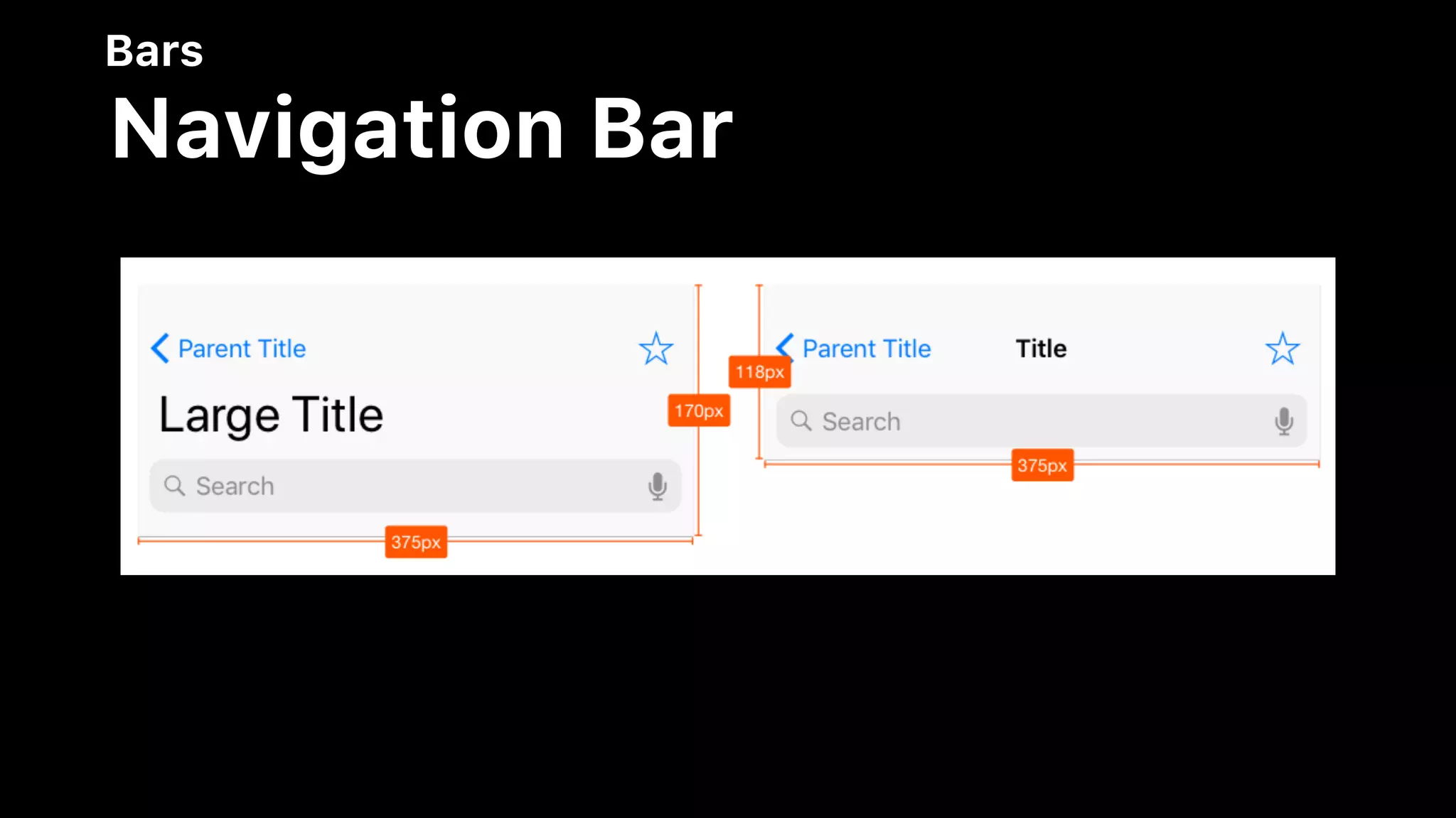


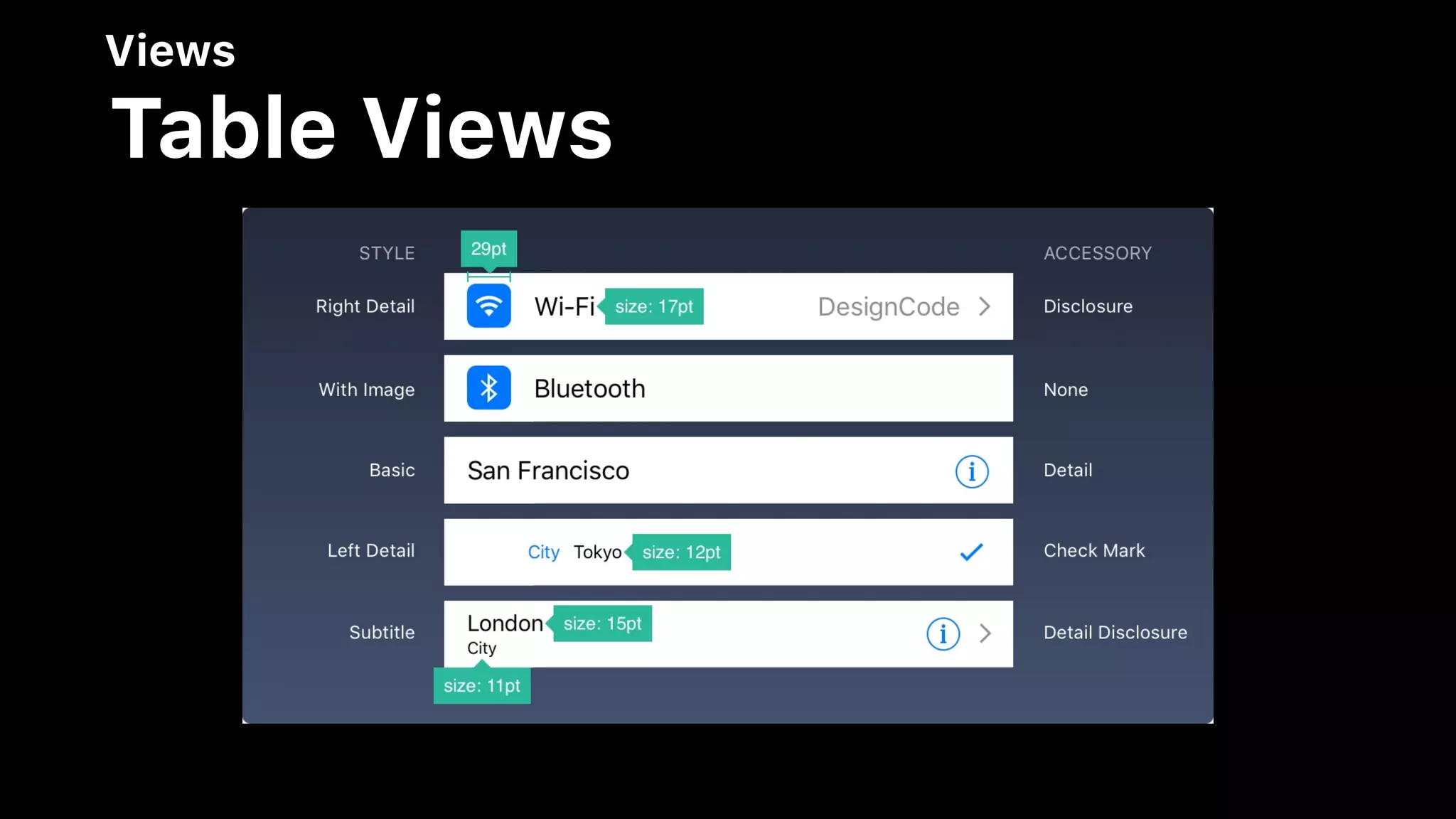

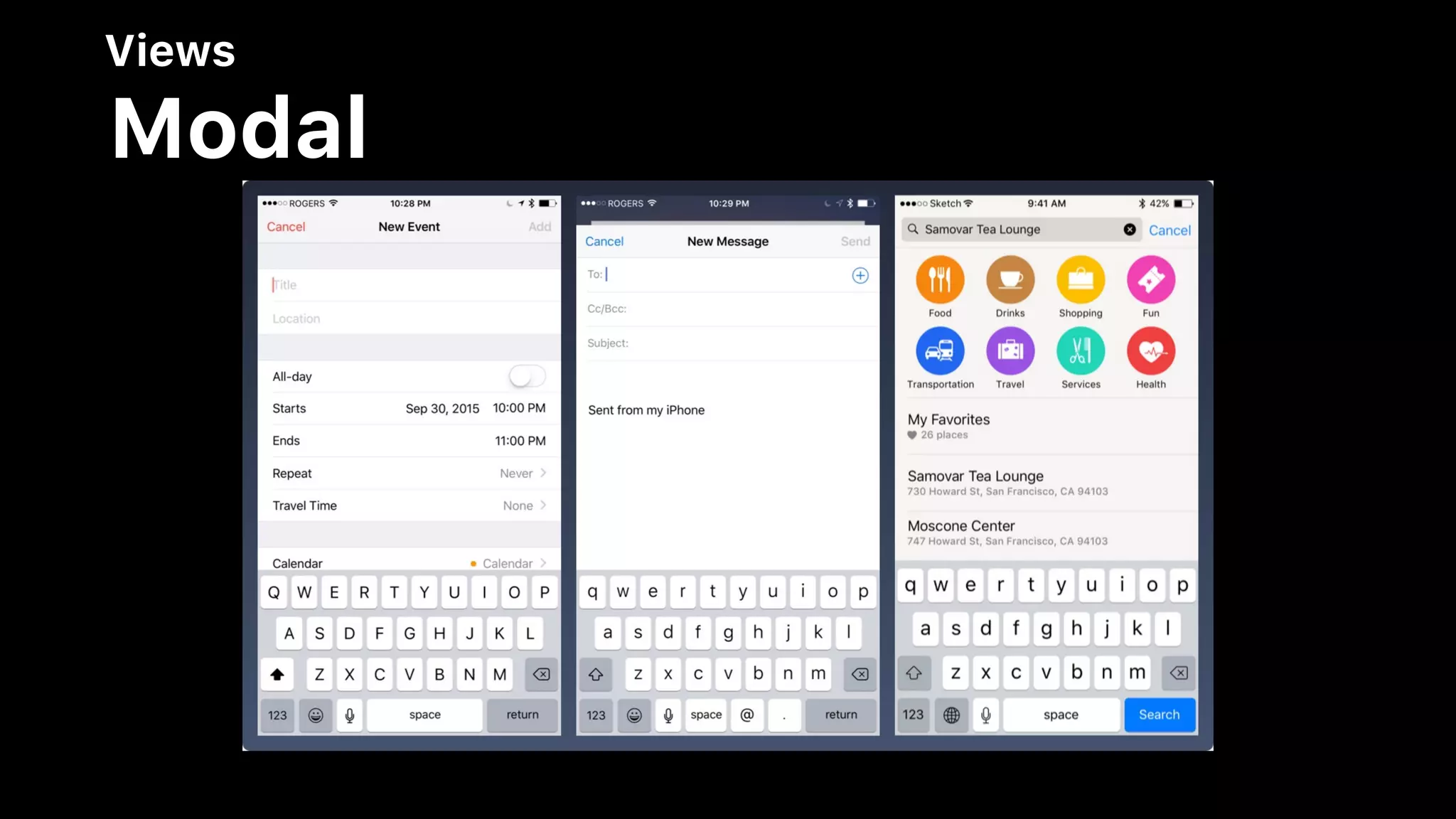

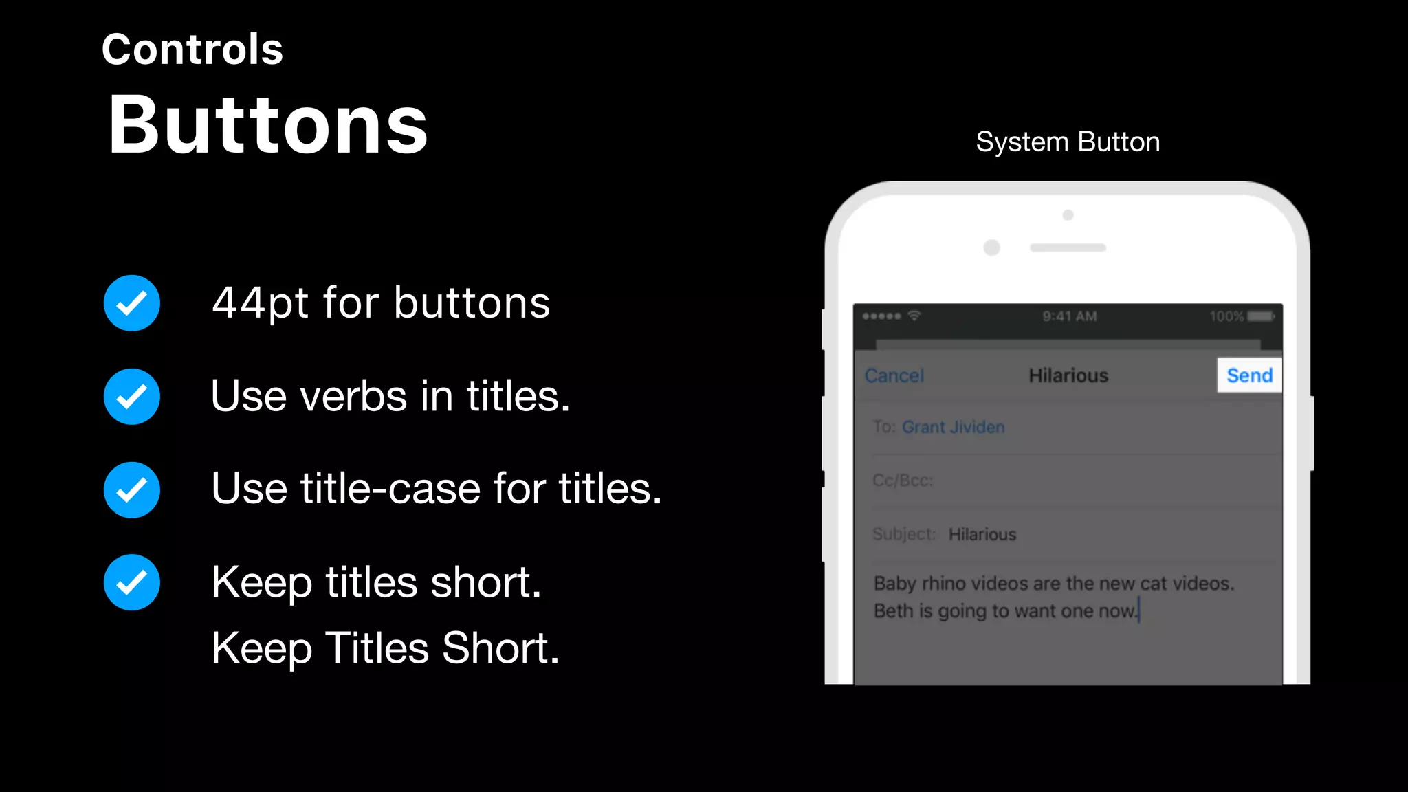


The document outlines the iOS Human Interface Guidelines, focusing on design principles such as user interactions, visual design, and system capabilities. It explains the importance of points in the coordinate system for rendering images into pixels, detailing resolution and scaling for various iPhone models. It also covers UI design best practices, controls, and available technologies like Apple Pay and HealthKit.


