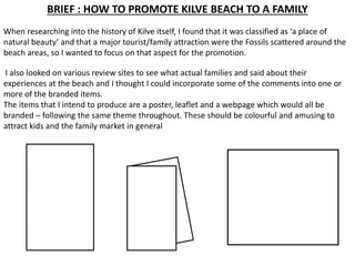
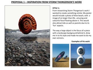
INTERIM REVIEW FOR DESIGN IDEAS 
BY 
BRADLEY SANTON
BRIEF : HOW TO PROMOTE KILVE BEACH TO A FAMILY 
When researching into the history of Kilve itself, I found that it was classified as ‘a place of 
natural beauty’ and that a major tourist/family attraction were the Fossils scattered around the 
beach areas, so I wanted to focus on that aspect for the promotion. 
I also looked on various review sites to see what actual families and said about their 
experiences at the beach and I thought I could incorporate some of the comments into one or 
more of the branded items. 
The items that I intend to produce are a poster, leaflet and a webpage which would all be 
branded – following the same theme throughout. These should be colourful and amusing to 
attract kids and the family market in general
CHOSEN PATHWAY – DESIGN 
Definitely DESIGN because I like using the computer to come up with solutions to 
a brief but also because I prefer to be challenged to come up with new ideas for 
a client rather than doing art for my own pleasure. 
I want to do a degree in either graphic design or 
game design which both involve illustration and 
design work using digital media. This is where I 
think my forte lies. For my portfolio I would need 
to include examples of my design solutions to 
problems and also my hand drawn illustrations.
PROPOSAL 1 – INSPIRATION FROM STORM THORGERSON’S WORK 
STYLE 1: 
From researching Storm Thorgerson’s work I 
wanted to create something similar. My poster 
would include a photo of Kilve beach, with a 
image of an larger than life , amusing and 
colourful fossil floating above it. This would 
also attract kids as well as parents due to its 
‘fun’ aspects. 
The way a large object is the focus of a piece 
with a landscape background behind it, drew 
me in to his style and made me want to do my 
own versions. 
Examples of his work
PROPOSAL 2 – TYPOGRAPHY DAVID CARSON 
STYLE 2: 
The second idea would be based from the style of Graphic Designer David Carson’s work. His work features 
the use of typography, to create a structure from, whether person or object. Mine would include a fossil 
shaped in typography, the typography would include info on Kilve . 
The words would be in strong 
bright primary colours to 
attract kids and families , set 
against a light background of 
the beach or rocks. I like the 
colours used in the burger 
example and the shape of the 
writing in the bomb.
PROPOSAL 3 – INFOGRAPHICS 
STYLE 3: 
The third style was inspired by film infographics. Infographics are a more illustrative way of telling a story, 
thought your work and to translate different messages. 
My poster would include an infographics structure for the beach attractions in Kilve, such as fossils, and 
maybe some history about the area. This approach is also great for tourists who only have to look at the 
images to understand the attraction. 
Also images of a family once again 
using bright colours like the ‘human 
body’ poster below.
CONCLUSION 
STYLE 1 : I like the overall 
look of this poster but 
obviously it needed words 
to let people know what 
area it is promoting. I 
would also include a 
website. It may be a bit 
TOO off the wall for 
families and kids and 
would more likely attract 
older audiences. 
STYLE 2 : I really like the 
overall look and feel of this 
poster but the lettering needs 
to be more uniform so it is 
easier for people to read. 
Again, I would also include a 
website. I think it is attractive 
to families and kids because 
of the bright colours but 
maybe the background is a bit 
too washed out. 
STYLE 3 : This style of 
poster could potentially be 
my favourite of the three, 
and therefore one I am 
most likely to develop 
further. At the moment it 
is very basic, as an info 
graphics poster should be, 
however I want to refine it 
further for the three 
branded ideas.

Interim review presentation kilve brief

  • 1.
    INTERIM REVIEW FORDESIGN IDEAS BY BRADLEY SANTON
  • 2.
    BRIEF : HOWTO PROMOTE KILVE BEACH TO A FAMILY When researching into the history of Kilve itself, I found that it was classified as ‘a place of natural beauty’ and that a major tourist/family attraction were the Fossils scattered around the beach areas, so I wanted to focus on that aspect for the promotion. I also looked on various review sites to see what actual families and said about their experiences at the beach and I thought I could incorporate some of the comments into one or more of the branded items. The items that I intend to produce are a poster, leaflet and a webpage which would all be branded – following the same theme throughout. These should be colourful and amusing to attract kids and the family market in general
  • 3.
    CHOSEN PATHWAY –DESIGN Definitely DESIGN because I like using the computer to come up with solutions to a brief but also because I prefer to be challenged to come up with new ideas for a client rather than doing art for my own pleasure. I want to do a degree in either graphic design or game design which both involve illustration and design work using digital media. This is where I think my forte lies. For my portfolio I would need to include examples of my design solutions to problems and also my hand drawn illustrations.
  • 4.
    PROPOSAL 1 –INSPIRATION FROM STORM THORGERSON’S WORK STYLE 1: From researching Storm Thorgerson’s work I wanted to create something similar. My poster would include a photo of Kilve beach, with a image of an larger than life , amusing and colourful fossil floating above it. This would also attract kids as well as parents due to its ‘fun’ aspects. The way a large object is the focus of a piece with a landscape background behind it, drew me in to his style and made me want to do my own versions. Examples of his work
  • 5.
    PROPOSAL 2 –TYPOGRAPHY DAVID CARSON STYLE 2: The second idea would be based from the style of Graphic Designer David Carson’s work. His work features the use of typography, to create a structure from, whether person or object. Mine would include a fossil shaped in typography, the typography would include info on Kilve . The words would be in strong bright primary colours to attract kids and families , set against a light background of the beach or rocks. I like the colours used in the burger example and the shape of the writing in the bomb.
  • 6.
    PROPOSAL 3 –INFOGRAPHICS STYLE 3: The third style was inspired by film infographics. Infographics are a more illustrative way of telling a story, thought your work and to translate different messages. My poster would include an infographics structure for the beach attractions in Kilve, such as fossils, and maybe some history about the area. This approach is also great for tourists who only have to look at the images to understand the attraction. Also images of a family once again using bright colours like the ‘human body’ poster below.
  • 7.
    CONCLUSION STYLE 1: I like the overall look of this poster but obviously it needed words to let people know what area it is promoting. I would also include a website. It may be a bit TOO off the wall for families and kids and would more likely attract older audiences. STYLE 2 : I really like the overall look and feel of this poster but the lettering needs to be more uniform so it is easier for people to read. Again, I would also include a website. I think it is attractive to families and kids because of the bright colours but maybe the background is a bit too washed out. STYLE 3 : This style of poster could potentially be my favourite of the three, and therefore one I am most likely to develop further. At the moment it is very basic, as an info graphics poster should be, however I want to refine it further for the three branded ideas.