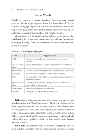
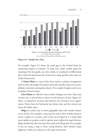
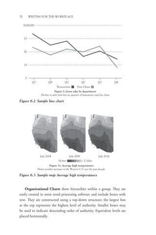
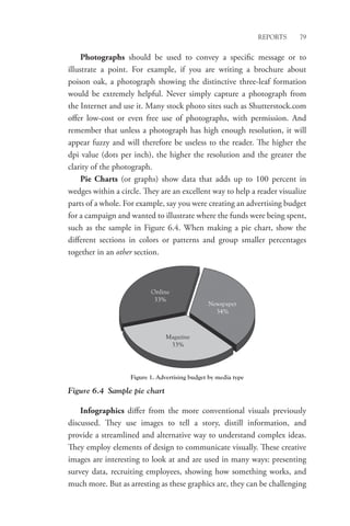
1. CHAPTER 6
Reports
Reports provide accounts of information and range from short, informal
e-mails to over 100 page formal manuscripts. They may be distributed
to an internal or external audience, read via hard copy or on a computer
screen, and written in a variety of business genres.
Typically reports fall into one of several categories. Informational
reports present information without analysis. They offer facts but do
not interpret information. Analytical reports interpret data or informa-
tion and often provide recommendations. They may be written to assess
a business opportunity, provide solutions to problems, or to support
business decisions. Proposals are analytical reports that pose persuasive
requests to influence decisions either within an organization or to an
external audience.
Reports, like all professional communication, must be well written:
clear, comprehensive, and organized. In addition, because they often
contain information obtained from a wide variety of sources, reports
must be meticulously cited to give them credibility. This chapter provides
an overview of the most common types of reports, the various formats
used to present reports, components to include in reports, and document
design.
Report Types
Whether informal or formal, short or long, each type of report has a spe-
cific purpose. Individual organizations may name reports differently, but
most reports fall into one of the categories listed in Tables 6.1 and 6.2.
Personnel in organizations write other types of reports. A few of the
most common include the strategic plan, which defines a company’s goals
and objectives and the action plans to attain those goals. A
marketing
plan outlines an organization’s target market and competition to best
identify its own niche and presents the advertising and promotional plans
2. 70 WRITING FOR THE WORKPLACE
Table 6.1 Common informational reports
Report type or
name Purpose
Elements to
include
Activity Summarize regular activities or
unusual events for managers
Bulleted points
describing activities
Trip/development
activity
Describe most important takeaway
to justify trip or activity
Introduction, body,
conclusion
Progress Explain status of project,
describing work completed, work
in progress, work to do, current
or anticipated problems, expected
date of completion
Background, work
completed, work in
progress, problems,
target completion
date(s)
Technical Provide managers with facts and
data
Executive summary,
introduction,
conclusions,
recommendations
(if applicable)
Table 6.2 Common analytical reports
Report type Purpose Elements to include
Feasibility Evaluate viability of specific
course of action
Background, benefits,
problems, costs
Proposal Persuade audience to take a
course of action
Letter of transmittal,
abstract or executive
summary, table of contents,
list of illustrations,
introduction, background,
plan, schedule, personnel,
budget
Recommendation Justify action, often within
an organization
Background, alternatives,
recommendation
White paper Argue a position or propose
a solution; provide evidence
of subject expertise
Introduction, background,
solution, conclusion
to maximize its market share. A business plan is a roadmap for a new
enterprise or a formalized plan for growing an existing business.
Report Styles
Whether a report is formal or informal depends on the audience. Many
internal reports—those written for someone within an organization—will
3. Reports 71
be informal. For example, if a supervisor asks an employee to write up a
justification for taking a trip, the report would likely be informal, written
as an e-mail or a memo and using a casual, conversational tone. Not all
reports written for internal audiences are informal, however. If a division
of a large organization must submit a yearly strategic plan to
corporate
headquarters, the report would likely be a bound or digital manuscript
written in a formal tone. In fact, such a report is among the most formal
type of writing done in organizations.
One of the ways to hit the right note of formality is by employing the
characteristics of formal and informal writing. Refer to Table 1.4 (Formal
and informal writing styles) for a breakdown of the characteristics and
components of each writing style.
Report Formats
Reports may be written using a variety of document formats. For example,
a report informing a manager about a trip to an industry expo might
be delivered in a short e-mail. Sometimes, a formal letter may be used.
Say a company is responding to a request for information about providing
drought-resistant landscaping services. The initial inquiry may have come
via phone or e-mail, but a reply detailing the services the company offers
would be best communicated in a formal letter. Such a document would
likely be several pages in length.
Memos are also effective for presenting information in reports. Memo
reports tend to be less lengthy and less formal than manuscripts, ranging
from one to several pages, and are typically used within an organization,
though they may at times be sent to an outside audience. Memo reports
are often sent via e-mail and are accompanied by a brief e-mail message
that forecasts the document’s contents (see transmittal messages section
that follows). Manuscript reports may be produced in print or digital
versions. Print manuscripts are bound; digital versions of the print report
are often a PDF of the print version. Some digital reports contain links
that take the reader outside of the manuscript.
Today many companies prefer report decks over more traditional
reports. Report decks (sometimes referred to as data blocks) are created
in PowerPoint and include narrative and graphics to present information
succinctly. They are distributed digitally to individuals or groups, and
4. 72 WRITING FOR THE WORKPLACE
although they are prepared using presentation software such as Power-
Point, they are not designed to be used for oral presentations.1
See Appendix B for sample documents of a trip report e-mail, a memo
proposal, and a letter report.
Report Components
Reports often contain an assortment of elements, which are broken into
major sections: front matter, body, and back matter. Here we’ll discuss the
various elements that may be included in a report.
Transmittal
Whether being distributed digitally or presented in person, reports are
always accompanied by an introductory message called a transmittal.
The transmittal accompanies the report but is not part of the report itself.
The message may be in the form of a letter, especially for formal reports
going to an outside audience, but it may also be an e-mail or a memo.
Transmittals are written using the direct strategy and discuss what the
report is about and why it was written. They may introduce the main
points of interest within the report. The more formal the report, the more
formal the transmittal.2
Front Matter
Front matter is comprised of the first few pages of a report that come
before the narrative. Front matter may include a cover, an attractively
designed front piece for formal reports and those intended for a wide
audience. The written information on a cover varies, but it will, at a
minimum, contain the title of the report and the name of the person or
organization submitting it.
Some reports contain an abstract, a brief distillation of the report’s
content. Scientific or technical reports often contain abstracts.
Descriptive
abstracts simply describe the information in the report without
offering
interpretation. Informative abstracts summarize key results and offer
interpretations.
5. Reports 73
A title page will contain some or all of the following:
• Report name
• Person or organization submitting the report
• Name of individual receiving the report
• Date the report is submitted
• Copyright
The table of contents is an outline of the report that provides readers
with the location of major categories and subcategories of information. A
good table of contents should offer enough detail so the reader can immedi-
ately locate a particular section. Such detail may be written in several formats:
• Decimal outline format (1.0, 1.1, 1.1.2, etc.)
• Alphanumeric outline (I, A, 1, a, etc.)
• Graphic markers (boldface, indentation, etc.)
Obviously, a table of contents must contain accurate pagination.
The list of illustrations shows all tables, figures, and maps. It appears
on its own page and is not part of the table of contents. Tables are gener-
ally listed and numbered separately from other figures. All other figures
(charts, graphs, maps, photographs) are listed sequentially as they appear
in the report. (We will discuss the types of illustrations and the rules for
inserting them into reports later in this chapter.)
An executive summary presents the most important elements of a report
in a condensed form so a busy manager can glean the report’s most critical
takeaways. Depending on the length of the report, an executive summary may
be one or 10 pages. For longer executive summaries, informational headings
should be used. Executive summaries are objective and must accurately sum-
marize information contained in the report body. A well-constructed exec-
utive summary often makes reading the entirety of the report unnecessary.
Body
The body of a report contains several sections. The introduction orients
the reader. It includes background information explaining the context of
the report and defines the report’s limitations (what it will and will not
cover). It may provide an overview or the report’s organization, sources
6. 74 WRITING FOR THE WORKPLACE
or methodology used to conduct research, definitions of key terminology,
authorization for writing the report, and the report’s purpose or signifi-
cance. An introduction should not be confused with a summary, which is
read in lieu of or separately from a report body.
The findings include the information and supporting facts of the
report. Reports are broken into sections or chapters defined by headings.
Whichever system is used—alphanumeric or decimal outline or
graphics
for reader cues—headings are organized by hierarchy (see the
sample
below). First level headings name major topics. Second level
headings
subdivide information under a first level heading. Third level headings
further subdivide information. It is not necessary to give each body para-
graph its own heading; doing so can bog down the reading of a long
report. However, for readability, include at least one heading per page.
The following is a sample of headings using graphic markers.
Headings may be informative or descriptive. Informative headings
can be written as questions or as summaries, but they are most effective
when they are limited to four to eight words.3
Descriptive headings name
topics.
In the various sections of a report, information is often cited using a
formal citation system. Academic reports use discipline specific citation
systems such as MLA for the humanities, APA for the social sciences, or
CSE for the sciences. Many organizations use The Chicago Manual of Style
(CMS) as their guide for citing, which employs footnotes or endnotes
accompanied by a list of references in the report’s back matter.
It is important to consider the ethical use of information at this
point. It is dishonest (and illegal!) to use copyrighted material without
TITLE
(Centered, caps, boldface)
Heading Level 1
(Centered, upper and lower case, boldface)
Heading Level 2
(Flush left, upper and lower case, boldface)
Heading Level 3
(Flush left, upper and lower case, boldface, begin typing directly after
heading)
7. Reports 75
permission from the author. You may not use photographs or other
images you encounter on the Internet without specific permission. The
only exception to this rule is information published by the government.
Another element of ethical use of information is the avoidance of
plagiarism. Never cut and paste information and claim it as your own
work. Instead, rely on paraphrase and summary, using direct quotes only
when they add emphasis, and always with proper attribution. Whether
paraphrasing, summarizing, or quoting, always give credit to your sources;
it makes your work appear well researched as well as making it ethical.
All reports must have an ending. A summary is a recap of the report
findings. Conclusions explain how the data in the findings relate to the
original problem named in the report’s introduction. Because conclusions
sum up the report’s details, they never contain new material. Some reports
end with recommendations. Recommendations provide solutions to the
problem the report addresses or suggestions for future actions. Sometimes
report conclusions and recommendations appear in the same section.
The following example shows the differences between a finding,
a conclusion, and a recommendation.
Finding More than 80 percent of pet owners delay prophylactic
dental treatment for their pets, citing cost as the deterrent.
Conclusion Current high costs for prophylactic pet dental treat-
ment are leading to more costly and serious pet health issues and
unhappy pet owners.
Recommendation Develop alternate fee structures for prophylactic
dental treatments.
Back Matter
Back matter is the section of a report that contains details referred to, but
not fully included, in the body. Typical sections are the references and
appendixes. References contain a list of the sources cited or consulted in
the writing of the report, using a formal citation system. Appendixes are
supplemental to the body of the report and are labeled A, B, C, and so
on when more than one appendix is needed. Appendixes are reserved for
lengthy or highly detailed portions of a report that readers may not want
to read in detail.
8. 76 WRITING FOR THE WORKPLACE
Report Visuals
Visuals in reports serve several functions. First, they draw readers’
attention. The old adage “A picture is worth a thousand words” is true.
Whether a bar graph or pie chart, visuals turn numbers into pictures and
help readers grasp points more readily. Second, they help break up text
and make a long report more readable and visually attractive.
Visuals should only be used when they highlight an important point,
and choosing the correct visual to communicate an idea or fact is crucial
to relaying meaning. Table 6.3 summarizes the uses of the most com-
monly used visuals.
Table 6.3 Visual types and purpose
Type Purpose or use
Table Organize numerical data or information into rows and
columns
Bar or column
chart
Show data in vertical or horizontal columns for comparison
Gantt chart Plan and track status of project with beginning and end dates
Line chart Illustrate trends over time; compare data over time
Map Show specific points within an area; illustrate distances; show
geographic features
Organizational
chart
Depict hierarchies within an organization; show how ele-
ments relate to one another
Photographs Illustrate actual image; record events
Pie chart Show parts of a whole adding up to 100%
Tables display information in rows and columns and can be com-
prised of text (such as Table 6.3) or numbers. Numerical tables are used to
show large amounts of data and are easily created in spreadsheet or word
processing software. Place tables with important information within the
body of the narrative; place other tables in the appendix. When making
tables, organize data logically, name row and column headings clearly,
and use white space, gradation of color, or lines to differentiate between
rows and columns.
Bar Charts are excellent ways to illustrate comparisons and are
most useful to the reader when they communicate one simple message.
9. Reports 77
0
‘02 ‘03 ‘04 ‘05 ‘06 ‘07 ‘08 ‘09 ‘10 ‘11 ‘12
0.5
1.0
1.5
$2.0 trillion
U.S. China
Figure 7. U.S. and China Exports and Imports 2002−2012
U.S.−China trade gap in dollars.
Source: National Association of Manufacturers
Figure 6.1 Sample bar chart
For example, Figure 6.1 shows the trade gap in the United States by
comparing exports to imports. To help your reader readily grasp the
meaning of the bar graph, use color, shade, or crosshatch to differentiate
data. Label the horizontal and vertical axes using specific values that are
clearly demarcated.
A Gantt Chart is a type of bar chart used as a project management
tool. It shows the length of a project and names specific tasks to be accom-
plished, sometimes naming key players. Do a simple Google search to see
examples of Gantt charts.
Line Charts are effective ways to show changes over time. They may
contain one or several lines to show several elements of data. Figure 6.2
shows a comparison of gross sales between two divisions of an organi-
zation. Notice how the horizontal axis shows time and the vertical axis
shows the dollar value.
Maps are useful ways to show geographic data with another feature
or set of data. For example, a map may be used to show weather
patterns
across a region or a country, such as the one in Figure 6.3. A map’s label
must explain its purpose, and its caption must explain the map’s features.
Maps should only show the data that needs to be illustrated. For
example,
if you are using a map to show voting districts, don’t include major
highways, which are irrelevant to the map’s main point.
10. 78 WRITING FOR THE WORKPLACE
Organizational Charts show hierarchies within a group. They are
easily created in most word processing software and include boxes with
text. They are constructed using a top-down structure; the largest box
at the top represents the highest level of authority. Smaller boxes may
be used to indicate descending order of authority. Equivalent levels are
placed horizontally.
Q3
0
25
50
75
$100,000
Q4 Q1 Q2 Q3 Q4
Housewares
Figure 3. Gross sales by department
Decline in sales from last six quarters of housewares and fine china
Fine China
Figure 6.2 Sample line chart
July 2004 July 2009 July 2014
Hotter
Figure 11. Average high temperatures
Hotter weather increases in the Western U.S. over the past decade.
Colder
Figure 6.3 Sample map Average high temperatures
11. Reports 79
Photographs should be used to convey a specific message or to
illustrate a point. For example, if you are writing a brochure about
poison oak, a photograph showing the distinctive three-leaf formation
would be extremely helpful. Never simply capture a photograph from
the
Internet and use it. Many stock photo sites such as Shutterstock.com
offer
low-cost or even free use of photographs, with permission. And
remember that unless a photograph has high enough resolution, it will
appear fuzzy and will therefore be useless to the reader. The higher the
dpi value (dots per inch), the higher the resolution and the greater the
clarity of the photograph.
Pie Charts (or graphs) show data that adds up to 100 percent in
wedges within a circle. They are an excellent way to help a reader visualize
parts of a whole. For example, say you were creating an advertising
budget
for a campaign and wanted to illustrate where the funds were being spent,
such as the sample in Figure 6.4. When making a pie chart, show the
different sections in colors or patterns and group smaller percentages
together in an other section.
Online
33%
Newspaper
34%
Magazine
33%
Figure 1. Advertising budget by media type
Figure 6.4 Sample pie chart
Infographics differ from the more conventional visuals
previously
discussed. They use images to tell a story, distill information, and
provide a streamlined and alternative way to understand complex ideas.
They employ elements of design to communicate visually. These creative
images are interesting to look at and are used in many ways: presenting
survey data, recruiting employees, showing how something works, and
much more. But as arresting as these graphics are, they can be challenging
12. 80 WRITING FOR THE WORKPLACE
to create. Many tools are available for creating infographics such as
Piktochart and Visual.ly.
Integrating Visuals into Text
Use the following rules when integrating visuals into a report.
1. Mention the visual in the narrative. Direct your reader’s attention
to the visual by referencing it. Write “See Figure 1” or “As
Figure 1
illustrates … ”. Never let a visual stand alone without some discussion
of its contents.
2. Place the visual near where it is discussed. Do not confuse readers by
making them search for the image.
3. Label visuals clearly. The title of the visual should accurately and
concisely describe its main message.
4. Use a caption with a title to identify the image’s purpose.
5. Keep images on one page. Never break up a table or other image
onto two pages.
6. Refer to tables as tables and all other images as figures.
7. Number visuals sequentially.
8. Include a source line when taking information from an outside
source. Place it in the lower left.
9. Place lengthier visuals in an appendix.
Report Document Design
As with all workplace documents, reports must be easy to read, so docu-
ment design is extremely important. For shorter reports—e-mails, letters,
memos—the standard document design we have discussed earlier applies.
Here we’ll discuss document design for longer reports.
Page Design
The way your report page appears will encourage or discourage reading.
These pointers can help make a long report more visually appealing.
13. Reports 81
1. Consider using an attractive header and footer as a way to create
visual interest in longer reports. A logo or infographic image that is
unobtrusive can liven up a page. Even a simple colored line across
the top and bottom of a page will make a report with many pages
appear less tedious. Include page numbers in either the header or
footer.
2. Use right and left margins of 1 to 1.25 in., and use 1 in. for the top
and bottom. You may also opt to use two columns for a standard
report. Doing so can make dense text easier to track.
3. Choose font style for readability. Many manuscript reports use serif
fonts, but increasingly, sans serif fonts are also being used. If you
do use a sans serif font for a report, adjust your spacing between
lines. When a report will be read on a screen, use generous spacing
between lines with both serif and sans serif fonts. (Locate the Pew
Research Center’s report Millennials: A Portrait of Generation Next
on the Internet for an excellent model of document design using a
serif font to be read on the screen.)
4. Differentiate between body copy and headings with boldface and
font size. If you use a sans serif font for body copy, choose a serif font
for headings. Never use more than two fonts in a long report.
5. Add color for visual interest. Stick to a color scheme using no more
than three complementary colors.
Writing Collaboratively
Because reports may be large projects, they are often written collabora-
tively. Producing a collaborative project on a deadline can be challenging.
Different writing styles and abilities and even different levels of commit-
ment to a project can affect collaborative writing. If you are working with
a group of people to write a report, consider these pointers.
• Meet regularly to discuss project progress
• Assign tasks and keep on schedule
• Share information
14. 82 WRITING FOR THE WORKPLACE
• Use a group editing document space like Google Docs or
Dropbox
• Rely on individual strengths
• Edit for a unified voice and document design
Conclusion
Reports are an important way of communicating information within
organizations, to stakeholders, and to other organizations. Many types of
reports are regularly written in the workplace using various formats, from
short e-mails to manuscripts of more than 100 pages. Reports are broken
into sections and must be well organized and visually appealing. Collab-
orative report preparation can expedite completion but requires commit-
ment and coordination. Clearly written reports that display information
in an approachable way continue to play a large role in communicating
in the workplace.