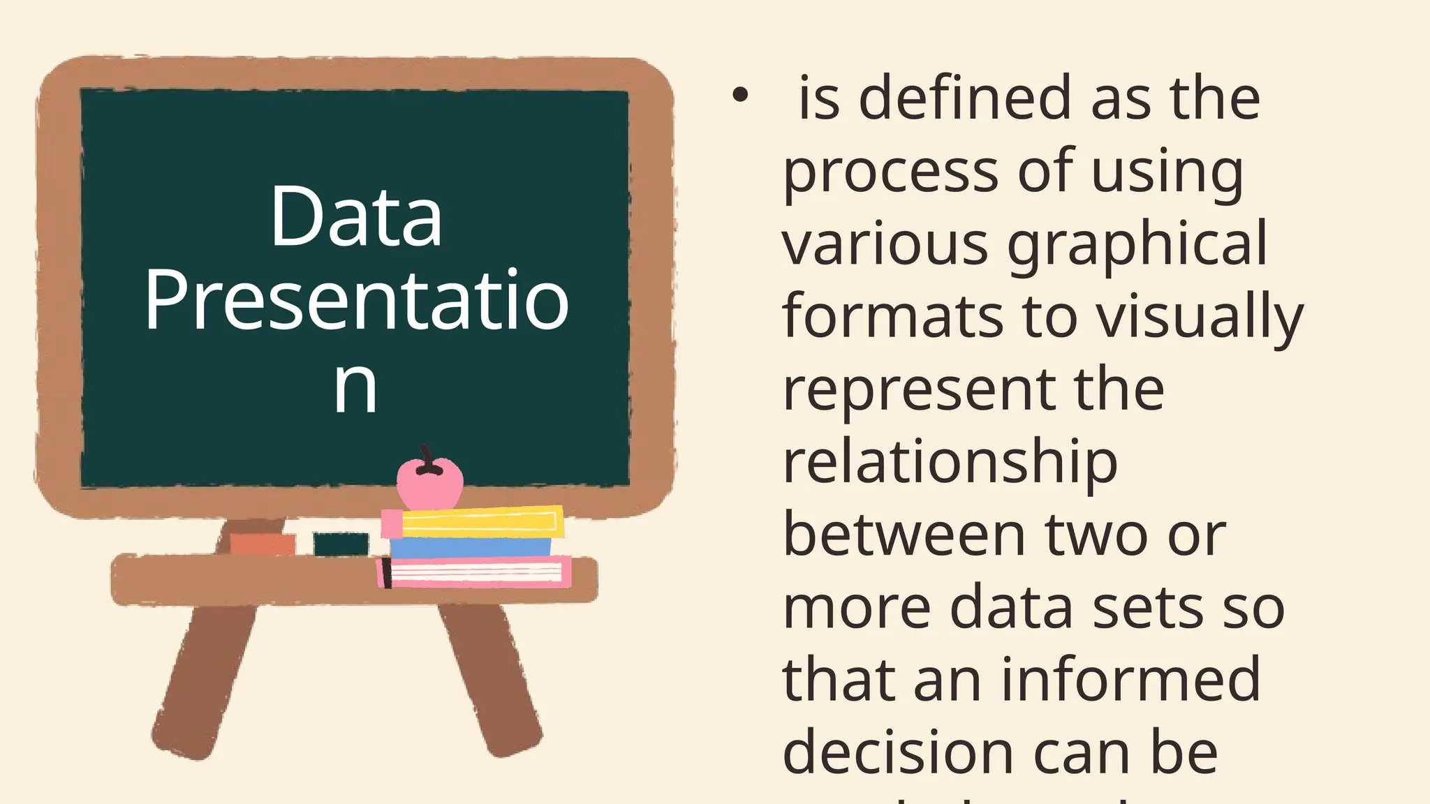
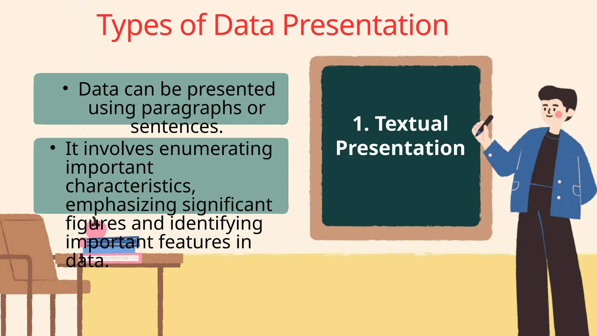
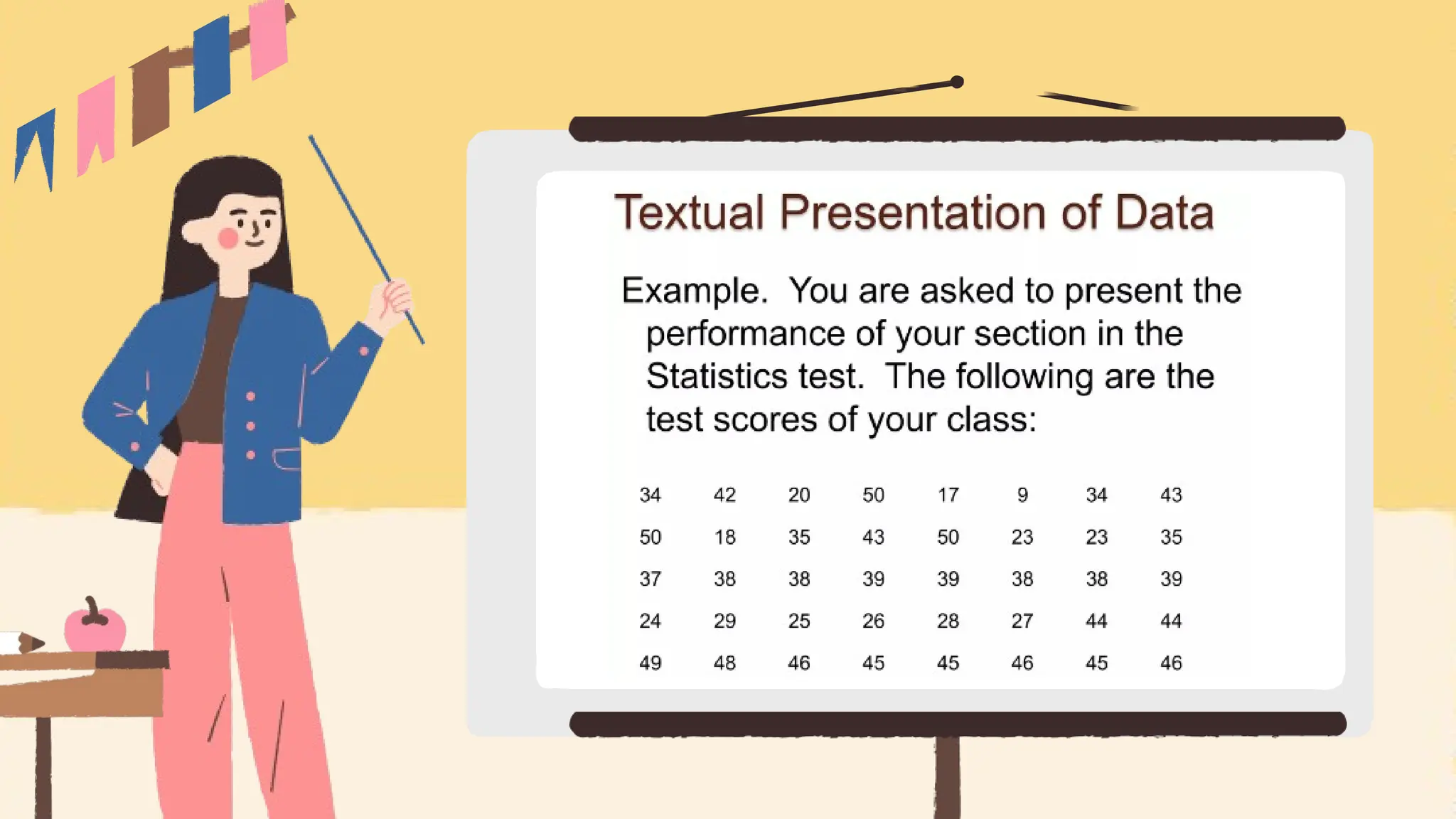
How to Write
Data
Presentation
Presenter: Marjorie Ann C. Ontulan
• is defined as the
process of using
various graphical
formats to visually
represent the
relationship
between two or
more data sets so
that an informed
decision can be
Data
Presentatio
n
Why are data presentations
important?
3. Comprehension
4. Decision-making
5. Impact
1. Clarity:
2. Engagement
Types of Data Presentation
1. Textual
Presentation
• Data can be presented
using paragraphs or
sentences.
• It involves enumerating
important
characteristics,
emphasizing significant
figures and identifying
important features in
data.
2. Tabular
Presentation
• Employs tables to
arrange and structure
your data systematically.
• These tables are invaluable
for comparing various data
groups or illustrating how
data evolves over time.
3. Graphical
Presentation
• harnesses the visual
impact of charts and
graphs to breathe life
into your data.
Charts and graphs
are powerful tools
for spotlighting
trends, patterns, and
relationships hidden
within the data.
• Bar Chart
• Pie Chart
• Line Graph
• Scatter Plots
3. Graphical Presentation
What to include in data presentation?
When creating your data presentation,
remember these key components:
• Data points
• Comparison
• Graphical methods
• Infographics
• Numerical values
• Qualitative information
• Source citation
‍
How to structure an effective data presentation?
Here's a step-by-step guide to help you
craft a compelling and organized
presentation that captivates your
audience:
‍
1. Know your audience
2. Have a clear message
3. Tell a compelling story
4. Leverage visuals
5. Be clear and concise
6. Practice your delivery
Additional tips for enhancing your data
presentation
To take your data presentation
to the next level, consider these
additional tips:
• Consistent design
• High-quality visuals
• Concise text
• Anticipate questions
Do’s and Don'ts on a data presentation
Do's:
• Use visuals: Incorporate charts
and graphs to enhance
understanding.
• Keep it simple: Avoid clutter and
complexity.
• Highlight key points: Emphasize
crucial data.
• Engage the audience: Encourage
questions and discussions.
Do’s and Don'ts on a data presentation
Don'ts:
• Overload with data: Less is often more; don't
overwhelm your audience.
• Fit Unrelated data: Stay on topic; don't include
irrelevant information.
• Neglect the audience: Ensure your
presentation suits your audience's level of
expertise.
• Read word-for-word
• Lose focus: Stick to your presentation's
purpose.
Thank you for
listening! Have a
blessed Sunday
everyone!

How to write Data Presentation in Research

  • 1.
  • 2.
    • is definedas the process of using various graphical formats to visually represent the relationship between two or more data sets so that an informed decision can be Data Presentatio n
  • 3.
    Why are datapresentations important? 3. Comprehension 4. Decision-making 5. Impact 1. Clarity: 2. Engagement
  • 4.
    Types of DataPresentation 1. Textual Presentation • Data can be presented using paragraphs or sentences. • It involves enumerating important characteristics, emphasizing significant figures and identifying important features in data.
  • 6.
    2. Tabular Presentation • Employstables to arrange and structure your data systematically. • These tables are invaluable for comparing various data groups or illustrating how data evolves over time.
  • 8.
    3. Graphical Presentation • harnessesthe visual impact of charts and graphs to breathe life into your data. Charts and graphs are powerful tools for spotlighting trends, patterns, and relationships hidden within the data.
  • 9.
    • Bar Chart •Pie Chart • Line Graph • Scatter Plots 3. Graphical Presentation
  • 10.
    What to includein data presentation? When creating your data presentation, remember these key components: • Data points • Comparison • Graphical methods • Infographics • Numerical values • Qualitative information • Source citation ‍
  • 11.
    How to structurean effective data presentation? Here's a step-by-step guide to help you craft a compelling and organized presentation that captivates your audience: ‍ 1. Know your audience 2. Have a clear message 3. Tell a compelling story 4. Leverage visuals 5. Be clear and concise 6. Practice your delivery
  • 12.
    Additional tips forenhancing your data presentation To take your data presentation to the next level, consider these additional tips: • Consistent design • High-quality visuals • Concise text • Anticipate questions
  • 13.
    Do’s and Don'tson a data presentation Do's: • Use visuals: Incorporate charts and graphs to enhance understanding. • Keep it simple: Avoid clutter and complexity. • Highlight key points: Emphasize crucial data. • Engage the audience: Encourage questions and discussions.
  • 14.
    Do’s and Don'tson a data presentation Don'ts: • Overload with data: Less is often more; don't overwhelm your audience. • Fit Unrelated data: Stay on topic; don't include irrelevant information. • Neglect the audience: Ensure your presentation suits your audience's level of expertise. • Read word-for-word • Lose focus: Stick to your presentation's purpose.
  • 15.
    Thank you for listening!Have a blessed Sunday everyone!