Download to read offline
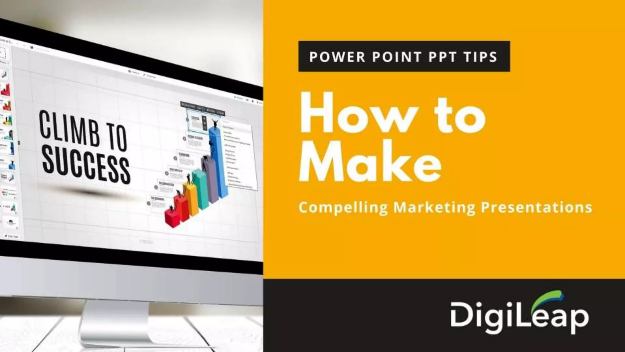


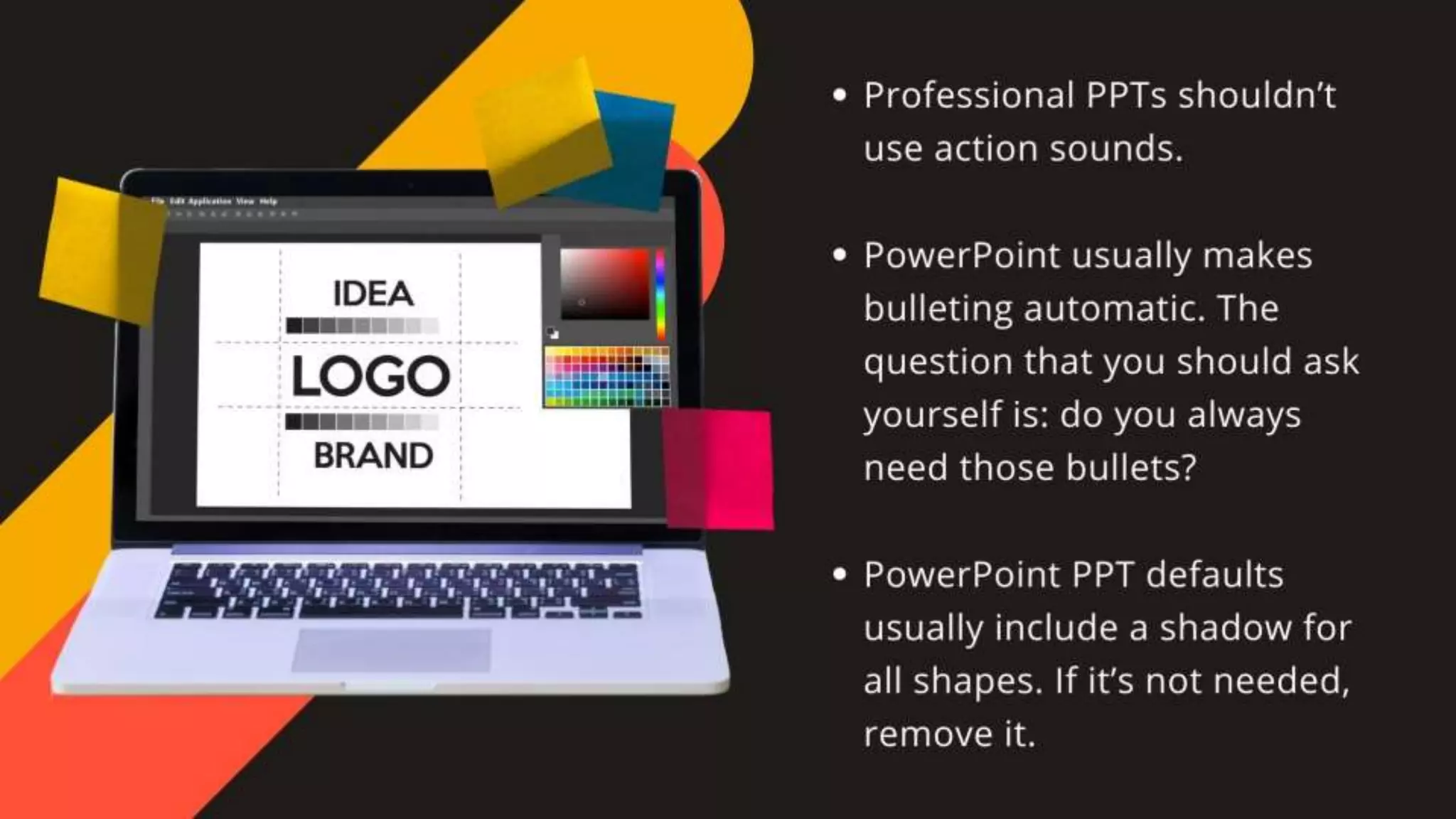


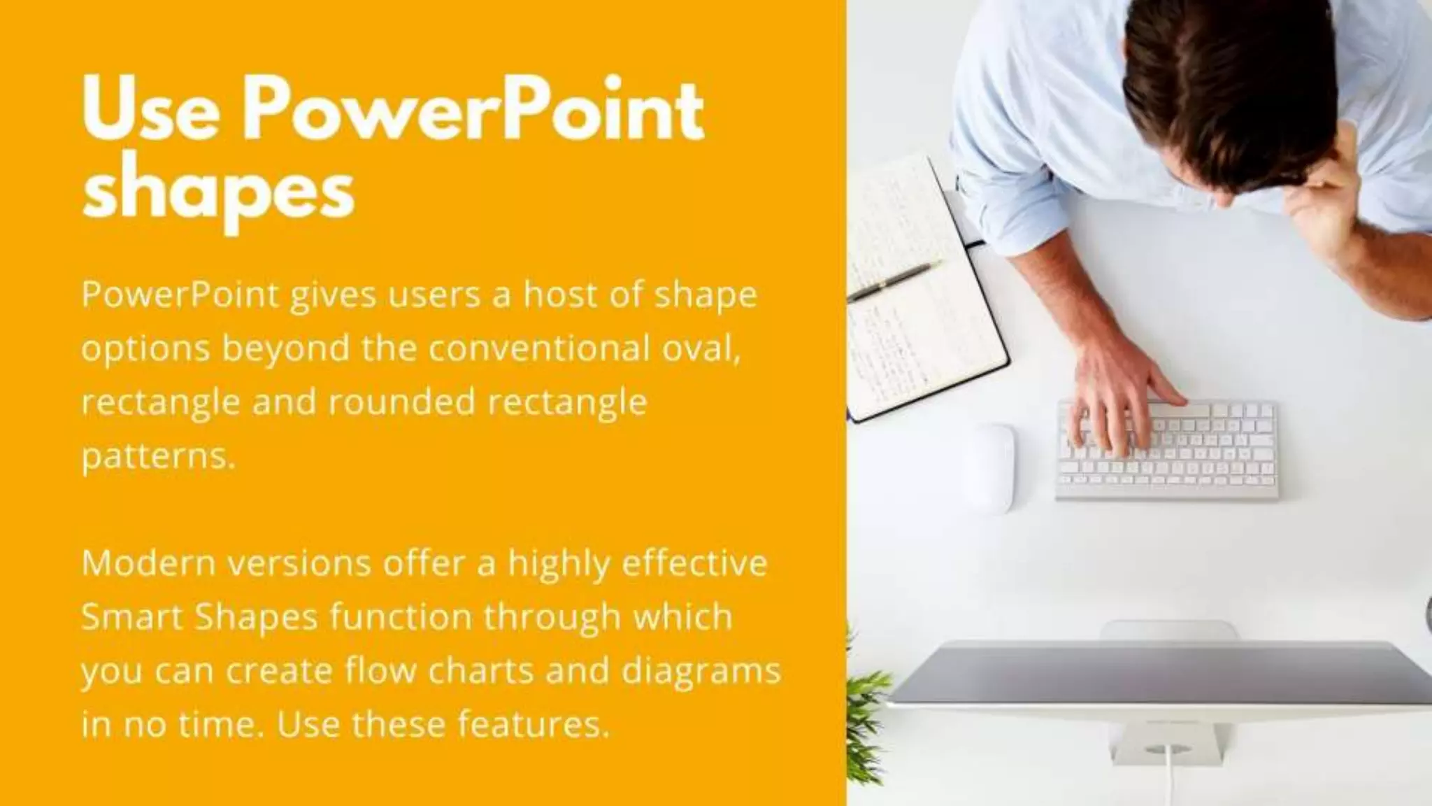

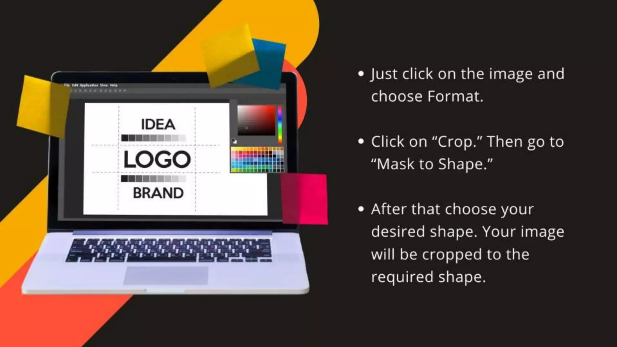


This document provides tips for creating compelling marketing presentations using Microsoft PowerPoint. Key advice includes customizing slide sizes, editing templates at the start, ensuring proper alignment of objects, utilizing the format menu, and embedding multimedia for a professional finish. Overall, the guidance focuses on creativity and effective use of PowerPoint's features to enhance presentation quality.