The document discusses using diagrams to replace text in presentations. It provides examples of different types of diagrams including three-tier systems, graphs, and flow charts. The benefits of using diagrams are that they are fast to read and understand and simple to create while also clearly showing context. Recommendations are provided for resources to learn more about creating diagrams.
Six safe fonts to use in your presentationsPresentitude
When you are creating PowerPoints and choosing a font, you have to make your selection carefully. Not only because fonts are communicating a feeling and a mood for your presentation, but also for practical reasons. There are only 40-something fonts that are safe to use if you want your PowerPoint to show correctly on any computer or in any version of PowerPoint Six of these “safe” fonts are these six “C-fonts”.
500 Powerpoint business diagrams Powerpoint templates Powerpoint maps Powerpo...enargeia
The PPT Library : more than 500 fully editable diagrams, maps and graphics to be used in Powerpoint in order to enhance visual quality of your presentations and increase productivity. Used by top consulting firms and marketing professionnals
Download at www.thepptlibrary.com
How to improve your communication skills and make Great PowerPoint slides using Colour, Font, Layout and Design features. The full presentation and PowerPoint 2010 *.pptx version can be found here: http://alesandrab.wordpress.com/2013/03/29/how-to-make-a-great-presentation/
Bullet points can kill your presentation.Al Bonner
"The term “bullet-point” comes from people firing guns at annoying presenters." - Don McMillan
Bullet points can kill great content. If your presentations fall into the bullet point trap, use this tutorial to transform your current work into something amazing. It's easier than you think.
Design makeover of a sample corporate presentation introducing company to stakeholders. This makeover uses PowerPoint 2013 and templates from All PPT Templates site to make the slides more visual, engaging and meaningful.
Download Annual Report Powerpoint Template PPT background, theme you can easily edit or add the content as per your requirement. at: http://www.slideworld.com/ppt_templates/Download-powerpoint-templates.aspx/Annual-Report-8984
Wk 5 Individual Preparing for Working in TeamsTop of FormBott.docxhelzerpatrina
Wk 5 Individual: Preparing for Working in Teams
Top of Form
Bottom of Form
Assignment Content
1.
Top of Form
Collaboration is everywhere, especially in the health care industry. It is important to learn how to work and communicate in a collaborative environment. As you progress through your program, you will experience learning teams in your courses. Learning teams provide you with valuable experiences that will prepare you for working collaboratively in the health care industry.
Navigate to the University Library homepage.
Locate the Learning Team Toolkit on the upper right side of the homepage.
Create a 7- to 10-slide Microsoft® PowerPoint® presentation that identifies the Learning Team resources provided by the University and the importance of working effectively in a team. A presentation format has been provided for this assignment; however, you may choose to format your presentation in another professional manner.
Include the following in your presentation:
Slide One: Title Slide
· Title of presentation
· Your name
· Course abbreviation and course number
· Due date
· Your facilitator’s name
Slide Two: Introduction
· Describe what the Learning Team Toolkit is.
· Provide screenshots of the Learning TeamToolkit.
Slides Three and Four: Review the Learning Team Charter
· Explain the importance of the Learning Team Charter.
· Why is it created?
· Why is it important in collaborative environments?
· How can it be used during team conflicts?
· Why is it important to communicate with your faculty?
Slides Five and Six: Review the Learning Team Evaluation
· Explain the importance of the Learning Team Evaluation form.
· Why is it important to rate the members of your team?
· Why is it important that your faculty know how you would rate your team members?
Slide Seven: Learning Team Toolkit Resources
· Explain the resources available in the LearningTeam Toolkit.
Slide Eight: Importance of Team Work
· Explain the importance of team work in education and the workplace.
· Identify some strategies you would use when working in a team.
· Identify effective communication you would use when working in a team.
Slide Nine: References
· Cite 3 peer-reviewed, scholarly, or similar references.
· Format your references according to APA guidelines.
Note: Speaker notes are to be provided for each slide. Refer to the “Tutorial: Adding Speaker Notes to Microsoft® PowerPoint® Presentations” document for more information on how to add speaker notes to your presentation.
Note: The University’s Center for Writing Excellence provides samples of different deliverables. Under Samples, you will find a sample Microsoft® PowerPoint® presentation to use as a reference while creating your presentation.
Cite 3 peer-reviewed, scholarly, or similar references to support your presentation.
Format your assignment according to APA guidelines. Include a title slide, detailed speaker notes, and a reference slide.
Submit your assignment.
Bottom of Form
INFO FROM THE BOOK ...
Communication and Testing: Why You Have Been Wrong All Along!TechWell
You ran all the tests you planned for your team, you reported all the bugs with clear and to the point descriptions, and you sent a weekly email with a professional PowerPoint presentation including graphs and statistics pointing out the risk areas and project issues. However, you still feel the organization is not taking your testing seriously, management is unaware of what your team is achieving—and apparently no one is actually reading your reports. Sound familiar? Everyone else is not the problem; the way you are communicating your testing information is! Join Joel Montvelisky to review some common real-life problems and mistakes testers make while communicating the results of their work—all of which affect the way people treat their testing deliverables. Joel presents a practical model to help testers plan and perform their communications based on the very different needs of their stakeholders. And finally, he shows how you can use correct communication skills to increase the perceived value of the test team to the whole organization.
ReadySetPresent (Delegation PowerPoint Presentation Content): 100+ PowerPoint presentation content slides. Appropriate delegating of employees will improve their efficiency, and your expectations, in the workplace. Delegation PowerPoint Presentation Content slides include topics such as: the common objectives for delegation, 7 slides on overcoming barriers to delegating, top five reasons to delegate, 10+ slides on types of questions to ask before delegating, 4 slides with an effective delegation checklist, 6 steps for effective delegation, and appropriate tasks for delegation, 9 delegation opportunities, crisis delegation, 10+ tips for delegating to experts, bosses, and associates, 5 ingredients of communicating successfully, 10+ slides on personal benefits, 10+ slides on organizational benefits, how to's and more!
Have you found yourself suddenly saddled with management duties? When you are a manager, not only are you responsible for your own tasks, but you are also on the line for the tasks of those you manage. Like everything else, management is a skill that has to be learned.
This can be an overwhelming task, especially when you are trying to balance your work and personal life or even several projects. You need to keep getting things done and move your projects forward.
CSIS 100CSIS 100 - Discussion Board Topic #1One of the object.docxmydrynan
CSIS 100
CSIS 100 - Discussion Board Topic #1:
One of the objectives of this course is to enable students to differentiate between the disciplines of Information Systems, Information Technology, and Computer Science. Oftentimes, these areas overlap and are difficult to distinguish – even among professionals within the industries.
There are some distinctions that become evident, but all too frequently, people do not understand these distinctions until they are already deep within their programs of study. Consequently, many decide that it is too late to pursue a different avenue in the computing world without losing valuable time and money spent on courses that may or may not apply to a different major.
Given the importance of achieving effective planning from the beginning, your first assignment in this course is to delve into the broad areas of Information Systems, Information Technology, and Computer Science and write about your career choice in a discussion board post. This should be your thought process:
· First, define each field (i.e. IS, IT, CS). Understand the similarities and differences.
· Second, determine what jobs are available in each area.
· Third, look at the degree completion plans for each of these programs.
· Fourth, assess your own skills (e.g. Are you good in math? Do you like business? Do you like algorithms? Are you gifted at problem-solving? Do you like learning about new technology? Do you enjoy working hands-on with equipment/hardware/wires?)
· Fifth, (and most importantly) ask God what He wants you to pursue based on your talents, interests, and abilities.
· Sixth, based on your analysis above, what career do you hope to obtain after graduation, and what degree will you pursue to achieve this goal?
To facilitate your research, there are four videos in your Reading & Study folder that will help you understand the differences between the computing fields and become familiar with the job opportunities in each area. Be sure to view these videos first.
The LU Registrar’s home page has information on degree completion plans. Here is a link to all of the currently available ones in the university:
http://www.liberty.edu/academics/registrar/index.cfm?PID=2981
Be sure to look at all of the ones listed for Information Systems and Information Technology. At the time of this writing, Computer Science is only listed under residential degree plans. That does not mean that you should rule out Computer Science as a potential major. You must consider all options and listen to God’s calling upon your life. With God, all things are possible.
Discussion Board Deliverables
Main Post:
In a minimum of 300 words, create a thread in Module 1’s discussion board forum that describes the following:
1. Your desired career upon graduation
2. Why you chose this career
3. Your intended major
4. Your strengths, weaknesses, and interests
5. How the major supports your chosen career
6. How God has led you to reach your decision
7. A Bib.
Dear students get fully solved assignments
Send your semester & Specialization name to our mail id :
help.mbaassignments@gmail.com
or
call us at : 08263069601
QUESTION 1 1. Create a clustered bar graph showing employment stat.docxmakdul
QUESTION 1 1. Create a clustered bar graph showing employment status and education level in the lab1a.xlsx file. Interpret this graph based on shape and trend.
Paste your Excel graph into the Word submission template document. Intepret the graph based on shape and trend. Make sure you have appropriate axis titles and graph title.
1. Attach File
QUESTION 2 1. (Question 2) Create a stacked bar graph showing education level by gender in the lab1a.xlsx file. Interpret this graph based on shape and trend.
Paste your Excel graph into the Word submission template document. Intepret the graph based on shape and trend. Make sure you have appropriate axis titles and graph title.
1. Attach File
QUESTION 3 Create a clustered box plot showing annual salary based on education in the lab1a.xlsx file. Annual salary is measured in 1000’s of dollars. Please indicate this on the vertical axis. This is an extension of the long procedure done in class. Use YouTube or Google to find out how to make a Boxplot in Excel 2016.
Paste your Excel graph into the Word submission template document. Make sure you have appropriate axis titles and graph title.
1. Attach File
QUESTION 4
1. (Question 4) Create two more histograms to categorize the Blackberry and Google Stock Prices in the lab1b.xlsx.
Paste your Excel graph into the Word submission template document. Make sure you have appropriate axis titles and graph titles.
1. Attach File
QUESTION 5
1. (Question 4, Part 2)How do the histograms of the stock prices compare?
a. The histograms all have a similar shape.
b. The histograms have different shapes.
c. The distributions all follow the bell curve.
d. Unable to determine.
QUESTION 6
1. (Question 4, Part 3)The most volatile stock appears to be and the most stable stock appears to be according to a visual inspection of the histograms.
QUESTION 7
1. (Question 5) Create two more scatterplots comparing: 1) Apple’s Adjusted Closing Price Per Stock to Google’s Adjusted Closing Price Per Stock and 2) Google’s Adjusted Closing Price Per Stock to Blackberry’s Adjusted Closing Price Per Stock in the lab1b.xlsx. Title your graphs appropriately and adjust the axes as necessary.
Paste your Excel graph into the Word submission template document. Make sure you have appropriate axis titles and graph titles.
1. Attach File
QUESTION 8
1. (Question 5a) Which adjusted closing stock price per share (Apple or Google) explains the most variation in Blackberry’s adjusted closing stock price per share?
QUESTION 9
1. (Question 5b)Which two stocks display the strongest correlation coefficient?
a. Google and Blackberry
b. Apple and Blackberry
c. Google and Apple
d. Unable to determine without further calculations.
QUESTION 10
1. (Question 5c)Which two stocks display the weakest association between their prices?
a. Google and Apple
b. Apple and Blackberry
c. Blackberry and Google
d. Unable to determine without further calculations
QUESTION 11
1. (Question 5d) Fift ...
Similar to How to Change Text to Diagrams (infodiagram visualization) (20)
Coronavirus Protection and Actions: Creative Illustration in PowerPointPeter Zvirinsky
Coronaviruses are a large family of viruses that cause illness ranging from the common cold to more severe diseases such as Middle East Respiratory Syndrome (MERS-CoV) and Severe Acute Respiratory Syndrome (SARS-CoV). The most recently discovered coronavirus causes coronavirus disease COVID-19. See our infographics on how you can protect yourself from coronavirus.
This is a demo presentation of PPT graphics for education purposes. Free for any non-commercial use, public health, government and educational institutions.
Contact us: www.infoDiagram.com
Finance and Sales Charts in PowerPoint: Communicate through SymbolsPeter Zvirinsky
Presenting finance reports or sales figures? Then you surely use charts for showing big amounts of complicated information. Make your slides modern and visually appealing with a few creative design moves.
See how we can improve regular slide:
1. Replace data from the text with a data chart
2. Recolor to make it more visual, show key data values
3. Add icons and simple design elements
See Outline Business graphics: https://www.infodiagram.com/diagrams/outline-icons-ppt-business-infographics.html?cp=camp7
2017 is coming to the end and this is a busy time: we’re creating reports, yearly reviews and building future plans.
Project calendar is a great tool to assist you in creating all these documents, and it’ll save a bunch of your time as well.
Follow four steps to make your calendar look appealing within Powerpoint or any other document:
1. Update default look of the calendar table
2. Specify the time frame
3. Highlight important events
4. Illustrate it with appropriate symbols
Look for more examples and inspiration on our blog: https://blog.infodiagram.com
Create Happy Holidays card in 5 minutes using PowerPointPeter Zvirinsky
Create an awesome holidays card in PowerPoint. A handmade card can be a great add-on to your presents :)
Follow three simple steps from this guide and add holiday mood to your webpages, slides, mailings or blogs, using only PowerPoint (or Keynote) tools and your creativity.
Wishing you great holiday mood from all infoDiagram team :)
Why is it better to visualize ideas? There are three main advantages: diagrams are fast to read and understand, simple to create and they show context clearly.
In this guide, I'm sharing a simple method changing the text to diagrams, so you can learn how to do it quickly. Use these tips to improve your presentations and create powerful slides.
More presentation design ideas: https://blog.infodiagram.com
Illustrating Top-Management Concepts in Your PresentationPeter Zvirinsky
Top management accumulates dozens of concepts and tools. I gathered ideas how you can illustrate frequently used concepts in the upper management: organizational structure, risk, strategy, growth, action and synergy. To bring these concept ideas to life, a good way is to apply icons and diagrams in the presentation.
All is based on easy to use PowerPoint shapes and icons.
More presentation design ideas: https://blog.infodiagram.com
Guide how to make big data processes and structures visual in a presentation.
Replacing boring text bullet-points by flow chart diagram.
Analysing the content to match diagram type - overlapping by Venn diagrams, sequence process by linear and non linear flow charts, hierarchies and structures by tree diagrams or organizational charts.
Illustrating data sources, data storing and storage by iconographics. Making icon mosaic for presentation title slide (like a word cloud, but with pictograms).
Visualizing data flows by set of icons and chevron arrows.
Quickly make do-it-yourself simple infographics using PowerPoint shapes and icons instead of presenting plain text information.
Free creative Powerpoint shapes resource: www.infodiagram.com/freesample
Presentation Rooms - Training Toolbox, part 2Peter Zvirinsky
Presentation rooms types, Pros and cons of various presentation places. Illustrations for public speaking presentation training.
Room types: Classroom, Big conference theater, Round table - consider influence of different room setups to a way people present and interact with others.
Presentation of sustainable and green transport modes: Walking, Bike, Car, Carpool, Taxi, Bus, Tram. Fuel types according to environment friendly classes - from conventional fuels, bio fuels, electric and hybrid ones. Types of vehicle with various ecology footprint - like Conventional internal combustion engine, Bio-fuel, All-electric, Hydrogen fuel cell, Hybrid electric.
Illustratory data charts with green technology statistics: Transportation gasoline usage per 100 km per passenger; Green Transportation pyramid and Fuel economy
Waste sources types - visual pictograms for each type e.g. household, municipal, consutruction waste, industry or commerce waste.
Ways of waste treatment and recycling such as landfill, incinetation of garbage, waste waters, composting of waste.
Waste generation statistics charts with iconography, Eurostat data. Waste recovery data chart and waste prevention diagram.
Hand Drawn Pencil Symbols Banners Visuals pptPeter Zvirinsky
Unique Graphical elements for creative presentation slides design. Examples of using hand drawn pencil doodle symbols of sales and finance, using retro banners with maps or drafting a process diagram on blackboard.
Ideas how to change formal slides to creative presentation, by adding pictures illustrating creativity. By adding hand drawn graphical elements. Or by using tempalte with untypical slide background pattern.
Infographics Key Data KPI presentation slidesPeter Zvirinsky
Infographics of key data values and KPIs - inspirative of creative slide design templates. Flat style diagrams and geometric shapes. Inspiration how to present a text formal data in an unique visual way. Graphics is in modern metro UI graphical style, easily redoable and editable in PowerPoint.
BPO Transition Framework diagrams.
Business Process Outsourcing method schema and workflows with icons visuals, editable in PowerPoint
Transition Framework service and Process transfer to new location schema.
Key areas of Transition framework, Phased approach
4 phases, milestones, results: Initiate, Plan, Change, Operate Phase flowcharts with symbols of People, Process, System and infrastructure, Risk, Finance, Project
Infographics shapes and flat style flowchart diagrams. Ideas how to change text slides into strongly visual and simple infographics slide. Get inspired by those examples of company history timelines, flow arrows steps illustrated by icons.
Infographics shapes and diagrams - graphical inspirations if you want to present a text bullet point slide in an attractive visual way. Examples of infographics diagrams shapes for linear lists, e.g. presentation agenda or table of content, shapes for ordered lists (numbered items) and central item with subitems (by puzzle pieces, circles, pentagram). Diagrams are in modern UI flat graphical style, editable in PowerPoint.
Handling uncertainty in IT software development projects. Follow Agile framework Scrum project methodology rules - do retrospectives often, frequent product increments, stick to simple rules. Visual slides made with editable powerpoint icons.
Healthcare medical & pharma visuals presentation toolboxPeter Zvirinsky
Health care visuals for presentation slides design: Medical and Pharmaceuticals symbols and diagrams (as PowerPoint editable icons).
Medical personnel, doctor, nurse, patient, GP, dentist ...
Medical facilities such as Hospital, Pharmacy, Pharmaceuticals Warehouse, Ambulance.
Medical tools, documents, biological research
Pharmaceuticals production, distribution, storage, medicines, pills. And some sketch healthcare icons: hearth, cross, beaker.
Diagram Mistakes in Presentation Slide DesignPeter Zvirinsky
Three diagram mistakes to avoid when preparing a presentation slides. Follow simple graphical design rules - consistency, alignment and white space, not to have too dense slide. Hints how to improve schema visualizations in Powerpoint - using alignment tool, format painter.
7 Alternatives to Bullet Points in PowerPointAlvis Oh
So you tried all the ways to beautify your bullet points on your pitch deck but it just got way uglier. These points are supposed to be memorable and leave a lasting impression on your audience. With these tips, you'll no longer have to spend so much time thinking how you should present your pointers.
Book Formatting: Quality Control Checks for DesignersConfidence Ago
This presentation was made to help designers who work in publishing houses or format books for printing ensure quality.
Quality control is vital to every industry. This is why every department in a company need create a method they use in ensuring quality. This, perhaps, will not only improve the quality of products and bring errors to the barest minimum, but take it to a near perfect finish.
It is beyond a moot point that a good book will somewhat be judged by its cover, but the content of the book remains king. No matter how beautiful the cover, if the quality of writing or presentation is off, that will be a reason for readers not to come back to the book or recommend it.
So, this presentation points designers to some important things that may be missed by an editor that they could eventually discover and call the attention of the editor.
Transforming Brand Perception and Boosting Profitabilityaaryangarg12
In today's digital era, the dynamics of brand perception, consumer behavior, and profitability have been profoundly reshaped by the synergy of branding, social media, and website design. This research paper investigates the transformative power of these elements in influencing how individuals perceive brands and products and how this transformation can be harnessed to drive sales and profitability for businesses.
Through an exploration of brand psychology and consumer behavior, this study sheds light on the intricate ways in which effective branding strategies, strategic social media engagement, and user-centric website design contribute to altering consumers' perceptions. We delve into the principles that underlie successful brand transformations, examining how visual identity, messaging, and storytelling can captivate and resonate with target audiences.
Methodologically, this research employs a comprehensive approach, combining qualitative and quantitative analyses. Real-world case studies illustrate the impact of branding, social media campaigns, and website redesigns on consumer perception, sales figures, and profitability. We assess the various metrics, including brand awareness, customer engagement, conversion rates, and revenue growth, to measure the effectiveness of these strategies.
The results underscore the pivotal role of cohesive branding, social media influence, and website usability in shaping positive brand perceptions, influencing consumer decisions, and ultimately bolstering sales and profitability. This paper provides actionable insights and strategic recommendations for businesses seeking to leverage branding, social media, and website design as potent tools to enhance their market position and financial success.
Between Filth and Fortune- Urban Cattle Foraging Realities by Devi S Nair, An...Mansi Shah
This study examines cattle rearing in urban and rural settings, focusing on milk production and consumption. By exploring a case in Ahmedabad, it highlights the challenges and processes in dairy farming across different environments, emphasising the need for sustainable practices and the essential role of milk in daily consumption.
Can AI do good? at 'offtheCanvas' India HCI preludeAlan Dix
Invited talk at 'offtheCanvas' IndiaHCI prelude, 29th June 2024.
https://www.alandix.com/academic/talks/offtheCanvas-IndiaHCI2024/
The world is being changed fundamentally by AI and we are constantly faced with newspaper headlines about its harmful effects. However, there is also the potential to both ameliorate theses harms and use the new abilities of AI to transform society for the good. Can you make the difference?
Expert Accessory Dwelling Unit (ADU) Drafting ServicesResDraft
Whether you’re looking to create a guest house, a rental unit, or a private retreat, our experienced team will design a space that complements your existing home and maximizes your investment. We provide personalized, comprehensive expert accessory dwelling unit (ADU)drafting solutions tailored to your needs, ensuring a seamless process from concept to completion.
Expert Accessory Dwelling Unit (ADU) Drafting Services
How to Change Text to Diagrams (infodiagram visualization)
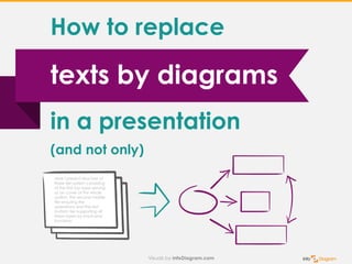
1. texts by diagrams
How to replace
in a presentation
(and not only)
Here I present structure of
three tier system consisting
of the first top layer serving
as an cover of the whole
system, the second middle
tier ensuring the
operations and the last
bottom tier supporting all
three layers by back-end
functions
2. a geometric symbolic representation
of information, usually two-dimensional.
Also called a graph.
What’s a diagram?
3. 3. Shows clearly
the context
Why visualization
by diagrams
1. Fast to read
& understand
2. Simple
to create
4. 3. Shows clearly
the context
Why visualization
by diagrams
1. Fast to read
& understand
2. Simple
to create
13. 1 message
All slides should be related
to the key message
the presentation supports.
„1 message rule”
of good presentation
14. What defines a success?
Business A Business B
Business X
”Success can happen anywhere.
It’s not determined by education,
funding or other factors.”
16. Showing ”How” a relation goes
Today Tomorrow
B1 B2
A1 A2 A3
``
Our plan A
Our plan B
17. Trust
Easy projectsGood times
Seth Godin blog:
Where does trust
come from?
Hint: it never comes from the good times
and from the easy projects.
We trust people because they showed up
when it wasn't convenient, because they
told the truth when it was easier to lie and
because they kept a promise when they
could have gotten away with breaking it.
18. Source: Seth Godin blog post
Sale conversation
Offer a
solution
Get
a trust
Know
needs
1. use case 2. proposal
Show effect,
what is it for
start
here
not
here
http://sethgodin.typepad.com/seths_blog/2011/02/whats-the-use-case.html
20. To get more diagram examples & learn
how to make diagrams visit:
blog „Simple visualization of Ideas”
http://blog.infoDiagram.com
21. Try free sample
of editable PPT graphics
at www.infodiagram.com
(click to open)
To get more diagram examples & learn
how to make diagrams visit:
blog „Simple visualization of Ideas”
http://blog.infoDiagram.com
22. Follow me on Slideshare for more presentations,
hit FOLLOW on slideshare.net/infodiagramFollow
Try free sample
of editable PPT graphics
at www.infodiagram.com
(click to open)