Download as PDF, PPTX


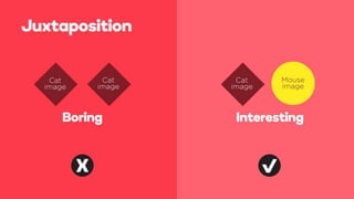
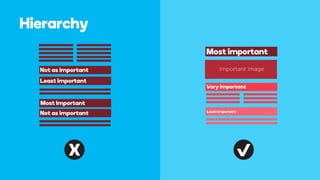

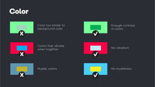

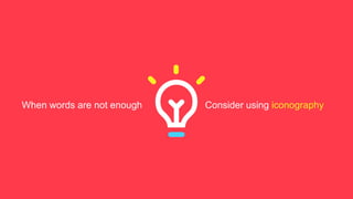

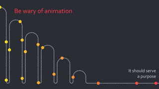
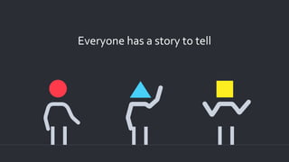
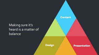


Propoint is a NYC creative studio that leads the market in presentation design. Our talented team follows these simple rules to create best in class presentations for the world's most popular brands. Here is a SlideShare to show how you too can build an awesome presentation that will get the audience to focus on what's important.