Download as PDF, PPTX


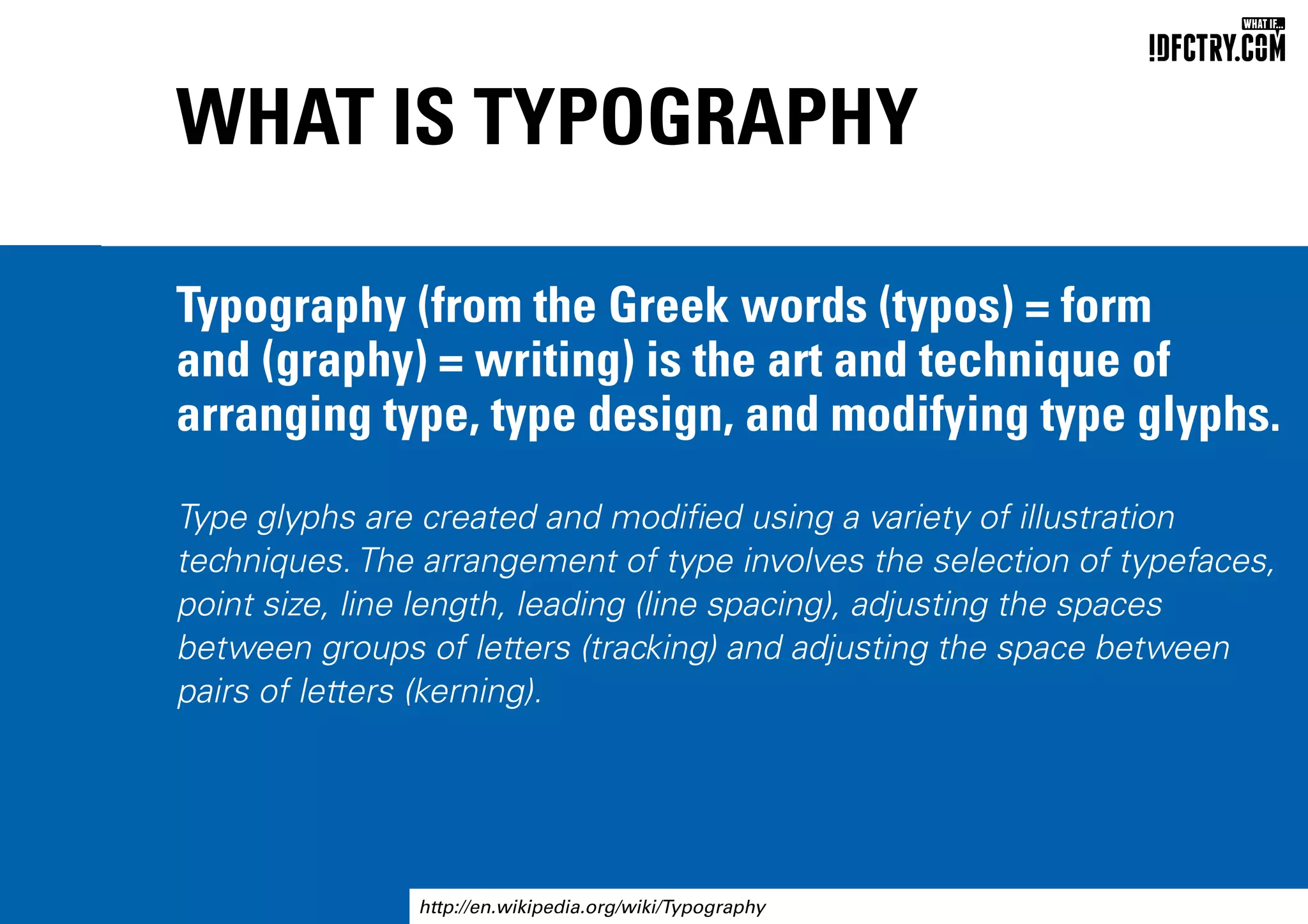
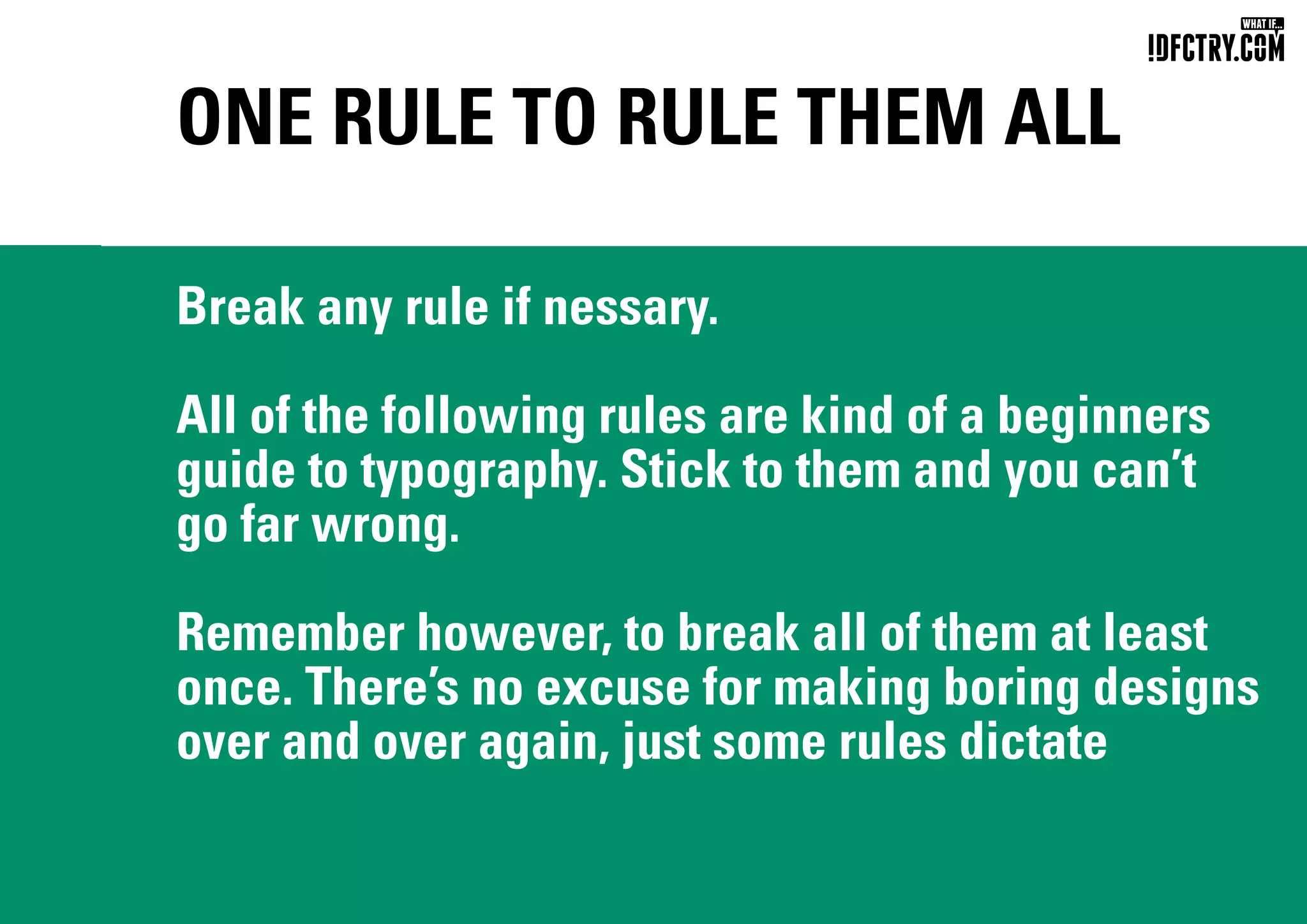
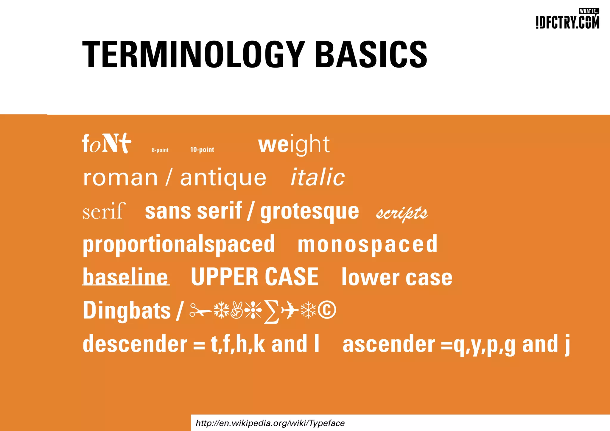
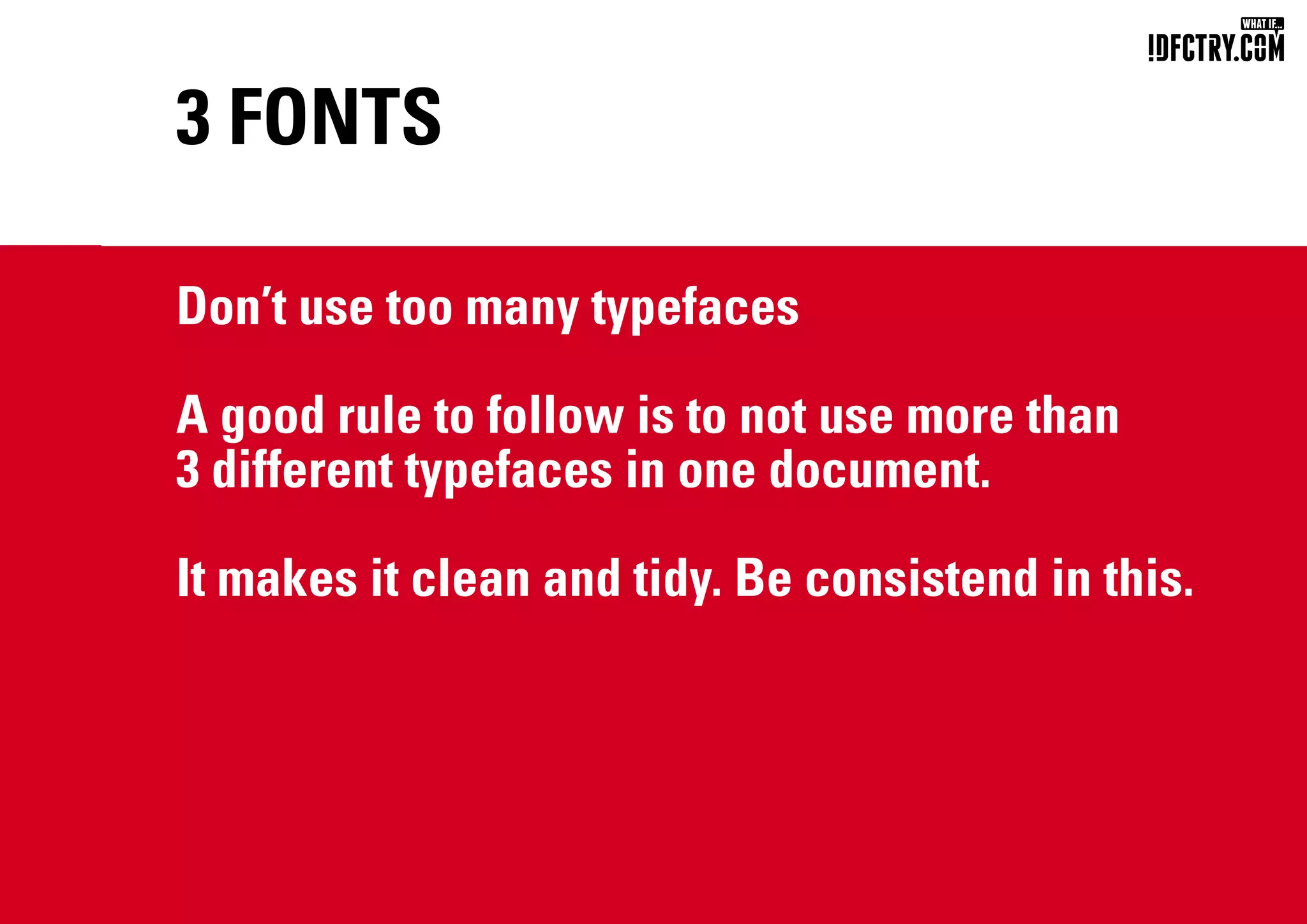

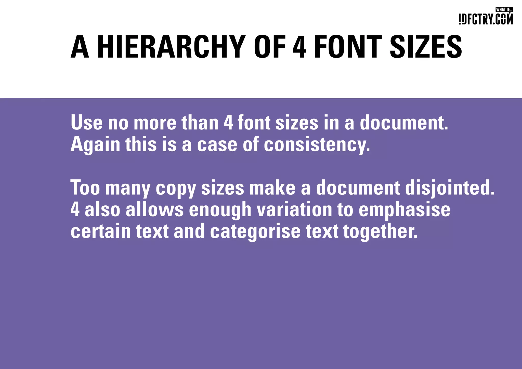

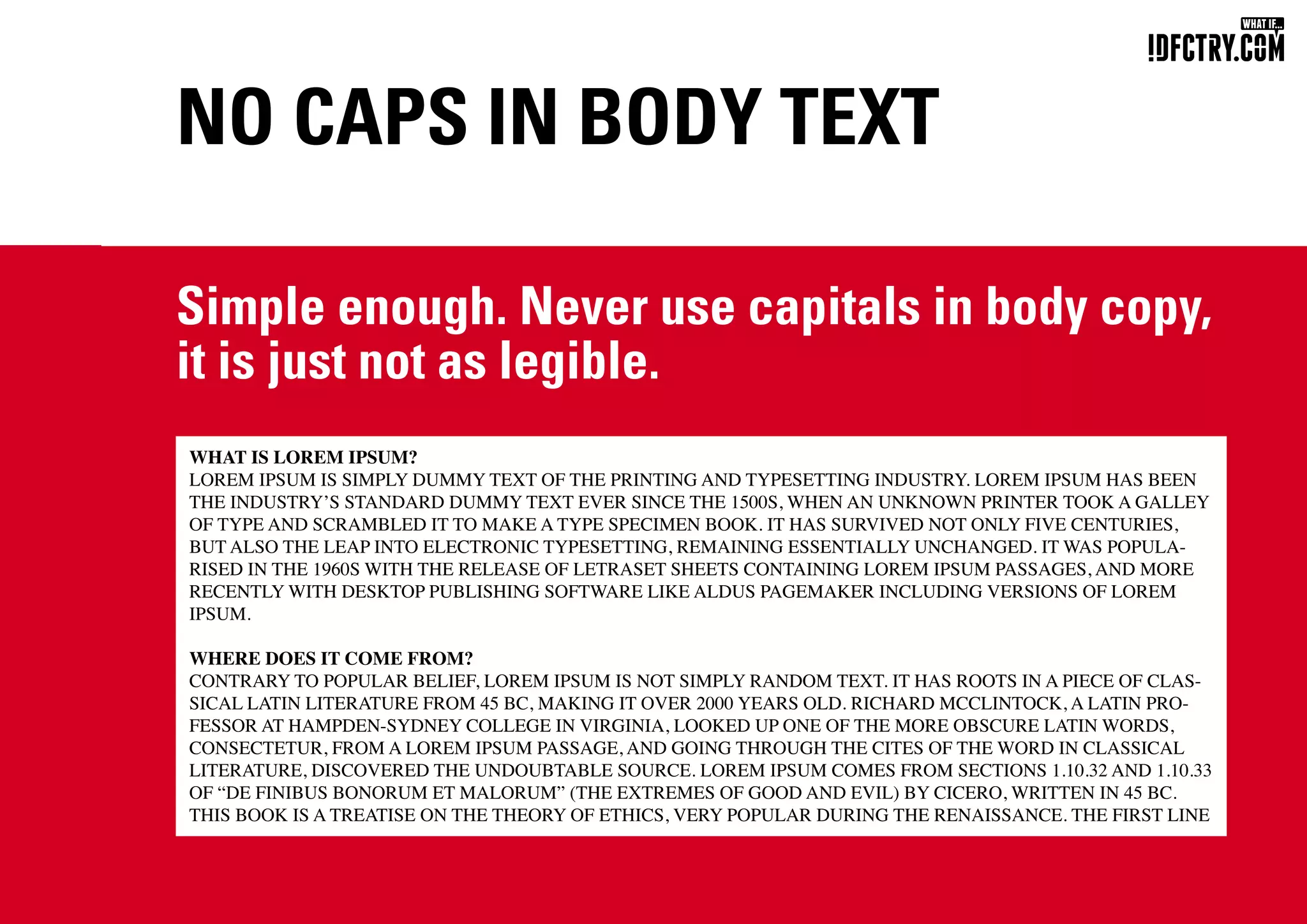
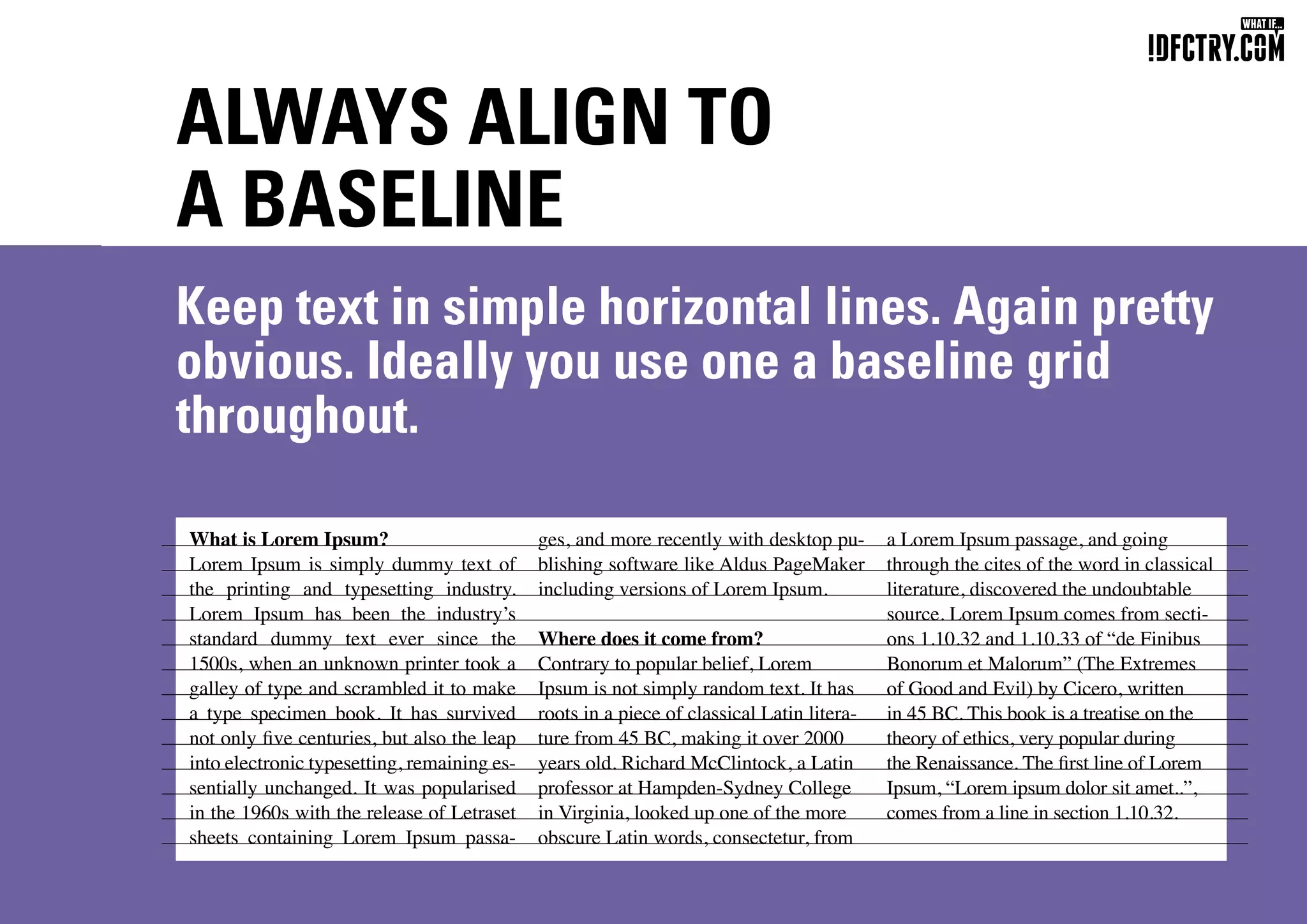
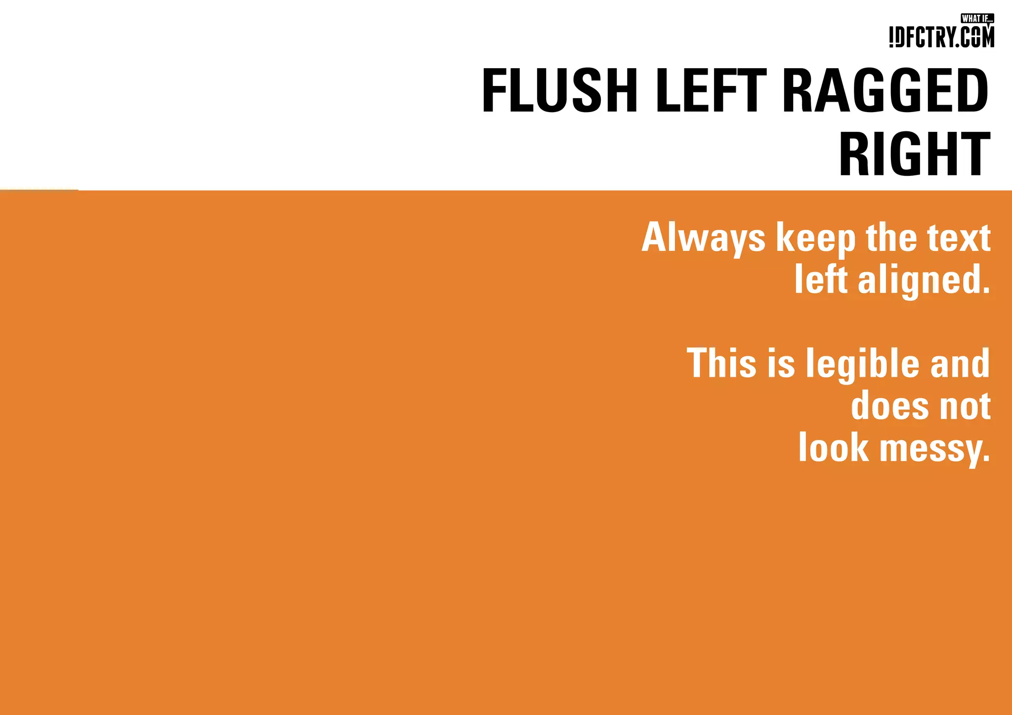
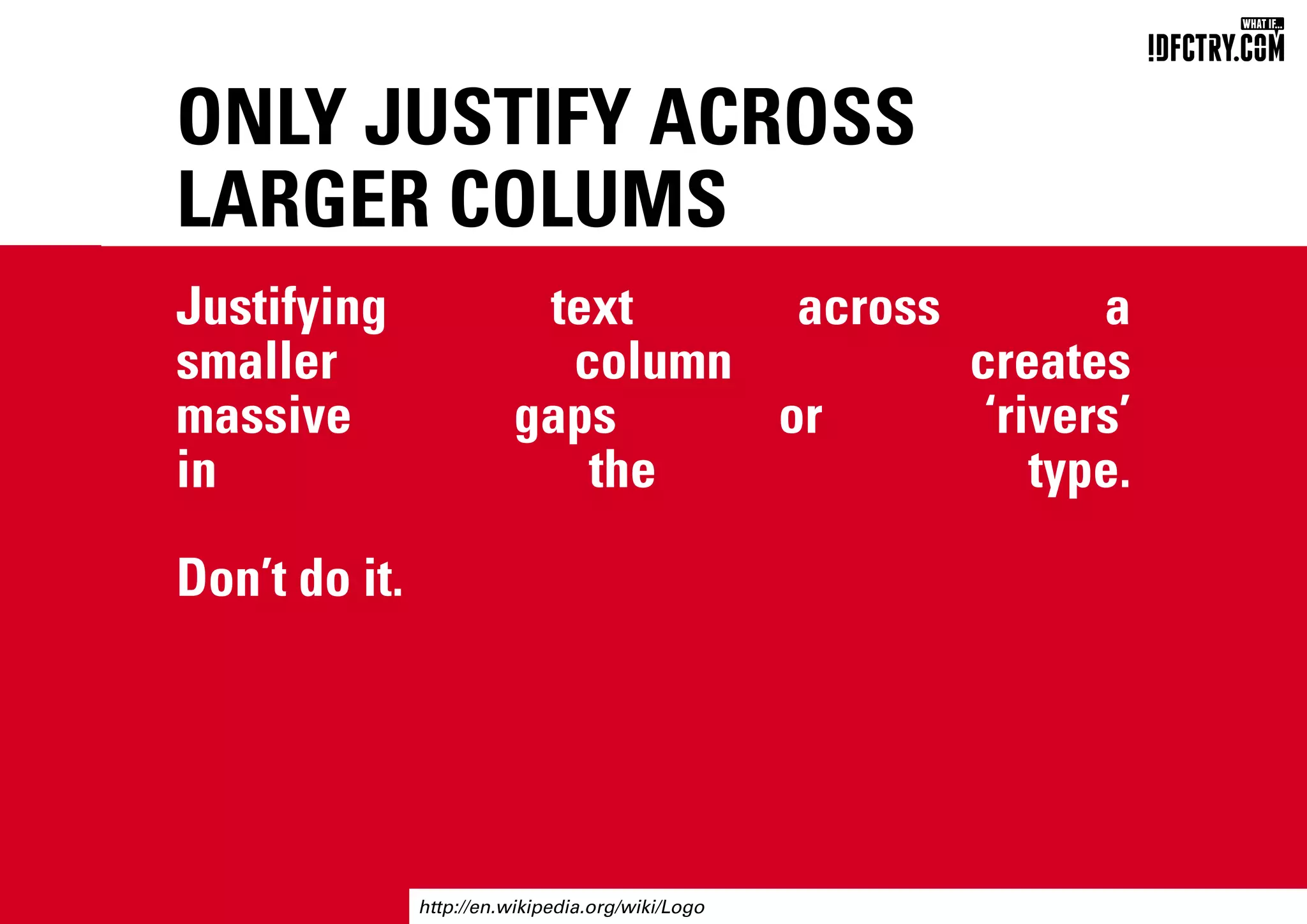
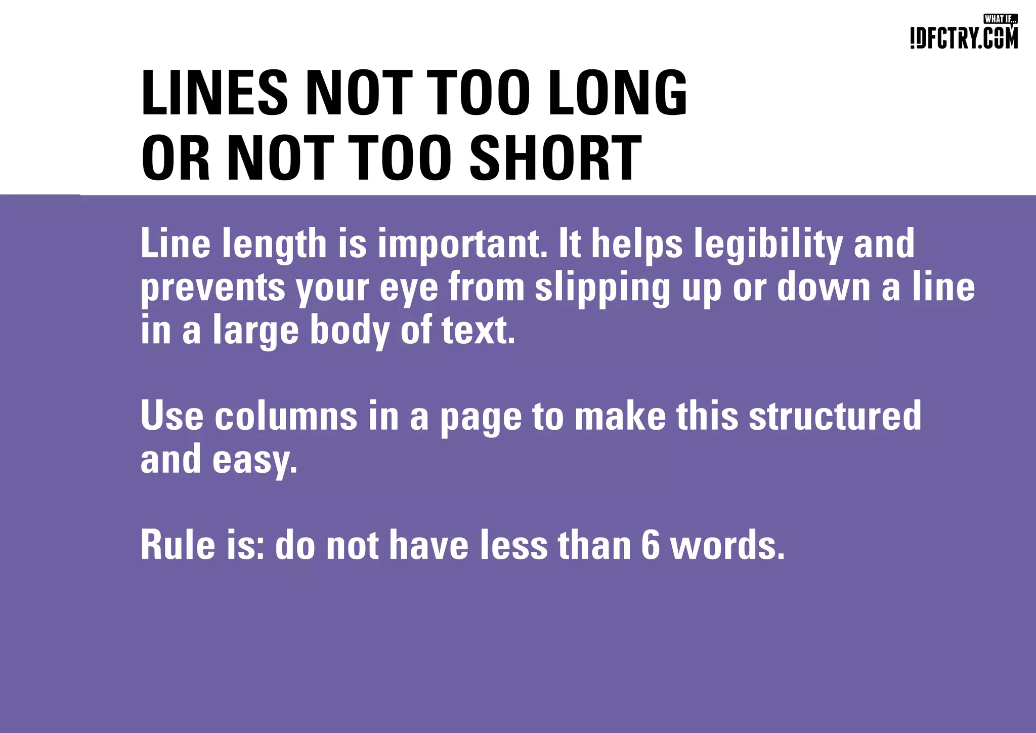

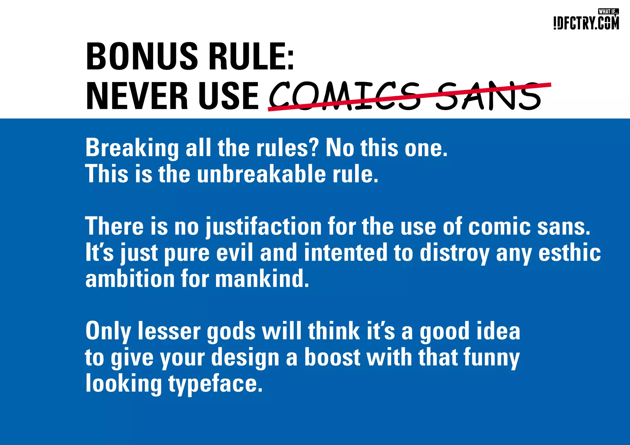
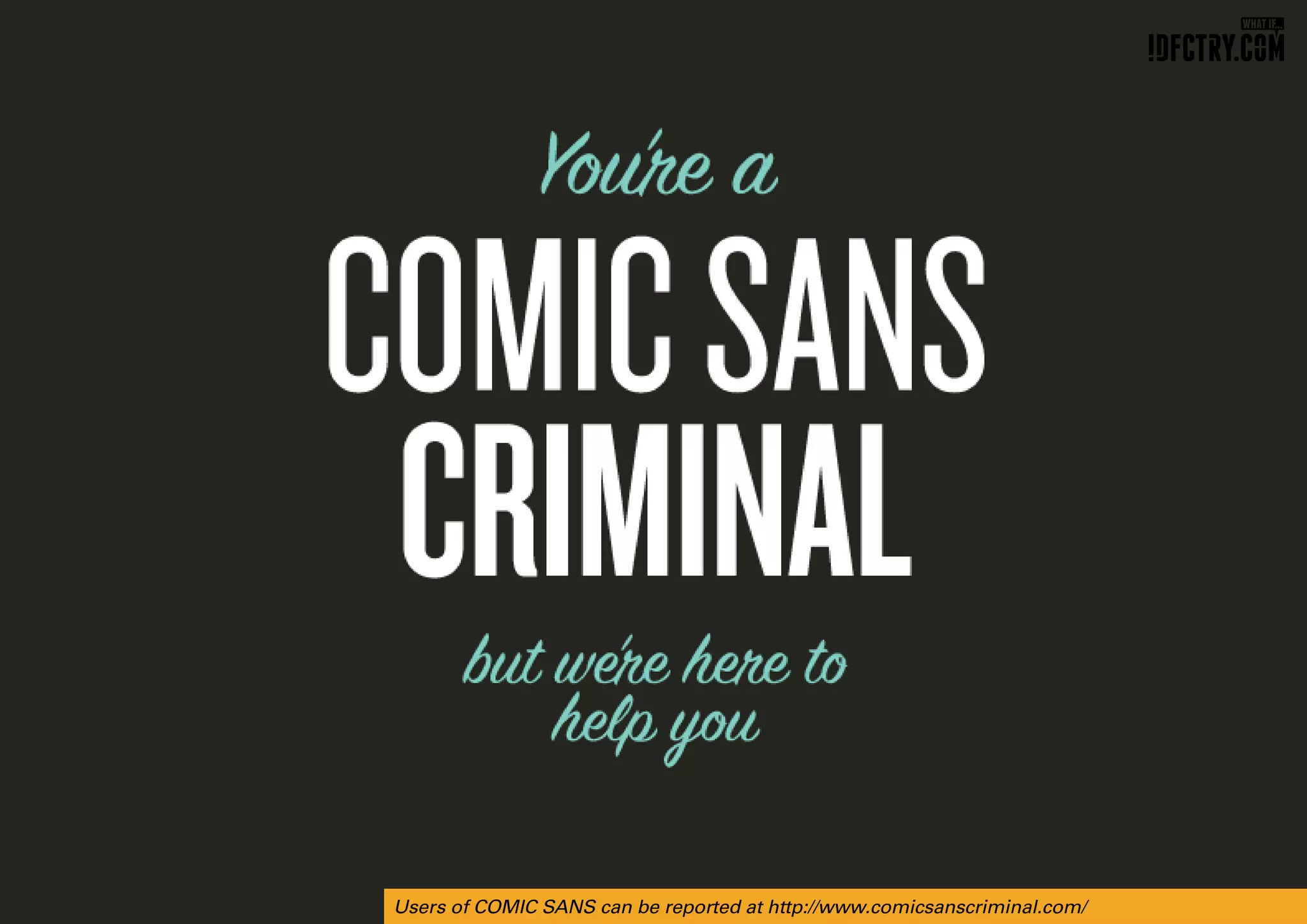

The document provides a brief introduction to typography, outlining key principles such as font selection, spacing, and alignment to achieve effective type design. It emphasizes consistency, the use of a limited number of typefaces, and the importance of legibility while allowing for creative expression within certain guidelines. Additionally, it discusses historical context, such as the origins of 'lorem ipsum' text, while humorously cautioning against the use of Comic Sans.


![[DevDay2019] Spacing and Typography, keys to a professional UI design - By Ng...](https://cdn.slidesharecdn.com/ss_thumbnails/duongnguyen-typographyspacing-190408082945-thumbnail.jpg?width=640&height=640&fit=bounds)