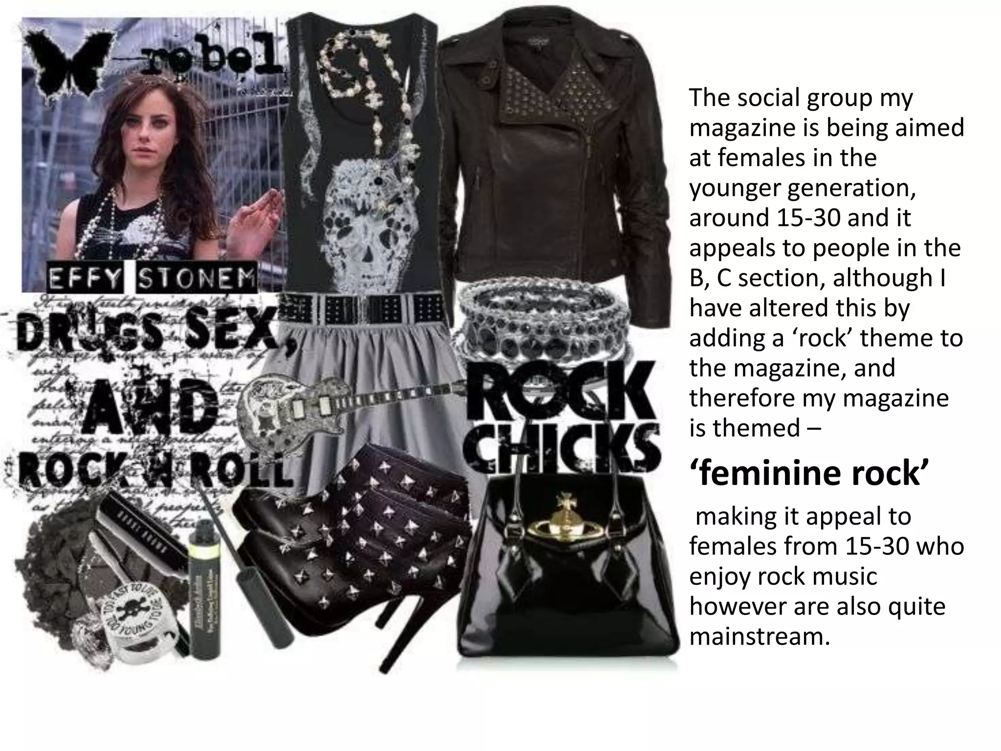
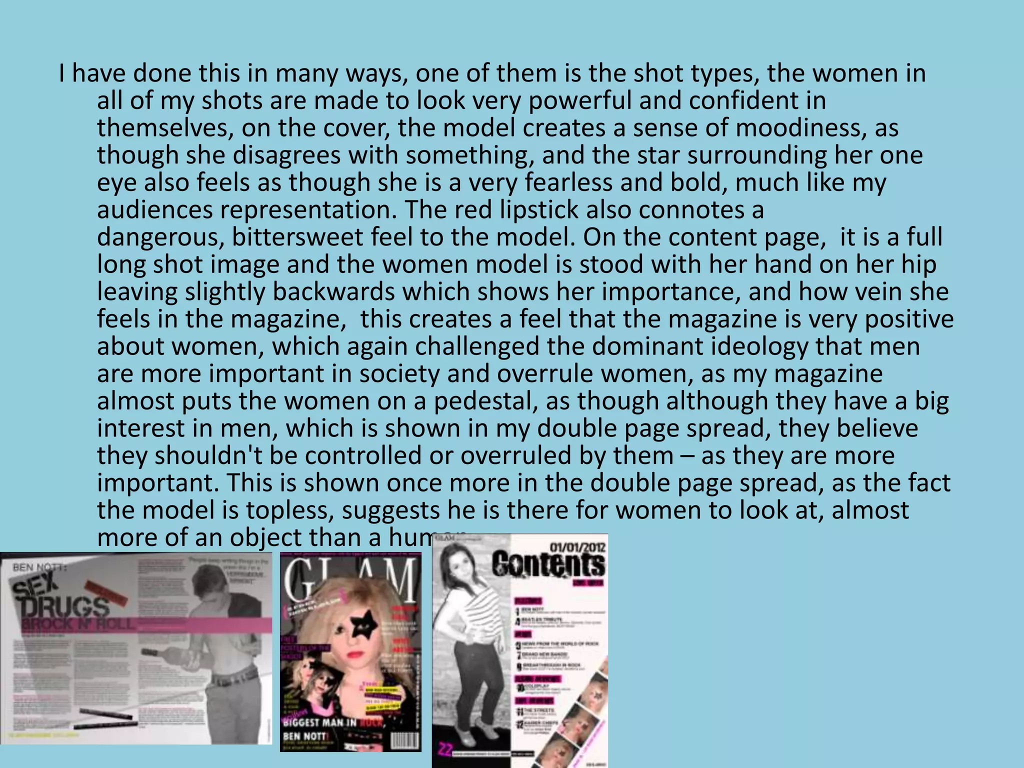
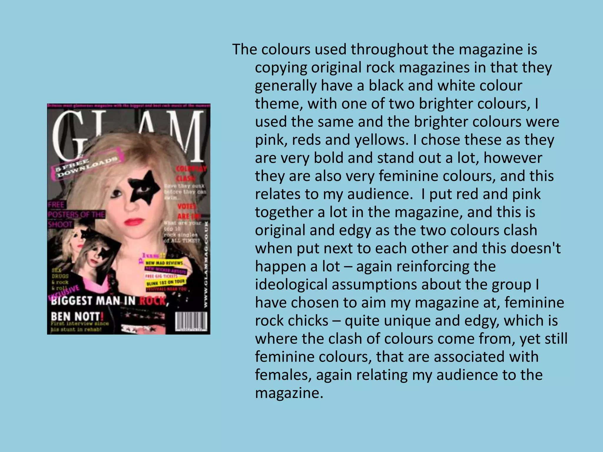
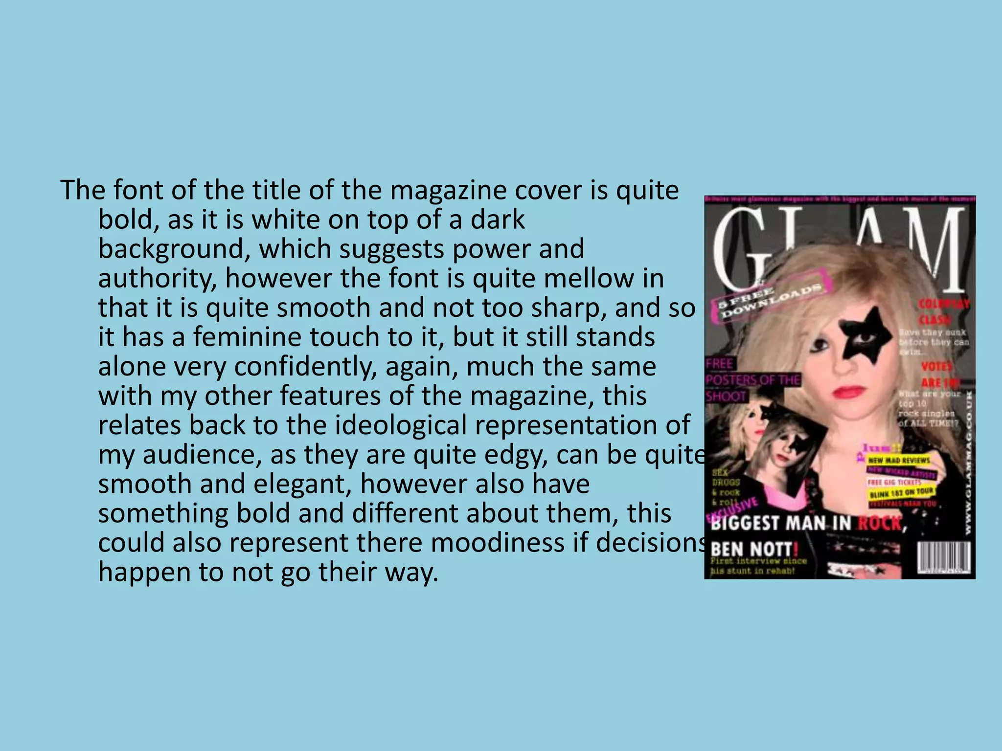
How does your media product
represent particular social groups?
The social group my
magazine is being aimed
at females in the
younger generation,
around 15-30 and it
appeals to people in the
B, C section, although I
have altered this by
adding a ‘rock’ theme to
the magazine, and
therefore my magazine
is themed –
‘feminine rock’
 making it appeal to
females from 15-30 who
enjoy rock music
however are also quite
mainstream.
The dominant ideology of a ‘rock chick’ is an easy going, music loving, free-spirited
hedonist, that has an edge of a tough girl. They may seem quite intimidating to on
lookers, and could be thought of as having a rebelish touch, rebelling against
people who disagree with their strong opinions, increasing their sense of power.
My magazine is following this stereotypical representation totally, however this is
going against most other music magazines as there is nothing yet in the market like
this, aiming specifically at this particular audience.
I have done this in many ways, one of them is the shot types, the women in
    all of my shots are made to look very powerful and confident in
    themselves, on the cover, the model creates a sense of moodiness, as
    though she disagrees with something, and the star surrounding her one
    eye also feels as though she is a very fearless and bold, much like my
    audiences representation. The red lipstick also connotes a
    dangerous, bittersweet feel to the model. On the content page, it is a full
    long shot image and the women model is stood with her hand on her hip
    leaving slightly backwards which shows her importance, and how vein she
    feels in the magazine, this creates a feel that the magazine is very positive
    about women, which again challenged the dominant ideology that men
    are more important in society and overrule women, as my magazine
    almost puts the women on a pedestal, as though although they have a big
    interest in men, which is shown in my double page spread, they believe
    they shouldn't be controlled or overruled by them – as they are more
    important. This is shown once more in the double page spread, as the fact
    the model is topless, suggests he is there for women to look at, almost
    more of an object than a human.
The colours used throughout the magazine is
   copying original rock magazines in that they
   generally have a black and white colour
   theme, with one of two brighter colours, I
   used the same and the brighter colours were
   pink, reds and yellows. I chose these as they
   are very bold and stand out a lot, however
   they are also very feminine colours, and this
   relates to my audience. I put red and pink
   together a lot in the magazine, and this is
   original and edgy as the two colours clash
   when put next to each other and this doesn't
   happen a lot – again reinforcing the
   ideological assumptions about the group I
   have chosen to aim my magazine at, feminine
   rock chicks – quite unique and edgy, which is
   where the clash of colours come from, yet still
   feminine colours, that are associated with
   females, again relating my audience to the
   magazine.
The font of the title of the magazine cover is quite
  bold, as it is white on top of a dark
  background, which suggests power and
  authority, however the font is quite mellow in
  that it is quite smooth and not too sharp, and so
  it has a feminine touch to it, but it still stands
  alone very confidently, again, much the same
  with my other features of the magazine, this
  relates back to the ideological representation of
  my audience, as they are quite edgy, can be quite
  smooth and elegant, however also have
  something bold and different about them, this
  could also represent there moodiness if decisions
  happen to not go their way.
However, although I have tried to challenge the dominant representation of a
  feminine by adding a rock chick theme, It could also be argued I have
  followed the dominant ideology and the residual ideology that women are
  also very mainstream feminine. I have done this is a number of way, firstly
  with their postures, especially in the content page, the models breasts are
  stuck out almost as a revealing pose and this could suggest that although
  my magazine is suggesting that women are very positive and in control, it
  could also mean that they are in fact their to be looked at, and to look
  good; this is stereotyped as many other social groups, such as male,
  disabled, or the older generation are not likely to stand in this sort of pose
  as it would be looked at as bizarre, and almost ‘wrong’ whereas when
  women stand like this, it’s acceptable as they feel like they have many
  people looking at them appreciating their image – hence why it is in my
  magazine. This then relates to the title of the magazine ‘GLAM’ as it
  suggests that women are very glamorous, and should be very glamorous,
  possibly for people to look at. Other ways I have added the residual
  ideology of femininity is by adding pink colours, which are regularly
  related to women, the cover models lipstick is very bright red and bold
  suggesting sexuality, and passion, again relating to women and feminine,
  and so it could be argued that although there is an original twist in my
  target audience, the features in the magazine still relate quite similarly to
  the dominant ideology of females and femininity.

How does your media product represent particular social

  • 1.
    How does yourmedia product represent particular social groups?
  • 2.
    The social groupmy magazine is being aimed at females in the younger generation, around 15-30 and it appeals to people in the B, C section, although I have altered this by adding a ‘rock’ theme to the magazine, and therefore my magazine is themed – ‘feminine rock’ making it appeal to females from 15-30 who enjoy rock music however are also quite mainstream.
  • 3.
    The dominant ideologyof a ‘rock chick’ is an easy going, music loving, free-spirited hedonist, that has an edge of a tough girl. They may seem quite intimidating to on lookers, and could be thought of as having a rebelish touch, rebelling against people who disagree with their strong opinions, increasing their sense of power. My magazine is following this stereotypical representation totally, however this is going against most other music magazines as there is nothing yet in the market like this, aiming specifically at this particular audience.
  • 4.
    I have donethis in many ways, one of them is the shot types, the women in all of my shots are made to look very powerful and confident in themselves, on the cover, the model creates a sense of moodiness, as though she disagrees with something, and the star surrounding her one eye also feels as though she is a very fearless and bold, much like my audiences representation. The red lipstick also connotes a dangerous, bittersweet feel to the model. On the content page, it is a full long shot image and the women model is stood with her hand on her hip leaving slightly backwards which shows her importance, and how vein she feels in the magazine, this creates a feel that the magazine is very positive about women, which again challenged the dominant ideology that men are more important in society and overrule women, as my magazine almost puts the women on a pedestal, as though although they have a big interest in men, which is shown in my double page spread, they believe they shouldn't be controlled or overruled by them – as they are more important. This is shown once more in the double page spread, as the fact the model is topless, suggests he is there for women to look at, almost more of an object than a human.
  • 5.
    The colours usedthroughout the magazine is copying original rock magazines in that they generally have a black and white colour theme, with one of two brighter colours, I used the same and the brighter colours were pink, reds and yellows. I chose these as they are very bold and stand out a lot, however they are also very feminine colours, and this relates to my audience. I put red and pink together a lot in the magazine, and this is original and edgy as the two colours clash when put next to each other and this doesn't happen a lot – again reinforcing the ideological assumptions about the group I have chosen to aim my magazine at, feminine rock chicks – quite unique and edgy, which is where the clash of colours come from, yet still feminine colours, that are associated with females, again relating my audience to the magazine.
  • 6.
    The font ofthe title of the magazine cover is quite bold, as it is white on top of a dark background, which suggests power and authority, however the font is quite mellow in that it is quite smooth and not too sharp, and so it has a feminine touch to it, but it still stands alone very confidently, again, much the same with my other features of the magazine, this relates back to the ideological representation of my audience, as they are quite edgy, can be quite smooth and elegant, however also have something bold and different about them, this could also represent there moodiness if decisions happen to not go their way.
  • 7.
    However, although Ihave tried to challenge the dominant representation of a feminine by adding a rock chick theme, It could also be argued I have followed the dominant ideology and the residual ideology that women are also very mainstream feminine. I have done this is a number of way, firstly with their postures, especially in the content page, the models breasts are stuck out almost as a revealing pose and this could suggest that although my magazine is suggesting that women are very positive and in control, it could also mean that they are in fact their to be looked at, and to look good; this is stereotyped as many other social groups, such as male, disabled, or the older generation are not likely to stand in this sort of pose as it would be looked at as bizarre, and almost ‘wrong’ whereas when women stand like this, it’s acceptable as they feel like they have many people looking at them appreciating their image – hence why it is in my magazine. This then relates to the title of the magazine ‘GLAM’ as it suggests that women are very glamorous, and should be very glamorous, possibly for people to look at. Other ways I have added the residual ideology of femininity is by adding pink colours, which are regularly related to women, the cover models lipstick is very bright red and bold suggesting sexuality, and passion, again relating to women and feminine, and so it could be argued that although there is an original twist in my target audience, the features in the magazine still relate quite similarly to the dominant ideology of females and femininity.