Heuristic Principles
In other words: Usability Guidelines
Jacob Neilsen’s 10 general principles for
interaction design. They’re called heuristics
because they’re broad rules of thumb and not
specific usability guidelines
Jacob Neilsen
Heuristic
Meaning:
Enabling a person
to discover or
learn something
for themselves.
Visibility of system status
The system should always keep users
informed about what is going on,
through appropriate feedback within
reasonable time.
Keep users in
the loop.
Match between system and
the real world
The system should speak the users'
language, with words, phrases and
concepts familiar to the user, rather
than system-oriented terms. Make
information appear in a natural and
logical order.
Follow real world
conventions.
User Control and Freedom
Users often choose system functions
by mistake and will need a clearly
marked “emergency exit” to leave the
unwanted state without having to go
through an extended dialogue. Support
Undo and Redo.
Support undo
and redo.
Consistency and Standards
Users should not have to wonder
whether different words, situations, or
actions mean the same thing.
Follow platform
conventions.
Error Prevention
Either eliminate error-prone conditions
or check for them and present users
with a confirmation option before they
commit to the action.
Prevention is
better than cure.
Please find attached my documents
Recognition rather than
Recall
Minimize the user's memory load by making
objects, actions, and options visible. The user
should not have to remember information
from one part of the dialogue to another.
Instructions for use of the system should be
visible or easily retrievable whenever
appropriate.
Make it easily
accessible.
Flexibility and Efficiency of
Use
Design for novices
& experts.
Accelerators — unseen by the novice
user — may often speed up the
interaction for the expert user such that
the system can cater to both
inexperienced and experienced users.
Allow users to tailor frequent actions.
Aesthetic and Minimalist
Design
Dialogues shouldn’t contain
information which is irrelevant or is
rarely needed. Every extra unit of
information in a dialogue competes
with the relevant units of information
and diminishes their relative visibility.
Less is
more.
Help users recognize,
diagnose and recover from
errors
Error messages should be expressed in
plain language (no codes), precisely
indicate the problem, and
constructively suggest a solution.
Be clear and
helpful.
Help and Documentation
Even though it is better if the system can be
used without documentation, it may be
necessary to provide help and
documentation. Any such information should
be easy to search, focused on the user's task,
list concrete steps to be carried out, and not
be too large.
Be the friend
in deed.
Thank You
Swathy Tantry

Heuristic principles

  • 1.
    Heuristic Principles In otherwords: Usability Guidelines
  • 2.
    Jacob Neilsen’s 10general principles for interaction design. They’re called heuristics because they’re broad rules of thumb and not specific usability guidelines Jacob Neilsen Heuristic Meaning: Enabling a person to discover or learn something for themselves.
  • 3.
    Visibility of systemstatus The system should always keep users informed about what is going on, through appropriate feedback within reasonable time. Keep users in the loop.
  • 11.
    Match between systemand the real world The system should speak the users' language, with words, phrases and concepts familiar to the user, rather than system-oriented terms. Make information appear in a natural and logical order. Follow real world conventions.
  • 17.
    User Control andFreedom Users often choose system functions by mistake and will need a clearly marked “emergency exit” to leave the unwanted state without having to go through an extended dialogue. Support Undo and Redo. Support undo and redo.
  • 21.
    Consistency and Standards Usersshould not have to wonder whether different words, situations, or actions mean the same thing. Follow platform conventions.
  • 28.
    Error Prevention Either eliminateerror-prone conditions or check for them and present users with a confirmation option before they commit to the action. Prevention is better than cure.
  • 30.
  • 32.
    Recognition rather than Recall Minimizethe user's memory load by making objects, actions, and options visible. The user should not have to remember information from one part of the dialogue to another. Instructions for use of the system should be visible or easily retrievable whenever appropriate. Make it easily accessible.
  • 38.
    Flexibility and Efficiencyof Use Design for novices & experts. Accelerators — unseen by the novice user — may often speed up the interaction for the expert user such that the system can cater to both inexperienced and experienced users. Allow users to tailor frequent actions.
  • 43.
    Aesthetic and Minimalist Design Dialoguesshouldn’t contain information which is irrelevant or is rarely needed. Every extra unit of information in a dialogue competes with the relevant units of information and diminishes their relative visibility. Less is more.
  • 48.
    Help users recognize, diagnoseand recover from errors Error messages should be expressed in plain language (no codes), precisely indicate the problem, and constructively suggest a solution. Be clear and helpful.
  • 53.
    Help and Documentation Eventhough it is better if the system can be used without documentation, it may be necessary to provide help and documentation. Any such information should be easy to search, focused on the user's task, list concrete steps to be carried out, and not be too large. Be the friend in deed.
  • 60.

Editor's Notes

  • #4 Users should always be informed of system operations with easy to understand and highly visible status displayed on the screen within a reasonable amount of time. Translation: Let the user know what is going on. The user cannot always see directly inside the system, so it is important to give feedback letting them know answers to questions like, “how far through the sign up process am I?”, “How much of this file is loaded?” and “How long will I have to wait for the next stage?” Probably the two most important things that site visitors need to know are: “Where am I?” and “Where can I go next?”.
  • #5 Download in progress Loading screen Upload in progress Flight direction
  • #6 Starting a project on Kickstarter is a complicated process so it’s important that they’ve made it as easy as possible. I can clearly see which sections of the form I have completed and which are still to be done.
  • #7 Uploading a single photo usually only takes a couple of seconds but, even so, Facebook shows me a progress bar so I know it’s working and I can see when it will be complete.
  • #8 Traffic lights indicate what needs to be done Countdown timer Also three slots because color blind and accesibility
  • #9 The lift panel indicated the number of the floor that has been selected It also indicates where the lift currently is and its progress towards your floor
  • #10 Time of the train’s arrival Countdown timer Destination, stops along the way Speed
  • #11 Indicated the stops and indicates which side door will open as well as how far you’ve come in your journey
  • #12 Designers should endeavor to mirror the language and concepts users would find in the real world based on who their target users are. Presenting information in logical order and piggybacking on user’s expectations derived from their real-world experiences will reduce cognitive strain and make systems easier to use.
  • #13 Instead of sign up they’ve used, ‘Yes, I want Neil to teach me grow my business’ More human than sign up, also that’s probably how you’ll talk in you were to call on the phone. I’d like to learn this course and so on
  • #14 This is replicating the physical card and it's also ensuring that all the digits are from the right places
  • #15 The recycle bin icon is called and looks like a dustbin. Something we see everyday This is fashioned after shelves from a library so its looks familiar
  • #16 Natural groupings of products in appropriate aisles. All the ketchups go together. All the soaps go together. You don’t see them mixed with each other. When I go grocery shopping I know I’ll find all the juices in the same section. I don’t have to run around wondering whether I’ve missed some juices.
  • #17 The cartoon is adapted in Hindi language and uses the language that we are familiar with. Shin Chan seems one of our own, not a foreigner with whom we can’t relate.
  • #18 Offer users a digital space where backward steps are possible, including undoing and redoing previous actions. Freedom to navigate. Exploration without fear.
  • #19 This is something that is so important and you’ll only realize it's important if it weren't there. Imagine if you had uploaded some document by mistake and the only way to undo that action was to write an actual physical letter to some admin at Google. That’s how things worked back in the old days. Now it's simpler. People make mistakes so allow them to recover. Ask for a confirmation if it might be dangerous.
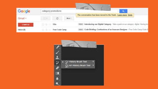
  • #20 Undo is another cool function to have. You can either ask for confirmation or allow undo depending on the context. If you’ve used photoshop you know the everything is recorded there. Because when you’re going to make changes, the details will vary. It might be a small section or it might be the whole thing. Either way you can pick the specific part and modify it.
  • #21 Whitener allows redo. The test drive is a confirmation before actually buying the car Same with clothes. The concept of the trial room. They also have return policy sometimes. Which is confirmation and redo.
  • #22 Interface designers should ensure that both the graphic elements and terminology are maintained across similar platforms. For example, an icon that represents one category or concept should not represent a different concept when used on a different screen.
  • #23 The physical keyboard and the onscreen keyboard look the same. The sign in icon/ profile icon/ icon for homepage etc. are usually in the same area.
  • #24 The menu structure is the same across microsoft’s varios applications
  • #25 The menu is same in all their branches
  • #26 The play and the pause button are same on both youtube and vimeo. The main function button is kept across different platforms.
  • #27 Play music and gaana too have the same play and pause button, also within the app
  • #28 This is from a project that we’re currently working on where the users will have to byheart that goal, target and projections have different meanings and remember the meanings too. It would have been simpler if they would have kept different terms or Added simple prefixes like Monthly Yealy goal, monthly goal and daily goal or something like that because they’re all goals at the end of the day
  • #29 Whenever possible, design systems so that potential errors are kept to a minimum. Users do not like being called upon to detect and remedy problems, which may on occasion be beyond their level of expertise. Eliminating or flagging actions that may result in errors are two possible means of achieving error prevention.
  • #30 They’re letting you know whether your password fits the required convention as you’re typing it and confirming that you’re on the right track Thats another way of preventing an error as they tell you that the item is already in your cart
  • #31 Gmail prompts you if you mention attachments and try to send the mail without attaching any file. Preventing the error from occurring. Here google’s helping you by showing a list of related elements without you having to correct the spelling or searching something odd which you didn't want.
  • #32 The passport verification is a long procedure. Your form is checked at the reception counter. In case of errors, the guy asks you to bring the files or copies of originals. Then there’s another round of checking. And another and another and another till you’re finally at the exit. They do it thoroughly so you won't have any future problems.
  • #33  Minimize cognitive load by maintaining task-relevant information within the display while users explore the interface. Human attention is limited and we are only capable of maintaining around five items in our short-term memory at one time. Due to the limitations of short-term memory, designers should ensure users can simply employ recognition instead of recalling information across parts of the dialogue. Recognizing something is always easier than recall because recognition involves perceiving cues that help us reach into our vast memory and allowing relevant information to surface. For example, we often find the format of multiple choice questions easier than short answer questions on a test because it only requires us to recognize the answer rather than recall it from our memory.
  • #34 The emergency exit should be clearly marked as emergency exit. I remember the last time I was on a flight, the attendant announced that window 8 and window 12 are also emergency exits and I thought it important to memorize those numbers in case of an emergency. They should have just marked it instead so that I don’t have to remember the seat numbers Here foursquare is helping by giving you options. What is it that you’re looking for or can look for. Instead of you having to type out each category
  • #35 Bing keeps your search history so you can easily recognize what you were looking for the last time and whether you’d like to search for that information again. Amazon keeps a track of your window shopping footsteps and prompt you next time you’re looking for something It also shows your related items that might be of interest to you This is not usability this is experience. Making it a bit delightful.
  • #36 If they would have just given you a token, you’ll have had to memorize the number or the section in which you’re bag is kept or point to your bag so they could have given it back to you In this example they’re showing the token number and the counter where it will be served. In our office canteen they give you the coupon but they take it at the counter so you have to remeber your token number which is a bit annoying
  • #37 That’s the tailor’s way of recognizing your dress material He can easily find yours by looking at those little pieces
  • #38 Helps to find the answer as one among the given options Here you’ve to eliminate the wrong answer by recognizing the right one rather than having to completely remember the right answer
  • #39  With increased use comes the demand for less interactions that allow faster navigation. This can be achieved by using abbreviations, function keys, hidden commands and macro facilities. Users should be able to customize or tailor the interface to suit their needs so that frequent actions can be achieved through more convenient means.
  • #40 For those who are unaware of the vicious internet and its first born child demands there’s the regular way to sign up For all those who have previously suffered at the hands of the devil and learnt hard lessons there is advanced settings Keyboard shortcuts for experts. This is also helps in case your mouse refuses to work
  • #41 You have training wheels for beginners which can be later removed as the user becomes an expert in balancing
  • #42 You have the auto mode for beginners And every other mode for prfoessionals
  • #43 Your camera comes with a basic lens but as you get better you can upgrade to the variety of different lens options the company provides
  • #44 Keep clutter to a minimum. All unnecessary information competes for the user's limited attentional resources, which could inhibit user’s memory retrieval of relevant information. Therefore, the display must be reduced to only the necessary components for the current tasks, whilst providing clearly visible and unambiguous means of navigating to other content.
  • #45 Classic example is google. Just gives you a simple input field this is why you fear nothing and ask google everything. Think about asking your parents such questions. There are so many things that will stop you from even asking a question because there are a lot of lines and a lot to read between those invisible lines. This weather app has the precise screen which gives you a dashboard style of information and a detailed version as well
  • #46 The image on the right is the organized simple version of the image on the left. Look at how many words you’re brain has to process, remember and probably even start making notes on it to figure it out. It matters how your layout guides the user through a visual hierarchy
  • #47 Everything has been given the same visual weight My eyes have to take an entire tour of the ticket before coming to spot where the most important information is All I need to know id which seat I’ll be occupying. Some highlight would have drawn my attention
  • #48 This example gives it to you straight Cinema 1 stands out and H8 stands out immediately
  • #49  Designers should assume users are unable to understand technical terminology, therefore, error messages should almost always be expressed in plain language to ensure nothing gets lost in translation.
  • #50 It important how you help the user. Just telling them something went wrong doesn’t help. Tell them what’s wrong and don’t write a love letter explaining the problem. They don’t need to know the details. Tell them how to solve the problem so they can achieve their goals.
  • #51 Here’s a mailchimp example that shows the error message, in a clear and concise manner along with offering help
  • #52 Earlier they just used to show error 404 User’s don’t know what that means Then I remember googling what that meant Things shouldn’t be this difficult This is a fun and simple example
  • #53 The number you have dialled is incorrect. Please check the number and try again. This message helps the user understand how to go ahead in their journey
  • #54 Ideally, we want users to navigate the system without having to resort to documentation. However, depending on the type of solution, documentation may be necessary. When users require help, ensure it is easily located, specific to the task at hand and worded in a way that will guide them through the necessary steps towards a solution to the issue they are facing.
  • #55 FAQs are great because they are a set of problems that a lot of users might need help with Getting started, how to make an account, how to upload ,how to this, how to that This is another way of teaching the users how things work by showing them the controls and giving them a walkthrough while also showing them all they can do on the app
  • #56 Whether or not you’re a first timer in an airport, it always helps to have help. Though it is well designed, sometimes you maybe overwhelmed or confused. You go to the help desk and they sort you out.
  • #57 Reception is another form of help desk, you can ask and fortunately its placed right at the entrance so you don’t get lost in a foreign place
  • #58 Sure you can explore and find the brands and the stores on your own but if you’re short on time or specific a map helps. Also gives you an overview of the entire mall
  • #59 Helps you locating your position in the park. Helps a lot since there is network problems as you go higher up.
  • #60 The obstacles the user has to face if something is poorly designed The goal is simple to pass the test No grouping of buttons or labelling or sectioning On the other hand, overtime the user learns to use that poorly designed system as well. To a point that it seems natural. So. its our responsibility that we do our best.