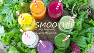
2. Client: Green Smoothie
Background: A new local and organically focused business in Dundee whose
mission is to provide a fast and healthy snack for customers in a hurry or who want
to sit and relax.
Goal: Establish Green Smoothie’s role and reach to all demographics of Omaha.
Emphasizing why we are different than other chain smoothie places and local fruit
smoothie shops.We want to inform the consumer that we care about the fresh,
organic and healthy ingredients that fuel and refresh your body.
Target Audience: Men andWomen 18+ who live an active, healthy lifestyle on an
expandable budget. Anyone who wants a quick snack on the go and enjoys the
benefits of healthful living.
3. • The big idea for Green Smoothie is to showcase to the
public we are different than our competitors.
• Primary focus is catering to a healthier community and
lifestyle while living in a face paced world. We want to
communicate the message that we understand people are
busy and we want to help make lives easier.
• Stress the importance of using all organic and local
ingredients.
4. • Location: 4808 Dodge St. Omaha, NE 68132
• Phone Number: (402) 609-8760
• Email: www.GreenSmoothie.com
• Facebook: Green Smoothie Dundee
• Instagram: @GreenSmoothieDundee
Blog: www.Wordpress/GreenSmoothie.com
ESSENTIAL INFORMATION
6. • Bing
• Bartender’s Guide
• Health Blogs
• Yoga Blogs
• Corbis Images
• Full List included in Last slide
7. •Simple, Organic, Healthy
• The simplicity of the slogan doesn’t need any explanation. It get’s to the
point of the product Green Smoothie carries and doesn’t not steer our
target audience away from the message.The image we want to portray is
one of an all organic, easy and quick option for two kinds of lifestyles: Busy
on the go, and for those who want to sip, relax and enjoy.
8. GREEN SMOOTHIE
LOGO
Design Elements: Green Lotus Flower symbolizes improvement
of life, start of good habits, Self-awareness and purity.
Green Smoothie: Simple name let’s the consumer’s know what
the product is and easily recognizable.
9. GREEN SMOOTHIE
STATIONERY
• The stationery piece includes mostly white space with only
information that pertains to Green Smoothie
• This is where the polka dot’s are introduced this becomes
another repeating element in the business card and
newsletter.
• Using alignment to separate the logo and business
information at the bottom and the business slogan along the
top.
• The idea is to maintain repeating design elements using the
logo in the top left corner and the company information
along the bottom.
• Keeping the Letterhead simple it allows people to see the
business logo and get all the information they would need.
10. GREEN SMOOTHIE
BUSINESS CARD
• The business card will be printed on a recycled yet strong,
smooth and non bendy paper with a soft velvety touch and
rounded corners to provide an extra sleek and modern look.
• Green Smoothie’s logo will be along the top, “Simple,
Organic, Healthy”
• Followed with the logo centered in the middle
• Business information along the bottom including;Owner,
phone number, address and email
• The borders will include the polka dots that matches the
letterhead—Keeping everything simple and repetitive
• Owner’s will keep these on the counter at Green Smoothie,
but also work with other local non-competitive companies
who are willing to disperse the business card at their
establishment
11. GREEN SMOOTHIE
NEWSLETTER
• The idea is to create a seasonal newsletter published
four times a year.We will break the month’s into
seasons and the beginning of the seasonal month is
when the newsletter will be sent out to everyone on our
mailing list and email list, but also copies available at
the shop.
• Winter: December, January, February
• Spring: March, April, May
• Summer: June, July,August
• Fall: September,October, November
The newsletter will be filled with information on maintaining
healthy over the busy holiday season, Spring cleansing, getting
fit for Summer and DIY projects and recipes yummy for the Fall.
12.
13.
14. GREEN SMOOTHIE
INTERACTIVEAD
• The purpose of this ad is to catch the audience’s
attention and show that we provide something extra
besides all green products
• I used a white background to create as much white
space as possible to keep the attention on the design
and what the ad says.
• Using a call-to-action for the audience to go to our
link on Facebook to “Like” our page and be entered in
a contest to win a gift certificate.
• Providing information in a catchy way with letting
consumer’s know we provide all natural and organic
products
15. GREEN SMOOTHIE
NEWSPAPER AD
• The newspaper ad will be mostly in black and white with the only
color being the logo and address at the bottom of the ad
• Centered in the middle is a nutritional info label that make’s that is
simple, yet catch’s attention and makes the reader wonder why it is
placed there.
• Using a catchy phrase letting the audience know, “you know what
you’re getting at Green Smoothie, Save the label for something else.”
• This idea provides the reader that this is a healthy establishment
• This will also have a call-to-action inviting the reader in for an
incentive
16. GREEN SMOOTHIE
MAGAZINEAD
• The photo used is a unique way to remember a class
green smoothie by inviting the customer in for a
“happy hour” drink
• Call to action informs the consumer that we are
offering a happy hour and will receive a discounted
price on any smoothie
• Using the same font and colors seen in the logo the
ad will resemble the same style throughout
• The photo will be tailored for each publication it will
run it
17. GREEN SMOOTHIE
DIRECT MAIL
• The postcard will be made on a 5X7 recycled and
non-bendy material as used on the business cards.
• Using this high quality paper will catch the
attention of customer’s not only by the look, but
with the velvety, soft feel all around.
• The image on the front contains a bright green
smoothie with the slogan across the top.
• Inviting your audience to turn it over and let them
know their next smoothie is on the house by
bringing in the postcard “call-to-action”
18. • The campaign supports the overall image and goal for Green Smoothie
• Modern, healthy and simple design look to represent Green Smoothie’s
products
• Building brand awareness to separate Green Smoothie with other smoothie
places by offering low-fat and low-sugar alternatives by using all Organic
ingredients
• The campaign will reach to a large demographic and also the Dundee
community