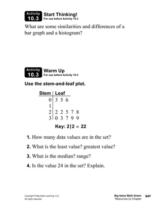
Copyright © Big Ideas Learning, LLC Big Ideas Math Green
All rights reserved. Resources by Chapter
347
Activity
10.3
Start Thinking!
For use before Activity 10.3
Activity
10.3
Warm Up
For use before Activity 10.3
What are some similarities and differences of a
bar graph and a histogram?
Use the stem-and-leaf plot.
1. How many data values are in the set?
2. What is the least value? greatest value?
3. What is the median? range?
4. Is the value 24 in the set? Explain.
Stem Leaf
0 3 5 6
1
2 2 2 5 7 8
3 0 3 7 9 9
Key: 2|2 = 22
Big Ideas Math Green Copyright © Big Ideas Learning, LLC
Resources by Chapter All rights reserved.
348
Lesson
10.3
Start Thinking!
For use before Lesson 10.3
Lesson
10.3
Warm Up
For use before Lesson 10.3
What does it mean for a data set to have a
skewed distribution?
Make a dot plot of the data. In your own
words, how would you describe the shape
of distribution?
Ride Tickets Sold
35 29 30 33 27
28 25 29 30 30
31 31 30 32 30
Copyright © Big Ideas Learning, LLC Big Ideas Math Green
All rights reserved. Resources by Chapter
349
10.3 Practice A
Name_________________________________________________________ Date __________
Make a dot plot of the data. In your own words, how would you describe
the shape of the distribution?
1. 2.
Describe the shape of each distribution.
3. 4.
5. The frequency table shows the ages of the members of two local fitness clubs.
a. Display the data for each fitness club in a histogram. Describe the shape
of each distribution.
b. Which fitness club would appeal more to a young adult? Explain.
Cups of Water Per Day
8 6 9 6 8 8 8 10 7 8
7 9 8 10 7 9 5 8 11 8
Pairs of Shoes Worn Per Day
1 1 1 3 2 2 1 2 1 3 4
2 1 1 2 3 1 1 2 4 2 2
0 1 2 43 5
Inches
Inches of Rainfall
10
20
30
40
50
60
0
0–19 20–39 40–59 60–79 80–99
Houses
Frequency
Houses on Paper Routes
Ages of Members 18–25 26–33 34–41 42–49 50–57 58–65
Frequency for Fitness Club A 14 19 13 8 6 3
Frequency for Fitness Club B 4 9 12 13 8 5
Big Ideas Math Green Copyright © Big Ideas Learning, LLC
Resources by Chapter All rights reserved.
350
10.3 Practice B
Name _________________________________________________________ Date _________
Describe the shape of each distribution.
1. 2.
3. The frequency table shows the numbers of books read this month for the
students in your class and the students in your friend’s class.
a. Display the data for each class in a dot plot. Describe the shape of
each distribution.
b. Which class read more books? Explain.
c. Which class has a greater mean? Explain.
d. Which class has a lesser mode? Explain.
4. The table shows the number of videos
rented each day.
a. Make a histogram of the data starting
with the interval 10–19. Describe the
shape of the distribution.
b. During the following week, the number of video rentals were: 25, 37, 38,
31, 22, 35, 24. Make a new histogram including the new video rental data.
c. Describe the shape of the new distribution.
0 1 2 43 5 6
RBIs
Runs Batted In
10
20
30
40
50
60
0
0–19 20–39 40–59 60–79 80–99
Points
Frequency
Test Scores
Number of Books Read This Month 0 1 2 3 4 5
Your Class 0 3 6 8 7 6
Your Friend’s Class 6 10 7 5 1 1
Videos Rented
54 61 43 48 14 21 51 42 35
36 52 29 17 65 43 59 24 48
42 62 36 29 19 58 51 47 42
Copyright © Big Ideas Learning, LLC Big Ideas Math Green
All rights reserved. Resources by Chapter
351
10.3 Enrichment and Extension
Name_________________________________________________________ Date __________
Using Scatter Plots
A scatter plot displays two sets of data to determine if there is a relationship between the
data. If the data appear to be increasing from left to right, there is a positive correlation.
If the data appear to be decreasing from left to right, there is a negative correlation. If
the data are neither increasing nor decreasing, there is no correlation.
Example: Create a scatter plot from the data and determine if there is a positive
correlation, negative correlation, or no correlation.
The data appear to be increasing from left to right, so there is a positive correlation.
Using the data in the table, create a scatter plot. Then determine if there is
a positive correlation, negative correlation, or no correlation.
1.
2.
3.
4.
Determine if the data collected would be most likely to result in a positive
correlation, negative correlation, or no correlation. Explain.
5. The amount of television you watch and your grade in math class.
6. The number of songs on your MP3 player and the number of times you
brush your teeth every day.
Height (in.) 68 71 78 73 70
Weight (lb) 156 219 241 194 176
Hours Studying 1 3 0.5 2 1
Test Score 52 88 48 78 63
Month April May June July
Rainfall (in.) 6.1 7.9 3.9 6.9
Temperature °( F) 74 86 62 85
Popsicles Sold 215 325 185 332
Shoe Size 6 8 15 4 7
Favorite Number 12 30 1 0 99
68 70 72 74 76 78
250
225
200
175
150
Height (in.)
Weight(lb)
Big Ideas Math Green Copyright © Big Ideas Learning, LLC
Resources by Chapter All rights reserved.
352
Puzzle Time
Name _________________________________________________________ Date _________
Have You Heard The Joke About The Jump Rope?
Write the letter of each answer in the box containing the exercise number.
Make a dot plot of the data. Describe the shape of the distribution.
1.
H. Skewed left I. Symmetric J. Skewed Right
2.
G. Skewed left H. Symmetric I. Skewed Right
3.
R. Skewed left S. Symmetric T. Skewed Right
4.
T. Skewed left U. Symmetric V. Skewed Right
5.
N. Skewed left O. Symmetric P. Skewed Right
6. Display the data in a histogram. Describe the shape of the distribution.
K. Skewed left L. Symmetric M. Skewed Right
10.3
Ages of Concert Band Members
14 13 12 16 15 13 14 11 13 15 16 14 17 15 14 12
Number of Study Halls Per Week
1 3 1 2 1 2 0 3 4 2 0 2 6 1 4 1 5 2 1 3
Number of Siblings
5 5 5 6 1 4 2 4 2 3 4 3 4 3 6 7
Heights of Sixth Graders (inches)
61 59 60 63 59 61 62 57 61 60 58 60 58 60 60 59 61 61
Number of Blocks Students Walk to School
2 1 6 4 2 5 1 3 1 2 2 1 3 2 0 4 3 1 0 1
Ages 1–9 10–19 20–29 30–39 40–49 50–59 60–69
Frequency 1 2 2 4 5 6 2
3 6 2 5 1 4

Green resources 10_03

  • 1.
    Copyright © BigIdeas Learning, LLC Big Ideas Math Green All rights reserved. Resources by Chapter 347 Activity 10.3 Start Thinking! For use before Activity 10.3 Activity 10.3 Warm Up For use before Activity 10.3 What are some similarities and differences of a bar graph and a histogram? Use the stem-and-leaf plot. 1. How many data values are in the set? 2. What is the least value? greatest value? 3. What is the median? range? 4. Is the value 24 in the set? Explain. Stem Leaf 0 3 5 6 1 2 2 2 5 7 8 3 0 3 7 9 9 Key: 2|2 = 22
  • 2.
    Big Ideas MathGreen Copyright © Big Ideas Learning, LLC Resources by Chapter All rights reserved. 348 Lesson 10.3 Start Thinking! For use before Lesson 10.3 Lesson 10.3 Warm Up For use before Lesson 10.3 What does it mean for a data set to have a skewed distribution? Make a dot plot of the data. In your own words, how would you describe the shape of distribution? Ride Tickets Sold 35 29 30 33 27 28 25 29 30 30 31 31 30 32 30
  • 3.
    Copyright © BigIdeas Learning, LLC Big Ideas Math Green All rights reserved. Resources by Chapter 349 10.3 Practice A Name_________________________________________________________ Date __________ Make a dot plot of the data. In your own words, how would you describe the shape of the distribution? 1. 2. Describe the shape of each distribution. 3. 4. 5. The frequency table shows the ages of the members of two local fitness clubs. a. Display the data for each fitness club in a histogram. Describe the shape of each distribution. b. Which fitness club would appeal more to a young adult? Explain. Cups of Water Per Day 8 6 9 6 8 8 8 10 7 8 7 9 8 10 7 9 5 8 11 8 Pairs of Shoes Worn Per Day 1 1 1 3 2 2 1 2 1 3 4 2 1 1 2 3 1 1 2 4 2 2 0 1 2 43 5 Inches Inches of Rainfall 10 20 30 40 50 60 0 0–19 20–39 40–59 60–79 80–99 Houses Frequency Houses on Paper Routes Ages of Members 18–25 26–33 34–41 42–49 50–57 58–65 Frequency for Fitness Club A 14 19 13 8 6 3 Frequency for Fitness Club B 4 9 12 13 8 5
  • 4.
    Big Ideas MathGreen Copyright © Big Ideas Learning, LLC Resources by Chapter All rights reserved. 350 10.3 Practice B Name _________________________________________________________ Date _________ Describe the shape of each distribution. 1. 2. 3. The frequency table shows the numbers of books read this month for the students in your class and the students in your friend’s class. a. Display the data for each class in a dot plot. Describe the shape of each distribution. b. Which class read more books? Explain. c. Which class has a greater mean? Explain. d. Which class has a lesser mode? Explain. 4. The table shows the number of videos rented each day. a. Make a histogram of the data starting with the interval 10–19. Describe the shape of the distribution. b. During the following week, the number of video rentals were: 25, 37, 38, 31, 22, 35, 24. Make a new histogram including the new video rental data. c. Describe the shape of the new distribution. 0 1 2 43 5 6 RBIs Runs Batted In 10 20 30 40 50 60 0 0–19 20–39 40–59 60–79 80–99 Points Frequency Test Scores Number of Books Read This Month 0 1 2 3 4 5 Your Class 0 3 6 8 7 6 Your Friend’s Class 6 10 7 5 1 1 Videos Rented 54 61 43 48 14 21 51 42 35 36 52 29 17 65 43 59 24 48 42 62 36 29 19 58 51 47 42
  • 5.
    Copyright © BigIdeas Learning, LLC Big Ideas Math Green All rights reserved. Resources by Chapter 351 10.3 Enrichment and Extension Name_________________________________________________________ Date __________ Using Scatter Plots A scatter plot displays two sets of data to determine if there is a relationship between the data. If the data appear to be increasing from left to right, there is a positive correlation. If the data appear to be decreasing from left to right, there is a negative correlation. If the data are neither increasing nor decreasing, there is no correlation. Example: Create a scatter plot from the data and determine if there is a positive correlation, negative correlation, or no correlation. The data appear to be increasing from left to right, so there is a positive correlation. Using the data in the table, create a scatter plot. Then determine if there is a positive correlation, negative correlation, or no correlation. 1. 2. 3. 4. Determine if the data collected would be most likely to result in a positive correlation, negative correlation, or no correlation. Explain. 5. The amount of television you watch and your grade in math class. 6. The number of songs on your MP3 player and the number of times you brush your teeth every day. Height (in.) 68 71 78 73 70 Weight (lb) 156 219 241 194 176 Hours Studying 1 3 0.5 2 1 Test Score 52 88 48 78 63 Month April May June July Rainfall (in.) 6.1 7.9 3.9 6.9 Temperature °( F) 74 86 62 85 Popsicles Sold 215 325 185 332 Shoe Size 6 8 15 4 7 Favorite Number 12 30 1 0 99 68 70 72 74 76 78 250 225 200 175 150 Height (in.) Weight(lb)
  • 6.
    Big Ideas MathGreen Copyright © Big Ideas Learning, LLC Resources by Chapter All rights reserved. 352 Puzzle Time Name _________________________________________________________ Date _________ Have You Heard The Joke About The Jump Rope? Write the letter of each answer in the box containing the exercise number. Make a dot plot of the data. Describe the shape of the distribution. 1. H. Skewed left I. Symmetric J. Skewed Right 2. G. Skewed left H. Symmetric I. Skewed Right 3. R. Skewed left S. Symmetric T. Skewed Right 4. T. Skewed left U. Symmetric V. Skewed Right 5. N. Skewed left O. Symmetric P. Skewed Right 6. Display the data in a histogram. Describe the shape of the distribution. K. Skewed left L. Symmetric M. Skewed Right 10.3 Ages of Concert Band Members 14 13 12 16 15 13 14 11 13 15 16 14 17 15 14 12 Number of Study Halls Per Week 1 3 1 2 1 2 0 3 4 2 0 2 6 1 4 1 5 2 1 3 Number of Siblings 5 5 5 6 1 4 2 4 2 3 4 3 4 3 6 7 Heights of Sixth Graders (inches) 61 59 60 63 59 61 62 57 61 60 58 60 58 60 60 59 61 61 Number of Blocks Students Walk to School 2 1 6 4 2 5 1 3 1 2 2 1 3 2 0 4 3 1 0 1 Ages 1–9 10–19 20–29 30–39 40–49 50–59 60–69 Frequency 1 2 2 4 5 6 2 3 6 2 5 1 4