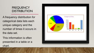
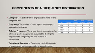
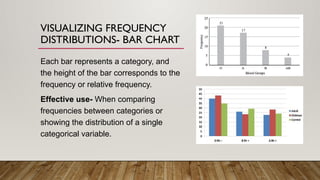
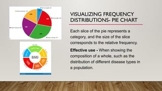
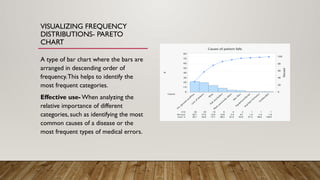
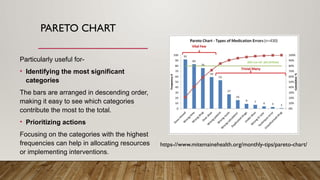
FREQUENCY DISTRIBUTION-
FREQUENCY DISTRIBUTIONS
OF QUALITATIVEVARIABLES
IMMANUEL SAN DIEGO
FREQUENCY
DISTRIBUTION
A frequency distribution for
categorical data lists each
unique category and the
number of times it occurs in
the data set.
This information is often
presented in a table or a
chart.
COMPONENTS OF A FREQUENCY DISTRIBUTION
• Category- The distinct values or groups that make up the
categorical data.
• Frequency- The number of times a particular category
appears in the data set.
• Relative Frequency- The proportion of observations that
fall into a specific category. It is calculated by dividing the
frequency of a category by the total number of
observations.
• Cumulative Frequency- The running total of frequencies
as you move through the categories in ascending order.
VISUALIZING FREQUENCY
DISTRIBUTIONS- BAR CHART
Each bar represents a category, and
the height of the bar corresponds to the
frequency or relative frequency.
Effective use- When comparing
frequencies between categories or
showing the distribution of a single
categorical variable.
VISUALIZING FREQUENCY
DISTRIBUTIONS- PIE CHART
Each slice of the pie represents a
category, and the size of the slice
corresponds to the relative frequency.
Effective use - When showing the
composition of a whole, such as the
distribution of different disease types in
a population.
VISUALIZING FREQUENCY
DISTRIBUTIONS- PARETO
CHART
A type of bar chart where the bars are
arranged in descending order of
frequency.This helps to identify the
most frequent categories.
Effective use- When analyzing the
relative importance of different
categories, such as identifying the most
common causes of a disease or the
most frequent types of medical errors.
PARETO CHART
Particularly useful for-
• Identifying the most significant
categories
The bars are arranged in descending order,
making it easy to see which categories
contribute the most to the total.
• Prioritizing actions
Focusing on the categories with the highest
frequencies can help in allocating resources
or implementing interventions.
https-//www.mitemainehealth.org/monthly-tips/pareto-chart/
WHY PARETO CHART (OVER BAR GRAPH/PIE GRAPH)
Descending Order- Pareto charts arrange the bars in descending order of frequency. This immediately highlights
the categories that occur most frequently, making it easier to identify the most important areas for focus.
Cumulative Frequency- Pareto charts often include a cumulative frequency line. This line shows the cumulative
percentage of observations as you move through the categories. This helps to visualize the overall distribution of
the data and quickly identify the "vital few" categories that account for the majority of the observations.
Prioritization- The descending order and cumulative frequency line make it easy to determine which categories
are most impactful or require the most attention. For example, if 80% of a problem is caused by 20% of the
factors, focusing on those 20% factors can yield significant improvements.(80/20 rule )
Visual Clarity- Pareto charts are visually appealing and easy to understand, even for those without a strong
statistical background. The descending order and clear representation of the cumulative frequency line make it a
powerful tool for communicating data effectively.

Frequency Distribution Categorical Data.pptx

  • 1.
    FREQUENCY DISTRIBUTION- FREQUENCY DISTRIBUTIONS OFQUALITATIVEVARIABLES IMMANUEL SAN DIEGO
  • 2.
    FREQUENCY DISTRIBUTION A frequency distributionfor categorical data lists each unique category and the number of times it occurs in the data set. This information is often presented in a table or a chart.
  • 3.
    COMPONENTS OF AFREQUENCY DISTRIBUTION • Category- The distinct values or groups that make up the categorical data. • Frequency- The number of times a particular category appears in the data set. • Relative Frequency- The proportion of observations that fall into a specific category. It is calculated by dividing the frequency of a category by the total number of observations. • Cumulative Frequency- The running total of frequencies as you move through the categories in ascending order.
  • 4.
    VISUALIZING FREQUENCY DISTRIBUTIONS- BARCHART Each bar represents a category, and the height of the bar corresponds to the frequency or relative frequency. Effective use- When comparing frequencies between categories or showing the distribution of a single categorical variable.
  • 5.
    VISUALIZING FREQUENCY DISTRIBUTIONS- PIECHART Each slice of the pie represents a category, and the size of the slice corresponds to the relative frequency. Effective use - When showing the composition of a whole, such as the distribution of different disease types in a population.
  • 6.
    VISUALIZING FREQUENCY DISTRIBUTIONS- PARETO CHART Atype of bar chart where the bars are arranged in descending order of frequency.This helps to identify the most frequent categories. Effective use- When analyzing the relative importance of different categories, such as identifying the most common causes of a disease or the most frequent types of medical errors.
  • 7.
    PARETO CHART Particularly usefulfor- • Identifying the most significant categories The bars are arranged in descending order, making it easy to see which categories contribute the most to the total. • Prioritizing actions Focusing on the categories with the highest frequencies can help in allocating resources or implementing interventions. https-//www.mitemainehealth.org/monthly-tips/pareto-chart/
  • 8.
    WHY PARETO CHART(OVER BAR GRAPH/PIE GRAPH) Descending Order- Pareto charts arrange the bars in descending order of frequency. This immediately highlights the categories that occur most frequently, making it easier to identify the most important areas for focus. Cumulative Frequency- Pareto charts often include a cumulative frequency line. This line shows the cumulative percentage of observations as you move through the categories. This helps to visualize the overall distribution of the data and quickly identify the "vital few" categories that account for the majority of the observations. Prioritization- The descending order and cumulative frequency line make it easy to determine which categories are most impactful or require the most attention. For example, if 80% of a problem is caused by 20% of the factors, focusing on those 20% factors can yield significant improvements.(80/20 rule ) Visual Clarity- Pareto charts are visually appealing and easy to understand, even for those without a strong statistical background. The descending order and clear representation of the cumulative frequency line make it a powerful tool for communicating data effectively.