1. 106 107
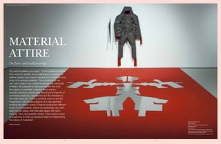
Home Suit Home, 2014
Didier Faustino
Carpet and transparent polyester collars
190 x 90 x 35 cm
Unique piece
From the 2014 exhibition Buildering: Misbehaving
the City at the Lois & Richard Rosenthal Center for
Contemporary Arts, Cincinnati, USA
Courtesy of the artist and Michel Rein, Paris/Brussels
MATERIAL
ATTIRE
You will not believe your eyes… From ceramic to stone,
from wood to textiles, from wallpapers to carpets, no
interior surface can hope to escape from the enormous
array of coverings available. The environments we
can now create in our internal envelope are practically
limitless. Be prepared to discover textiles that look
like paper or waterfalls, marbled wood planks,
wooden ceramics, stone walls flaunting the imprints of
primordial creatures, carpets that act like windows to
the wide-open sky. There is certainly much to fire the
imagination, with subtle patterns of a new aesthetic
entering the interior scene. Projects emphasise different
levels of interpretation, which can potentially vary with
each human being, and then alter again with each
viewing. Thus, the question arises: if the creative vision
is subjective, is there an absolute basis for determining
the nature of materials?
On floor- and wallcoverings
PATRIZIA COGGIOLA
DAMN°48 magazine / FLOORS AND WALLS
3. 110 111
ELISA STROZYK
Designer
The use of materials with innovative applications
and outlook, forms the core of Elisa Strozyk research.
She is creating a vast rage of carpets and textile designs
for the interior that are composed of different combina-
tions of wood mosaic, with a 3D effect. Depending on
the weight and stiffness of the material, each surface
exhibits a different behaviour. The wood is laser cut,
and all the tiles are glued-on by hand, to compose a
textile-like surface. In 2014 she presented a collection
called Wooden Plaids (pictures) for Gestalten, which
are sold exclusively at the Gestalten Pavilion, a new
concept store in Bikini Berlin.
“During my studies in textile design, I was always in-
terested in combining hard and soft materials to create
very tactile, three-dimensional surfaces. Then I thought
about using wood, which has nothing to do with tex-
tiles, and tried to combine textile techniques with this
material. It took me almost a year, from the first tests
with wood to the finished ‘wooden textile’. From the
perspective of a textile designer, I am researching ways
to provide wood with textile properties, testing meth-
ods to make wood flexible and soft, or interweaving
textile elements. The outcome is a material that is half
wood, half textile, between hard and soft, challenging
what can be expected from a material or category. De-
signing a flexible wooden surface involves its decon-
struction into pieces that are then attached to a textile
base.”
elisastrozyk.de
news.gestalten.com/pavilion
THIBAUT VAN RENNE
The son of a carpet dealer, Thibault Van
Renne started travelling to the Middle
East in his childhood. This aesthete
par excellence was spoon-fed a sense
of craftsmanship and refinement. In
2006, Van Renne launched his luxury
carpet label with computer-generated
patterns, finely handcrafted. The ‘Im-
mersive’ designs are to be premiered
at Domotex 2015, a collection that
is more than ever a bridge between
old and new, classic and modern.
Each fibre exudes detail and reveals
the layering of up to seven different
designs atop one other. In this way,
a fascinating game emerges between
the different pile heights, formed by
hand-trimming the drawings. Immer-
sive is executed in a combination of
hand-carded, hand-spun wool from
Bikaner, using hand-spun natural silk of
the finest quality.
thibaultvanrenne.be
ROCHE BOBOIS
Bina Baitel
INKBLOT rugs by Roche Bobois, designed
by Bina Baitel, are inspired by Rorsch-
ach tests. The Inkblot collection lets our
imagination run free. From a distance, or in
detail, in one sense or another, Inkblot rugs
seem to reinvent themselves every time
you look at them. Simple blots spreading
casually across a surface create unusual
images, such as dancers, mythical animals,
weird plants, and also more familiar shapes
from the domestic environment.
roche-bobois.com
binabaitel.com
NICOLETTE BRUNKLAUS
Designer at EGE Carpet
Danish manufacturer EGE Carpets has teamed up
with Dutch interior designer Nicolette Brunklaus, who
has designed a new collection truly reflecting her love
of rich textile structures. A tiny sample of worn linen,
loosely woven and faded, was the starting point of her
creative process: mapping textures, colours, and mem-
ories.
Nicolette Brunklaus explains: “My work is tied to
memories that, once translated into designs, become
universal. In this way, my work personally touches the
people who interact and relate to it. Canvas Collage
(pictures) is a continuation of this approach; beauti-
ful atmospheres that are emotionally relatable. It is
inspired by reflections on industry, just before the in-
dustrial revolution. Today, industry and efficiency have
replaced this laborious craft. The woven structure is
applied to all variations, layered over dried dahlia flow-
ers in a patchwork of colours, and combined with new
forms. The collection is timeless. I manipulate my own
photographs to create unique designs, with the images
chosen for their colour palette and poetic meaning.”
ege.dk
brunklaus.nl
Throw all common ideas and perceptions about
carpets out the window, as being produced in the
here-and-now are items of controversial beauty and
function. It is so tempting to indulge in the optical
illusions, digital prints, Google Earth views, and LED
interactive threads on offer. Crafting hands have
mastered the forms, with vibrant materials serving
as a medium of fascination.
C A R P E T S
DAMN°48 magazine / FLOORS AND WALLS
PAOLA LENTI
At the end of 2014, Paola Lenti presented the book Weaving
Spaces, edited by Corraini Edizioni, to celebrate 20 years
of textile production and design experimentation. Weaving
Spaces examines, through suggestions and visual associa-
tions, the key concepts of a unique approach to design.
The idea of giving visibility to beauty and harmony is visually
and tactilely reflected in the graphics and appearance of the
book. Linked by Lenti’s thread, the concepts expand into
images and reflections, forming a canvas, a multidisciplinary
fabric full of ideas.
paolalenti.it
6. 116 117
WERNER AISSLINGER
Designer for Vorwerk
For Vorwerk, Werner Aisslinger has designed a new
interpretation for area floor coverings. Primary geomet-
ric shapes are the inspiration for Elements, a collection
that refers to basic shapes that can be combined to form
out-of-the-ordinary collages in various colours and rug
structures. At a width of one metre and in any desired
length, even spacious hallways obtain a refreshing pro-
gression of colours and materials – a new interpretation
of the classic carpet runner.
“The new carpet tiles are inspired by primary geometric
shapes, which can easily be combined, and thus align
for a bigger area of coverage. Customers and flooring
planners are able to choose between neutral and more
rhythmic patterns as well as more intense graphic com-
positions. The modularity of the carpet tiles and their
easy adjustment enable the creation of individual floor-
ing solutions, offering the possibility to create fresh col-
our schemes on the floor, time and again.”
vorwerk-carpet.com
aisslinger.de
NODUS
Nodus is an experimental studio and cultural project that
combines the oldest traditions in the art of rug-making
(from Nepal, Portugal, Pakistan, Morocco, Turkmenistan,
China, and Turkey) with visionary ideas from some of the
best creative minds of today. One of the latest creations is
the carpet for Raymundo Sesma crafted in Nepal, having
more than 100 knots per square inch.
nodusrug.it
raymundosesma.com
KATIA MENEGHINI AND THANOS
ZAKOPOULOS (CTRLZAK)
Designers for cc-tapis
Ishihara Carpets Collection, a project by CTRLZAK
studio for French/Italian company cc-tapis, investigates
the field of visual perception. “The series is a reference
to the Ishihara colour test used to determine vision de-
fects like Daltonism. The Ishihara test consists of 38
plates containing groups of coloured dots of the same
brightness, on a white background. The examinee has
to recognise numbers or pathways that are usually in-
visible to Daltonic people. The carpets we designed are
inspired by those exact plates, presenting patterns of
coloured dots that form an overall message decipher-
able only by colour-blind people. The three rugs have
a different motif according to the message contained
therein. Only a small per cent of viewers is able to en-
tirely comprehend those messages.”
CTRLZAK is a hybrid studio that integrates different
disciplines and cultures. Its founders, Katia Meneghini
and Thanos Zakopoulos, are both artists and designers,
in their own right. The Italian/Greek duo’s creations are
inspired by their travels and experiences around the
world, and by their own rich cultural backgrounds.
ctrlzak.com
cc-tapis.com
DAMN°48 magazine / FLOORS AND WALLS
MARC JANSSEN
CEO of ICE International
Rug company ICE International is led by Marc
Janssen and his brother, Rogier Janssen, who looks af-
ter the Dutch activities. Marc Janssen joined the family
business in 1999 after having worked with Procter &
Gamble for four years. He is now realising his dream of
transforming it into a global supplier of high-end prod-
ucts. During the last edition of Dutch Design Week,
ICE International launched a set of eight different
carpets by Netherlands-based design duos, including
Jeanine & Piet Hein Eek, Kiki van Eijk (2) & Joost van
Bleiswijk, and Claire & Roderick Vos (1).
“Each designer came up with a rug in their signature
style, very peculiar and iconic, permitting us to create a
collection called Dutch Landscapes. Claire Vos, for ex-
ample, used the gradients typical in her work to create
a grey rug, striped with reddish tones that blend out-
ward from a central axis. The rug was tufted by hand in
India and then sheared to create a relief in the texture.
Kiki van Eijk, on the other hand, translated one of her
watercolour paintings of red and grey lines onto the
rug. Although these are different tones and approaches,
the hand-working of the rug has allowed the design to
be replicated as close as possible.”
rugs.nl
1 2
BALDESSARI E BALDESSARI
The Colossal rug, designed by Baldessari e Baldessari for
cc-tapis, pays tribute to the world of cinema. Its irregular
white lines, broken at the centre, resemble the closing
credits in a movie. Seen from the right perspective, the black
line dividing the white lines shows a finer weave size, while
the white lines appear raised in a disorderly but well-suited
fashion.
cc-tapis.com
baldessariebaldessari.it
7. 118 119
NIPA DOSHI & JONATHAN LEVIEN
Designers for Nani Marquina
The Rabari collection, designed by Doshi Levien,
is among the novelties presented by Nani Marquina in
2014. Rabari consists of four rugs visualised as a canvas
that features a refined combination of rhythms with a
unique graphic sensuality. The London-based design
studio, established in 2000, celebrates a hybrid com-
ing-together of cultures, craft, technology, and storytell-
ing. “At the very beginning of the project, we decided
to create a series of rugs that evoke the sensual and
shiny world of tribal folk embroidery from India. We
already had in mind the intricately handcrafted embroi-
deries made by the Nomadic community of the Raba-
ris from the Kutch region. Nipa’s aunt had an amazing
embroidery workshop in Ahmedabad, with 25 highly
skilled craftswomen who were all experts in hand em-
broidery, working with glistening mirrors, silk and cot-
ton thread, and metallic sequins, amongst other non-
precious materials. The women sat together on rugs
on the floor, surrounded by these jewel-like elements
scattered about them as they worked. We wanted our
collection for Nani Marquina to reference these unfin-
ished embroideries, examples of different techniques in
progress as they gradually emerge over time. The spon-
taneous compositions of rugs embody the serendipity
and freedom to improvise that is inherent in each step
of a handmade piece. Joyful, irreverent, and unique.”
doshilevien.com
nanimarquina.com
HELLA JONGERIUS
Design director at DANSKINA
Dutch designer Hella Jongerius has launched her
first range of rugs as the newly appointed design di-
rector for Danskina (2014). The company was set up
in 1973 to represent Danish design. The name Dansk
refers to this, with the last part of the word, ‘ina’, sig-
nifying the name of Piet van Eijken’s spouse, who set
up the company. Since then, Danskina has grown to
be a strong brand in the area of rugs, having created a
number of iconic products. Will anything change now?
“It is a gift to be able to build on the archives of such
a strong brand. When Ulf Moritz was designing rugs
for the company, his use of materials was genuinely in-
novative. I am taking up the tradition of innovation,
obviously in my own way. Danskina is ready to expand
the product range and to generate a new perspective
on the power of rugs. The company was internationally
known for its innovations in materials and combina-
tions of materials, structures, and techniques, while at
the same time using traditional production methods.
This remains as a basis today, but the company is un-
dergoing a process of rejuvenation. It’s time to rock
the scene and shake things up. In the market for rugs,
there is a conservative ethos, and too few companies
are brave enough to enter uncharted territory.”
Danskina’s and Jongerius’s ambitions are expressed in
products like Cork & Felt (pictures), an unusual combi-
nation of two materials associated with the idea of com-
fort. Normally, not matched together, this new line of
rugs combines the warmth and colour of felt with anti-
slip cork, with the cork creating a rhythmic game of
striped patterns.
danskina.com
Time is captured in the very skin of cork. From
design to architecture, the wonders of this impressive
material are spreading. Besides the very many
creative possibilities of raw cork, every project is
able to benefit from its high insulation capacity, its
lightweight, and its environmental friendliness.
C O R K
DAMN°48 magazine / FLOORS AND WALLS
AMORIM
Amorim, the world’s largest producer of cork, fosters natural cork as a first choice material in the
construction industry and in interior decoration, especially in the sustainable construction segment.
The Portuguese company also has an innovative, design-driven natural cork flooring venture called
Wicanders, which has recently been responsible for installing natural cork flooring at the Victoria and
Albert Museum (1) during the last edition of London Design Week, where a series of tiles were laid in
a repeating tromp l’oeil geometric pattern, based on a scientific diagram of the cellular structure of
cork. Other new partnerships in major international events are the Serpentine Gallery Pavilion (2) and
the Istanbul Design Biennial (3), embodying Amorim’s drive to promote the unbeatable technical and
sustainability credentials of this impressive material.
wicanders.com / amorim.com
1
23
ROOSMARIJN PALLANDT
Roosmarijn Pallandt’s projects investigate the relationship between geography,
culture, and local craftsmanship. Her designs are inspired by Google Earth im-
ages, starting with an aerial photo of the region where the craftsmen live. One of
the latest projects was focused on Japan and Satoyama, a Japanese term ap-
plied to the border zone, or area between mountain foothills and arable flatlands.
roosmarijnpallandt.com
8. 120 121
KASIA ZAREBA
Designer for Ceramiche Refin
Kasia Zareba was selected by a jury chaired by
Mendini Architects, as the winner of the Create Your
Tile competition promoted by DesignTaleStudio, the
research and development branch of tile brand Ceram-
iche Refin. Kasia Zareba grew up in Poland, where she
studied architecture before attending Design Academy
Eindhoven in the Netherlands. Afterwards she opened
her own design firm and has worked successfully with
a number of companies, including the Fabric Museum
in Tilburg, Cultuur-Ondernemen, Design Drift, Mini
/ BMW, Izabela Bołoz studio, and Studio Toer. Her style
is always a balanced mix of design, art, and installation,
and her works run from small to large and feature con-
crete surfaces and textures, fantasy and technology. Her
Fossil tile collection was successfully launched during
the last edition of the Cersaie fair in Bologna.
“The Fossil collection revisits the prehistorical imprints
left by plants and animals in rock formations, designed
as ornamental patterns destined for contemporary in-
teriors. The preliminary designs were particularly in-
spired by the signs left by the grooved shells of extinct
ammonites. The hand-drawn pattern gives it a unique
appearance, similar to the imprints of primordial crea-
tures impressed on the surface of the stone. In our own
imagination, each of us can see different figures in the
subtle patterns. The imprints break up and overlap, just
like the signs of time in archaeological digs. Moving in
different directions, the Fossil surface creates optical il-
lusions of voids and other more densely patterned areas,
producing a simple, natural, and elegant atmosphere.”
kasiazareba.com
refin-ceramic-tiles.com
designtalestudio.com
TAGINA
The textures of Tagina ceramics decorate the first floor of
San Lorenzo, the central marketplace in Florence that was
renovated in 2014 on the anniversary of the 140-year-old
iron and glass structure. A project designed by Archea As-
sociati, the geometrical patterns and engraved floral decora-
tions bring an air of renewed originality to the first floor of
this historical market building. The Déco Perlage collection
by Tagina Ceramiche D’Arte brings a sophisticated and
tactile mood that accompanies this ‘theatre of taste’.
tagina.com
archea.it
REFIN PRODUCT
The FILO collection was designed by Atelier Mendini archi-
tects as an entry in the Create your Tile competition run by
Ceramiche Refin in 2014. The collection interprets a tradi-
tional orthogonal grid, redesigned in a uniquely distorted
and resized version: thin lines weave and run through to
form a grid, creating an almost three-dimensional optical
illusion. The effect created is both geometric and abstract,
instantly recalling the Op Art artistic movement. Presented
for the first time at the Salone del Mobile in Milan last April,
Filo is now complete, in a range of four colours.
refin-ceramic-tiles.com
ateliermendini.it
Tile design is reminiscent of a different universe, far away, both
in space and in time. Contemporary ceramic surfaces express
symbols of cartographic keys, of pre-historical imprints, of
silent sedimentary lines, of aged wood blocks. Any references
and inspirations proceed to fade away in a perfect sensorial
tempest, as the surface takes on a life of its own.
C E R A M I C S
PIEMME
Geostone is the upshot of a careful study into sedimentary
rocks, carried out in the Ceramiche Piemme laboratories in
order to select the most interesting aesthetic patterns and
translate them into stoneware lines. The endless nuances of
Geostone and its 3D surfaces make it a modern example of
geological beauty. These porcelain stoneware slabs have a
special material depth and a large variety of veins. Ceram-
iche Piemme has created a porcelain stoneware collection
inspired by wood.
ceramichepiemme.it
DAMN°48 magazine / FLOORS AND WALLS
INGA SEMPÉ
Designer for Mutina
Tratti (pictures) is a new collection of 10 x 10cm
tiles designed by Inga Sempé for Italian brand Mutina.
The porcelain stoneware with digitally printed glazing
comes in eight different patterns that can be randomly
matched. The material is suitable for floors and walls,
indoors and outdoors.
“Each design is reminiscent of a different universe:
from the fields seen from the sky, to pieces of fabric, to
embroideries, to symbols of cartographic keys, to ar-
chitectural patterns, to symbols reproduced by prison-
ers on the wall to count the days. Contrary to big slabs
that create uniform surfaces, which have a big impact
but often convey a cold feeling, I have focused on a
collection composed of small tiles characterised by 12
handmade patterns. They are all different but are re-
lated to each other through a ‘familiar’ look.”
Inga Sempé was born in Paris into a family of well-
off artists. The importance of drawing in the domestic
environment, even if unattached to design, has surely
contributed to distinguishing her. In 2003, Sempé was
awarded the Grand Prize of Creation for design in Par-
is, and presented her projects in a personal exhibition
at the Musèe des Arts Décoratifs.
mutina.it
ingasempe.fr
9. 122 123
LEIGH OSBORNE & GRAHAM VOCE
Property owners
Leigh Osborne and Graham Voce are the owners
of an amazing residence, which they spent several
months designing, constructing, and ultimately trans-
forming from its original state as an old water tower.
Located in central London, the tower was an architec-
tural remnant of the 19th century that had been left
untouched until 2014. It took only eight months to
meet the ambitious goal of constructing a home that
offers its own jaw-dropping views. “Crowning the
massive tower from the beginning was a water tank
that we decided to keep, and the addition of six win-
dows, to offer a 360° view of London like no oth-
er.” The owners used Mosa tiles for the bathrooms,
kitchen with a view, and the terrace. “We chose the
mid-grey colour from the Terra Maestricht collection
for its light, bright, distinctive appearance. It enhances
the calm atmosphere and lets the building and interior
stand out.” The same tiles are used on the terrace as
well, to create a spacious feeling.
ceramicasantagostino.it
SANT AGOSTINO
Blendart, the new porcelain stoneware collection by Ceram-
ica Sant’Agostino, is a surface recreating woodgrain: time
seams to have left an indelible mark on the original nature of
the gnarled wood. Craft is a single plate of 30 x 120cm, with
strips of various sizes that can be composed as a random
set. It thus becomes a system whereby the graphic and
chromatic appeal of Blendart is emphasised. Applicable to
both floors and walls, an almost endless array of combina-
tions and pictorial effects can be created..
ceramicasantagostino.it
MOSA
Mosa Solids is a specially designed collection by dutch brand Mosa that
balances practicality and strength with high quality and a natural look. The
tiles are designed in a variety of sizes, including a generous and versatile
60 x 60cm version, which highlights their versatility, cost-efficiency, and
toughness. This robust and dynamic range can be applied to a great variety
of public spaces, such as shops, stations, hospitals, schools, and the con-
temporary home, due to its hard-wearing, practical nature.
www.mosa.nl
DAMN°48 magazine / FLOORS AND WALLS
ALICE PILASTRE
Textile designer and artist
Alice Pilastre’s work is all about textile tradition, and
unravels, via sculptural pieces, a whole new aspect of tex-
tile identity. With a fine dialogue between the conscious
and unconscious, using repetitive gestures and motifs,
she interrogates the technique and explores the poetry
of patterns. Every fabric is a trace, a passage, a transmis-
sion through which our relation to intimacy is revealed
by touch, sight, scent, sound. She works with minutia
and extreme precision, laser-cutting wallpaper thread-
by-thread, like a neurosurgeon, evoking time passing by.
“The spaces we live in and leave, the people who occupy
these spaces, and the memories that superpose them-
selves, confront each other in the same dimension. For
me, it is mandatory to decompose, unthread, reassem-
ble, and fix, in order to better understand the fabrics and
try to make sense of them in my own personal way.”
In the project Rorschach (2012) (1), the artist fixed thou-
sands of detached threads and projected them from one
wall to the wall opposite, creating an immaterial space.
“In 2013 I realised Art 26 (2), a monumental piece ex-
tracting portraits of workers from the walls of a factory
in northern France; workers who were demanding fair
wages for their labour. Fire Lance Pattern (3) is one of
the latest creations, a tapestry variation on my Fire Sta-
tion work (2014).”
The exhibition, designed in collaboration with Ritter Studio, a Sablon dealer
specialised in 20th century Design, can be seen in Brussels at LKFF Art &
Sculpture Projects until 31 January. lkff-sculptures.com
Walls venture out of bounds. They go 3D, they sport
digital macro patterns, they flaunt screen-printed
embroideries or aged mirror surfaces. Graphics
are flooded with warm colours, utilising mysterious
patterns of light and shade.
W A L L -
PA P E R
INKIOSTRO BIANCO
The idea of Toile de Jouy and ancient textiles as research,
and the experimentation of textures, is reflected in the im-
agery that Italian brand Inkiostro Bianco has transferred onto
wallpaper, thanks to the company’s state-of-the-art digital
printing technology. These canvases confront viewers and
force them to observe the exotic, ambiguous, and mysteri-
ous images filling the room.
inkiostrobianco.com
1
2
3
10. 124 125
STEFAN SCHOLTEN
AND CAROLE BAIJINGS
Designers at Maharam
Maharam Digital Projects describes large-scale wall
installations created by esteemed artists, designers, il-
lustrators, and photographers. To make these fine-art-
quality works accessible to a broad audience, the works
are not editioned and follow an egalitarian pricing
model: each is offered at the same price per square foot,
regardless of authorship. Utilising advanced digital
printing techniques to create complex, high-resolution
imagery, the pieces are produced to order, and can be
sized or modified to suit specific project requirements.
In January, Maharam is introducing two projects by
Scholten & Baijings. Lines (1) and Planes (2) translate
Scholten & Baijings’s signature graphics onto textiles:
“The designs are expanded to 10’H x 36’8”W and 10’H
x 53’W, respectively. We have proposed only one colour
each, since these installations are intended for direct
wall application and are produced to order. In Lines,
shifting light and dark fields are achieved through var-
ying densities of parallel and perpendicular lines. For
Planes, we explore colour-blocking through neutral
tints accented by ‘highlighter’ yellows. With a balanced
yet dynamic composition, colour fields shift from the
foreground to the background.”
Scholten & Baijings was founded in 2000, an Amster-
dam-based studio by husband-and-wife team, Stefan
Scholten and Carole Baijings. Their work in furniture
and product design is characterised by clean lines, min-
imal forms, simple geometric patterns, and a singular
approach to colour.
maharam.com
Post Typography Floral Explosion, Baltimore Museum, 2011 (3)
Pruitt, All The Pandas, Museum Dhondt Dhaenens, 2014 (4)
DAMN°48 magazine / FLOORS AND WALLS
CUSTHOM (1/2)
The embroidered wallpapers by London-based studio Custhom combine traditional embroidery
patterns with digital stitching technology. Custhom, founded by RCA graduates Nathan Phil-
pott and Jemma Ooi, works with skilled embroiderers to interpret historic designs and create
English-based patterns called Berye, and Aves, derived from Mexican designs. “We’ve worked
hard to develop the process”, says Custhom. “We work with textiles craftsmen in the North of
England, and have adapted their process and techniques to paper, creating large-scale designs
that flood the wall with pattern and texture. Wallpapers are screen-printed by hand and then
overlaid with digitally embroidered patterns that mimic a 17th century technique called Crewel,
to create a multi-layered design of branches, leaves, and berries. The design uses flint-grey and
peach coloured thread on a light grey background.”
custhom.co.uk
MINAKAMI LAB (4)
Minakani Lab for Maison M Paris
has created a collection of four
patterns. Each design comes
in two lengths, which form a
1.80m-wide panel. Each pack
can be placed next to another
to cover a wider surface.
maisonmparis.com
www.minakanilab.com
VÉRONIQUE
VILLARET (5)
Celeste is the first line of wall-
papers signed by Véronique
Villaret for Maison M Paris. Each
unit is sold individually. It may be
used alone, or in combination
with others; aligned, reversed,
or uncentred.
maisonmparis.com
nl.pinterest.com/verovillaret
ANTIQUE MIRROR
During the last 40 years, Antique
Mirror has dedicated its produc-
tion to the research of special sur-
faces in the flat glass industry. The
sheets are now produced with
particular patented procedures
and crafted techniques. Each mir-
ror sheet is unique and unrepeat-
able, thanks to manual dropping
of different chemical agents on the
mirror back. Patterns range from
antique to traditional, contem-
porary, and artistic, for domestic
settings or public spaces.
antiquemirror.it
JANELLI & VOLPI (3)
The J&V collection by Jannelli & Volpi is being presented at Heimtextil in Frankfurt in January.
It comprises of a series of impressive murals measuring up to 300cm high. Made of vinyl on
a TNT backing, this collection is inspired by African influences, Swahili longings. From the
marks of hands and feet dyed in henna on the island of Lamu, the graphics are flooded with
the warm colours of the land, and mysterious lights are denoted in the shaded patterns.
jannellievolpi.it
1
2
3
4
1 2
3
4
5
11. 126 127
V+T
Resort Bufi is a residence in the historic centre of Molfetta,
on the Adriatic coast of Italy. Designers Gianni Veneziano
and Luciana di Virgilio (Veneziano+Team) have brought
back to life the old palace using a dual language, altering
the natural stone walls by presenting big drawings made
of digital mosaic. “The digital mosaic produces a sort of
pop revolution, allowing us to transpose any shape that our
thoughts might suggest”, says Gianni Veneziano.
venezianoteam.it
Stone has never been so lightweight. And warm and
comfortable. New technologies can bring extremely soft
textures and mouldability to stone, recomposed marble,
and quartz, responding to creative needs that once were
not even conceivable.
S T O N E
YOSEF SHIRAN
CEO of Caesarstone
Yos Shiran has been the Caesarstone CEO
since January 2009. Established in 1987, the company
pioneered the original quartz surface, which comprises
of up to 93% quartz and utilises advanced technologies
and proprietary know-how. In 2014, Caesarstone
introduced the ultra-premium Calacatta Nuvo, inspired
by natural Calacatta marble.
“Calcatta Nuvo (pictures) is Caesarstone’s interpretation
oftheexquisitenaturalrock.Amodern-daymasterpiece,
this ultra-premium design exhibits a bold yet elegant
look, with cascading veins and an outstanding texture.
We are extremely proud to be launching these new
surfaces; their dramatic, advanced design qualities
create a truly unique interior environment and highlight
new colour trends in premium surfaces.” Cutting-edge
design has also been introduced in the Classico
collection, in in six new designs, four of which belong to
the successful Supernatural series. These new designs
include a variety of intricate patterns, richer colours,
bolder veins and textures, which are inspired by the
beauty of rock and granite in the attainment of their
exquisite, natural stone appearance.
caesarstone.com
Photos: Tom Mannion
DAMN°48 magazine / FLOORS AND WALLS
LORENZO PALMERI
Designer at Stone Italiana
The StoneCircus project, launched by Stone Italiana,
focuses on the rich world of relationships that go be-
yond the boundaries of a single product, to define a new
format for industrial production that is able to elimi-
nate competitiveness. “It’s a new idea of networking. By
working with other companies, the project benefits from
different types of expertise. In this way, each company
gains preferential access to the world of the others.
For instance, the stone surfaces collection, Juta (1), is
born from a collaboration between Stone Italiana and
Jannelli&Volpi. “This is the continuation of a profitable
cooperation that started last year with three StoneWall-
paper prototypes based on sublimation technology.
The idea concerns intuition; that it could be possible,
interesting, and perhaps even surprising, to transfer a
texture from paper to stone.”
From the encounter between Stone Italiana and carpet
producer Nodus, a new collection of stone surfaces has
been launched: Macramé (2). “Here, the ancient wis-
dom of carpet-weavers is transmitted to stone. Each
knot is different from the other; each is as unique as the
hand that wove it. The transposition from the world of
textiles to stone creates a sort of living fossil – irregular,
imperfect, and true. The craftsmen and artisans of both
Nodus and Stone Italiana work together to give life to a
stone surface: “soft, like carpet”.
stoneitaliana.com
jannellievolpi.it
nodusrug.it
STEFFEN KEHRLE
Designer at Cosentino
The ‘House of Dekton’ (3), a project by Steffen Ke-
hrle, is to be showcased by Cosentino in early 2015 at
the BAU fair in Munich and the Stockholm Furniture
Fair. Dekton uses a sophisticated mixture of the raw
materials used to manufacture glass, porcelain, and
quartz surfaces.
“Technologically advanced surfaces that allow create
mimetic designs for the home and public spaces, Dek-
ton presents five new colours that highlight the beauty
of natural stone. Playing with huge panel sizes, House
of Dekton delivers a powerful and versatile experience
via the ultra-compact Dekton surface. It is a great mate-
rial for the purpose, not only due to the huge dimen-
sion of its panel format, but also its fantastic perform-
ance and applicability. The many outstanding qualities
of the material offer both architects and interior design-
ers totally new options, and it is these options we want
to showcase. The 14-sided house is entirely made of
Dekton: floors, walls, roof, seating, and a correspond-
ing 14-sided table as the central element. In the inte-
rior, the qualities of the material are exclusively com-
municated by the material itself: there is no need for
additional information panels.”
Within this new collection, the Aura version (4) par-
ticularly stands-out, as it embodies a new design con-
cept that is remarkably attractive. Developed as a single
slab, it creates limitless symmetrical patterns. Thanks
to eight unique versions, compositions can be made
whereby the veining continues from one slab to the
next, lending a true mirror effect (book-matching). Au-
ra’s pale, white background is striated with fabulous,
sharp veining, evoking natural rock formations.
cosentino.com
dekton.com
21
3
4
12. 128 129
ULRIKA ELOVSSON
Textile designer
ArkDes Pavilon 2014, a recurring concept in
which designers and architects are invited to create
a pavilion in the garden of Skeppsholmen, an island
in Stockholm, was created in cooperation with tex-
tile designer Ulrika Elovsson, creative director of Is-
sey Miyake’s Reality Lab. Her pavilion was a dubbed
The Final Curtain; 11 feet in diameter and 4 feet
high, it was made of wool fabric woven with de-
scending shades of colour. Consisting of a curtain
that forms a temporary room, it relates to the local
horizons. The internationally known Swedish tex-
tile designer was handpicked to participate in Issey
Miyake’s technology-driven Research Studio Reality
Lab. She describes her working method as a digital
craft, a mix between high and low-tech, where tra-
ditional weaving techniques are used to produce in-
novative textiles. “I relate to textiles in the same way
as in nature, all the answers are already in the mate-
rial; we just need to know how to ask the question.
This fabric is woven in wool and, like a sheep, it can
withstand wind, water, frost, and snow. Temporary
pavilions… I think of them as easily made architec-
ture, a kind of large garment that holds many, and
moves; walls can bulge, it is pliable and can dress
and undress, like clothes on the body.”
arkdes.se
isseymiyake.com
video: youtu.be/AJZwhzMSn5o
BOLON & MISSONI
The collaboration between Swedish company Bolon
and iconic Italian fashion house Missoni continues this
year, and for the first time includes an interpretation
of Missoni’s classic Zig Zag pattern, which is to be
premiered at Maison&Objet in Paris in January. Bolon
established a creative partnership with Missoni in 2012.
The latest collection introduces two new patterns –
Zigzag and Flame Patch – as well as updates of Optical
and Flame. Warm, passionate colours are very much
to the fore, and in in this new interpretation, Bolon By
Missoni exudes joy and confidence. All the designs
come in rolls, except Flame Patch, which is available
exclusively and for the first time in 50 x 50cm tiles.
bolon.com
missoni.com
ROBERTA LICINI
The design origins of Rob-
erta Licini are rooted in the
fashion world; in the past,
she designed many pieces
of men’s and women’s wear.
She recently approached
the world of design, pre-
senting a mini-collection of
covers, cushions, and rugs
in wool, cotton/cashmere,
wood/cashmere. The com-
mon denominator in all of
her projects is her profound
passion for art that is
translated into a sophisti-
cated exercise of spatial and
proportional ratios obtained
using inlay or marquetry,
jacquard designs, and point
work. A strong visual impact
was made in Milan, in the
showroom at Italian design
label Colé’s headquarters, a
brand inspired by research
and the high quality of
skilled artisan crafts.
robertalicini.com
Textiles have always been the most malleable of materials – they can
be brought into play in the whole gamut of interior environments,
adding nuance to three-dimensional structures and giving shape to
2D screen-like walls. Colour is a benchmark, since it can range from
the more indefinite and neutral to the blaringly energetic, all within
the same design. The possibilities for designers to push the limits of
product design are amplified when textiles are in the picture.
T E X T I L E S
RENEE MERCKX & JOS
PELDERS
Owners of FEBRIK
FEBRIK is a new player in the world of in-
terior textiles. Its collection of knitted materials
(previously known as Innofa stretch textiles)
was born in 2008. Its production identity is
based on the company’s versatile collection, in-
novative approach, and collaborative attitude.
“With FEBRIK, we challenge designers and ar-
chitects to not merely think about textiles as a
last step in the design process, but instead to
use them as a springboard for their interior
concepts and industrial designs. We have tex-
tiles that sport more than one face. For exam-
ple, the designs by Bertjan Pot, Sprinkles and
Triangle, have multi-layered, padded, geomet-
ric 3D structures oozing an intrinsic richness
and dignity whilst simultaneously evoking a
warm and cozy ambiance. And our popular
knitted textile, Uniform Mélange, has been up-
dated with a new range of refined colour tones.
When applied to upholstery, the fabric adapts
to fit countless shapes without resistance. Due
to the textile’s inherent stretch, seams are thus
reduced to a bare minimum.” Backed by years
of experience, and with its in-house design de-
partment and production facilities, the young
brand is strongly rooted in Tilburg, the Nether-
lands, a city of historical importance regarding
textiles.
febrik.com
DAMN°48 magazine / FLOORS AND WALLS
CHRIS KABEL
Woven Night Skies by Chris Kabel comprises of curtains of light
that float in the dark. The window coverings of the conference
room in the Fogo Island Inn echo the northern lights in these
ghostly curtains. The windows of this room, situated in a hotel
on a tiny Canadian island close to the Polar Circle, face north. A
special glow-in-the-dark yarn has been used for the fabrics, and a
new technique invented to allow very fluent transitions to be cre-
ated between delicate gradients in the fabric. Digitally produced
patterns are converted onto the material, keeping the subtle color
transition fluent during the translation from one medium to the
other. When the conference room lights are turned on, the glow-
in-the-dark yarn in the fabric loads up. When the lights are turned
off, such as for a presentation, the fabric glows with a soft light. In
the darkness, the woven pattern seems to float in space, produc-
ing a realistic impression of the famed Northern Lights.
chriskabel.com
13. 130 131
ISA GLINK
Creative director at Kinnasand
The new Faces collection (1/2) is a family of colour-
ful, emotive curtains and home textiles designed by Isa
Glink. Up to 27 curtains feature a strong, clear visual
identity; some are sculptured and paper-like, others are
translucent and floating. Though each is distinctive in
its own right, the curtains in the collection share certain
values: they explore textile structure and offer eye-catch-
ing interplays of colour, ideal for mixing and matching.
“We have been excited about the idea of fusing differ-
ent material mixes, techniques, and finishing processes
into one homogeneous collection of individual curtains
and carpets. They all speak to each other with the same
language, show a strong character, and shape the mood
and identity of the interior.” For the curtains called Fac-
es, production involved the use of technical materials
such as modal and Tyvek. We’re always looking for new,
surprising materials and ways to interpret them, in or-
der to experience their special features. In this case, we
like the ultra smooth and floating feeling of modal when
combined with fine linen, and the waxy, more paper-like
expression of the Tyvek. Here we aim at the unexpected
element, what appeals to our senses, and I think that
curiosity is always the key driver in the creative process.
We are now working on the architecture of soft materials
and will present more details next year.”
kinnasand.com
DAMN°48 magazine / FLOORS AND WALLS
ALFREDO HÄBERLI
Designer for Kvadrat
Argentine-Swiss designer Alfredo Häberli has de-
signed a new series of textiles for Kvadrat. A guest lec-
turer at schools of design and architecture in the US
and Europe, Häberli has worked with many top design
firms, including Vitra, Moroso, Camper, Luceplan, Tho-
net, and Zanotta. The Häberli knit collection for Kvadrat
comprises of three vibrant yet refined knitted upholstery
textiles: Nebula, Nadir, and Galaxy (pictures). Thanks
to their knitted construction, they offer good stretch-
ability, which makes them ideal for organically shaped
furniture. The designer says: “All of them are very differ-
ent, but are nevertheless interrelated due to their specific
colouring. The colour design of this collection was ex-
tremely fun! The colourways for Nebula, Nadir and Gal-
axy combine contrasting and tone-on-tone hues, which
range from bright to earthy. Although their respective
colouring is distinct from one another, they are linked
by the colours of one or more yarns. Consequently, the
three designs work particularly well together.”
Based on a Japanese floral picture, which is transformed
into a pixelated raster using the knitting technique, the
three-dimensional Nebula pattern features organic, ab-
stract shapes. The Nadir pattern is based on interlinking
and overlapping rings of different sizes, which build an
irregular, directionless motif. Galaxy features instead an
irregular but refined pattern of small dots, which con-
trast with a unicoloured, light or dark background. This
recalls the clusters of stars that make up galaxies and
includes neon, bold hues and natural shades. “In some
colourways, the contrast between the ‘stars’ and the
shade of the background is strong; in others it is more
subtle. The colour combination gives the textile a very
distinctive appearance.”
alfredo-haeberli.com
kvadrat.dk
JULES GREY
Maison Marie Mees Cathérine Biasino
These curtains are made out of 40%
wool and 60% linen. The fabric is weaved
in Belgium using very durable wool and
Belgian linen of high quality. Marie Mees
and Cathérine Biasino offer an expertise
in curtains and rugs to architects, interior
designers, shopkeepers. “All our curtains
can be made to measure. For many years,
we have been working with the same
sewing professionals, whose skills and feel
for finish are unrivalled”. For larger surfaces,
we can provide the fabric at 300cm width.
All fabrics can be made fireproof, on
request.
thealfredcollection.be
ANDREA BORAGNO
CEO of Alcantara
Alcantara, producer of the homonymous material
made in Italy, presents a new luxury collection for the
interior world at Paris Déco Off. Inspired by the vital
primal element, Acqua enhances the expressive poten-
tial of Alcantara through decorations and colours that
highlight the many and various hues of the marine en-
vironment.
“With Acqua (3/4), we go back to basics, to the source
of life itself. Inspiration came from water, as this is the
element that symbolises life, purification, and change.
Through the collection, Alcantara becomes fluid, shim-
mering, and plays with the see-through effect, recall-
ing the mysterious transience of the watery element. I
believe that Acqua will meet the needs of an extremely
sophisticated public that demands exclusive solutions.
Our design team has explored unexpected combinations
of precious materials, hence a new collection was born
that defines itself as a real luxury essential.”
It is a crucial turning point that relies on the sustain-
able production methods. “Sustainability has been
a concrete focus for us for over five years now. Since
2009, we have drafted an annual Sustainability Report,
subjecting it to thorough control and the certification
of the international institution TÜV SÜD. Every day, in
fact, Alcantara puts a documented series of measures
into effect to reduce and offset all of the CO2 emissions
deriving from its activities: a truly daily commitment
that enables us to guarantee 100% carbon-neutral pro-
duction. The goal of carbon neutrality was achieved
thanks to the coordinated implementation of a series
of targeted actions: the accurate measurement of over-
all CO2 levels, the drastic reduction of CO2 emissions
(due to the updating of machinery), the streamlining of
processes, improvements in the technical teams, energy
procurement, and treatment of waste water.”
Combined with KOKUYO’s newest chair, INSPINE, the
rough, primitive design of the shelving and tables cre-
ate an arresting contrast.
alcantara.com
1
2
3
4
14. 132 133
CHRIS KABEL
Designer and art director at Chris Kabel
Chris Kabel was born in Bloemendaal, the Nether-
lands in 1975, and graduated in 2001 from the Design
Academy Eindhoven. After that he moved to Rotter-
dam, where he now has his own design practice. He
works for major design labels, architects, cultural in-
stitutions, and design galleries. In 2014 he presented a
project called Floorfiller.
“Floorfiller aims to give a textural meaning to floor
surfaces. This prototype features a massage pattern; it
was made for the Winter Anti Depression Show that
took place in Maastricht last year.” That event offered
alternative and highly engaging ways to combat win-
ter depression, with works from, amongst others, Kafe
Mathews, Katja Gruyters, and Allessandro Gaultieri.
“The pattern that is milled out of black MDF tiles offers
a reflexology massage for the feet, in different intensi-
ties - from smooth ‘pebbles’ to intense ‘spikes’ - that,
according to Chinese philosophy, refresh the whole
body after walking around on it for a while.”
chriskabel.com
Among natural materials, wood is the one that most closely
adheres to its primal features. Wooden flooring interprets
traditional patterns, offering slight changes and subtle
revisions to the classic floor. Keen on getting the best from the
material’s natural veins and structures, brands look into the
expressive potential of mixing and combining different types
of wood, obtaining marble and textile-like surfaces.
W O O D
TABU
SLIM 35mm is an ultra-narrow floor plank,
only 35mm wide and 1000/1500mm long,
as per the standard version designed by
Federico Delrosso for Tabu. A product that
is relevant to both design and architec-
ture, the effect of SLIM 35mm resembles
something very solid and well structured,
as found in the flooring of early vessels;
with such a narrow width, it is possible to
create a more intricate pattern that can fit
into irregular spaces and that can dress
any object or surface.
tabu.it
federicodelrosso.com
DAMN°48 magazine / FLOORS AND WALLS
THOMAS & HEIDI DINESEN
Owners of Dinesen
Thomas and Heidi Dinesen have been in charge
of the family business since 1989, when they took
over the old sawmill. Thomas Dinesen is the fourth
generation to head Dinesen wooden planks produc-
tion, which is based on more than 110 years of experi-
ence. “High quality and excellent craftsmanship have
always been the cornerstones of our work with raw
wood. Today, modern technology is another natural
part of our production, which, then as now, is situated
in Denmark. No two Dinesen floors are alike. Wood
is a living material, and we take pride in producing
harmonious floors that respect the personality of the
tree and preserve nature’s riches. Therefore, it is not
our ambition to deliver knot-free floors. A knot is the
part of a branch that is embedded in the trunk, and
it’s a testimony to the history and vitality of the tree.
One of our latest products is GrandPatterns. It is in
oak and comes in extraordinary dimensions. All the
patterns are upscaled versions of the well-know tra-
ditional ones, giving the floor surface a familiar yet
extraordinary appearance.”
dinesen.com
15. 134 135
HADI TEHERANI
Architect and designer for Parador
With the New Classics collection by Hadi Teherani,
Parador presents laminate and engineered wooden floors
that reveal interpretations of traditional installation pat-
terns with slight nuances. Valuable materials are used in
subtle ways to play with classic floor art. “The ability to
combine designs creates further scope with a number of
variation options”, says Teherani, who has used tradi-
tional wood and marble flooring materials to create the
Light Marble Oak and Dark Marble Oak laminates. “The
interplay between the materials generates an exciting
tension in the room, which is accentuated by the stripy
nature of the marble elements.” With Light Marble Oak,
Teherani combines natural oak with white Italian mar-
ble, while Dark Marble Oak features a liaison between
TACTIS
Tactis is a brand created in 2011 to provide original solutions
to the increasing demand for sophisticated interior wall
panels with special, unmistakable aesthetic qualities. Highly
tactile textures, bold patterns, and unusual colour combina-
tions allow a high degree of customisation, making Tactis
a perfect partner for creative projects. It comes as an MDF
panel that can be used to build doors and cover internal
surfaces in order to create atmospheres with a strong visual
impact. When treated with care and attention, engineered
wood and aluminium lend themselves to original and unex-
pected effects.
tactis.eu
DAMN°48 magazine / FLOORS AND WALLS
thermal oak and black marble. “The laminate versions,
such as Ornamental Oak and Graphic Oak, are based
on the geometric, decorative possibilities of the classic
parquet floor, referring to light and dark diamonds that
form star-shaped, playful structures reminiscent of the
grand properties of days gone by. Graphic Oak also uses
the diamond look in a purist, straight-line style. The in-
terplay of light and dark oak creates a relief-effect on the
floors, which almost gives the impression of inlay work.
The various ways the laminate planks can be combined
ensures a one-of-a-kind floor design.”
parador.de
haditeherani.com
BACK ISSUES
Single issue
€12
www.DAMNmagazine.net/subscribe
SUBSCRIPTIONS
6 issues of
DAMN° good pleasure:
Europe: €70
Rest of the world: $172
Students: -20%
IPAD
Single issue
including two free issues
€5.49
www.DAMNmagazine.net/subscribe
SUBSCRIPTIONS
6 issues of
DAMN° good pleasure:
€24.99
A Great Gift!
Marcello Morandini /
Tatiana Trouvé /
Ugo La Pietra /
Peter Doig /
Paolo dell’Elce /
François Schuiten
& Benoît Peeters /
Richard Estes /
Neri&Hu /
Floors and Walls
EUR12€UK11£
JANUARY/FEBRUARY2015-OFFICEOFDISPOSAL9000GENTX-P509314
JANUARY/FEBRUARY 2015
48
10 yrs
A MAGAZINE ON CONTEMPORARY CULTURE
Marcello Morandini /
Tatiana Trouvé /
Ugo La Pietra /
Peter Doig /
Paolo dell’Elce /
François Schuiten
& Benoît Peeters /
Richard Estes /
Neri&Hu /
Floors and Walls
EUR12€UK11£
JANUARY/FEBRUARY2015-OFFICEOFDISPOSAL9000GENTX-P509314
JANUARY/FEBRUARY 2015
48
10 yrs
A MAGAZINE ON CONTEMPORARY CULTURE
Happy 2015!