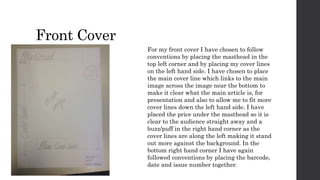
Flat Plans 
Planning
Front Cover 
For my front cover I have chosen to follow 
conventions by placing the masthead in the 
top left corner and by placing my cover lines 
on the left hand side. I have chosen to place 
the main cover line which links to the main 
image across the image near the bottom to 
make it clear what the main article is, for 
presentation and also to allow me to fit more 
cover lines down the left hand side. I have 
placed the price under the masthead so it is 
clear to the audience straight away and a 
buzz/puff in the right hand corner as the 
cover lines are along the left making it stand 
out more against the background. In the 
bottom right hand corner I have again 
followed conventions by placing the barcode, 
date and issue number together.
Contents Page 
My flat plan for my contents page shows how I 
plan to layout my contents page. I would like to 
place my title along the top with a small 
subheading underneath with a brief explanation 
of this issue. Under this on the left I would like 
to place an image and on the right hand side of 
this a small title and text from the editor. Below 
the image I will place my regulars in an informal 
way as the text and numbers aren’t in neat 
boxes/squares. I chose to do this because the rest 
of my contents page is formal and it creates a 
sense of edginess. Next to my regulars will be 
links to social networking as social networking is 
very popular among my chosen audience. Below 
this I will have an image with a brief 
subheading below it. Finally, along the right 
hand side running from top to bottom will be my 
features with the folio in the bottom corner.
Double Page Spread 
I have designed my dps to have the title along the top 
with a brief subheading below it including 
appropriate credits such as interviewer. I then begin 
my questions with a drop cap. I chose to do this as it 
is very common in magazines of similar genres and 
also for presentation as it looks less boring than just 
having the same consistent text. I have laid my text 
out to have the question above and then the response 
below it. They are shown in a formal way and are 
next to each other neatly. I did this so the flow of the 
article will be clear for the audience. On the right 
page, I will place an image to allow the audience to 
see who is being interviewed and to make the 
personality that is being expressed through the 
interview is there visually to. On my image I will 
place a pull-quote to entice the audience to read into 
the interview and also presentational features as it 
looks good and is common in magazines of all genres.

Flat plans

  • 1.
  • 2.
    Front Cover Formy front cover I have chosen to follow conventions by placing the masthead in the top left corner and by placing my cover lines on the left hand side. I have chosen to place the main cover line which links to the main image across the image near the bottom to make it clear what the main article is, for presentation and also to allow me to fit more cover lines down the left hand side. I have placed the price under the masthead so it is clear to the audience straight away and a buzz/puff in the right hand corner as the cover lines are along the left making it stand out more against the background. In the bottom right hand corner I have again followed conventions by placing the barcode, date and issue number together.
  • 3.
    Contents Page Myflat plan for my contents page shows how I plan to layout my contents page. I would like to place my title along the top with a small subheading underneath with a brief explanation of this issue. Under this on the left I would like to place an image and on the right hand side of this a small title and text from the editor. Below the image I will place my regulars in an informal way as the text and numbers aren’t in neat boxes/squares. I chose to do this because the rest of my contents page is formal and it creates a sense of edginess. Next to my regulars will be links to social networking as social networking is very popular among my chosen audience. Below this I will have an image with a brief subheading below it. Finally, along the right hand side running from top to bottom will be my features with the folio in the bottom corner.
  • 4.
    Double Page Spread I have designed my dps to have the title along the top with a brief subheading below it including appropriate credits such as interviewer. I then begin my questions with a drop cap. I chose to do this as it is very common in magazines of similar genres and also for presentation as it looks less boring than just having the same consistent text. I have laid my text out to have the question above and then the response below it. They are shown in a formal way and are next to each other neatly. I did this so the flow of the article will be clear for the audience. On the right page, I will place an image to allow the audience to see who is being interviewed and to make the personality that is being expressed through the interview is there visually to. On my image I will place a pull-quote to entice the audience to read into the interview and also presentational features as it looks good and is common in magazines of all genres.