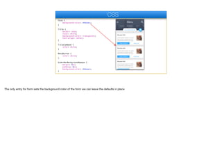
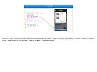
Extracting ui Design - part III
In this part we’ll review the CSS required to bind the application UI
CSS
© Codename One 2017 all rights reserved
If you haven’t done so I’d recommend checking out the video or material about CSS integration in Codename One as this section assumes it’s something that you are
familiar with
#Constants {
includeNativeBool: false;
rendererShowsNumbersBool: false;
}
Container {
background-color: transparent;
padding: 0px;
margin: 0px;
}
Label {
background-color: transparent;
color: black;
font-family: "native:MainThin";
font-size: 3mm;
}
List {
background-color: transparent;
margin: 0px;
}
CSS
The constants selector is a special case for theme constants. Normally, includeNativeBool must be true but in this case we have a layered theme and setting this to false
works around some issues. The rendererShowsNumbersBool flag hides numbers in the list renderer which you normally should define if you use lists.

For most themes Container and Label are transparent but not in all themes so it’s important to define these. 0 padding and margin are also very important for a container,
they should be there by default but this makes sure. Other than that we just set a decent font for the label.
Form {
background-color: #ebeaec;
}
Title {
border: none;
color: white;
background-color: transparent;
text-align: center;
}
TitleCommand {
color: white;
}
MenuButton {
color: white;
}
OrderBarBackgroundOpaque {
margin: 0px;
padding: 0px;
background-color: #ebeaec;
}
CSS
The only entry for form sets the background color of the form we can leave the defaults in place
Form {
background-color: #ebeaec;
}
Title {
border: none;
color: white;
background-color: transparent;
text-align: center;
}
TitleCommand {
color: white;
}
MenuButton {
color: white;
}
OrderBarBackgroundOpaque {
margin: 0px;
padding: 0px;
background-color: #ebeaec;
}
CSS
The title UIID makes sure the title is transparent but most importantly it disables a border that might be applied to that UIID by the native theme. It also enforces center
alignment which is the default in iOS but not on Android
Form {
background-color: #ebeaec;
}
Title {
border: none;
color: white;
background-color: transparent;
text-align: center;
}
TitleCommand {
color: white;
}
MenuButton {
color: white;
}
OrderBarBackgroundOpaque {
margin: 0px;
padding: 0px;
background-color: #ebeaec;
}
CSS
The command and menu color is set thru these two UIID’s
Form {
background-color: #ebeaec;
}
Title {
border: none;
color: white;
background-color: transparent;
text-align: center;
}
TitleCommand {
color: white;
}
MenuButton {
color: white;
}
OrderBarBackgroundOpaque {
margin: 0px;
padding: 0px;
background-color: #ebeaec;
}
CSS
I mentioned before that the area here is a special component that abstracts the view of the underlying image. This component is of the same color as the form color with
no margin so we will get the visual effect of the buttons peeking bellow the image.
TopBar {
margin: 0px;
padding: 0px;
background-image: url(images/title-image.jpg);
cn1-background-type: cn1-image-scaled-fill;
}
YourOrder {
border: cn1-pill-border;
background-color: white;
color: #31aaff;
padding-left: 3mm;
padding-right: 4mm;
padding-top: 2mm;
padding-bottom: 3mm;
margin: 0px 1mm 1mm 1mm;
box-shadow: 0 0 0 1mm rgba(0,0,0,0.2);
}
CSS
We place the title image that we cut out before in the background on top with the scale to fill option. This allows it to fill up available space and possibly overflow from the
sides, top or bottom.
TopBar {
margin: 0px;
padding: 0px;
background-image: url(images/title-image.jpg);
cn1-background-type: cn1-image-scaled-fill;
}
YourOrder {
border: cn1-pill-border;
background-color: white;
color: #31aaff;
padding-left: 3mm;
padding-right: 4mm;
padding-top: 2mm;
padding-bottom: 3mm;
margin: 0px 1mm 1mm 1mm;
box-shadow: 0 0 0 1mm rgba(0,0,0,0.2);
}
CSS
The order section on top uses a round rectangle border which in css is defined as a pill border. Notice the generous amount of padding to push the border so it won’t
seem cramped. Also notice that the right padding isn’t even…

The reason for that is the shadow of the round border that is technically a part of the border, since the shadow is cast to the bottom/right we need more padding on those
sides.
ShoppingCart {
border: cn1-round-border;
box-shadow: 0 0 0 1mm rgba(0,0,0,0.3);
background-color: #31aaff;
color: white;
padding: 2mm 2mm 3mm 1mm;
margin: 0px 3mm 0mm 1mm;
}
ListRenderer {
background-color: transparent;
color: #aaaaaa;
font-family: "native:MainThin";
font-size: 3mm;
text-align: center;
border: none;
}
CSS
The shopping cart icon uses a regular round border, it’s the same border type as the pill border in Codename One but in css they are defined differently. Notice the usage
of margin to push the border from the right side to distance it from the right edge of the form.
ShoppingCart {
border: cn1-round-border;
box-shadow: 0 0 0 1mm rgba(0,0,0,0.3);
background-color: #31aaff;
color: white;
padding: 2mm 2mm 3mm 1mm;
margin: 0px 3mm 0mm 1mm;
}
ListRenderer {
background-color: transparent;
color: #aaaaaa;
font-family: "native:MainThin";
font-size: 3mm;
text-align: center;
border: none;
}
CSS
The list renderer is opaque by default so we need to specify it as transparent. In the design the text is slightly translucent but that’s a bit expensive and makes the text
too hard to read. Instead I chose to just give it a grayish color which produces a similar effect without performance implications and better readability.

I also had to align the text to the center as it’s aligned to the left by default and that looks weird in the carousel mode
ListRenderer.selected {
color: white;
background-color: transparent;
}
ListRendererFocus {
background-color: transparent;
}
DishListTitle {
background-color: transparent;
color: black;
font-family: "native:MainLight";
font-size: 3mm;
}
DishListBody {
background-color: transparent;
color: #989898;
font-family: "native:MainThin";
font-size: 3mm;
}
CSS
The selected version of the renderer is white and appears in the center. The positioning of the selected element and its behavior are determined in the code.
ListRenderer.selected {
color: white;
background-color: transparent;
}
ListRendererFocus {
background-color: transparent;
}
DishListTitle {
background-color: transparent;
color: black;
font-family: "native:MainLight";
font-size: 3mm;
}
DishListBody {
background-color: transparent;
color: #989898;
font-family: "native:MainThin";
font-size: 3mm;
}
CSS
The title of each dish entry is determined here, I use a decent font and size although in a later revision I made the one larger which improved the design
ListRenderer.selected {
color: white;
background-color: transparent;
}
ListRendererFocus {
background-color: transparent;
}
DishListTitle {
background-color: transparent;
color: black;
font-family: "native:MainLight";
font-size: 3mm;
}
DishListBody {
background-color: transparent;
color: #989898;
font-family: "native:MainThin";
font-size: 3mm;
}
CSS
I copied the color of the text from the PSD file for the body and used a thinner font to differentiate from the title.
AddToOrderButton {
padding-top: 1mm;
padding-bottom: 1mm;
padding-left: 2mm;
padding-right: 2mm;
margin: 0px;
text-align: center;
color: white;
}
MoreInfoButton {
padding-top: 1mm;
padding-bottom: 1mm;
padding-left: 2mm;
padding-right: 2mm;
margin: 0px;
text-align: center;
color: #31aaff;
}
WhiteSeparatorLine {
background-color: white;
padding: 1px 3mm 1px 3mm;
margin: 0px;
}
CSS
The border of the buttons is a 9-piece image border. I defined it in the theme itself with the GUI tool as I found that to be easier and more reliable. That might be due to
personal habit as I’m not used to CSS.

I used some padding to space out the content of the button.
AddToOrderButton {
padding-top: 1mm;
padding-bottom: 1mm;
padding-left: 2mm;
padding-right: 2mm;
margin: 0px;
text-align: center;
color: white;
}
MoreInfoButton {
padding-top: 1mm;
padding-bottom: 1mm;
padding-left: 2mm;
padding-right: 2mm;
margin: 0px;
text-align: center;
color: #31aaff;
}
WhiteSeparatorLine {
background-color: white;
padding: 1px 3mm 1px 3mm;
margin: 0px;
}
CSS
A common trick to implementing a separator line is to use 1 pixel padding with an opaque or translucent color. That’s what I did here. I also added 3 millimeter padding
on both sides to make sure the separator spans correctly in this case
DishCheckoutTitle {
background-color: transparent;
color: black;
font-family: "native:MainThin";
font-size: 3mm;
}
CheckoutPrice {
background-color: transparent;
color: #31aaff;
font-family: "native:MainThin";
font-size: 2.5mm;
}
PriceTotal {
background-color: transparent;
color: #31aaff;
font-family: "native:MainThin";
font-size: 3.5mm;
padding: 2mm 1mm 1mm 1mm;
text-align: right;
}
CSS
Moving on to the checkout UI most of the details in this page are relatively simple. The one thing that’s slightly different but reasonably obvious is the right alignment of
the price total entry
CheckoutButton {
cn1-derive: AddToOrderButton;
font-family: "native:MainRegular";
font-size: 4mm;
padding: 2mm;
margin: 2mm 2mm 2mm 2mm;
text-align: center;
color: white;
}
PaymentDialogTop {
margin: 2mm 2mm 0px 2mm;
padding: 3.5mm 3.5mm 1.5mm 3.5mm;
}
PaymentDialogBottom {
margin: 0mm 2mm 0px 2mm;
padding: 3.5mm;
}
CSS
The checkout button derives from the add to order button and increases the size, padding & margin of everything. Using inheritance in this way is valuable as it allows us
to reuse a design element and thus save RAM in cases like this where a 9-piece border is used
CheckoutButton {
cn1-derive: AddToOrderButton;
font-family: "native:MainRegular";
font-size: 4mm;
padding: 2mm;
margin: 2mm 2mm 2mm 2mm;
text-align: center;
color: white;
}
PaymentDialogTop {
margin: 2mm 2mm 0px 2mm;
padding: 3.5mm 3.5mm 1.5mm 3.5mm;
}
PaymentDialogBottom {
margin: 0mm 2mm 0px 2mm;
padding: 3.5mm;
}
CSS
The pieces we cut for the receipt background were cut into a 9-piece border in the theme designer here we define the padding and margin.

The padding is requires so the text won’t exceed the boundaries of the 9-piece image and the margin helps us space the component from the edges. Notice the top/
bottom margins are 0 so the two separate pieces can touch

Extracting ui Design - part 3 - transcript.pdf

  • 1.
    Extracting ui Design- part III In this part we’ll review the CSS required to bind the application UI
  • 2.
    CSS © Codename One2017 all rights reserved If you haven’t done so I’d recommend checking out the video or material about CSS integration in Codename One as this section assumes it’s something that you are familiar with
  • 3.
    #Constants { includeNativeBool: false; rendererShowsNumbersBool:false; } Container { background-color: transparent; padding: 0px; margin: 0px; } Label { background-color: transparent; color: black; font-family: "native:MainThin"; font-size: 3mm; } List { background-color: transparent; margin: 0px; } CSS The constants selector is a special case for theme constants. Normally, includeNativeBool must be true but in this case we have a layered theme and setting this to false works around some issues. The rendererShowsNumbersBool flag hides numbers in the list renderer which you normally should define if you use lists. For most themes Container and Label are transparent but not in all themes so it’s important to define these. 0 padding and margin are also very important for a container, they should be there by default but this makes sure. Other than that we just set a decent font for the label.
  • 4.
    Form { background-color: #ebeaec; } Title{ border: none; color: white; background-color: transparent; text-align: center; } TitleCommand { color: white; } MenuButton { color: white; } OrderBarBackgroundOpaque { margin: 0px; padding: 0px; background-color: #ebeaec; } CSS The only entry for form sets the background color of the form we can leave the defaults in place
  • 5.
    Form { background-color: #ebeaec; } Title{ border: none; color: white; background-color: transparent; text-align: center; } TitleCommand { color: white; } MenuButton { color: white; } OrderBarBackgroundOpaque { margin: 0px; padding: 0px; background-color: #ebeaec; } CSS The title UIID makes sure the title is transparent but most importantly it disables a border that might be applied to that UIID by the native theme. It also enforces center alignment which is the default in iOS but not on Android
  • 6.
    Form { background-color: #ebeaec; } Title{ border: none; color: white; background-color: transparent; text-align: center; } TitleCommand { color: white; } MenuButton { color: white; } OrderBarBackgroundOpaque { margin: 0px; padding: 0px; background-color: #ebeaec; } CSS The command and menu color is set thru these two UIID’s
  • 7.
    Form { background-color: #ebeaec; } Title{ border: none; color: white; background-color: transparent; text-align: center; } TitleCommand { color: white; } MenuButton { color: white; } OrderBarBackgroundOpaque { margin: 0px; padding: 0px; background-color: #ebeaec; } CSS I mentioned before that the area here is a special component that abstracts the view of the underlying image. This component is of the same color as the form color with no margin so we will get the visual effect of the buttons peeking bellow the image.
  • 8.
    TopBar { margin: 0px; padding:0px; background-image: url(images/title-image.jpg); cn1-background-type: cn1-image-scaled-fill; } YourOrder { border: cn1-pill-border; background-color: white; color: #31aaff; padding-left: 3mm; padding-right: 4mm; padding-top: 2mm; padding-bottom: 3mm; margin: 0px 1mm 1mm 1mm; box-shadow: 0 0 0 1mm rgba(0,0,0,0.2); } CSS We place the title image that we cut out before in the background on top with the scale to fill option. This allows it to fill up available space and possibly overflow from the sides, top or bottom.
  • 9.
    TopBar { margin: 0px; padding:0px; background-image: url(images/title-image.jpg); cn1-background-type: cn1-image-scaled-fill; } YourOrder { border: cn1-pill-border; background-color: white; color: #31aaff; padding-left: 3mm; padding-right: 4mm; padding-top: 2mm; padding-bottom: 3mm; margin: 0px 1mm 1mm 1mm; box-shadow: 0 0 0 1mm rgba(0,0,0,0.2); } CSS The order section on top uses a round rectangle border which in css is defined as a pill border. Notice the generous amount of padding to push the border so it won’t seem cramped. Also notice that the right padding isn’t even… The reason for that is the shadow of the round border that is technically a part of the border, since the shadow is cast to the bottom/right we need more padding on those sides.
  • 10.
    ShoppingCart { border: cn1-round-border; box-shadow:0 0 0 1mm rgba(0,0,0,0.3); background-color: #31aaff; color: white; padding: 2mm 2mm 3mm 1mm; margin: 0px 3mm 0mm 1mm; } ListRenderer { background-color: transparent; color: #aaaaaa; font-family: "native:MainThin"; font-size: 3mm; text-align: center; border: none; } CSS The shopping cart icon uses a regular round border, it’s the same border type as the pill border in Codename One but in css they are defined differently. Notice the usage of margin to push the border from the right side to distance it from the right edge of the form.
  • 11.
    ShoppingCart { border: cn1-round-border; box-shadow:0 0 0 1mm rgba(0,0,0,0.3); background-color: #31aaff; color: white; padding: 2mm 2mm 3mm 1mm; margin: 0px 3mm 0mm 1mm; } ListRenderer { background-color: transparent; color: #aaaaaa; font-family: "native:MainThin"; font-size: 3mm; text-align: center; border: none; } CSS The list renderer is opaque by default so we need to specify it as transparent. In the design the text is slightly translucent but that’s a bit expensive and makes the text too hard to read. Instead I chose to just give it a grayish color which produces a similar effect without performance implications and better readability. I also had to align the text to the center as it’s aligned to the left by default and that looks weird in the carousel mode
  • 12.
    ListRenderer.selected { color: white; background-color:transparent; } ListRendererFocus { background-color: transparent; } DishListTitle { background-color: transparent; color: black; font-family: "native:MainLight"; font-size: 3mm; } DishListBody { background-color: transparent; color: #989898; font-family: "native:MainThin"; font-size: 3mm; } CSS The selected version of the renderer is white and appears in the center. The positioning of the selected element and its behavior are determined in the code.
  • 13.
    ListRenderer.selected { color: white; background-color:transparent; } ListRendererFocus { background-color: transparent; } DishListTitle { background-color: transparent; color: black; font-family: "native:MainLight"; font-size: 3mm; } DishListBody { background-color: transparent; color: #989898; font-family: "native:MainThin"; font-size: 3mm; } CSS The title of each dish entry is determined here, I use a decent font and size although in a later revision I made the one larger which improved the design
  • 14.
    ListRenderer.selected { color: white; background-color:transparent; } ListRendererFocus { background-color: transparent; } DishListTitle { background-color: transparent; color: black; font-family: "native:MainLight"; font-size: 3mm; } DishListBody { background-color: transparent; color: #989898; font-family: "native:MainThin"; font-size: 3mm; } CSS I copied the color of the text from the PSD file for the body and used a thinner font to differentiate from the title.
  • 15.
    AddToOrderButton { padding-top: 1mm; padding-bottom:1mm; padding-left: 2mm; padding-right: 2mm; margin: 0px; text-align: center; color: white; } MoreInfoButton { padding-top: 1mm; padding-bottom: 1mm; padding-left: 2mm; padding-right: 2mm; margin: 0px; text-align: center; color: #31aaff; } WhiteSeparatorLine { background-color: white; padding: 1px 3mm 1px 3mm; margin: 0px; } CSS The border of the buttons is a 9-piece image border. I defined it in the theme itself with the GUI tool as I found that to be easier and more reliable. That might be due to personal habit as I’m not used to CSS.
 I used some padding to space out the content of the button.
  • 16.
    AddToOrderButton { padding-top: 1mm; padding-bottom:1mm; padding-left: 2mm; padding-right: 2mm; margin: 0px; text-align: center; color: white; } MoreInfoButton { padding-top: 1mm; padding-bottom: 1mm; padding-left: 2mm; padding-right: 2mm; margin: 0px; text-align: center; color: #31aaff; } WhiteSeparatorLine { background-color: white; padding: 1px 3mm 1px 3mm; margin: 0px; } CSS A common trick to implementing a separator line is to use 1 pixel padding with an opaque or translucent color. That’s what I did here. I also added 3 millimeter padding on both sides to make sure the separator spans correctly in this case
  • 17.
    DishCheckoutTitle { background-color: transparent; color:black; font-family: "native:MainThin"; font-size: 3mm; } CheckoutPrice { background-color: transparent; color: #31aaff; font-family: "native:MainThin"; font-size: 2.5mm; } PriceTotal { background-color: transparent; color: #31aaff; font-family: "native:MainThin"; font-size: 3.5mm; padding: 2mm 1mm 1mm 1mm; text-align: right; } CSS Moving on to the checkout UI most of the details in this page are relatively simple. The one thing that’s slightly different but reasonably obvious is the right alignment of the price total entry
  • 18.
    CheckoutButton { cn1-derive: AddToOrderButton; font-family:"native:MainRegular"; font-size: 4mm; padding: 2mm; margin: 2mm 2mm 2mm 2mm; text-align: center; color: white; } PaymentDialogTop { margin: 2mm 2mm 0px 2mm; padding: 3.5mm 3.5mm 1.5mm 3.5mm; } PaymentDialogBottom { margin: 0mm 2mm 0px 2mm; padding: 3.5mm; } CSS The checkout button derives from the add to order button and increases the size, padding & margin of everything. Using inheritance in this way is valuable as it allows us to reuse a design element and thus save RAM in cases like this where a 9-piece border is used
  • 19.
    CheckoutButton { cn1-derive: AddToOrderButton; font-family:"native:MainRegular"; font-size: 4mm; padding: 2mm; margin: 2mm 2mm 2mm 2mm; text-align: center; color: white; } PaymentDialogTop { margin: 2mm 2mm 0px 2mm; padding: 3.5mm 3.5mm 1.5mm 3.5mm; } PaymentDialogBottom { margin: 0mm 2mm 0px 2mm; padding: 3.5mm; } CSS The pieces we cut for the receipt background were cut into a 9-piece border in the theme designer here we define the padding and margin. The padding is requires so the text won’t exceed the boundaries of the 9-piece image and the margin helps us space the component from the edges. Notice the top/ bottom margins are 0 so the two separate pieces can touch