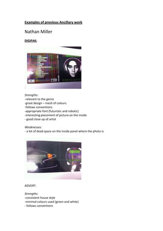
Examples of previous Ancillary work

Nathan Miller
DIGIPAK:


Strengths:
-relevant to the genre
-great design – mesh of colours
-follows conventions
-appropriate font (futuristic and robotic)
-interesting placement of picture on the inside
- good close up of artist

Weaknesses:
- a lot of dead space on the inside panel where the photo is


ADVERT:

Strengths:
-consistent house style
-minimal colours used (green and white)
- follows conventions
Weaknesses:
- seems to be randomly arranged


Messie M
DIGIPAK:
Strengths:
-follows conventions (barcode, label etc)
-consisent font
-clear images
-appropriate effects


Weaknesses:
- Back picture seems a bit inappropriate
- Not great placement of the picture on the CD (hole should have been on the ear to
make it appear like headphones)

ADVERT:
Strengths:
-consistent colour scheme (house style)
- concise and to the point
- clear link to the digipak
- follows conventions


Weaknesses:
-the company logos are missing (HMV, iTunes, amazon) – just written in blue rather
then the actual image


Poppy Power
DIGIPAK:


Strengths:
- consistent link between colours in the video and in the digipak
- consistency (all aspects)
- clear, legible font
- follow conventions: barcode, labels, copyright information
- good placement of images
- appropriate costume
- simple but effective


Weaknesses:
Hardly any!


ADVERT:
Strengths:
- consistency between ancillaries
- follows conventions
- interesting placement of pictures and text.


Weaknesses:
- phrasing is a bit odd “available digitally”

Examples Of Previous Ancillary Work

  • 1.
    Examples of previousAncillary work Nathan Miller DIGIPAK: Strengths: -relevant to the genre -great design – mesh of colours -follows conventions -appropriate font (futuristic and robotic) -interesting placement of picture on the inside - good close up of artist Weaknesses: - a lot of dead space on the inside panel where the photo is ADVERT: Strengths: -consistent house style -minimal colours used (green and white) - follows conventions
  • 2.
    Weaknesses: - seems tobe randomly arranged Messie M DIGIPAK: Strengths: -follows conventions (barcode, label etc) -consisent font -clear images -appropriate effects Weaknesses: - Back picture seems a bit inappropriate - Not great placement of the picture on the CD (hole should have been on the ear to make it appear like headphones) ADVERT: Strengths: -consistent colour scheme (house style) - concise and to the point
  • 3.
    - clear linkto the digipak - follows conventions Weaknesses: -the company logos are missing (HMV, iTunes, amazon) – just written in blue rather then the actual image Poppy Power DIGIPAK: Strengths: - consistent link between colours in the video and in the digipak - consistency (all aspects)
  • 4.
    - clear, legiblefont - follow conventions: barcode, labels, copyright information - good placement of images - appropriate costume - simple but effective Weaknesses: Hardly any! ADVERT: Strengths: - consistency between ancillaries - follows conventions - interesting placement of pictures and text. Weaknesses: - phrasing is a bit odd “available digitally”