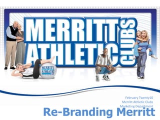
2. Repackaging the Merritt Brand Table of Contents Brand Positioning The new branded look for Merritt Athletic Clubs accomplishes two major challenges for the company. Update the Merritt brand in the mind of the consumer to a fresh contemporary look. Preserve the existing heritage of the Merritt logo to prevent major capital investment in changing building signage and equipment coverings. The new brand image has both contemporary and traditional elements to take the consumer through an easy transition of how they perceive and identify Merritt. While the look and colors are completely different, they will immediately identify them as Merritt Athletic Clubs saving any market identity adjustment and making the roll-out of the look seamless.
11. Red used only to draw emphasis to contact information (including online clicks) and USP Results logo
12. A photo inclusion would take the dotted “movement lines” and wrap around the photo to show movement. All photos used would be either action shots or contemporary close-in lifestyle shots and be color coordinated with the art.All materials would adhere to this new color and graphic theme, including print ads, redesign of Merritt website, External signage and internal schedules, signs, flyers and brochures.
13. Branded Look The components of our designs that make up the Merritt brand. New Established Merritt colors are: PMS Reflux blue Dark blue 2745 Light blue 2995 Red 200 White Contemporary lifestyle shots or exercise shots used and re-colored to coordinate with graphic elements. Photos wrapped in dotted “movement lines” Grey dotted grid Stacked outlined headline font The “wave and swish” design is subtlety integrated in white blue and grey as an accent and a carryover from the pre-existing branded look The Merritt logo appears in Reflux and 2995 in a white outlined ball Contact information in red 200 or blue 2745 Locations address block conveys the convenience of multiple locations near where you live and work Merritt’s USP: Results Guarantee is on all advertising.
14. Graphic Elements of the Branded Look Table of Contents Brand Positioning Contemporary stacked font for headlines Merritt logo in Reflux and 2995 Grey dot grid Rounded corner gradient boxes with white and grey accent outlines Dotted “movement lines” “Wave and Swish” in white, grey and reflux
15. Merritt’s New Official Colors Table of Contents Brand Positioning Red used for contact information White used as a dominant color in all designs and grey used for accents and on the dotted grid graphic.
22. Viral Marketing Our Viral Brand presence includes our club website, our own social network site, Facebook, Twitter and MySpace in addition to online advertising and Google analytics.
23. Viral Marketing Frequent eBlasts to both Prospects and members promote our online sales offers and special programs
24. Summer Member Referral Campaign This is our “Red Hot Summer” Promotion with the new look. We do a t-shirt give-away for every member that refers three friends names and give away one grill per club in a drawing at the end of the promotion. Members are entered in the drawing each time one of their referred friends joins. T-shirt art concept screened on a Navy blue gradient died shirt
25. Program Brochures And Flyers Branding all elements of our marketing, including all of our members programs serves to solidify the complete Merritt brand package and convey the consistent quality of the Merritt brand across all nine of our clubs.