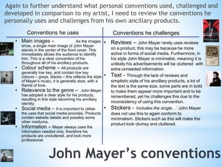
Evaluation – question 1.
In order to look back and see what conventions I did 
and did not follow, I must reconsider the conventions 
from the pop genre. I used research from theorist 
Andrew Goodwin, and used this to influence my pre-production 
choices for my product. 
This is my initial genre 
research, and looking back at 
my product I can see how this 
influenced my final decisions, 
having used many of the 
conventions stated. These are 
music video conventions. 
Conducting this research also made me more aware of what is considered 
before creating a music video, how this will appear to the target audience, 
and how they will respond. Through all these being used in Rhianna ft. 
Drake ‘What’s my name’ and this song having huge popularity, I know that 
these conventions work for the pop genre, and conform to audiences 
expectations.
This is my personal research into the pop genre, and this helped me 
identify more obscure conventions, understanding the aims of the 
genre. Again this helped me apply this to John Mayer’s work so I 
could see what conventions were and weren’t present in his work. 
I then looked at real media texts 
from established pop artists. I 
learnt how these conventions, 
from my own research and 
theorists research were applied 
to products, and how they are 
adapted to suit the artists styles 
and needs. They all followed 
conventions, just in different 
manners. This helped me 
understand how to conform to 
conventions, but also diverge 
away. And I learnt more about 
why John Mayer’s production 
style and how he applies these 
conventions in his personal music 
videos.
Reviewing John Mayer’s music videos, I have identified 
what conventions he personally does and doesn’t use. 
Conventions he uses Conventions he challenges 
• Performance element – this is 
something Goodwin identifies, and this is 
present in all of John Mayer’s music 
videos, present either with a guitar or 
miming. This conforms to his acoustic 
style of song. 
• Emphasis on production – Many 
music videos of him are in the studio, or 
with him on stage in concert. This shows 
his dedication and puts an emphasis on 
the production of his products and the 
technology involved. 
• Close ups – He uses close ups, but not 
all the time – and this partly conforms to 
conventions, as Goodwin states ‘lots of 
close-ups’ 
• Narrative – In most music videos, a 
clear narrative is used – and this is an 
important convention of the genre. 
Mostly they are relationship orientated – 
which conforms further to genre 
expectations. 
• Voyeuristic treatment of women – 
Due to the slow, steady beat to John 
Mayer’s songs, they are more romantic than 
wild. Therefore it would be inappropriate to 
use women in such ways, therefore he 
doesn’t conform to such convention. 
• Close ups – His main shots are a mid to 
long shot, whereas in a song ft. Katy Perry, 
a close up shot is constantly used – this may 
be because she is more conformist to pop 
genre conventions. 
• Mise-en-scene – There is a lack of 
emphasis with mise-en-scene – very low key 
and simple, John Mayer wearing casual 
clothing in a relatable location. Naturalistic. 
• Link between visuals, music and 
lyrics - John Mayer focuses further on the 
pragmatics of the lyrics, and focuses more 
on a narrative/to portray a message rather 
than creating links between the 3 
conventional factors
I must evaluate what conventions I did and did not use, doing 
this will then allow me to explain why I chose to do this. 
Conventions I used Conventions I challenged 
• A link between the visuals, 
lyrics and music. 
• Mise-en-scene 
• Narrative 
• Dancing 
• Voyeuristic treatment of the 
female body 
• Reflecting existing trends 
• Colouring 
After creating this table, I have realised how much I have conformed to 
John Mayer’s conventions, and further to pop genre conventions.
A link between visuals, lyrics and music - During the pre-production phase of the project, whilst on my first shooting 
script with the lyrics, I found my ideas were best fitted to create this visual link, this is partly because I was influenced by having 
the lyrics in front of me, so I conformed to what they were saying, and it is also easier to create a narrative using this style. I knew 
not to make the narrative too complicated, because to due not being advanced or confident enough to make it extremely effective. 
Furthermore, a generic convention with my chosen genre is the link, therefore I am conforming. Whilst I conform to pop genre 
conventions, I challenge John Mayer, who does not identify with the link. I challenged John Mayer because many of his videos simply 
feature him miming to the music, which is not something I wanted to feature within my music video. 
Mise-en-scene - My mise-en-scene used is simplistic and representative of the type of song and romance. Therefore it is suited 
to the type of song, which conforms to genre stereotypes. The use of the field shows the rurality of the song, and romanticises the 
themes of love within it. I put thought in consideration into the planning, knowing which section of countryside I wanted to use, and 
what clothes I wanted my actors to wear, for example, I knew for the dancing section I wanted a black leotard and black skirt to be 
worn. This is because this is a neutral outfit, a typical dancing uniform. This keeps these sections formal and smart - serious. By 
wearing such outfit, it keeps the section non-sexual, because the outfit conforms to the style of dance and keeps the formality in 
place. I chose to do this because I thought they were relevant towards the song and how it portrays the message, furthermore, I 
enjoyed shooting the footage more because I enjoyed the location I was in. 
Narrative - Another genre convention is the use of a narrative, I conform to this, using a narrative of romance. I chose to use this 
style of narrative because the song is primarily about love ‘I’m a bad boy for breaking her heart’ and there is an emphasis on love 
styled narratives within this genre - so automatically I thought about creating this styled narrative through being influenced by other 
media texts. 
Dancing - Whilst this comes under the headline ‘performance elements’ in my personal genre research I found that a separate 
pop genre convention is the encouragement of dance, and being dance orientated. I conform to this, because I use a softer style of 
dance that features within normal pop products - hiphop normally features - that is more suited to the song, I chose to conform to 
this convention because it suits the soft style of song I’ve used, and provides variation for my audience, so the whole product isn’t 
based around a narrative. This is positive as some narratives can become boring throughout the song, whereas this provides relief 
from it for my audience. I also enjoyed helping to choreograph certain movements - being able to visualise them in my head, I knew 
what I wanted. I enjoy dancing so understood how to make it look effective, it also enhanced skills as I had to learn how to make 
these look effective through choosing a camera angle best for the move, and also edit these into my product. This gave me more 
skills to present. 
6
Voyeuristic treatment of the female body - This is a convention I have not followed. This is 
because it does not fit within the themes of my product - as it is a slow, soft song about the nature of love, 
featuring no fast beats or explicit content, which are features that stereotypically accompany such 
conventions. Such representations don’t fit to the songs or my ideas - it would also seen as degrading for a 
female within this style of song, it simply does not conform to the conventions for its use. 
Reflecting existing trends - My product does not reflect any existing trends - such as fashion. I 
consciously chose not to do this because I feel my product doesn’t need to focus on such things, instead I chose 
to focus more on the cinematography elements, and meanings this will create rather than conforming to world 
trends. 
Colouring - I think I challenge conventions of colour. In pop genre music videos, colours are always 
representative of the style of song - for example, Rhianna’s ‘What’s my name’ Uses many vibrant colours, 
which represent the light hearted nature of the song, whilst Sam Smiths ‘Stay’ uses low key lighting, which 
shows the sadness of the song. Whilst for my own product I use black and white - which conforms to 
conventions because they are dull colours, which conform to the song, and also to John Mayer’s style (many of 
his videos such as ‘Waiting on the world to change’ are in black and white). However, I develop this to again 
suit my product more because I use vey dull, rural - green- colours, which does not conform to genre 
conventions, as they’re all similar. However, I think it suits my products style. 
Also, the simple feature of miming does not feature in my music video. I challenge this convention because it is 
a popular feature within music videos and within John Mayer’s personal conventions, however, I chose against 
using this convention because I didn’t feel it fit in with my narrative, and it would be difficult to make it look 
natural for my actors. 
7
Performance element – I challenged the performance element through using John Mayer’s 
convention of playing the guitar, whilst I do this I challenged this convention by changing the way I 
have showed it. I use many close ups, which does not conform to John Mayer’s use of it, as he is 
normally featured using a long shot. This is so the audience can see him playing the guitar, whereas I 
wanted to focus on the actual playing of the guitar. Therefore I have used this as a convention, but 
developed it to suit my own product. 
Close ups - I develop the use of close ups because I use them, yet not as often as a true part of the 
convention would. Therefore it is a convention that I use, by using close up shots, however I challenge 
it by using more. This is because I knew that other shots would look better in their place, and so I used 
close ups occasionally to create a variation in shots. 
Colouring - I think I challenge conventions of colour. In pop genre music videos, colours are always 
representative of the style of song - for example, Rhianna’s ‘What’s my name’ Uses many vibrant 
colours, which represent the light hearted nature of the song, whilst Sam Smiths ‘Stay’ uses low key 
lighting, which shows the sadness of the song. Whilst for my own product I use black and white - which 
conforms to conventions because they are dull colours, which conform to the song, and also to John 
Mayer’s style (many of his videos such as ‘Waiting on the world to change’ are in black and white). 
However, I develop this to again suit my product more because I use vey dull, rural - green- colours, 
which does not conform to genre conventions, as they’re all similar. However, I think it suits my 
products style. 
8
What are the conventions of digipaks and advertisements? 
I have conducted smaller amounts of research into this aspect of the 
task in comparison to my genre research. I ensured I discovered 
everything that would need to be included, and things that would not. I 
further conducted artist ancillary product research, so I could see John 
Mayer’s conventions and compare them against genre conventions. 
Doing this allowed me to gather more ideas for my personal ancillary 
products, and seeing what conventions I did and did not like, I also 
looked at personal digipaks I owned to gather a real life perspective of 
their functioning, and whether I wanted to use a 6 or 4 panel wallet. 
9
To be able to identify what conventions I did and didn’t use, I must 
again identify what the conventions of ancillary products are. 
Conventions of digipaks Conventions of advertisements 
10 
• Main images - These are the main promoters of 
the pack, and link to production, they must be eye 
catching, relevant to the product, and contain critical 
information such as name of the artist/album, song 
names, music label, bar codes. 
• Relevance to the genre – The product music 
be representative of the genre so audiences will be 
able to identify and label. 
• Reviews - Reviews will make the product look 
more in demand, and this may influence audiences 
to buy the album who are fans of the magazine. 
• Colour scheme – The colour scheme used 
conventionally reflects the mood of the album and 
artist. 
• Information – Track list, artist, titles, basic 
background information, acknowledgments. 
• Images - They are always images of the artist on 
the advertisement, this means the audience can make 
connections to the artist. Again through being eye 
catching it will help the audience remember it, and this 
will create a good impression for the album. It is 
normally a themed photo shoot 
• Information – Advertisements always include 
relevant information such as release date, title, name 
of the artist, reviews, albums availability. 
• Social Media – From the rise of social media in 
the succession of media products, it is a convention 
that social media forms will appear on the 
advertisement. These include Twitter (hash tags), 
Facebook pages, websites and more. 
• Text – The text used is important, and needs to be 
selected carefully, using adjectives such as 
‘Outstanding’ and ‘Brilliant’ which make the product 
look more appealing. Furthermore there are certain 
phrases which conventionally are larger/smaller. Such 
as the artists name is larger, along with the title and 
‘new album’. Potentially an ‘includes’ list.
Again to further understand what personal conventions used, challenged and 
developed in comparison to my artist, I need to review the conventions he 
personally uses and challenges from his own ancillary products. 
Conventions he uses Conventions he challenges 
• Main images – As the images 
show, a single main image of John Mayer 
stands in the center of the front cover. This 
immediately allows the audience to identify 
him. This is a clear convention of his 
throughout all of his ancillary products. 
• Colour scheme – All products are 
generally low key, and contain low key 
colours – greys, blacks – this reflects the style 
of Mayer’s music, it is generally slow, with a 
theme of love. 
• Relevance to the genre – John Mayer 
has adopted a clear style for his products, 
resulting in this style becoming his ancillary 
identity. 
• Social media – It is important to utilise 
the uses that social media provides. Products 
contain website details and possibly some 
other mediums. 
• Information – Mayer always uses the 
information needed only, therefore his 
products are uncluttered, and look more 
professional. 
• Reviews – John Mayer rarely uses reviews 
on a product, this may be because he more 
active in forms of social media. Furthermore, in 
his style John Mayer is minimalist, meaning it is 
unlikely his advertisements will be cluttered with 
extra unneeded information. 
• Text - Through the lack of reviews and 
simplistic style of his ancillary products, a lot of 
the text is the same size, some parts are in bold 
to make them appear more important and to be 
remembered, yet he challenges this due to the 
inconsistency of using this convention. 
• Stickers - ‘includes the single…’ John Mayer 
does not use this to again conform to 
minimalism. Stickers such as this will make the 
product look clumsy and cluttered.
Creating a table such as this helps me identify what conventions I did and did not follow. 
Conventions I use Conventions I challenged 
• Still shots (use themed photoshoots) 
• Stickers 
• Information 
• Relevance to the genre 
• Colour 
• Text 
Again, it stands out that I have conformed more to conventions than not.
Information - I used this convention because it is key to a successful ancillary product, that audiences of 
all ages can understand. Through using relevant information it means my audience are aware of everything 
they need to know in order to access the product. This is a convention of all ancillary products regardless of 
the style/genre, because they are key to the audience understanding, and enjoying the product. 
Colour - I conform to the use of colour to represent the emotions/themes of the album. This is shown 
through the use of a mainly black and white colour scheme for my digipak wallet and advertisement, and 
subdued colouring for the booklet product - created through lowering the colouring on images behind the 
lyrics. I did this to create a colour theme amongst my ancillary products, and to conform to conventions. 
Text - I conform to the style of text mainly used for ancillary products in a huge way. This is because of 
the variety of text fonts my products present, across all aspects. This is particularly evident on my 
advertisement, where it is important for the audiences needs that certain sections of text stand out from 
others to highlight their importance and to separate them. Doing this also makes the product more eye 
catching, and varied in style, which in turn makes the product more likely to be noticed/remembered. 
Relevance to the genre – My product is relevant to the pop genre because of the images I use – an 
image of a happy young female - and the style of it. I further conform to John Mayer’s style by gathering 
ideas from his own personal digi-pak and replicating this. 
The format and framing of my digipak conforms to John Mayer, because I took inspiration from one of his own 
products. Using an image at the side with writing on the other at a 90 degree angle. Conforming to John Mayer 
and his style. However I go against John Mayer’s format/framing conventions for my advertisement product 
because of the way my images are placed (there are multiple), and the amount of information that is on the 
product - it goes against Mayer’s typical minimalistic style. 
13
Still shots – I go against the conventions of using still shots in ancillary products, mainly because I have 
used screenshots from my product, and this is not a typically used way for ancillaries. This is because for a 
developed artist, a professional themed photo shoot which is representative of the whole albums theme 
will be done. Therefore my digipak goes against the convention because I did not do this. By using still 
shots it makes the album look more professional, and the image will be clearer, an issue with mine is that 
the images on the front of my digipak are slightly blurred due to being screenshots from my final product. 
Stickers - These include stickers on the front of the product stating what hits are on the album, and I 
have not included this onto my product, because I have conformed to John Mayer’s minimalist style, 
therefore felt that using such marketing method was unneeded. Also, the track names are on the back, and 
the audience should be able to connect these to the succession of the song.
Images – I conform to the style of using images, through them being a continuous thing within my product, 
however I develop this on the 4 panel case of my digipak. With generic conventions and also John Mayer’s 
personal conventions, the norm is for the artist to use a personal image of themselves. Therefore I have 
developed this convention by using an image, which follows conventions, yet I adapt this to my own products 
style by using an image from my narrative. I did this to develop links amongst my products and increase 
audiences knowledge about the narrative. Furthermore, I conform to use of using professional images of my 
artist, however I’ve developed this because I do not use them as the main focus of selling the product. Instead 
I mainly use them inside my booklet, and this was to make the product more relevant to the artist, conforming 
to booklet formats, and also it wasn’t appropriate to try and link images from my product onto other songs - as 
they’re personal to ‘free fallin’’ and if the album was realistically being produced, other videos would have 
been produced for other songs on the album, hence the free fallin’ video would have been irrelevant to them. 
Therefore I have developed this by using the convention but not using it to be the main promotor of the album. 
Social media - I use this convention but develop it by using a limited amount. I have chosen select social 
media forms to use, using only his website and twitter. This is because using too many social media forms can 
make a product look cluttered and messy, and furthermore I am conforming towards John Mayer, although he 
uses more medias to promote products. Hence I am developing his convention through adapting it to fit my 
product. 
Reviews – I have used the convention of reviews on my ancillary product, yet develop it because I only use 
the marketing technique of reviews on one product – my advertisement. I chose to do this to make my product 
less crowded, however I felt it is such a prominent convention that I had to use it to make the succession of my 
product greater. It is also expected of an institution to provide reviews for a product, and for these to be 
displayed. Also, by not going into great detail I have gone against conventions, as I have only used an adjective 
to describe the magazines feelings, and so have adapted the convention to again suit my product.
Overall, across all of my products, I conformed to conventions more 
than not. This is because I feel by watching products, thus being 
influenced by them, it sways your production decisions to being 
more conformist towards genre conventions. By also conducting 
research on real media texts it helped me gather an understanding 
of what conventions I did and didn’t like personally, consequently 
liking more than I disliked, and editing these into my product. 
Also, by the genre I had chosen, which is stereotypical, it is difficult 
not to be conformist with the styles and ideas that I had. 
Furthermore, by diverging too far away from conventions it would 
drive my target audience away. This is because they have 
expectations of a product from the pop genre, and expects products 
too conform to this. 
So in conclusion, I feel as though my products they are conformist to 
the genre, and whilst I enjoyed developing conventions to put my 
own style onto them, conforming to conventions made my product 
more suited to my target audience, which is part of Goodwin’s 
theory of making the audience feel connected to the product, and 
feel as though they’re gaining something from it.

Evaluation question 1.

  • 1.
  • 2.
    In order tolook back and see what conventions I did and did not follow, I must reconsider the conventions from the pop genre. I used research from theorist Andrew Goodwin, and used this to influence my pre-production choices for my product. This is my initial genre research, and looking back at my product I can see how this influenced my final decisions, having used many of the conventions stated. These are music video conventions. Conducting this research also made me more aware of what is considered before creating a music video, how this will appear to the target audience, and how they will respond. Through all these being used in Rhianna ft. Drake ‘What’s my name’ and this song having huge popularity, I know that these conventions work for the pop genre, and conform to audiences expectations.
  • 3.
    This is mypersonal research into the pop genre, and this helped me identify more obscure conventions, understanding the aims of the genre. Again this helped me apply this to John Mayer’s work so I could see what conventions were and weren’t present in his work. I then looked at real media texts from established pop artists. I learnt how these conventions, from my own research and theorists research were applied to products, and how they are adapted to suit the artists styles and needs. They all followed conventions, just in different manners. This helped me understand how to conform to conventions, but also diverge away. And I learnt more about why John Mayer’s production style and how he applies these conventions in his personal music videos.
  • 4.
    Reviewing John Mayer’smusic videos, I have identified what conventions he personally does and doesn’t use. Conventions he uses Conventions he challenges • Performance element – this is something Goodwin identifies, and this is present in all of John Mayer’s music videos, present either with a guitar or miming. This conforms to his acoustic style of song. • Emphasis on production – Many music videos of him are in the studio, or with him on stage in concert. This shows his dedication and puts an emphasis on the production of his products and the technology involved. • Close ups – He uses close ups, but not all the time – and this partly conforms to conventions, as Goodwin states ‘lots of close-ups’ • Narrative – In most music videos, a clear narrative is used – and this is an important convention of the genre. Mostly they are relationship orientated – which conforms further to genre expectations. • Voyeuristic treatment of women – Due to the slow, steady beat to John Mayer’s songs, they are more romantic than wild. Therefore it would be inappropriate to use women in such ways, therefore he doesn’t conform to such convention. • Close ups – His main shots are a mid to long shot, whereas in a song ft. Katy Perry, a close up shot is constantly used – this may be because she is more conformist to pop genre conventions. • Mise-en-scene – There is a lack of emphasis with mise-en-scene – very low key and simple, John Mayer wearing casual clothing in a relatable location. Naturalistic. • Link between visuals, music and lyrics - John Mayer focuses further on the pragmatics of the lyrics, and focuses more on a narrative/to portray a message rather than creating links between the 3 conventional factors
  • 5.
    I must evaluatewhat conventions I did and did not use, doing this will then allow me to explain why I chose to do this. Conventions I used Conventions I challenged • A link between the visuals, lyrics and music. • Mise-en-scene • Narrative • Dancing • Voyeuristic treatment of the female body • Reflecting existing trends • Colouring After creating this table, I have realised how much I have conformed to John Mayer’s conventions, and further to pop genre conventions.
  • 6.
    A link betweenvisuals, lyrics and music - During the pre-production phase of the project, whilst on my first shooting script with the lyrics, I found my ideas were best fitted to create this visual link, this is partly because I was influenced by having the lyrics in front of me, so I conformed to what they were saying, and it is also easier to create a narrative using this style. I knew not to make the narrative too complicated, because to due not being advanced or confident enough to make it extremely effective. Furthermore, a generic convention with my chosen genre is the link, therefore I am conforming. Whilst I conform to pop genre conventions, I challenge John Mayer, who does not identify with the link. I challenged John Mayer because many of his videos simply feature him miming to the music, which is not something I wanted to feature within my music video. Mise-en-scene - My mise-en-scene used is simplistic and representative of the type of song and romance. Therefore it is suited to the type of song, which conforms to genre stereotypes. The use of the field shows the rurality of the song, and romanticises the themes of love within it. I put thought in consideration into the planning, knowing which section of countryside I wanted to use, and what clothes I wanted my actors to wear, for example, I knew for the dancing section I wanted a black leotard and black skirt to be worn. This is because this is a neutral outfit, a typical dancing uniform. This keeps these sections formal and smart - serious. By wearing such outfit, it keeps the section non-sexual, because the outfit conforms to the style of dance and keeps the formality in place. I chose to do this because I thought they were relevant towards the song and how it portrays the message, furthermore, I enjoyed shooting the footage more because I enjoyed the location I was in. Narrative - Another genre convention is the use of a narrative, I conform to this, using a narrative of romance. I chose to use this style of narrative because the song is primarily about love ‘I’m a bad boy for breaking her heart’ and there is an emphasis on love styled narratives within this genre - so automatically I thought about creating this styled narrative through being influenced by other media texts. Dancing - Whilst this comes under the headline ‘performance elements’ in my personal genre research I found that a separate pop genre convention is the encouragement of dance, and being dance orientated. I conform to this, because I use a softer style of dance that features within normal pop products - hiphop normally features - that is more suited to the song, I chose to conform to this convention because it suits the soft style of song I’ve used, and provides variation for my audience, so the whole product isn’t based around a narrative. This is positive as some narratives can become boring throughout the song, whereas this provides relief from it for my audience. I also enjoyed helping to choreograph certain movements - being able to visualise them in my head, I knew what I wanted. I enjoy dancing so understood how to make it look effective, it also enhanced skills as I had to learn how to make these look effective through choosing a camera angle best for the move, and also edit these into my product. This gave me more skills to present. 6
  • 7.
    Voyeuristic treatment ofthe female body - This is a convention I have not followed. This is because it does not fit within the themes of my product - as it is a slow, soft song about the nature of love, featuring no fast beats or explicit content, which are features that stereotypically accompany such conventions. Such representations don’t fit to the songs or my ideas - it would also seen as degrading for a female within this style of song, it simply does not conform to the conventions for its use. Reflecting existing trends - My product does not reflect any existing trends - such as fashion. I consciously chose not to do this because I feel my product doesn’t need to focus on such things, instead I chose to focus more on the cinematography elements, and meanings this will create rather than conforming to world trends. Colouring - I think I challenge conventions of colour. In pop genre music videos, colours are always representative of the style of song - for example, Rhianna’s ‘What’s my name’ Uses many vibrant colours, which represent the light hearted nature of the song, whilst Sam Smiths ‘Stay’ uses low key lighting, which shows the sadness of the song. Whilst for my own product I use black and white - which conforms to conventions because they are dull colours, which conform to the song, and also to John Mayer’s style (many of his videos such as ‘Waiting on the world to change’ are in black and white). However, I develop this to again suit my product more because I use vey dull, rural - green- colours, which does not conform to genre conventions, as they’re all similar. However, I think it suits my products style. Also, the simple feature of miming does not feature in my music video. I challenge this convention because it is a popular feature within music videos and within John Mayer’s personal conventions, however, I chose against using this convention because I didn’t feel it fit in with my narrative, and it would be difficult to make it look natural for my actors. 7
  • 8.
    Performance element –I challenged the performance element through using John Mayer’s convention of playing the guitar, whilst I do this I challenged this convention by changing the way I have showed it. I use many close ups, which does not conform to John Mayer’s use of it, as he is normally featured using a long shot. This is so the audience can see him playing the guitar, whereas I wanted to focus on the actual playing of the guitar. Therefore I have used this as a convention, but developed it to suit my own product. Close ups - I develop the use of close ups because I use them, yet not as often as a true part of the convention would. Therefore it is a convention that I use, by using close up shots, however I challenge it by using more. This is because I knew that other shots would look better in their place, and so I used close ups occasionally to create a variation in shots. Colouring - I think I challenge conventions of colour. In pop genre music videos, colours are always representative of the style of song - for example, Rhianna’s ‘What’s my name’ Uses many vibrant colours, which represent the light hearted nature of the song, whilst Sam Smiths ‘Stay’ uses low key lighting, which shows the sadness of the song. Whilst for my own product I use black and white - which conforms to conventions because they are dull colours, which conform to the song, and also to John Mayer’s style (many of his videos such as ‘Waiting on the world to change’ are in black and white). However, I develop this to again suit my product more because I use vey dull, rural - green- colours, which does not conform to genre conventions, as they’re all similar. However, I think it suits my products style. 8
  • 9.
    What are theconventions of digipaks and advertisements? I have conducted smaller amounts of research into this aspect of the task in comparison to my genre research. I ensured I discovered everything that would need to be included, and things that would not. I further conducted artist ancillary product research, so I could see John Mayer’s conventions and compare them against genre conventions. Doing this allowed me to gather more ideas for my personal ancillary products, and seeing what conventions I did and did not like, I also looked at personal digipaks I owned to gather a real life perspective of their functioning, and whether I wanted to use a 6 or 4 panel wallet. 9
  • 10.
    To be ableto identify what conventions I did and didn’t use, I must again identify what the conventions of ancillary products are. Conventions of digipaks Conventions of advertisements 10 • Main images - These are the main promoters of the pack, and link to production, they must be eye catching, relevant to the product, and contain critical information such as name of the artist/album, song names, music label, bar codes. • Relevance to the genre – The product music be representative of the genre so audiences will be able to identify and label. • Reviews - Reviews will make the product look more in demand, and this may influence audiences to buy the album who are fans of the magazine. • Colour scheme – The colour scheme used conventionally reflects the mood of the album and artist. • Information – Track list, artist, titles, basic background information, acknowledgments. • Images - They are always images of the artist on the advertisement, this means the audience can make connections to the artist. Again through being eye catching it will help the audience remember it, and this will create a good impression for the album. It is normally a themed photo shoot • Information – Advertisements always include relevant information such as release date, title, name of the artist, reviews, albums availability. • Social Media – From the rise of social media in the succession of media products, it is a convention that social media forms will appear on the advertisement. These include Twitter (hash tags), Facebook pages, websites and more. • Text – The text used is important, and needs to be selected carefully, using adjectives such as ‘Outstanding’ and ‘Brilliant’ which make the product look more appealing. Furthermore there are certain phrases which conventionally are larger/smaller. Such as the artists name is larger, along with the title and ‘new album’. Potentially an ‘includes’ list.
  • 11.
    Again to furtherunderstand what personal conventions used, challenged and developed in comparison to my artist, I need to review the conventions he personally uses and challenges from his own ancillary products. Conventions he uses Conventions he challenges • Main images – As the images show, a single main image of John Mayer stands in the center of the front cover. This immediately allows the audience to identify him. This is a clear convention of his throughout all of his ancillary products. • Colour scheme – All products are generally low key, and contain low key colours – greys, blacks – this reflects the style of Mayer’s music, it is generally slow, with a theme of love. • Relevance to the genre – John Mayer has adopted a clear style for his products, resulting in this style becoming his ancillary identity. • Social media – It is important to utilise the uses that social media provides. Products contain website details and possibly some other mediums. • Information – Mayer always uses the information needed only, therefore his products are uncluttered, and look more professional. • Reviews – John Mayer rarely uses reviews on a product, this may be because he more active in forms of social media. Furthermore, in his style John Mayer is minimalist, meaning it is unlikely his advertisements will be cluttered with extra unneeded information. • Text - Through the lack of reviews and simplistic style of his ancillary products, a lot of the text is the same size, some parts are in bold to make them appear more important and to be remembered, yet he challenges this due to the inconsistency of using this convention. • Stickers - ‘includes the single…’ John Mayer does not use this to again conform to minimalism. Stickers such as this will make the product look clumsy and cluttered.
  • 12.
    Creating a tablesuch as this helps me identify what conventions I did and did not follow. Conventions I use Conventions I challenged • Still shots (use themed photoshoots) • Stickers • Information • Relevance to the genre • Colour • Text Again, it stands out that I have conformed more to conventions than not.
  • 13.
    Information - Iused this convention because it is key to a successful ancillary product, that audiences of all ages can understand. Through using relevant information it means my audience are aware of everything they need to know in order to access the product. This is a convention of all ancillary products regardless of the style/genre, because they are key to the audience understanding, and enjoying the product. Colour - I conform to the use of colour to represent the emotions/themes of the album. This is shown through the use of a mainly black and white colour scheme for my digipak wallet and advertisement, and subdued colouring for the booklet product - created through lowering the colouring on images behind the lyrics. I did this to create a colour theme amongst my ancillary products, and to conform to conventions. Text - I conform to the style of text mainly used for ancillary products in a huge way. This is because of the variety of text fonts my products present, across all aspects. This is particularly evident on my advertisement, where it is important for the audiences needs that certain sections of text stand out from others to highlight their importance and to separate them. Doing this also makes the product more eye catching, and varied in style, which in turn makes the product more likely to be noticed/remembered. Relevance to the genre – My product is relevant to the pop genre because of the images I use – an image of a happy young female - and the style of it. I further conform to John Mayer’s style by gathering ideas from his own personal digi-pak and replicating this. The format and framing of my digipak conforms to John Mayer, because I took inspiration from one of his own products. Using an image at the side with writing on the other at a 90 degree angle. Conforming to John Mayer and his style. However I go against John Mayer’s format/framing conventions for my advertisement product because of the way my images are placed (there are multiple), and the amount of information that is on the product - it goes against Mayer’s typical minimalistic style. 13
  • 14.
    Still shots –I go against the conventions of using still shots in ancillary products, mainly because I have used screenshots from my product, and this is not a typically used way for ancillaries. This is because for a developed artist, a professional themed photo shoot which is representative of the whole albums theme will be done. Therefore my digipak goes against the convention because I did not do this. By using still shots it makes the album look more professional, and the image will be clearer, an issue with mine is that the images on the front of my digipak are slightly blurred due to being screenshots from my final product. Stickers - These include stickers on the front of the product stating what hits are on the album, and I have not included this onto my product, because I have conformed to John Mayer’s minimalist style, therefore felt that using such marketing method was unneeded. Also, the track names are on the back, and the audience should be able to connect these to the succession of the song.
  • 15.
    Images – Iconform to the style of using images, through them being a continuous thing within my product, however I develop this on the 4 panel case of my digipak. With generic conventions and also John Mayer’s personal conventions, the norm is for the artist to use a personal image of themselves. Therefore I have developed this convention by using an image, which follows conventions, yet I adapt this to my own products style by using an image from my narrative. I did this to develop links amongst my products and increase audiences knowledge about the narrative. Furthermore, I conform to use of using professional images of my artist, however I’ve developed this because I do not use them as the main focus of selling the product. Instead I mainly use them inside my booklet, and this was to make the product more relevant to the artist, conforming to booklet formats, and also it wasn’t appropriate to try and link images from my product onto other songs - as they’re personal to ‘free fallin’’ and if the album was realistically being produced, other videos would have been produced for other songs on the album, hence the free fallin’ video would have been irrelevant to them. Therefore I have developed this by using the convention but not using it to be the main promotor of the album. Social media - I use this convention but develop it by using a limited amount. I have chosen select social media forms to use, using only his website and twitter. This is because using too many social media forms can make a product look cluttered and messy, and furthermore I am conforming towards John Mayer, although he uses more medias to promote products. Hence I am developing his convention through adapting it to fit my product. Reviews – I have used the convention of reviews on my ancillary product, yet develop it because I only use the marketing technique of reviews on one product – my advertisement. I chose to do this to make my product less crowded, however I felt it is such a prominent convention that I had to use it to make the succession of my product greater. It is also expected of an institution to provide reviews for a product, and for these to be displayed. Also, by not going into great detail I have gone against conventions, as I have only used an adjective to describe the magazines feelings, and so have adapted the convention to again suit my product.
  • 16.
    Overall, across allof my products, I conformed to conventions more than not. This is because I feel by watching products, thus being influenced by them, it sways your production decisions to being more conformist towards genre conventions. By also conducting research on real media texts it helped me gather an understanding of what conventions I did and didn’t like personally, consequently liking more than I disliked, and editing these into my product. Also, by the genre I had chosen, which is stereotypical, it is difficult not to be conformist with the styles and ideas that I had. Furthermore, by diverging too far away from conventions it would drive my target audience away. This is because they have expectations of a product from the pop genre, and expects products too conform to this. So in conclusion, I feel as though my products they are conformist to the genre, and whilst I enjoyed developing conventions to put my own style onto them, conforming to conventions made my product more suited to my target audience, which is part of Goodwin’s theory of making the audience feel connected to the product, and feel as though they’re gaining something from it.