The document provides an evaluation of the front cover of a media product - an indie music magazine called "Playback". It summarizes the ways the front cover uses conventions of real music magazines, how it represents social groups, and who the target audience is. The front cover features a young female holding a beer can at a house party to appeal to its target audience of 16-19 year old students interested in indie/new music.
This document provides an evaluation of the front cover of a music magazine called "Playback". It summarizes the ways the front cover uses conventions of real music magazines, such as its color scheme and logo that are associated with indie music. It represents social groups like teenagers through images of a girl at a house party. The target audiences are identified as those interested in indie/alternative music and students aged 16-19.
1. The document discusses the evaluation of a student's final media products for a magazine, focusing on how conventions from real magazines were used, developed or challenged.
2. Specific aspects of the magazine discussed include the use of a black and white color scheme, title style inspired by NME magazine, and both conventional and unconventional elements like the contents page layout.
3. The student learned about technologies like photo manipulation and programs like Fireworks through constructing the magazine, and progressed from their preliminary task by incorporating more planning and following magazine conventions.
This document contains an evaluation of a music magazine product. It discusses the target audience which is males aged 15-35 interested in hip hop/rap music. It outlines how the magazine would attract this audience through the design of the front cover using images of male rappers, relevant genres and ages. It represents the black community through the choice of images and genres featured. The magazine challenges conventions through comparisons with similar magazines. It would likely be distributed through music retailers and its own mobile app. The creator learned about improving front covers, photo selection and layout through this process compared to an earlier school magazine.
This document contains an evaluation of a contents page for a media product. It discusses how the contents page uses or challenges conventions of real media products through its use of images and layout. Two images on the page represent different social groups - a "misfit loner" and someone enjoying a party lifestyle. The intended audience is identified as older teenagers and college/university students interested in new and indie music. It is noted that the contents page could have better represented and attracted this target demographic. The learning process of constructing the preliminary task and full product is discussed, including developing technical skills in Photoshop and learning about effective magazine layouts from examples.
1. The document discusses the process of creating a music magazine media product and what was learned. Conventions from real music magazines like layout and pictures were used as inspiration.
2. Unconventional aspects like the black and white color scheme and unique contents page design were incorporated. Techniques like band photos and article layouts matched real magazine conventions.
3. New skills with software like Fireworks and photo editing were developed, along with understanding magazine elements like targeting audiences and distribution channels. The process allowed for improved planning and use of conventions over the preliminary task.
1. The document discusses the evaluation of final media products created by the student for a school project.
2. It describes how the student's magazine front cover, contents page, and double page spread used conventions from real music magazines while also including some original and unconventional design elements.
3. The student learned about technologies like photo editing and magazine design through constructing their media products using programs like Fireworks and gained experience planning for audience and purpose.
The document discusses how the media product targets its audience through its use of conventions and representations. Specifically, it represents the social group of 15-25 year old metal fans by featuring a popular metal band and using fonts, language, and a color scheme commonly seen in metal magazines. It aims to attract this audience by addressing their interests in metal music and using exciting language and photos throughout the magazine that potential readers would find appealing.
The student created a music magazine called "Tone" targeted at 15-25 year old males and females. They focused on indie/rock music styles and included fashion. They used black, white, and red colors throughout with professional layouts and fonts. Audience feedback was positive and indicated the magazine seemed genuine and professional, with the article and contents page effectively informing readers and generating interest in the content. Through this project, the student learned new skills in blogs, Photoshop, InDesign, and transferring files, representing a progression from their initial college magazine design.
The document describes the design and layout choices made for the Repeat magazine. It discusses how the Repeat magazine uses the layout conventions of the NME magazine, such as the cover image placement and bold sans serif fonts. It also describes design choices made to make the Repeat magazine distinct from NME, such as the use of additional colors in the masthead. The document also discusses layout choices for the contents page and double page spread, and how these challenge conventions by reducing clutter compared to NME.
This double page spread from a music magazine introduces two up-and-coming artists, Lauren and Steph, representing different music scenes. The layout uses conventions from real music magazines with professional-looking images and an authentic font. While primarily aimed at teenagers interested in indie and new music, the rebellious poses and styles of the models also appeal to misfit musicians. Yellow text stands out against the dark images to attract the audience's attention and create intrigue about the featured interviewees.
The document discusses a student's music magazine project. It summarizes the key design elements and conventions the student drew from real music magazines like Q Magazine. These include using moody artist photos, fitting text around images, big titles and quotes, and banners along the top. The student explains how their magazine challenges conventions by combining these elements into a unique style targeting R&B music fans aged 17-20.
My music magazine follows conventions of real music magazines such as using bold colors and natural photos that represent the rock genre. It focuses on young adult audiences and represents a social group of enthusiastic young rock fans. A publishing house like IPC Media would be suited to distribute the magazine since it publishes similar magazines like NME. The process of creating the magazine taught me skills with technologies like Photoshop, Publisher, and using a smartphone camera. Overall, the progression from my preliminary college magazine showed improvements in using fonts, colors, and photography to better represent the target genre and audience.
The document is an evaluation of a music magazine created by Monique Jones. The magazine uses conventions from other successful music magazines, such as focusing solely on a singer or band on the cover. It also uses tactics like free gifts and subscriptions to attract readers. The magazine represents the R&B/hip-pop social group aged 15-25 through language, fashion, and topics covered in articles. The intended audience would be young people interested in R&B music.
The document summarizes the evaluation of a print media magazine project titled "FUSED Magazine" produced by Amelia Larkin. The magazine was modeled after existing rock magazines like Kerrang! and NME but focused on the indie rock genre instead. The target audience was teenagers aged 16-21 interested in indie rock music. Feedback indicated the magazine's presentation and content successfully attracted this target demographic. Through constructing the magazine, the author learned photography and design skills using technologies like DSLR cameras and Adobe Photoshop. Looking back, the author felt their skills and adherence to the music theme improved from the preliminary task to the final magazine product.
The document summarizes the student's evaluation of their media magazine project for an AS media studies course. It discusses how the magazine develops conventions of real music magazines by focusing on indie/alternative music and festivals. It represents social groups like music lovers and festival attendees. The intended distributor is Bauer Media Group, known for magazines like Kerrang. The target audience is younger people aged 16-30 interested in music festivals. Technologies learned include Microsoft Publisher, photography equipment, and photo editing software. Research was more extensive for the final project compared to the preliminary task, leading to improvements in photos, layout, and understanding the audience.
The document discusses the student's final evaluation of their media magazine product. It covers how the product used conventions of real magazines, represented a particular social group of older teenagers and young adults, and could be distributed by a media company like Emap. The student also discusses what they learned about technologies like Photoshop through constructing the product and how their skills improved from their preliminary task.
The document is a reflection by a student on their final media studies project creating a magazine. It discusses how the magazine used conventions of real magazines while also trying to be unique. It targeted teenagers and young adults interested in indie music. The student believes music stores and festivals would be most likely to distribute the magazine to its target audience. Through images and style, the student aimed to attract and address this target audience. The process taught the student new skills with software like Photoshop and helped improve planning from the preliminary project.
This document summarizes Sophie Davies' media studies evaluation of a magazine she created called "Pop Mix". The summary discusses the key aspects and conventions of real magazines that were used or developed in her magazine, such as the layout, color scheme, images, and topics. It also discusses how the magazine represents and targets a particular social group of teenagers interested in pop and R&B music. Finally, it discusses what type of music institution might distribute the magazine and why, focusing on an existing publisher of music magazines.
- The document describes a media product - an indie music magazine targeting 16-19 year olds.
- The magazine uses conventions from existing music magazines like Q in its layout, colors, and interview style.
- The target audience is represented by focusing on indie music, fashion, and bands popular with youth.
- Richard Desmond is proposed as a suitable distributor since he reaches a wide audience through various media products.
The document describes the process of creating a music magazine, including researching existing magazines for layout inspiration, choosing a target audience of 16-30 year olds interested in rock and indie music, and using promotions like free CDs to attract buyers. Key aspects like the cover photo, layout, and distribution through a company like Bauer Media were modeled after successful existing magazines. Overall, the creator learned important skills in photography, design software, and the magazine production process through completing this project.
The magazine challenges conventions by not following typical music magazine formats. Photos were taken in natural environments rather than professional studio shoots due to timing. The target audience may not be instantly clear as it does not look like a typical music magazine. Photos were edited in Photoshop to look brighter and more vibrant. The main article focused on a 17-20 year old Italian American artist to target a similar aged audience. Simple fonts were used to avoid clutter. The language aims to establish an audience aged 14+ by using a young writer's style for interviewing a young artist. The magazine genre mixes fashion, world events, music and movies like Time magazine. Distribution companies like Rolling Stone that cover similar topics would be suitable to distribute the magazine.
The document summarizes a student's media studies project creating a magazine cover and article spread. The student used conventions like color schemes, layouts, and imagery to represent alternative rock music. Feedback showed the color scheme and cover image effectively conveyed the genre. While images could be more consistent, the front cover and main article image were strong. The student learned to improve image quality, color schemes, and layouts between preliminary and final drafts.
Kwu shift creating urgency to buy - power point v3.2Linden Moe
This document provides an agent's guide to creating urgency for buyers to purchase homes. It discusses prequalifying buyers to ensure they are able, ready, and willing. Agents are advised to become the local housing market expert by researching current conditions and trends. The guide also reviews how to help buyers identify their motivations for buying and address any reluctance by focusing buyers on desirable properties. Overall, the document outlines strategies for agents to impact buyer urgency and move more properties in any housing market.
The document is about a real estate team called The Americas's Elite NJ Property Experts Team. They appear to be experts focused on high-end property in New Jersey. The team aims to provide their expertise and services related to elite New Jersey properties.
The document provides instructions for booking an in-person appointment with homeowners to evaluate their property. The key points are:
1. Ask the homeowner three times to book an appointment for an agent named Mr. Moe to evaluate their home for free, with no obligation to list.
2. Qualify the homeowner by asking questions about the property details, reasons for selling, expected sale price, and home condition.
3. Set a specific date and time for the appointment, and confirm contact details with the homeowner.
This document contains a script for a real estate agent calling a homeowner who has their home listed for sale by owner (FSBO). The agent asks if the homeowner is cooperating with real estate agents and offers to bring buyers in exchange for paying the agent commission. If the homeowner is not cooperating, the agent emphasizes the benefits of using an agent to sell the home faster and for more money. The agent schedules a 15-20 minute meeting to discuss listing the home and having the agent represent the sale.
The real estate agent is trying to schedule a meeting with a home seller to discuss listing and selling their home. The seller has various objections that the agent addresses, such as already having an agent or taking the home off the market. The agent emphasizes the need to meet to explain their approach to getting the home sold through agent outreach and buyer prospecting. They seek to schedule a time for all parties to meet when convenient for the seller.
The document discusses the benefits of exercise for mental health. Regular physical activity can help reduce anxiety and depression and improve mood and cognitive functioning. Exercise causes chemical changes in the brain that may help protect against mental illness and improve symptoms.
79 Things A Buyer Specialist Expert Does For their VIP buyer ClientsLinden Moe
The document lists 79 things that a buyer specialist in a VIP buyer program does to assist buyers through the home buying process. These include qualifying buyers, researching properties and areas, showing homes, assisting with offers and negotiations, facilitating inspections, appraisals, and the loan process, and being present at the closing to help the transaction be completed successfully. The buyer specialist acts as an advocate and guide for buyers every step of the way from initial search through closing on a new home.
This document contains an evaluation of a contents page for a media product. It discusses how the contents page uses or challenges conventions of real media products through its use of images and layout. Two images on the page represent different social groups - a "misfit loner" and someone enjoying a party lifestyle. The intended audience is identified as older teenagers and college/uni students interested in new and indie music. However, it is acknowledged that the contents page could better represent and attract this target demographic. Technical skills with software like Photoshop and learning from preliminary tasks were useful for constructing the media product.
This document contains an evaluation of a contents page for a media product. It discusses how the contents page uses or challenges conventions of real media products through the use of images and layout. It represents particular social groups through two images showing different types of teenagers. However, it does not clearly address the intended audience of older teenagers and music fans. The document reflects on what was learned from creating the preliminary college magazine contents page and how it informed the creation of the full media product. It finds the full product contents page could have been more successful by better clarifying the audience and fitting with the style of the other pieces.
This document discusses various aspects of the real estate market and home buying process. It covers topics such as understanding market conditions, benefits of buyer agency representation, how realtors are paid, working with for sale by owners and new home builders, the home buying process, purchase contracts, inspections, appraisals, loans, and closing. It emphasizes using a real estate team to help buyers and sellers and providing added value services to clients.
1. The document discusses the process of creating a music magazine as a final media product. It evaluates how conventions from real music magazines like NME were used and sometimes challenged through original design choices.
2. Details are provided on design elements like the front cover, contents page, and double page spread. Photographs were used to represent the target teenage audience.
3. The author learned new skills with software like Fireworks and gained experience planning layout, color schemes, and taking photos for the magazine. Valuable feedback was incorporated to improve the product.
The document provides details about an indie music magazine created by the author for a school assignment. It discusses various ways the author developed the magazine to look like a real professional product, including using barcodes, pricing, layout conventions from researched magazines, issue numbers, advertisements, and Polaroid-style photos. The intended audience is described as those interested in indie music, individualists, and young people. Potential publishers and points of distribution mentioned include music magazines like NME and local shops. The author learned new skills using programs like Photoshop and Publisher to design the magazine, and improved significantly from an initial preliminary task.
- The document is a reflection on a media studies assignment where the student created an acoustic music magazine
- The student used common magazine conventions like double page interviews and relevant photos laid out like a real magazine
- The front cover features an eye-catching unique font and photo to attract readers
- The target audience is mainly teenagers interested in acoustic/indie music and culture who attend music festivals
- Bauer Media Group would be a good institution to distribute the magazine as they are missing a leading acoustic title and have worldwide reach
- The student learned skills using InDesign, Photoshop and how to properly take photos to optimize the magazine's look
The student created a music magazine that challenges some conventions while adhering to others. The front cover and double page spread are similar to other music magazines with bright colors to attract readers. However, the table of contents uses an unconventional layout with a full background picture and opaque black box to contain visible text and relate it to page numbers through surrounding pictures. The magazine represents young people interested in music, both those creating and listening to it. It would likely be distributed in stores that sell music magazines like newsagents, supermarkets, and WH Smith, aiming its content at 14-30 year olds of mixed gender interested in new artists and sounds.
The document discusses the evaluation of final media products created by Jack Barlow for a class assignment. It summarizes the key design elements and conventions used in the different parts of the media product, including the front cover, contents page, and double page spread. It also discusses the target audience for the media product and how different design choices were meant to attract and address this audience.
1. The document discusses the media creator's final magazine products and what they have learned throughout the process. Conventions from real music magazines like layout, pictures, and attracting audiences were used.
2. Unconventional aspects like the black and white color scheme and unique contents page design were included to make the magazine stand out.
3. Various software programs were used to construct the magazine, teaching the creator new skills in areas like photo manipulation and design. Researching target audiences and real magazines informed the design choices.
The document summarizes a student's music magazine project. It describes how the student developed conventions from real music magazines like NME for the cover, contents page, and double-page spread of their magazine. The student targeted their magazine at an indie/alternative rock audience aged 16+ and addressed them using techniques like artists looking at the camera. Through creating the magazine, the student learned skills using software like InDesign, Photoshop, and Blogger and improved their understanding of the magazine industry. The student felt they progressed in applying their skills from their initial task to the final magazine product.
1) The document discusses a music magazine created by Luke Smith for an assignment.
2) The magazine utilizes common conventions of real music magazines, such as positioning the masthead and featuring the main article on the contents page.
3) One way the magazine develops conventions is by using three medium-sized images per page rather than one large image.
4) The magazine represents indie music fans aged 16-20 by featuring solo artists playing acoustic guitars, shown casually dressed.
The document is a print coursework evaluation for a media studies assignment on designing a music magazine called "FANATIC".
The evaluation summarizes how the magazine challenges conventions through its design, which draws from real magazines like Esquire and Billboard. It represents the target audience of female students aged 16-18 through the choice of artists and models. Potential distributors for the magazine include IPC Media or Bauer due to their experience in the music media industry.
The student learned new photography and image editing skills using Photoshop while creating the magazine, and improved at using consistent formatting, layout, and design elements from the preliminary to final project.
The document summarizes the responses to questions about a music magazine media project. It describes how the magazine uses conventions like layout but challenges conventions with a dark background. It represents 15-22 year olds interested in indie music. As an indie music magazine for younger audiences, it would be best distributed by IPC Media, who own NME. The target audience is music-loving 15-22 year olds interested in new bands. Photoshop skills like adjustments and healing tools were learned to create the magazine, as well as choosing an eye-catching font. More images and bold text were used for the magazine compared to an earlier college project.
The student created a music magazine for their media portfolio evaluation. They were influenced by existing magazines like Vibe and NME. Key elements like the masthead, cover image placement, and use of quotes followed conventions from Vibe. The content listing was also similar to Vibe but expanded to attract more attention. The double page spread centered the image and quote placement like Vibe. The target audience was ages 14-24 interested in dance/pop music. Bauer Media would be a suitable publisher since they already distribute similar music magazines. Creating the magazine improved the student's photography, Photoshop, and design skills.
The document describes the ways in which the media product challenges conventions of real music magazines. It uses some generic conventions like mastheads and cover stories, but challenges conventions in three ways: 1) Having fewer side stories on the cover page than typical magazines, 2) Being focused on Sufi music rather than more popular genres, and 3) Using less photoshop effects than most music magazines. The document then discusses how the media product represents Sufi music artists through stereotypical imagery and stories that appeal to different social groups. It suggests distributing the magazine through large existing publications to reach a wide audience aged 13-60 interested in learning about and enjoying Sufi music.
- The document discusses the conventions used in the student's music magazine, including a bold main image, masthead, strap line, and articles, similar to real music magazines.
- It represents young people as the target audience by featuring them prominently on the cover as cool and trendy.
- EMAP would be a suitable media institution to distribute the magazine as they have experience successfully publishing music magazines like Q for young audiences.
The student created a music magazine called N/A for a media studies evaluation. They used both conventional and unconventional conventions from other music magazines in their front cover and contents page layout. To attract their target audience of 13-18 year old rock music fans, primarily male, they used red coloring prominently based on audience research. Through the process, the student learned new skills in Adobe Photoshop and the importance of elements like image quality and lighting when designing the magazine. They felt their final product was an improvement over the preliminary task by using more professional design elements.
This document summarizes Sophie Davies' media studies evaluation of a magazine she created called "Pop Mix". The summary discusses the key points made about how the magazine uses conventions from real music magazines, represents a teenage audience interested in R&B and pop music, and would be distributed by a major music publisher like IPC to attract this target demographic. Sophie also reflects on what she learned about magazine layout, design, and technology from constructing the project.
The document provides feedback from an audience evaluation of the student's music magazine. 10 people from the target age group (15-20) were asked for their opinions. Most said they liked the bold color scheme and could relate to the images of artists around their own age. However, some felt there could be more variety in the artists featured rather than a single focus. Overall, the target audience found the magazine design and content appropriate and said they would consider buying it.
- The document evaluates a media production project where the author created magazine pages for a fictional music magazine called "Fresh."
- The author aimed to use conventional magazine design techniques like using common color schemes, traditional page layouts, and appealing imagery to attract their target audience of 16-25 year olds.
- Feedback was gathered through a questionnaire to understand how to best attract their target demographic.
- The author learned important skills in photo editing, page layout, and how elements like color, images and writing are crucial to engaging different audiences.
Vicki Dempsey's media product follows some conventions of real music magazines but also challenges some conventions. It has a simple front cover with a large central image, using contrasting bold colors like most music magazines. However, it uses a collage-style double page spread rather than separating text and images. The product represents 15-20 year old fans of rock and indie music, appealing to both male and female audiences. It could be distributed online through social media sites targeting its demographic, or in print through an established publisher to gain attention. The informal language, large band image, and mention of music events are intended to attract its intended audience. Through creating the product, Vicki learned skills like photo editing, using Blogger
Vicki Dempsey's media product follows some conventions of real music magazines but also challenges some conventions. It has a simple front cover with a large central image, using contrasting bold colors like most music magazines. However, it uses a collage-style double page spread rather than separating text and images. The product represents 15-20 year old fans of rock and indie music, appealing to both male and female audiences. It could be distributed online through social media sites targeting its demographic, or in print through an established publisher to gain attention. The informal language, large band image, and mention of music events are intended to attract its intended audience. Through creating the product, Vicki learned skills like photo editing and using publishing platforms
The document summarizes what the student learned in progressing from an initial preliminary task of creating a school magazine to the full music magazine product. The student notes that the preliminary magazine was a less professional first attempt that did not include many magazine conventions. In developing the music magazine, the student learned skills like cropping, cutting and editing images as well as effective presentation and layout to produce a more polished final product that better followed magazine conventions.
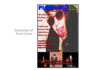
2. Question 1, In what ways does your media product use, develop pr challenge forms and conventions of real media products?In some forms, my media product is somewhat similar to the real media products, giving the layout and the different colour schemes, it may be hard to justify the music niche market which this music magazine mainly belongs to.; Indie music and similar, new music. The colour scheme of the name of the magazine ‘Playback’ and the headphones logo, is a bright blue colour. This colour, I personally associate with indie music, a bright boastful colour, which similarly reminds me of the music and artists who belong to the music scene. The use of the red font colour for the additional information, is also a bold cover, showing again the links between the conventions of my magazine and the niche indie music scene. The idea behind my final product, challenges real media product, as a music magazine purely based on new music, breaking artists who have just been signed. Yes other music magazines feature new music, (NME’s Radar section) however, is not fully based on new artists. The dominant image features a rebellious artist. This convention challenges real media product’s as most magazines feature commonly known artists, using this as their major appeal on the front cover. I have used this convention in a similar way, however also using the front cover as an advertisement, advertising new music and new artists. This again challenges the opinion and appeal of other music lovers, the front cover, features 4 individual's whom are all girls. This may be interpreted as a magazine aimed at girls, however this is not the case. This music magazine is aimed at indie and new music loving fans. Phrase 1
3. Question 2, How does your media product represent particular social groups? The front cover of my final product, can gain the trust of my target audience. The dominant image on the front cover, shows a young girl, age around 17, holding a can of fosters, the background of this image can easily be said to be at a house, so immediately the audience can guess that the theme of this image is that the young girl is at ‘a house party’ . This immediately links with my target audience, showing them that this person is just like them, a young person who is enjoying life enabling her to live the normal interactions that teenagers socialise in every day situations. I believe that the can of fosters, is a major key of representation, as the audience will somewhat relax, and be curious to find out of what this girl is doing on the front over of a music magazine. Steph, young girl, could even been seen as an role model for the target audience or a symbol of achievement. The bright colours and the somewhat ‘fun’ images, represent the fun elements of a teenagers life. In particular I believe that the main audience for this magazine would be in fact college/ Uni students and indie music scene. Most college students are interested in going to musicfestivals and gigs. This magazine would show students new music and cheap gigs they can go to. Phrase 2
4. Question 3, What kind of media institutionmight distribute your media product and why?Because my magazine is a full on Niche market magazine, this means that my magazine is a smaller organisation to other major music magazines out their. This means that my magazine would be owned by a large company, however the magazine would be an ‘experimental’ magazine, to see how the audience responds to the magazine, whetherthe magazine would be successful and therefore should be kept on, or should be scraped as an unsuccessful magazine. My magazine would not only be published, but would also be online to, 24hour music newsfeed, new artists to listen to, reviews of different gigs throughout the country etc. These are some of the reasons why Dennis Publishing would be a good publisher to publish my magazine. Because Dennis Publisher have not published any main music magazines, I would take it as opportunity to be the first music magazineto be published, even if the magazine would be an ‘project’ for thepublishing company. With this publishing company, they could also help to set my music magazine on to the web and create a 21st century readership profile. Phrase 3
5. Question 4, Who would be the audience for your media product? I believe my final product would have two target audiences, a Niche market audience, an a general audience. The Niche music audience would be indie and alternative music. This would be due to the main images placed on my front cover. The dominant image of the young teenage girl instinctively shows the casual relaxing pose of a indie artist. The artists, advertised on the front cover, The Drums, Florence and the Machine, are commonly known for being in the niche indie music scene. The general audience for my magazine would be students with the ages 16-19. This would be because of the new music mainly advertised in my magazine. It may seem discriminating to those older or younger who, may enjoy the reasons listed, however my claims are justiable. Students are more likely to listen and are more easy to advertise for new music. They have a more relaxing life style making it easier to travel and go to gigs, have more time to read and listen to new artists. Also the new music featuring in my magazine would appeal more to the target audience. All the images on the front cover, are showing girls. This could be a problem for advertising the magazine to both genders. However, this magazine does not have a target audience of just a female audience. Finished product
6. Question 5, How did you attract/ address your audience?Basically, on my front cover, I decided to use quotes from the ‘interview’s’ of the other artists, using these quotes as buzz words creating a hype around the that certain artist. The use of the amateur images used for the dominant image on the front cover, attractsthe target audience, with the target audience relating to that figure. Steph’s feature and characteristics in this photo are similar to those amidst in the target audience, which means that the target audience would look to Steph as a role model. The use of the red font and italics on the front cover are used for the additional information: ‘ ...’ The use of the red colour is so that the information can stand out from the images. Question 6, What have you learnt about the technologies from the process of constructing this product?The conventions I have learnt from using certain technologies are fairly complicated however, after having past experience from my years in secondary school, I find certain technology software easy to use . I believe that the technologies I used to produce my magazine, are easy to use once having a quick tutorial making it easier for anyone to produce certain products, i.e. a music magazine. Different technologies have developed through time enabling easier access to edit images to give certain effects. This then lets us produce the true product we want, as how I manipulated the dominant image for the front cover. Then even if editing needs to be done to my final pieces then it will let us do that as well. The types of software I used for my music magazine was mainly Photoshop... I found this software easy to use, after already having experience in using similar software. However, for manipulating some of these images, I used Microsoft 2007 to reset the lighting in my images. Question 7, Looking back at your preliminary task ( the college magazine), what do you feel you have learnt in the progression from it to full product? I have found the editing and layout to be challenging in my main product. I found It hard to place certain images and text to create the certain effect I would have liked to achieved. By producing my preliminary task before my music magazine, it taught me some of the methods I later used on my music magazine, for example, manipulating some of the images so comparing my Preliminary task to my main media product it showed me that the Preliminary task wasn’t so complex. The layout of my front cover in my Preliminary task and my music magazine front cover are somewhat similar. The additional information are placed in a column like style, a main image is used as an dominant image, creating the mood and scene of my magazine. My front cover for my main media product, was a simple design, however having the same appeal I would have expected. My knowledge developed by learning throughout lessons, looking at examples of real media products and researching information from the internets, for example layouts of different genres of magazines, use of images, how which images appeal to certain targeted niche markets, colour schemes and niche markets of certain media products. My technical skills developed by making my preliminary task giving me a taster of what I would be doing and use the preliminary task as an experiment to spot what errors I would not do on my final product . Example: Adding more colour onto my final product, adding more images on to the front cover to make the cover more appealing. Also the other way I learnt my technical skills was by making the product and using trial and error, then re-doing mistakes on my mistakes on my full product, to get it to the best overall quality.