2. Sets and design
In our music video we kept to the symbolic conventions of a typical music
video of this genre. As a female pop/rap artist it is traditional to have lots of
scenes with different styling, showing as many costumes and sets as possible.
We also decided to focus on the style of Bela our artist and the sets, showing
as much design as possible, including five different sets in the video.
These elaborate sets helped establish Bela’s domain, showing her many sides,
classy, elegant, edgy, sexy, seductive and cool. This tells the audience about
who Bela is and connects her with her brand and music as it creates a whole
cohesive package.
We followed this convention as it is an effective way to make the video
ascetically pleasing, allowing us to develop the video as the song goes on,
adding different scenes which kept it interesting and exciting. This is more
likely to entice the audience into watching the video again and sharing it with
friends.
By following these conventions it is easy for the audience to understand what
type of genre and artist our text is. Creating five different sets helped us
develop these conventions further, making a visually impressive and
memorable video. This would defiantly help sell Bela’s single, album, concert
tickets and merchandise as she now has a clear, vivid band image. As her
image fits conveniently into her genre it could also help appeal to existing fans
of similar artists as they can relate with her as well.
http://www.youtube.com/watch?v=uI6VfwBV8Gc
On the right are two examples of a similar style of set
design in Rita Ora’s music video. It follows the same
symbolic conventions to our video, changing scenes
frequently, showing many extravagant set designs in
various styles, also showing a diversity of Ora’s
personality like we have done with Bela.
3. Camera
We also followed the conventions of a pop video with our style of
camera work. Using mostly close ups and extreme close ups
allowed us to build recognition of Bela, showing the audience who
she is and what her star image is. Following this symbolic
convention also helped us emphasise the link between her song
and lyrics with her as we focused on her lip synching in order for
the audience to associate Bela with the song. This emphasises her
talent as you see her rap the words very fast while moving and
dancing interacting with the set.
This is alike Azelia Bank’s 212 video which consists of similar fast
and difficult lyrics. This video has also followed the same close
ups and extreme close ups of Bank’s lips lip synching the song,
enforcing her talent and star image with the song and therefore
emphasising her brand.
http://www.youtube.com/watch?v=i3Jv9fNPjgk
We also use the camera a number of times to dismember
Bela’s body into sections, going against other music video’s
typical conventions as we focus attraction away from the
artist’s face and beauty. We have done this to emphasise
her body and shown her in a sexual way, objectifying her to
appeal to a male audience.
4. Editing
Our key focus when editing was making sure we synched the song to
mimic the live lip synch as closely as possible to make it look professional
and clean cut. We also focused on cutting to the beat to emphasise the
upbeat rhythm and make the video flow with the song, this was also
helped by matching the pace of the song to emphasise the tempo and
emotions of Bela and the music. In order to do this we followed editing
conventions for such a fast paced song, by keeping each clip very short,
ranging from 0.5 seconds to maximum of 4 seconds. This resulted in the
visual pace going very well with the busy song, which was very effective
when trying to cram in five different scenes of creativity and Bela’s
attitude as a lot was going on and the video remained very exciting
throughout.
This fast editing technique is similar to Die Antwoord’s Fatty
Boom Boom video where the editing pace is so fast it is difficult to
keep up with everything going on, therefore the audience feels
more inclinde to watch it again. This results in more views and the
video being spread to other viewers, which is a very effective way
of the video becoming a success as it is so memorable.
http://www.youtube.com/watch?v=AIXUgtNC4Kc
We also followed the technique of discontinuity editing to make our video more surreal and
visually aesthetic. Using jump cuts between scenes created a high energy and since of frenetic
movement, emphasising Bela’s fast dancing and singing.
5. Lighting
We used artificial lighting from the studio throughout all our
scenes for our video. This is very common in music videos
similar to ours as the light gives the artist a glow of perfection,
giving the illusion they are flawless, beautiful and perfect,
adding to their star quality and image. We used strong white
lights to place around Bela while she was performing to make
her skin look iridescent and immaculate, this way her audience
look up to her as an idol for her beauty.
This is typical in all pop videos, such as Beyonce’s videos, eg
her song Flawless where she sings of how flawless she is. The
lighting and soft, flattering black and white colour confirms
that she looks flawless and very desirable to men and
inspirational to women.
http://www.youtube.com/watch?v=Tc8hyBfoBZg
We also used lighting in order to create stylistic features in
our video, for example in the chaise lounge scene we
scattered lights around the set not only for lighting but to
the visual look of the scene. We found this an effective way
to create a seductive, glamorous tone and atmosphere as
the lights emphasised the red backdrop surrounding Bela.
6. Costume, hair and makeup
We spent a lot of time planning and styling Bela’s costumes, hair and
makeup as we followed the symbolic conventions of an artist’s
image in this type of video. We took influence from different trends
in fashion at the moment, however we also broke the typical pop
conventions by adding more risqué, edgy outfits. For this outfit we
were inspired by this YSL advert, showing high fashion and a
seductive side to Bela.
We also used her styling to show who Bela is, giving the audience an
insight into her life and fashion, as we believe from these symbolic
conventions the audience can tell a lot about the artist from their
image and will judge them based on this alone. Therefore we have
stuck with a theme of glamour and sophistication mixed with some
edge and punk; this was she appears desirable and glamorous,
emphasising her star image.
This was a key aspect for us to follow as we had researched and
found that Bela’s target audience were most interested in the
fashion and beauty of the artist as this is what they want to look up
to and be inspired by. Therefore we wanted Bela to set new trends
and break boundaries, for example we applied a eye makeup mask
onto her to add a quirky look to her sophisticated image.
7. Props
We broke the typical convention of having instruments in the video like
so many do, instead we decided to keep the focus on Bela singing as the
song is all about the upbeat vocals and having a good time. Therefore
we gave Bela a variety of props to interact with, filming scenes with just
her and then scenes with her using the props. This way we could develop
each scene in post production, when editing we would first introduce
the scene with her and then later in the video we would introduce the
prop in the scene, for example the fan she uses and the sceptre she
dances with. We did this to keep the video interesting and show the
audience there is more to come.
Beyoncé also uses a sceptre as a prop in
her Miss Cater cover, we decided it was
a good prop as it adds power and wealth
to Bela’s image as it is associated with
royalty. However we broke its original
association as we used it in a more
seductive powerful way, having Bela
hold it while dancing to the song.
Here we have also included props
in the scene that develop the
image of the set even further.
Bela was also able to interact with
these props and enhance her
performance.
8. Performance
We broke the conventions of
most music videos as we did
not include a narrative in our
video. Bela was the single
performance throughout the
whole video, her confidence
and movement drove the
story of the video and it
played off and made the
video very fun looking.
In almost all the takes Bela looks directly into the camera which gives a
sense that she is communicating directly to her audience, allowing
them to have a connection with her and sing along, interacting.
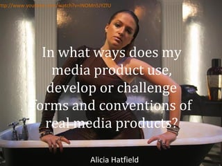
A unique performance unlike her other ones where she is mainly
dancing, is the one where she is in the bath. Much like Rihanna in her
video Stay it shows a more elegant, tranquil side to her, however she
still keeps it upbeat with her confident attitude and performs very
well.
We did also later decide on including two men to feature in the chaise
lounge scene as Bela’s butlers, we wanted to show her status as she
empowered the men and they became her props, not even showing
their faces and only being seen in wide shots so they were not given
an identity or power that could detract away from Bela, always having
the focus on her as the main artist. This is where we complied with the
convention of Bela being the main focus in the video as you can clearly
tell she is the star.
http://www.youtube.com/watch?
v=JF8BRvqGCNs
9. Digipak
For the digipak we followed the typical convention of having the
photos in black and white. This is often the case as it is a very
flattering, appealing style as it makes the artist look very perfect
and flawless. When we changed the images to black and white Bela
instantly looked more glamorous and elegant, however her diverse
costumes still add an edge to her image and show the audience
who she is. However we also broke this convention by keeping the
colour of her shoes a burgundy colour, we felt this added a unique
style to her images and shows the emphasis of the importance of
her fashion.
We also followed the conventions by having three close ups of Bela
to show the audience that she is a solo artist and therefor keeping
the attention all on her. We also included four different outfits to
emphasise her focus on fashion and her image, establishing her
star image.
Including still images from the sets of her music video creates a
cohesive overall brand between all the products as we used similar
material throughout them all. We did this in order for Bela’s
audience to clearly understand who she is and emphasise her star
image.
We also used the same font from her website on the digipak as the
same title, this way there is a theme in her products and it will be
easier for her audience to instantly recognise her products and
brand. I also placed the title of her name very large in the middle so
it will stand out on the shelves when being sold.
We also looked at Rihanna’s digipak which applies the same
conventions, having close ups of her in black and white, with a
variety of fashionable looks and keeping the focus purely on her
and her star image.
10. Website
When designing and creating Bela’s
website we researched into similar
artist’s pages to see what the
conventions of this type of artist’s
website was. Iggy Azalea had a very
attractive, interesting website,
showing her audience a lot into her
personal life and her professional
work. We liked the idea of having a lot
of photos and videos with little
writing so it was visually pleasing and
intriguing. We therefore added many
galleries of photos of her, her video,
and we also designed merchandise
that her fans could buy, which was
very typical of an artist like Bela to
have. We also created a news page,
keeping her fans up to date with what
she's doing so they can read an insight
into her life and really get to know her
on a more personal level.
Having a behind the scenes gallery of
photos from the day of filming the
music video (bottom right) allows the
audience to have an insight into Bela’s
private life. This attracts the audience
as they have privileged access into
Bela’s life which is highly cherished as
it is a rare thing to publicise.