This document summarizes a media product created for a nature channel targeted at children ages 5-12.
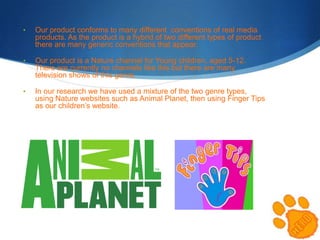
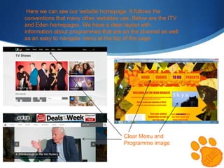
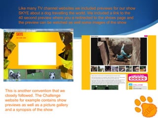
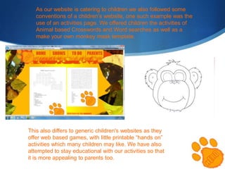
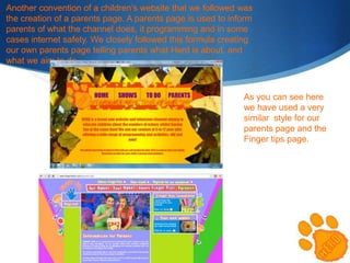
The product draws from conventions of both nature channels like Animal Planet and children's websites. It has a clear layout with program information and navigation like TV channel sites. It also includes show previews, activities, and a parents' page like children's websites.
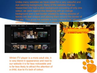
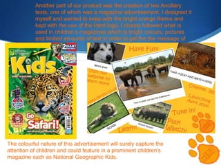
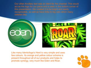
However, it challenges conventions by using a colorful, eye-catching background unlike most plain-colored websites. Brightly colored ads and idents are also used to stand out and appeal to children.
Overall, the product balances following conventions for usability while also innovating visually to attract its young audience.