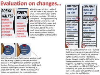
Spring gala 2024 photo slideshow - Celebrating School-Community Partnerships
evaluated changes
1. With the main sell line, I realised
that the name of my artist was too
small and the information on the
article was too large. I decided to
change this, I enlarged the writing
of the artists name so it would
stand out, I then left a space and
decreased the size of the article
information. I think this looks
much better as the name of the
artist stands out more and you
instantly read that and look at the
image.
With the puff, I found that the circle was too small
and the writing looked too cramped within in. I
decided to enlarge the circle and then spread out
the text. Furthermore, I made the text ‘WIN’ stand
out more by enlarging the text and keeping it
separate from the rest. I did this as the splash of
colour and size attracts the readers attention.
With the sub headlines/sell lines I realised
that the writing was to large with the lines
on either side, and some of the text were
slightly touching the line. I decided to
change this as it could be difficult for some
viewers to read and put them off my
magazine. I pulled my writing further up
the page so that the ‘/ED SHEERAN’ wasn’t
covered by the guitar. Furthermore, I
widened the space between the two black
lines so that the text fit better.