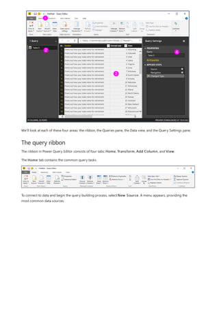
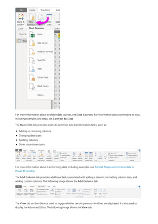
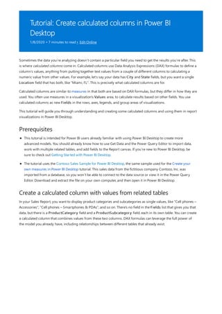
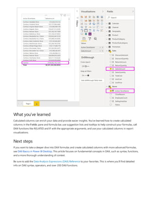
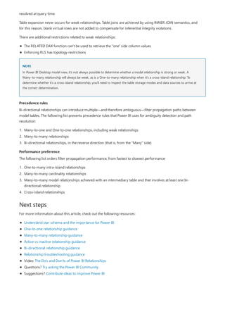
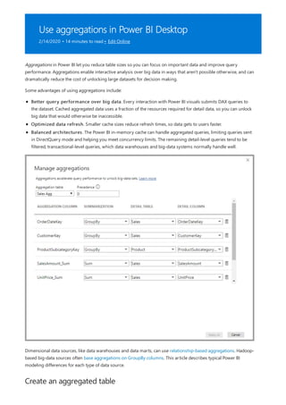
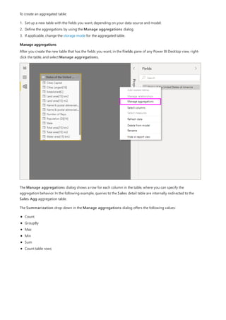
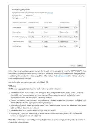
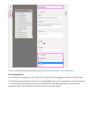
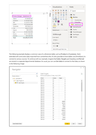
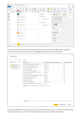
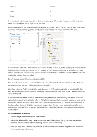
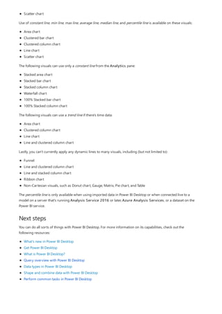
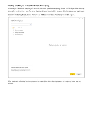
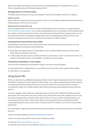
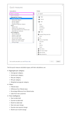
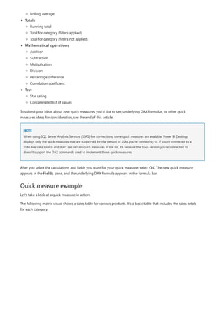
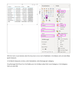
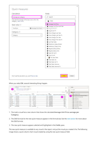
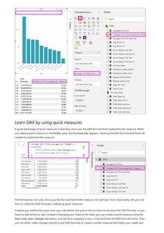
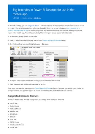
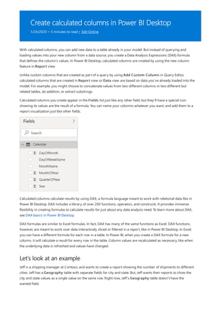
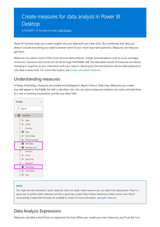
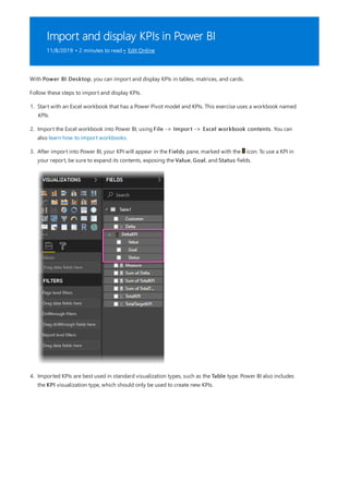
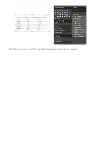
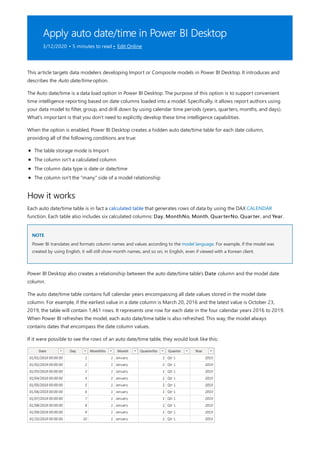
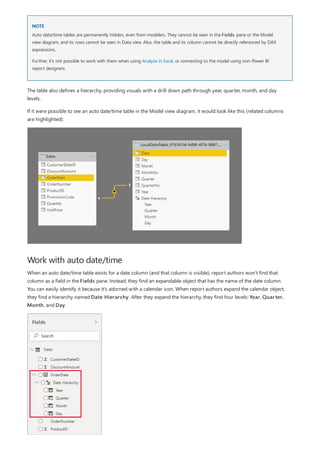
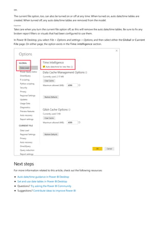
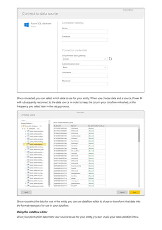
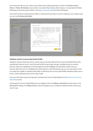
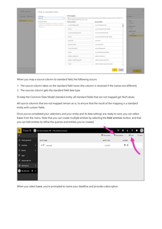
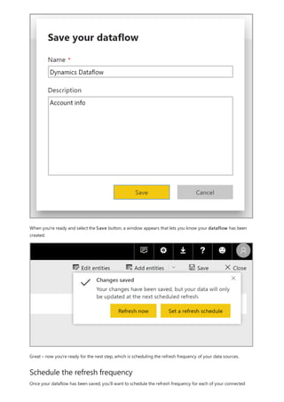
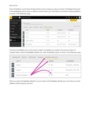
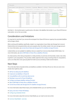
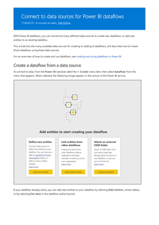
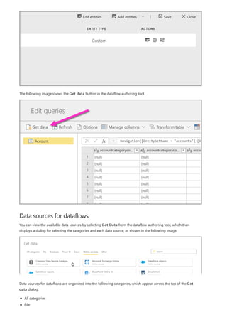
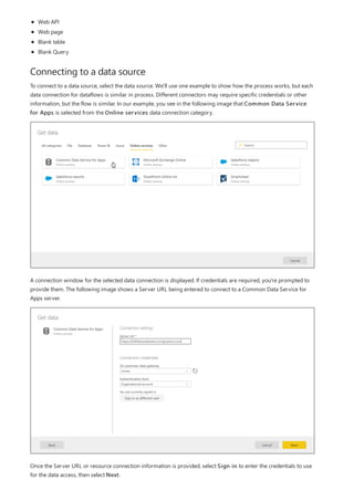
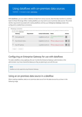
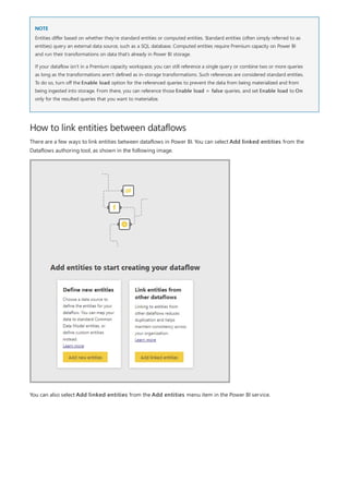
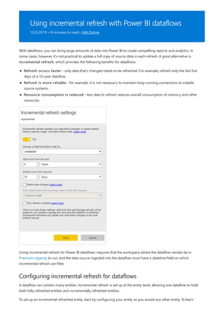
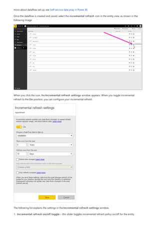
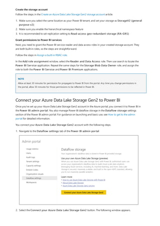
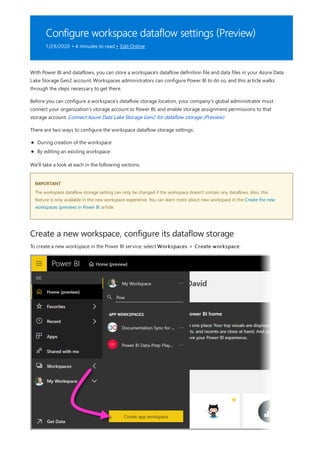
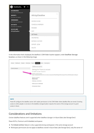
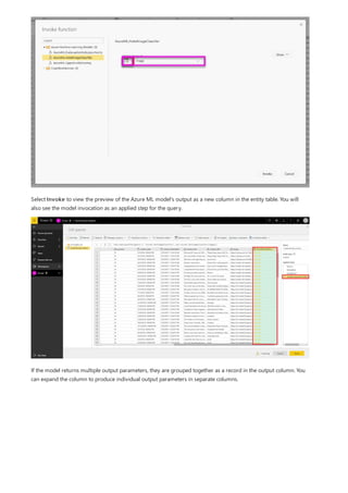
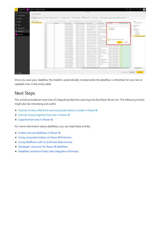
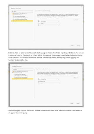
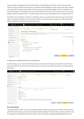
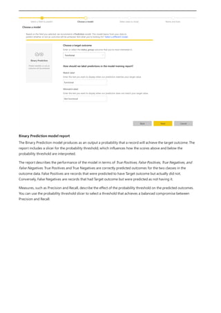
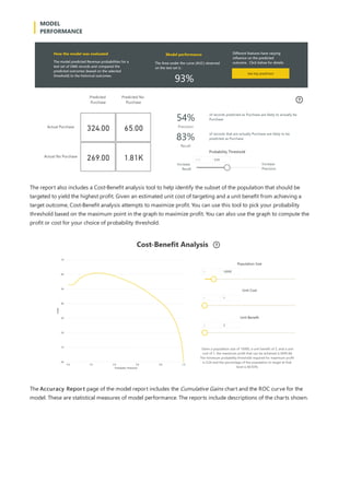
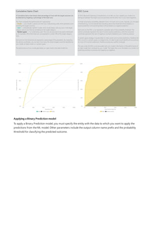
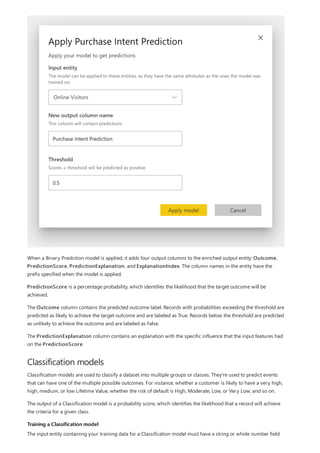
This document provides an overview of measures in Power BI Desktop and includes a tutorial for creating basic measures. It discusses automatic measures, creating measures using DAX functions, and common measure examples like sums, averages, and counts. The tutorial guides the reader through understanding measures and creating their own basic measures in the Power BI Desktop model.
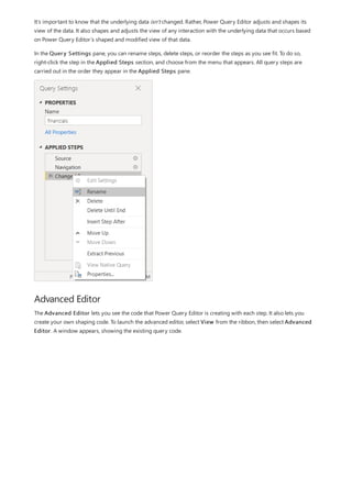
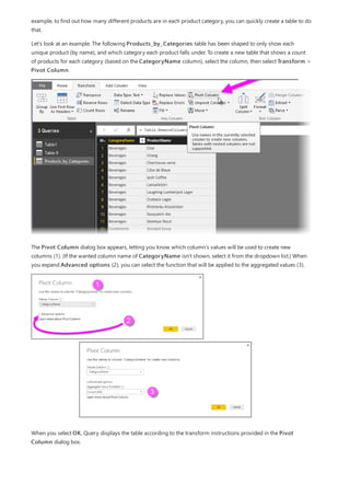
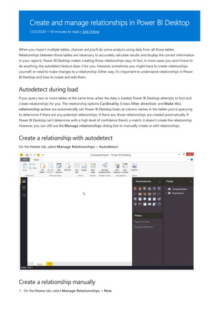
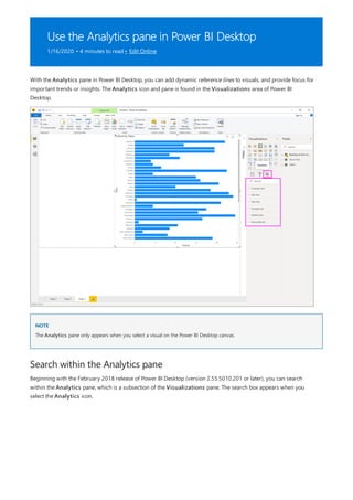
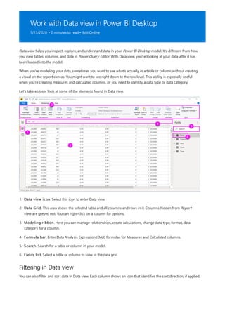
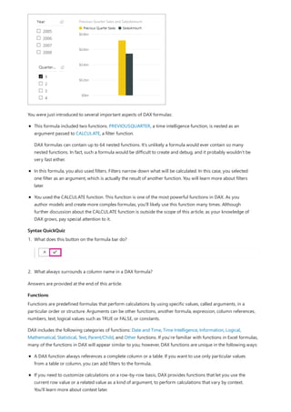
![TIP
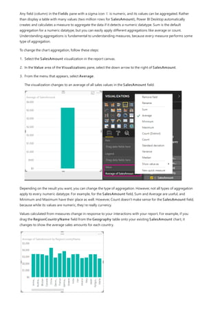
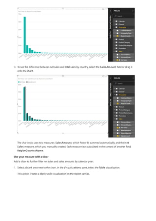
3. By default, each new measure is named Measure. If you don’t rename it, additional new measures are
named Measure 2, Measure 3, and so on. Because we want this measure to be more identifiable, highlight
Measure in the formula bar, and then change it to Net Sales.
4. Begin entering your formula. After the equals sign, start to type Sum. As you type, a drop-down suggestion
list appears, showing all the DAX functions, beginning with the letters you type. Scroll down, if necessary, to
select SUM from the list, and then press Enter.
An opening parenthesis appears, along with a drop-down suggestion list of the available columns you can
pass to the SUM function.
5. Expressions always appear between opening and closing parentheses. For this example, your expression
contains a single argument to pass to the SUM function: the SalesAmount column. Begin typing
SalesAmount until Sales(SalesAmount) is the only value left in the list.
The column name preceded by the table name is called the fully qualified name of the column. Fully
qualified column names make your formulas easier to read.
6. Select Sales[SalesAmount] from the list, and then enter a closing parenthesis.
Syntax errors are most often caused by a missing or misplaced closing parenthesis.
7. Subtract the other two columns inside the formula:
a. After the closing parenthesis for the first expression, type a space, a minus operator (-), and then another
space.
b. Enter another SUM function, and start typing DiscountAmount until you can choose the
Sales[DiscountAmount] column as the argument. Add a closing parenthesis.
c. Type a space, a minus operator, a space, another SUM function with Sales[ReturnAmount] as the
argument, and then a closing parenthesis.
8. Press Enter or select Commit (checkmark icon) in the formula bar to complete and validate the formula.](https://image.slidesharecdn.com/etl-microsoftmaterial-201226134007/85/ETL-Microsoft-Material-20-320.jpg)
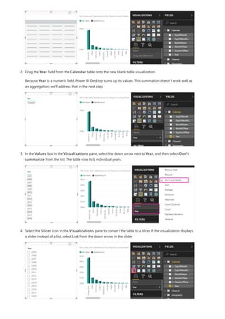
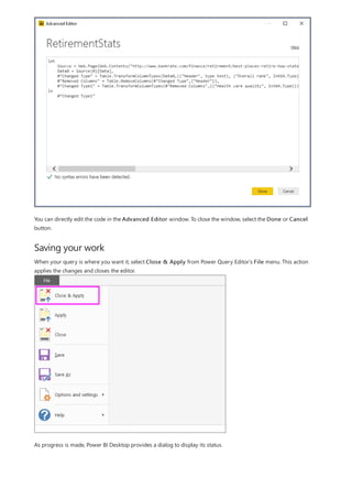
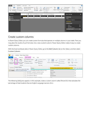
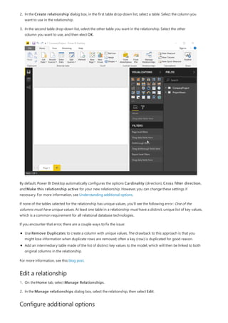
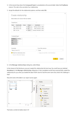
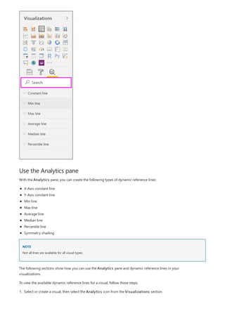
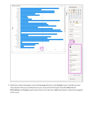
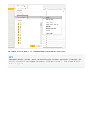
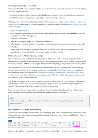
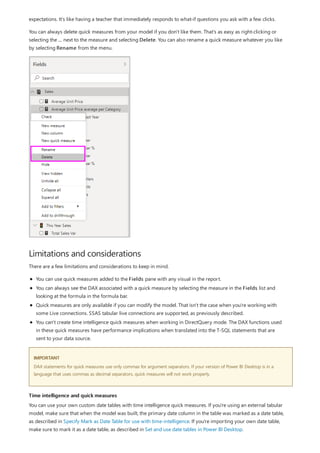
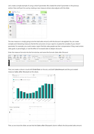
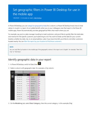
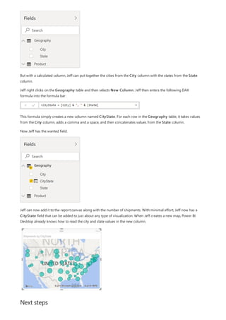
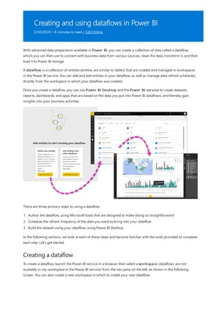
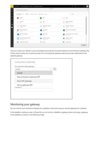
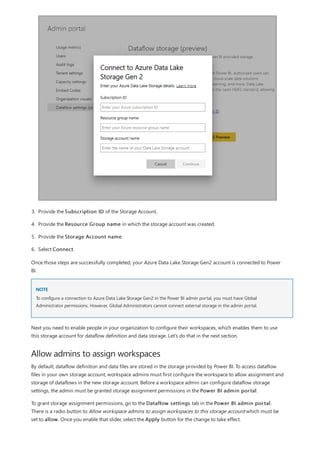
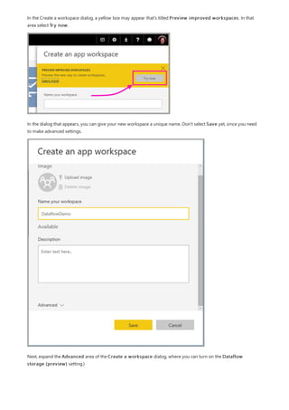
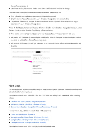
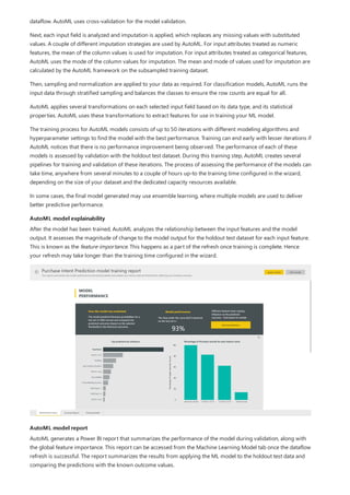
![Use your measure in another measure
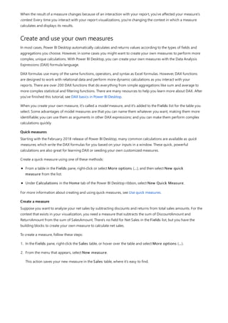
5. Select any value in the Year slicer to filter the Net Sales and Sales Amount by RegionCountryName
chart accordingly. The Net Sales and SalesAmount measures recalculate and display results in the context
of the selected Year field.
Suppose you want to find out which products have the highest net sales amount per unit sold. You'll need a
measure that divides net sales by the quantity of units sold. Create a new measure that divides the result of your
Net Sales measure by the sum of Sales[SalesQuantity].
1. In the Fields pane, create a new measure named Net Sales per Unit in the Sales table.
2. In the formula bar, begin typing Net Sales. The suggestion list shows what you can add. Select [Net Sales].
3. You can also reference measures by just typing an opening bracket ([). The suggestion list shows only
measures to add to your formula.
4. Enter a space, a divide operator (/), another space, a SUM function, and then type Quantity. The suggestion
list shows all the columns with Quantity in the name. Select Sales[SalesQuantity], type the closing
parenthesis, and press ENTER or select Commit (checkmark icon) to validate your formula.
The resulting formula should appear as:
Net Sales per Unit = [Net Sales] / SUM(Sales[SalesQuantity])
5. Select the Net Sales per Unit measure from the Sales table, or drag it onto a blank area in the report
canvas.
The chart shows the net sales amount per unit over all products sold. This chart isn't very informative; we'll
address it in the next step.](https://image.slidesharecdn.com/etl-microsoftmaterial-201226134007/85/ETL-Microsoft-Material-24-320.jpg)
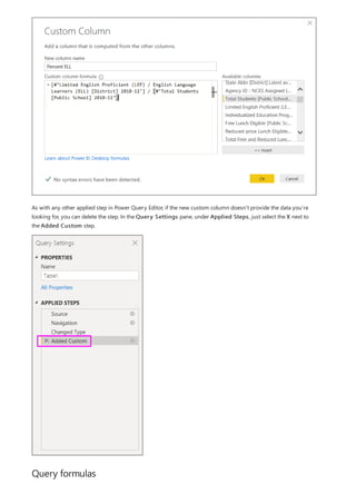
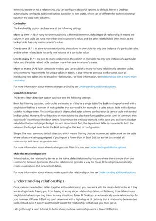
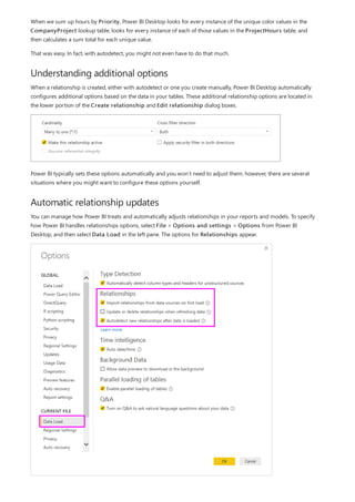
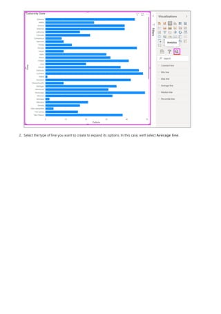
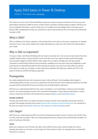
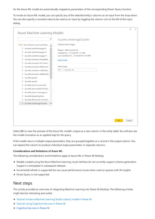
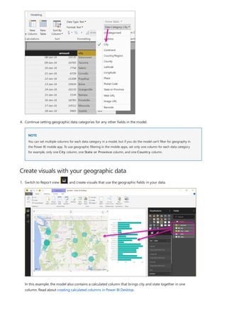
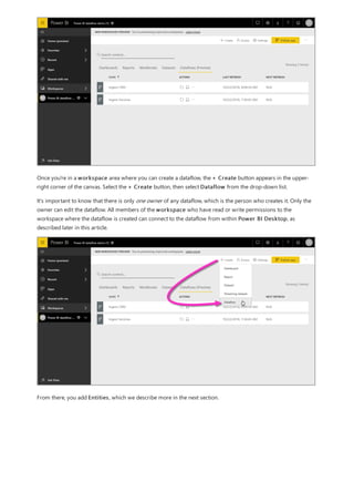
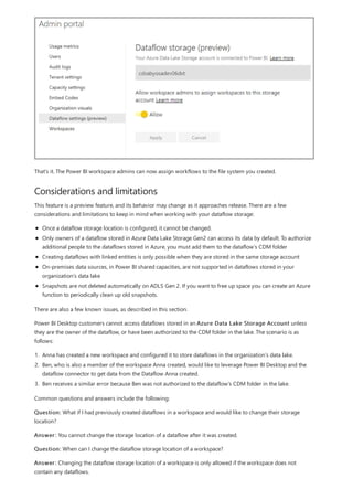
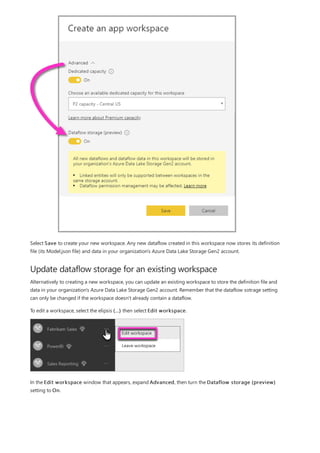
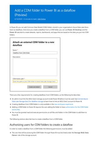
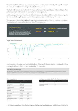
![TIP
TIP
4. You want the ProductCategory column from the ProductCategory table. Select
ProductCategory[ProductCategory], press Enter, and then type a closing parenthesis.
Syntax errors are most often caused by a missing or misplaced closing parenthesis, although sometimes Power BI
Desktop will add it for you.
5. You want dashes and spaces to separate the ProductCategories and ProductSubcategories in the new
values, so after the closing parenthesis of the first expression, type a space, ampersand (&), double-quote ("),
space, dash (-), another space, another double-quote, and another ampersand. Your formula should now
look like this:
ProductFullCategory = RELATED(ProductCategory[ProductCategory]) & " - " &
If you need more room, select the down chevron on the right side of the formula bar to expand the formula editor. In
the editor, press Alt + Enter to move down a line, and Tab to move things over.
6. Enter an opening bracket ([), and then select the [ProductSubcategory] column to finish the formula.
You didn’t need to use another RELATED function to call the ProductSubcategory table in the second
expression, because you are creating the calculated column in this table. You can enter
[ProductSubcategory] with the table name prefix (fully-qualified) or without (non-qualified).
7. Complete the formula by pressing Enter or selecting the checkmark in the formula bar. The formula](https://image.slidesharecdn.com/etl-microsoftmaterial-201226134007/85/ETL-Microsoft-Material-30-320.jpg)
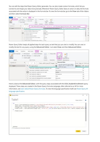
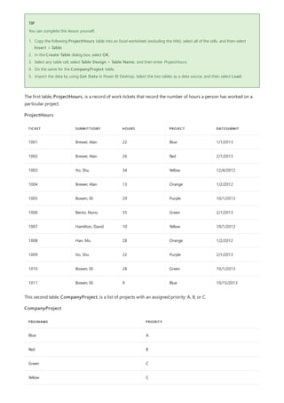
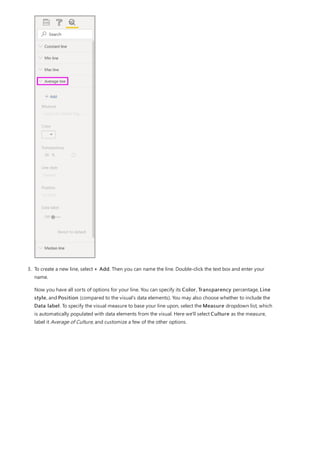
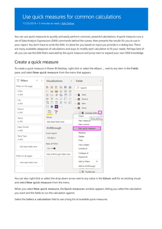
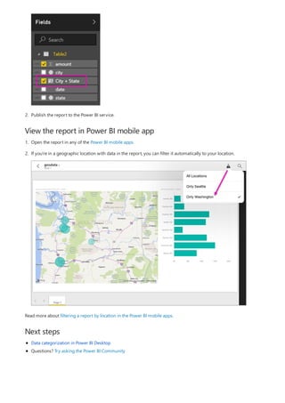
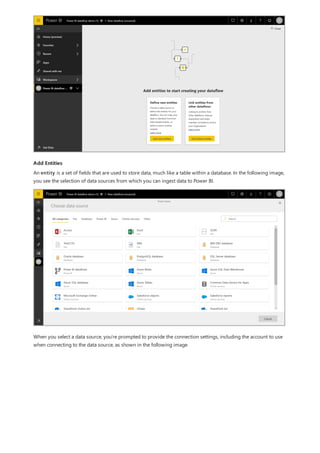
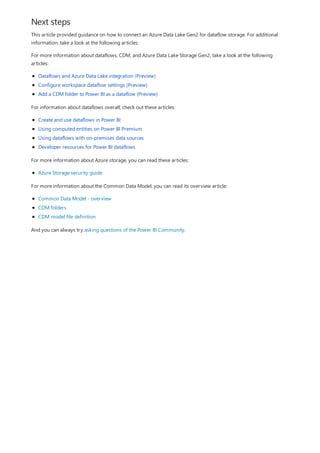
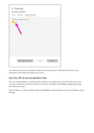
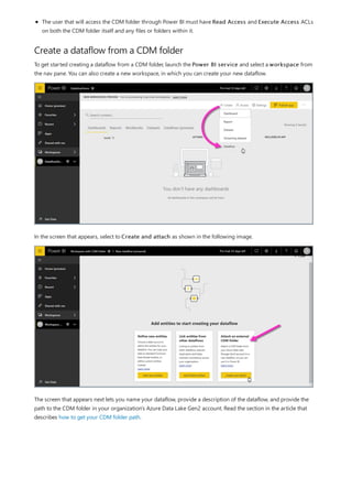
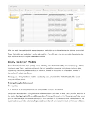
![Create a calculated column that uses an IF function
The Contoso Sales Sample contains sales data for both active and inactive stores. You want to ensure that active
store sales are clearly separated from inactive store sales in your report by creating an Active StoreName field. In
the new Active StoreName calculated column, each active store will appear with the store's full name, while the
sales for inactive stores will be grouped together in one line item called Inactive.
Fortunately, the Stores table has a column named Status, with values of "On" for active stores and "Off" for
inactive stores, which we can use to create values for our new Active StoreName column. Your DAX formula will
use the logical IF function to test each store's Status and return a particular value depending on the result. If a
store's Status is "On", the formula will return the store's name. If it’s "Off", the formula will assign an Active
StoreName of "Inactive".
1. Create a new calculated column in the Stores table and name it Active StoreName in the formula bar.
2. After the = sign, begin typing IF. The suggestion list will show what you can add. Select IF.
3. The first argument for IF is a logical test of whether a store's Status is "On". Type an opening bracket [,
which lists columns from the Stores table, and select [Status].](https://image.slidesharecdn.com/etl-microsoftmaterial-201226134007/85/ETL-Microsoft-Material-32-320.jpg)
![4. Right after [Status], type ="On", and then type a comma (,) to end the argument. The tooltip suggests that
you now need to add a value to return when the result is TRUE.
5. If the store's status is "On", you want to show the store’s name. Type an opening bracket ([) and select the
[StoreName] column, and then type another comma. The tooltip now indicates that you need to add a
value to return when the result is FALSE.
6. You want the value to be "Inactive", so type "Inactive", and then complete the formula by pressing Enter or
selecting the checkmark in the formula bar. The formula validates, and the new column's name appears in
the Stores table in the Fields pane.
7. You can use your new Active StoreName column in visualizations just like any other field. To show
SalesAmounts by Active StoreName, select the Active StoreName field or drag it onto the Report
canvas, and then select the SalesAmount field or drag it into the table. In this table, active stores appear
individually by name, but inactive stores are grouped together at the end as Inactive.](https://image.slidesharecdn.com/etl-microsoftmaterial-201226134007/85/ETL-Microsoft-Material-33-320.jpg)
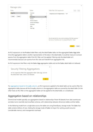
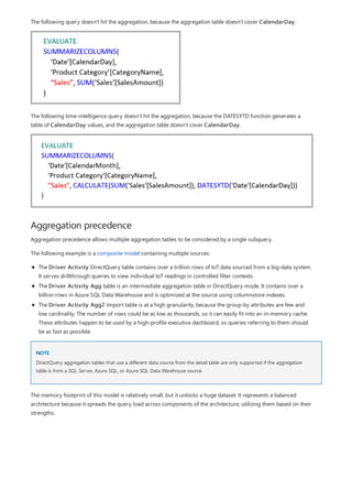
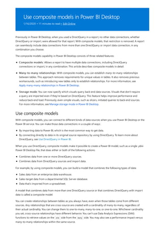
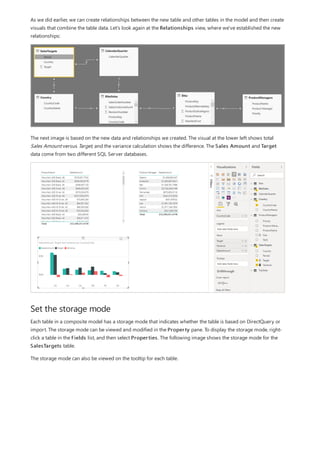
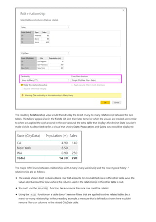
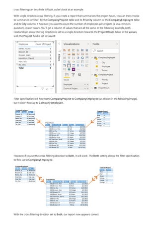
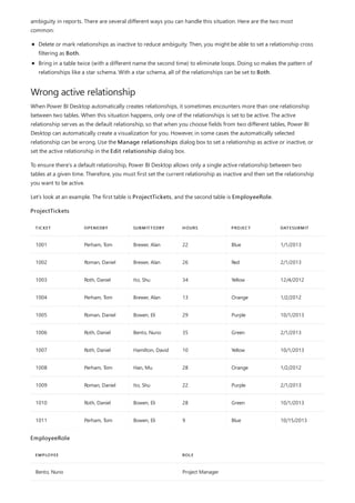
![Similarly, in the Relationship view in Power BI Desktop, we now see an additional table called
ProductManagers.
We now need to relate these tables to the other tables in the model. As always, we create a relationship between
the Bike table from SQL Server and the imported ProductManagers table. That is, the relationship is between
Bike[ProductName] and ProductManagers[ProductName]. As discussed earlier, all relationships that go
across source default to many-to-many cardinality.](https://image.slidesharecdn.com/etl-microsoftmaterial-201226134007/85/ETL-Microsoft-Material-69-320.jpg)
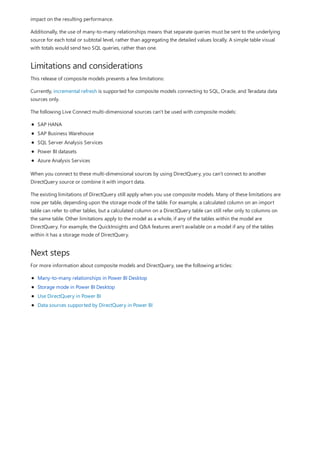
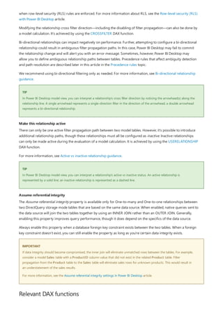
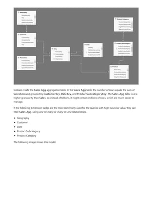
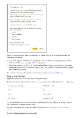
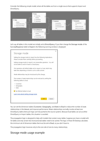
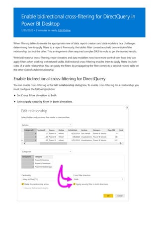
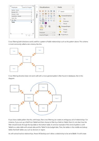
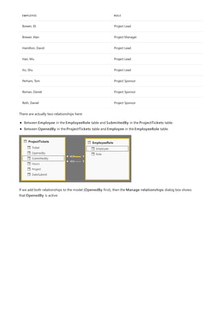
![What a relationship with a many-many cardinality solves
Use relationships with a many-many cardinality
Before relationships with a many-many cardinality became available, the relationship between two tables was
defined in Power BI. At least one of the table columns involved in the relationship had to contain unique values.
Often, though, no columns contained unique values.
For example, two tables might have had a column labeled Country. The values of Country weren't unique in either
table, though. To join such tables, you had to create a workaround. One workaround might be to introduce extra
tables with the needed unique values. With relationships with a many-many cardinality, you can join such tables
directly, if you use a relationship with a cardinality of many-to-many.
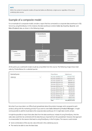
When you define a relationship between two tables in Power BI, you must define the cardinality of the
relationship. For example, the relationship between ProductSales and Product—using columns
ProductSales[ProductCode] and Product[ProductCode]—would be defined as Many-1. We define the relationship
in this way, because each product has many sales, and the column in the Product table (ProductCode) is unique.
When you define a relationship cardinality as Many-1, 1-Many, or 1-1, Power BI validates it, so the cardinality that
you select matches the actual data.
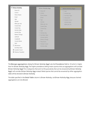
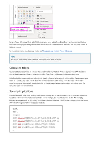
For example, take a look at the simple model in this image:
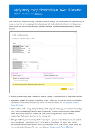
Now, imagine that the Product table displays just two rows, as shown:
Also imagine that the Sales table has just four rows, including a row for a product C. Because of a referential
integrity error, the product C row doesn't exist in the Product table.
The ProductName and Price (from the Product table), along with the total Qty for each product (from the
ProductSales table), would be displayed as shown:](https://image.slidesharecdn.com/etl-microsoftmaterial-201226134007/85/ETL-Microsoft-Material-77-320.jpg)
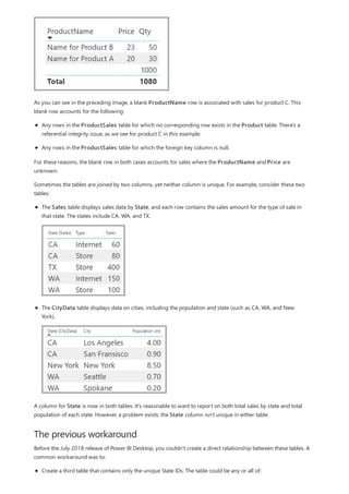
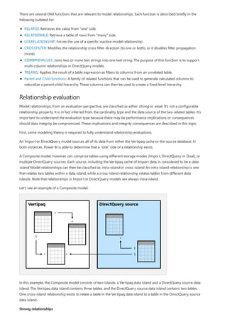
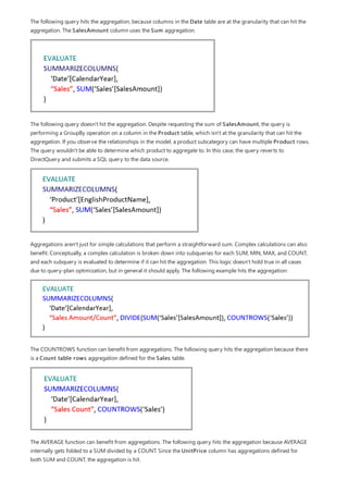
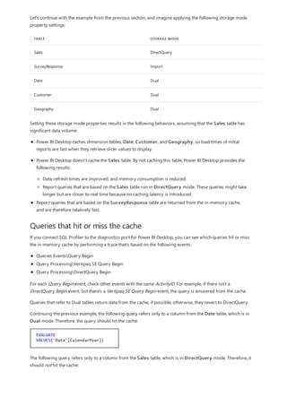
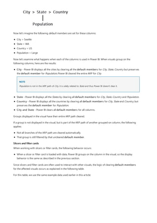
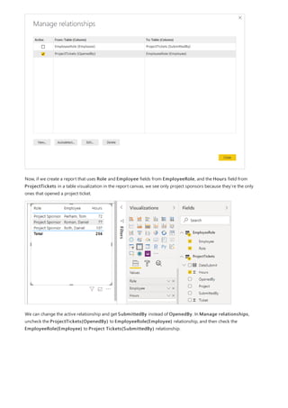
![NOTE
A calculated table (defined by using Data Analysis Expressions [DAX]).
A table based on a query that's defined in Query Editor, which could display the unique IDs drawn from
one of the tables.
The combined full set.
Then relate the two original tables to that new table by using common Many-1 relationships.
You could leave the workaround table visible. Or you may hide the workaround table, so it doesn't appear in the
Fields list. If you hide the table, the Many-1 relationships would commonly be set to filter in both directions, and
you could use the State field from either table. The later cross filtering would propagate to the other table. That
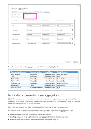
approach is shown in the following image:
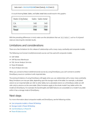
A visual that displays State (from the CityData table), along with total Population and total Sales, would then
appear as follows:
Because the state from the CityData table is used in this workaround, only the states in that table are listed, so TX is
excluded. Also, unlike Many-1 relationships, while the total row includes all Sales (including those of TX), the details don't
include a blank row covering such mismatched rows. Similarly, no blank row would cover Sales for which there's a null value
for the State.
Suppose you also add City to that visual. Although the population per City is known, the Sales shown for City
simply repeats the Sales for the corresponding State. This scenario normally occurs when the column grouping
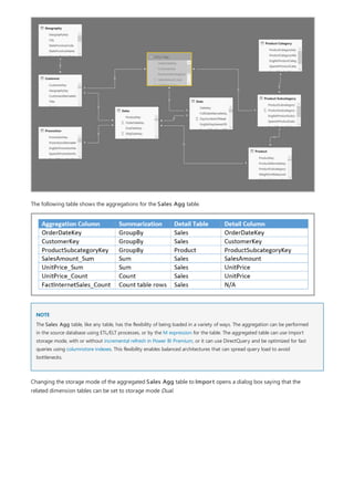
is unrelated to some aggregate measure, as shown here:](https://image.slidesharecdn.com/etl-microsoftmaterial-201226134007/85/ETL-Microsoft-Material-79-320.jpg)
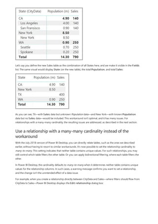
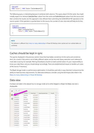


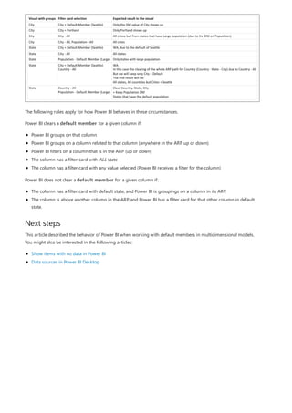
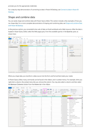
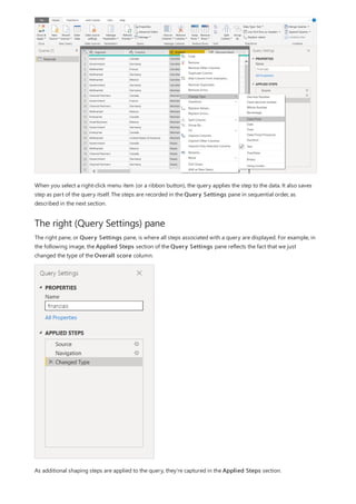
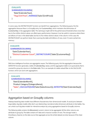
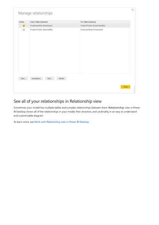
![Group rows
You can shape the data in many other ways in this query. You may remove any number of rows from the top or
bottom. Or you may add columns, split columns, replace values, and do other shaping tasks. With these features,
you can direct Power Query Editor to get the data how you want it.
In Power Query Editor, you can group the values from many rows into a single value. This feature can be useful
when summarizing the number of products offered, the total sales, or the count of students.
In this example, you group rows in an education enrollment dataset. The data is from the Excel workbook. It's been
shaped in Power Query Editor to get just the columns you need, rename the table, and make a few other
transforms.
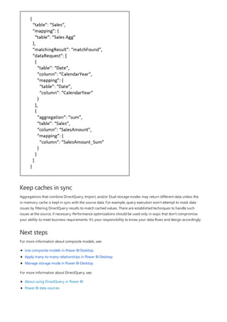
Let’s find out how many Agencies each state has. (Agencies can include school districts, other education agencies
such as regional service districts, and more.) Select the Agency ID - NCES Assigned [District] Latest
available year column, then select the Group By button in the Transform tab or the Home tab of the ribbon.
(Group By is available in both tabs.)
The Group By dialog box appears. When Power Query Editor groups rows, it creates a new column into which it
places the Group By results. You can adjust the Group By operation in the following ways:
1. The unlabeled dropdown list specifies the column to be grouped. Power Query Editor defaults this value to the
selected column, but you can change it to be any column in the table.
2. New column name: Power Query Editor suggests a name for the new column, based on the operation it
applies to the column being grouped. You can name the new column anything you want, though.
3. Operation: You may choose the operation that Power Query Editor applies, such as Sum, Median, or Count
Distinct Rows. The default value is Count Rows.
4. Add grouping and Add aggregation: These buttons are available only if you select the Advanced option. In
a single operation, you can make grouping operations (Group By actions) on many columns and create several
aggregations using these buttons. Based on your selections in this dialog box, Power Query Editor creates a
new column that operates on multiple columns.
Select Add grouping or Add aggregation to add more groupings or aggregations to a Group By operation. To
remove a grouping or aggregation, select the ellipsis icon (...) to the right of the row, and then Delete. Go ahead
and try the Group By operation using the default values to see what occurs.](https://image.slidesharecdn.com/etl-microsoftmaterial-201226134007/85/ETL-Microsoft-Material-98-320.jpg)

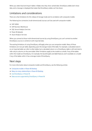
![NOTE
This formula includes the following syntax elements:
A. The measure name, Total Sales.
B. The equals sign operator (=), which indicates the beginning of the formula. When calculated, it will return a
result.
C. The DAX function SUM, which adds up all of the numbers in the Sales[SalesAmount] column. You’ll learn
more about functions later.
D. Parenthesis (), which surround an expression that contains one or more arguments. All functions require at
least one argument. An argument passes a value to a function.
E. The referenced table, Sales.
F. The referenced column, [SalesAmount], in the Sales table. With this argument, the SUM function knows on
which column to aggregate a SUM.
When trying to understand a DAX formula, it's often helpful to break down each of the elements into a language
you think and speak every day. For example, you can read this formula as:
For the measure named Total Sales, calculate (=) the SUM of values in the [SalesAmount ] column in the Sales
table.
When added to a report, this measure calculates and returns values by summing up sales amounts for each of the
other fields we include, for example, Cell Phones in the USA.
You might be thinking, "Isn’t this measure doing the same thing as if I were to just add the SalesAmount field to
my report?" Well, yes. But, there’s a good reason to create our own measure that sums up values from the
SalesAmount field: We can use it as an argument in other formulas. This may seem a little confusing now, but as
your DAX formula skills grow, knowing this measure will make your formulas and your model more efficient. In
fact, you’ll see the Total Sales measure showing up as an argument in other formulas later on.
Let’s go over a few more things about this formula. In particular, we introduced a function, SUM. Functions are
pre-written formulas that make it easier to do complex calculations and manipulations with numbers, dates, time,
text, and more. You'll learn more about functions later.
You also see that the column name [SalesAmount] was preceded by the Sales table in which the column belongs.
This name is known as a fully qualified column name in that it includes the column name preceded by the table
name. Columns referenced in the same table don't require the table name be included in the formula, which can
make long formulas that reference many columns shorter and easier to read. However, it's a good practice to
include the table name in your measure formulas, even when in the same table.
If a table name contains spaces, reserved keywords, or disallowed characters, you must enclose the table name in single
quotation marks. You’ll also need to enclose table names in quotation marks if the name contains any characters outside the
ANSI alphanumeric character range, regardless of whether your locale supports the character set or not.
It’s important your formulas have the correct syntax. In most cases, if the syntax isn't correct, a syntax error is](https://image.slidesharecdn.com/etl-microsoftmaterial-201226134007/85/ETL-Microsoft-Material-133-320.jpg)
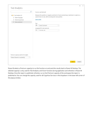
![Task: Create a measure formula
returned. In other cases, the syntax may be correct, but the values returned might not be what you're expecting.
The DAX editor in Power BI Desktop includes a suggestions feature, used to create syntactically correct formulas
by helping you select the correct elements.
Let’s create a simple formula. This task will help you further understand formula syntax and how the suggestions
feature in the formula bar can help you.
1. Download and open the Contoso Sales Sample Power BI Desktop file.
2. In Report view, in the field list, right-click the Sales table, and then select New Measure.
3. In the formula bar, replace Measure by entering a new measure name, Previous Quarter Sales.
4. After the equals sign, type the first few letters CAL, and then double-click the function you want to use. In
this formula, you want to use the CALCULATE function.
You’ll use the CALCULATE function to filter the amounts we want to sum by an argument we pass to the
CALCULATE function. This is referred to as nesting functions. The CALCULATE function has at least two
arguments. The first is the expression to be evaluated, and the second is a filter.
5. After the opening parenthesis ( for the CALCULATE function, type SUM followed by another opening
parenthesis (.
Next, we'll pass an argument to the SUM function.
6. Begin typing Sal, and then select Sales[SalesAmount], followed by a closing parenthesis ).
This is the first expression argument for our CALCULATE function.
7. Type a comma (,) followed by a space to specify the first filter, and then type PREVIOUSQUARTER.
You’ll use the PREVIOUSQUARTER time intelligence function to filter SUM results by the previous quarter.
8. After the opening parenthesis ( for the PREVIOUSQUARTER function, type Calendar[DateKey].
The PREVIOUSQUARTER function has one argument, a column containing a contiguous range of dates. In
our case, that's the DateKey column in the Calendar table.
9. Close both the arguments being passed to the PREVIOUSQUARTER function and the CALCULATE function
by typing two closing parenthesis )).
Your formula should now look like this:
Previous Quarter Sales = CALCULATE(SUM(Sales[SalesAmount]),
PREVIOUSQUARTER(Calendar[DateKey]))
10. Select the checkmark in the formula bar or press Enter to validate the formula and add it to the model.
You did it! You just created a complex measure by using DAX, and not an easy one at that. What this formula will
do is calculate the total sales for the previous quarter, depending on the filters applied in a report. For example, if
we put SalesAmount and our new Previous Quarter Sales measure in a chart, and then add Year and
QuarterOfYear as Slicers, we’d get something like this:](https://image.slidesharecdn.com/etl-microsoftmaterial-201226134007/85/ETL-Microsoft-Material-134-320.jpg)
![Context QuickQuiz
Summary
QuickQuiz answers
To better understand this formula, we can break it down, much like with other formulas.
This formula includes the following syntax elements:
A. The measure name, Store Sales.
B. The equals sign operator (=), which indicates the beginning of the formula.
C. The CALCULATE function, which evaluates an expression, as an argument, in a context that is modified by the
specified filters.
D. Parenthesis (), which surround an expression containing one or more arguments.
E. A measure [Total Sales] in the same table as an expression. The Total Sales measure has the formula:
=SUM(Sales[SalesAmount]).
F. A comma (,), which separates the first expression argument from the filter argument.
G. The fully qualified referenced column, Channel[ChannelName]. This is our row context. Each row in this
column specifies a channel, such as Store or Online.
H. The particular value, Store, as a filter. This is our filter context.
This formula ensures only sales values defined by the Total Sales measure are calculated only for rows in the
Channel[ChannelName] column, with the value Store used as a filter.
As you can imagine, being able to define filter context within a formula has immense and powerful capabilities.
The ability to reference only a particular value in a related table is just one such example. Don’t worry if you do
not completely understand context right away. As you create your own formulas, you will better understand
context and why it’s so important in DAX.
1. What are the two types of context?
2. What is filter context?
3. What is row context?
Answers are provided at the end of this article.
Now that you have a basic understanding of the most important concepts in DAX, you can begin creating DAX
formulas for measures on your own. DAX can indeed be a little tricky to learn, but there are many resources
available to you. After reading through this article and experimenting with a few of your own formulas, you can
learn more about other DAX concepts and formulas that can help you solve your own business problems. There
are many DAX resources available to you; most important is the Data Analysis Expressions (DAX) Reference.
Because DAX has been around for several years in other Microsoft BI tools such as Power Pivot and Analysis
Services Tabular models, there’s a lot of great information out there. You can find more information in books,
whitepapers, and blogs from both Microsoft and leading BI professionals. The DAX Resource Center Wiki on
TechNet is also a great place to start.
Syntax:
1. Validates and enters the measure into the model.
2. Brackets [].
Functions:](https://image.slidesharecdn.com/etl-microsoftmaterial-201226134007/85/ETL-Microsoft-Material-137-320.jpg)


![Let’s look at an example
Projected Sales = SUM('Sales'[Last Years Sales])*1.06
Data categories for measures
Analysis Expressions (DAX) formula language. DAX includes a library of over 200 functions, operators, and
constructs. Its library provides immense flexibility in creating measures to calculate results for just about any data
analysis need.
DAX formulas are a lot like Excel formulas. DAX even has many of the same functions as Excel, such like DATE , SUM
, and LEFT . But the DAX functions are meant to work with relational data like we have in Power BI Desktop.
Jan is a sales manager at Contoso. Jan has been asked to provide reseller sales projections over the next fiscal year.
Jan decides to base the estimates on last year's sales amounts, with a six percent annual increase resulting from
various promotions that are scheduled over the next six months.
To report the estimates, Jan imports last year's sales data into Power BI Desktop. Jan finds the SalesAmount field
in the Reseller Sales table. Because the imported data only contains sales amounts for last year, Jan renames the
SalesAmount field to Last Years Sales. Jan then drags Last Years Sales onto the report canvas. It appears in a
chart visualization as single value that is the sum of all reseller sales from last year.
Jan notices that even without specifying a calculation, one has been provided automatically. Power BI Desktop
created its own measure by summing up all of the values in Last Years Sales.
But Jan needs a measure to calculate sales projections for the coming year, which will be based on last year's sales
multiplied by 1.06 to account for the expected 6 percent increase in business. For this calculation, Jan will create a
measure. Using the New Measure feature, Jan creates a new measure, then enters the following DAX formula:
Jan then drags the new Projected Sales measure into the chart.
Quickly and with minimal effort, Jan now has a measure to calculate projected sales. Jan can further analyze the
projections by filtering on specific resellers or by adding other fields to the report.
You can also pick data categories for measures.
Among other things, data categories allow you to use measures to dynamically create URLs, and mark the data
category as a Web URL.
You could create tables that display the measures as Web URLs, and be able to click on the URL that's created based](https://image.slidesharecdn.com/etl-microsoftmaterial-201226134007/85/ETL-Microsoft-Material-179-320.jpg)
![Date Count = COUNT(Sales[OrderDate].[Date])
NOTE
Configure auto date/time option
The auto date/time generated hierarchy can be used to configure a visual in exactly the same way that regular
hierarchies can be used. Visuals can be configured by using the entire Date Hierarchy hierarchy, or specific levels
of the hierarchy.
There is, however, one added capability not supported by regular hierarchies. When the auto date/time hierarchy—
or a level from the hierarch—is added to a visual well, report authors can toggle between using the hierarchy or the
date column. This approach makes sense for some visuals, when all they require is the date column, not the
hierarchy and its levels. They start by configuring the visual field (right-click the visual field, or click the down-
arrow), and then using the context menu to switch between the date column or the date hierarchy.
Lastly, model calculations, written in DAX, can reference a date column directly, or the hidden auto date/time table
columns indirectly.
Formula written in Power BI Desktop can reference a date column in the usual way. The auto date/time table
columns, however, must be referenced by using a special extended syntax. You start by first referencing the date
column, and then following it by a period (.). The formula bar auto complete will then allow you to select a column
from the auto date/time table.
In Power BI Desktop, a valid measure expression could read:
While this measure expression is valid in Power BI Desktop, it's not correct DAX syntax. Internally, Power BI Desktop
transposes your expression to reference the true (hidden) auto date/time table column.
Auto date/time can be configured globally or for the current file. The global option applies to new Power BI Desktop
files, and it can be turned on or off at any time. For a new installation of Power BI Desktop, both options default to](https://image.slidesharecdn.com/etl-microsoftmaterial-201226134007/85/ETL-Microsoft-Material-186-320.jpg)


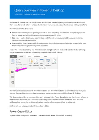
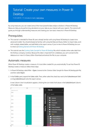
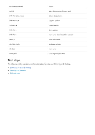
![Formula editor in Power BI Desktop
11/8/2019 • 2 minutes to read • Edit Online
Using the formula editor
KEYBOARD COMMAND RESULT
Ctrl+C Copy line (empty selection)
Ctrl+G Go to line…
Ctrl+I Select current line
Ctrl+M Toggle Tab moves focus
Ctrl+U Undo last cursor operation
Ctrl+X Cut line (empty selection)
Ctrl+Enter Insert line below
Ctrl+Shift+Enter Insert line above
Ctrl+Shift+ Jump to matching bracket
Ctrl+Shift+K Delete line
Ctrl+] / [ Indent/outdent line
Ctrl+Home Go to beginning of file
Ctrl+End Go to end of file
Ctrl+↑ / ↓ Scroll line up/down
Ctrl+Shift+Alt + (arrow key) Column (box) selection
Ctrl+Shift+Alt +PgUp/PgDn Column (box) selection page up/down
Ctrl+Shift+L Select all occurrences of current selection
Ctrl+Alt+ ↑ / ↓ Insert cursor above / below
Beginning with the October 2018 Power BI Desktop release, the formula editor (often referred to as the DAX
editor) includes robust editing and shortcut enhancements to make authoring and editing formulas easier and
more intuitive.
You can use the following keyboard shortcuts to increase your productivity and to streamline creating formulas in
the formula editor.](https://image.slidesharecdn.com/etl-microsoftmaterial-201226134007/85/ETL-Microsoft-Material-281-320.jpg)


![[DSC Europe 25] Ekaterina Bubenko - Behind the Curtain: How Data Roles Collab...](https://cdn.slidesharecdn.com/ss_thumbnails/anmv6x8dstqbbzchoklr-ekaterina-bubenko-behind-the-curtain-how-data-roles-collaborate-in-the-ai-era-a-260123083019-4b252ec7-thumbnail.jpg?width=640&height=640&fit=bounds)


![[DSC Europe 25] Raul Cruz Bonilla - Harnessing GEN AI in Fashion, Luxury and ...](https://cdn.slidesharecdn.com/ss_thumbnails/me7nvup5thwqzwzblbvw-raul-cruz-harnessing-ai-en-luxury-260123083019-32ac5a43-thumbnail.jpg?width=640&height=640&fit=bounds)

![[DSC Europe 25] Milos Belcevic - Product Professional's Journey to Full-Stack...](https://cdn.slidesharecdn.com/ss_thumbnails/1zovd6fgsycdg4wvgvls-milos-belcevic-product-professionals-journey-to-full-stack-product-developer-260123083019-d993120d-thumbnail.jpg?width=640&height=640&fit=bounds)


