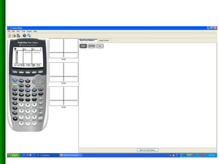
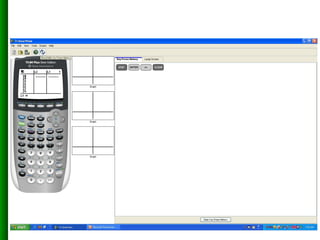
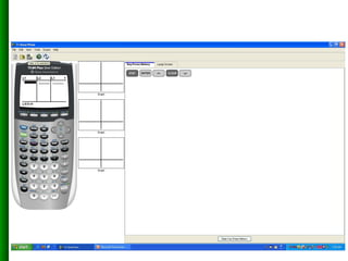
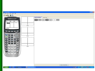
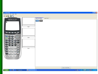
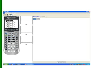
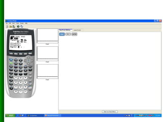
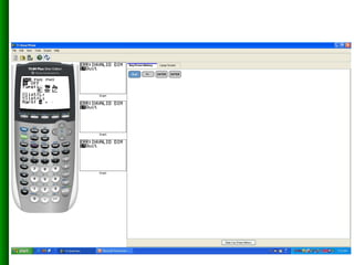
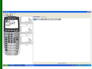
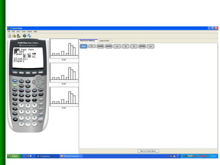
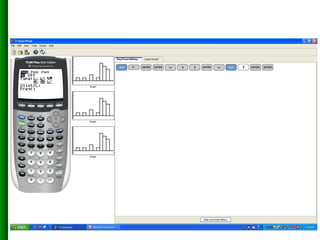
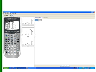
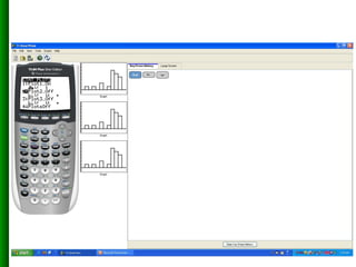
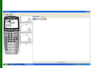
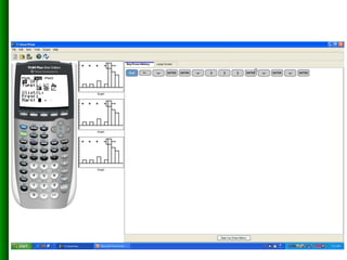
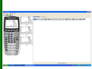
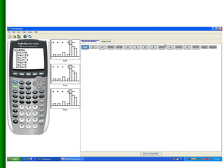
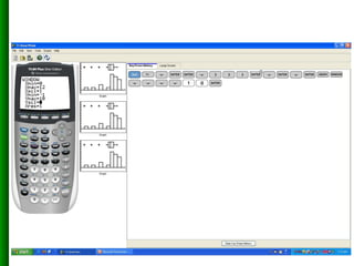
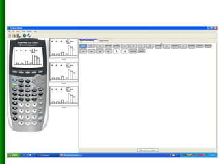
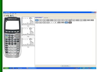
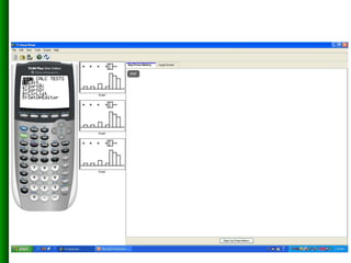
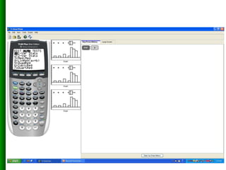
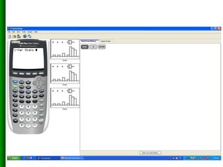
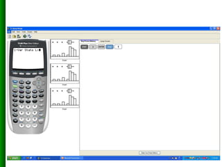
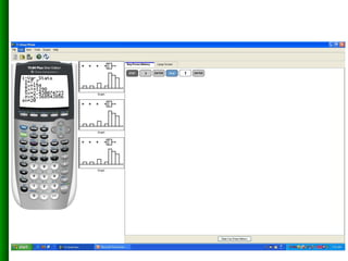
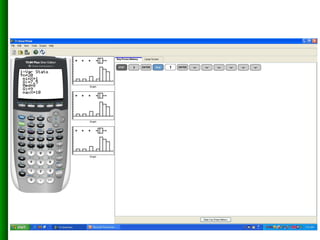
The document discusses statistical analysis features of the TI-83 calculator including entering data, creating a histogram and box plot to visualize data distributions, and generating descriptive statistics.
This document discusses box plots and whisker diagrams. Box plots show the distribution of data values, central tendencies, and variability through graphical representations. They consist of the maximum and minimum data values, the lower and upper quartiles, and the median. Box plots and whisker diagrams are used to summarize sets of numerical data in an interval scale and indicate the shape of the data distribution.
This document provides information about an introductory statistics course titled Math 1127 taught by Dr. Carlos Almada. It outlines the course format, expectations for students, and an overview of topics to be covered including descriptive statistics, inferential statistics, variables and data types, sampling methods, and the statistical process. A sample data set on employees is also presented to demonstrate variables and data.
Kindergarten Lesson Plan for April 2013Sierra Adkins
The document provides the class schedule for the Beaver class for the week of April 15-19. It includes the subjects and activities covered each day from 10:00-2:30, with the teacher listed as Miss Sierra/Miss Janice. The classes include language arts, math, social studies, science, art, music, gym, and more.
The document discusses histograms, frequency polygons, and other statistical concepts. It provides an example of children's hand span data displayed in a histogram with class intervals. It also shows how to construct a frequency polygon from the histogram and develop a curve from the polygon. Additionally, it defines statistical terms like mode, median, and cumulative frequency and provides examples of calculating each from sets of data.
Dokumen tersebut membahas tentang tugas statistika pendidikan yang dilakukan oleh kelompok 2. Dokumen tersebut menjelaskan tentang pengukuran data, pengumpulan data, penyajian data, dan pengolahan data dalam suatu penelitian statistika pendidikan.
Dokumen tersebut membahas analisis kebutuhan air irigasi maksimal di daerah irigasi Bendung Mrican dengan menggunakan statistika dan probabilitas. Tujuannya adalah untuk mengetahui debit air irigasi maksimal yang dibutuhkan dan faktor-faktor yang mempengaruhinya."
Introduction to image contrast and enhancement methodAbhishekvb
This document discusses various methods for contrast enhancement of digital images. It defines contrast and describes how contrast is important for distinguishing objects from backgrounds. Two main categories of contrast enhancement methods are described: spatial domain methods, which operate directly on pixel values; and frequency domain methods, which modify the Fourier transform of an image. Specific spatial techniques covered include logarithmic transformation, power law transformation, gamma correction, and histogram equalization. Contrast stretching is also discussed. Examples of code implementations and results are provided. Contrast enhancement has applications in medical imaging, surveillance, and other fields where improving image interpretability is important.
Contrast Limited Adaptive Histogram Equalization (CLAHE) is a contrast enhancement technique that differs from ordinary adaptive histogram equalization by limiting contrast in localized sections of images called tiles. CLAHE operates on tiles rather than the whole image, enhancing contrast in each tile while limiting amplification of noise. This technique can be used to improve contrast in applications like mammogram analysis and medical imaging while avoiding unwanted artifacts.
Teks tersebut membahas tentang statistik pendidikan. Statistik pendidikan adalah ilmu yang mempelajari prinsip, metode, dan prosedur analisis data berupa angka yang digunakan dalam pendidikan. Teks tersebut juga memberikan informasi tentang hasil pencarian untuk istilah "Statistik Pendidikan".
This document defines and provides examples of three different types of plots used to represent data distributions: stem and leaf plots, bar graphs, and histograms. It explains that stem and leaf plots organize large data sets by separating values into "stems" and "leaves", bar graphs represent frequencies using bars of equal or varying widths, and histograms use intervals to group continuous data and display frequencies. The document also lists advantages and disadvantages of each type of plot.
The document discusses organizing and presenting data through descriptive statistics. It covers types of data, constructing frequency distribution tables, calculating relative frequencies and percentages, and using graphical methods like bar graphs, pie charts, histograms and polygons to summarize categorical and quantitative data. Examples are provided to demonstrate how to organize data into frequency distributions and calculate relative frequencies to graph the results.
Graphs are useful for representing statistical data sets by presenting data in a consequential way that allows trends to be recognized rather than just listed values. Graphs can help portray large data sets involving millions or billions of values, which would otherwise be difficult to show without a visual representation.
Kami siap membantu anda dalam pengolahan data statistik untuk keperluan penyusunan Tugas Akhir, Skripsi, Tesis dan Disertasi. Mulai dari desain kuesioner (data primer), Rekapitulasi hasil kuesioner, Persiapan data dengan Ms. Excel, Pengolahan data, sampai dengan Analisis data dan interpretasinya.
Kami bantu anda melakukan serangkaian pengujian dan analisis data statistik deskriptif maupun inferensial, antara lain: Distribusi Frekuensi, Penyajian Diagram, Grafik, Histogram, T Skor, Uji Instrument Data (Validitas, Reliabilitas), Uji Asumsi Dasar (Normalitas, Homogenitas, Linieritas), Regresi Linier, Korelasi, Path Analysis (dll), Kami menggunakan software (SPSS 17, dan LISREL 8,80). WA. 085210849095
Introduction to graph of class 8th students. Find a new easy way to understand graph, histogram, double-bar graph, pie-chart etc....This ppt could lead to u a better picture of maths
A histogram is a graphical display of data using bars of different heights. It organizes and displays the distribution of data values or ranges of data. The document discusses what a histogram is, why there is variation in data, how to construct a histogram, and key elements to study like location, spread, and shape of the data distribution. To construct a histogram, you need the minimum and maximum values, number of cells, class width, and lower boundaries of each class. This allows plotting the frequency distribution in a visual way.
This document discusses various methods of graphically representing data, including bar diagrams, pie charts, histograms, and line graphs. It describes the construction and purposes of simple bar diagrams, multiple bar diagrams, compound bar diagrams, pie charts, and histograms. The document emphasizes that graphical representations are important for conveying insights from data more effectively than tables alone and for understanding patterns.
Line graphs are best for displaying continuous changes in a dependent variable in response to an independent variable. They show the relationship between two variables, with the dependent variable plotted on the y-axis and independent variable on the x-axis. Other common graphs include bar graphs, which display data collected by counting, and pie charts, which show the distribution of parts within a whole quantity. Organizing and presenting data through written reports and oral presentations are important science skills that allow scientists to share their results.
This document discusses different types of graphs and tables used to represent data. It introduces bar graphs, line graphs, circle graphs, and pictographs for visualizing data, as well as frequency tables and line plots for organizing raw numbers. Bar graphs compare data using bar lengths. Line graphs show changes over time by connecting points. Circle graphs represent parts of data as percentages of a whole circle. Pictographs use pictures to compare amounts of data, similar to bar graphs. Frequency tables list how often each item occurs, while line plots show frequencies using X marks.
The document provides guidance on recording and presenting data from scientific experiments. It emphasizes planning data collection before starting an experiment, organizing raw data in tables with independent variables on the left and dependent variables on the right, and processing the data to present it clearly in graphs and conclusions. Key points covered include choosing appropriate graph types based on continuous or discrete data, using titles, labels, and scales correctly in graphs, and identifying patterns in the data.
William Playfair, a Scottish engineer and economist, is considered the principal inventor of statistical graphs. In 1786, he published the 'Commercial and Political Atlas' containing 44 charts, which introduced the line graph, bar graph, and pie chart. Graphical representations visually display data using plots and charts to quantify, sort, and present information in an understandable way for various audiences. Common types include bar graphs, line graphs, histograms, and pie charts, which each have specific rules for effectively displaying different types of data.
This document provides information on interpreting histograms from cell counters. It discusses the principles of electronic impedance and optical light scatter cell counting methods. Histograms graphically represent cell population data based on cell size on the x-axis and cell number on the y-axis. Normal ranges are provided for red blood cell, platelet, and white blood cell histograms. Various flags that could appear are described, including possible causes such as platelet clumping, red blood cell agglutination, or extreme leukocytosis. Parameters for each cell type are also defined.
Digital Marketing Trends in 2024 | Guide for Staying AheadWask
https://www.wask.co/ebooks/digital-marketing-trends-in-2024
Feeling lost in the digital marketing whirlwind of 2024? Technology is changing, consumer habits are evolving, and staying ahead of the curve feels like a never-ending pursuit. This e-book is your compass. Dive into actionable insights to handle the complexities of modern marketing. From hyper-personalization to the power of user-generated content, learn how to build long-term relationships with your audience and unlock the secrets to success in the ever-shifting digital landscape.
How to Get CNIC Information System with Paksim Ga.pptxdanishmna97
Pakdata Cf is a groundbreaking system designed to streamline and facilitate access to CNIC information. This innovative platform leverages advanced technology to provide users with efficient and secure access to their CNIC details.
Building Production Ready Search Pipelines with Spark and MilvusZilliz
Spark is the widely used ETL tool for processing, indexing and ingesting data to serving stack for search. Milvus is the production-ready open-source vector database. In this talk we will show how to use Spark to process unstructured data to extract vector representations, and push the vectors to Milvus vector database for search serving.
Project Management Semester Long Project - Acuityjpupo2018
Acuity is an innovative learning app designed to transform the way you engage with knowledge. Powered by AI technology, Acuity takes complex topics and distills them into concise, interactive summaries that are easy to read & understand. Whether you're exploring the depths of quantum mechanics or seeking insight into historical events, Acuity provides the key information you need without the burden of lengthy texts.
5th LF Energy Power Grid Model Meet-up SlidesDanBrown980551
5th Power Grid Model Meet-up
It is with great pleasure that we extend to you an invitation to the 5th Power Grid Model Meet-up, scheduled for 6th June 2024. This event will adopt a hybrid format, allowing participants to join us either through an online Mircosoft Teams session or in person at TU/e located at Den Dolech 2, Eindhoven, Netherlands. The meet-up will be hosted by Eindhoven University of Technology (TU/e), a research university specializing in engineering science & technology.
Power Grid Model
The global energy transition is placing new and unprecedented demands on Distribution System Operators (DSOs). Alongside upgrades to grid capacity, processes such as digitization, capacity optimization, and congestion management are becoming vital for delivering reliable services.
Power Grid Model is an open source project from Linux Foundation Energy and provides a calculation engine that is increasingly essential for DSOs. It offers a standards-based foundation enabling real-time power systems analysis, simulations of electrical power grids, and sophisticated what-if analysis. In addition, it enables in-depth studies and analysis of the electrical power grid’s behavior and performance. This comprehensive model incorporates essential factors such as power generation capacity, electrical losses, voltage levels, power flows, and system stability.
Power Grid Model is currently being applied in a wide variety of use cases, including grid planning, expansion, reliability, and congestion studies. It can also help in analyzing the impact of renewable energy integration, assessing the effects of disturbances or faults, and developing strategies for grid control and optimization.
What to expect
For the upcoming meetup we are organizing, we have an exciting lineup of activities planned:
-Insightful presentations covering two practical applications of the Power Grid Model.
-An update on the latest advancements in Power Grid -Model technology during the first and second quarters of 2024.
-An interactive brainstorming session to discuss and propose new feature requests.
-An opportunity to connect with fellow Power Grid Model enthusiasts and users.
Let's Integrate MuleSoft RPA, COMPOSER, APM with AWS IDP along with Slackshyamraj55
Discover the seamless integration of RPA (Robotic Process Automation), COMPOSER, and APM with AWS IDP enhanced with Slack notifications. Explore how these technologies converge to streamline workflows, optimize performance, and ensure secure access, all while leveraging the power of AWS IDP and real-time communication via Slack notifications.
OpenID AuthZEN Interop Read Out - AuthorizationDavid Brossard
During Identiverse 2024 and EIC 2024, members of the OpenID AuthZEN WG got together and demoed their authorization endpoints conforming to the AuthZEN API
Fueling AI with Great Data with Airbyte WebinarZilliz
This talk will focus on how to collect data from a variety of sources, leveraging this data for RAG and other GenAI use cases, and finally charting your course to productionalization.
Ivanti’s Patch Tuesday breakdown goes beyond patching your applications and brings you the intelligence and guidance needed to prioritize where to focus your attention first. Catch early analysis on our Ivanti blog, then join industry expert Chris Goettl for the Patch Tuesday Webinar Event. There we’ll do a deep dive into each of the bulletins and give guidance on the risks associated with the newly-identified vulnerabilities.
TrustArc Webinar - 2024 Global Privacy SurveyTrustArc
How does your privacy program stack up against your peers? What challenges are privacy teams tackling and prioritizing in 2024?
In the fifth annual Global Privacy Benchmarks Survey, we asked over 1,800 global privacy professionals and business executives to share their perspectives on the current state of privacy inside and outside of their organizations. This year’s report focused on emerging areas of importance for privacy and compliance professionals, including considerations and implications of Artificial Intelligence (AI) technologies, building brand trust, and different approaches for achieving higher privacy competence scores.
See how organizational priorities and strategic approaches to data security and privacy are evolving around the globe.
This webinar will review:
- The top 10 privacy insights from the fifth annual Global Privacy Benchmarks Survey
- The top challenges for privacy leaders, practitioners, and organizations in 2024
- Key themes to consider in developing and maintaining your privacy program
Threats to mobile devices are more prevalent and increasing in scope and complexity. Users of mobile devices desire to take full advantage of the features
available on those devices, but many of the features provide convenience and capability but sacrifice security. This best practices guide outlines steps the users can take to better protect personal devices and information.
Salesforce Integration for Bonterra Impact Management (fka Social Solutions A...Jeffrey Haguewood
Sidekick Solutions uses Bonterra Impact Management (fka Social Solutions Apricot) and automation solutions to integrate data for business workflows.
We believe integration and automation are essential to user experience and the promise of efficient work through technology. Automation is the critical ingredient to realizing that full vision. We develop integration products and services for Bonterra Case Management software to support the deployment of automations for a variety of use cases.
This video focuses on integration of Salesforce with Bonterra Impact Management.
Interested in deploying an integration with Salesforce for Bonterra Impact Management? Contact us at sales@sidekicksolutionsllc.com to discuss next steps.