Download as PDF, PPTX

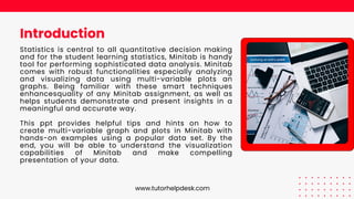
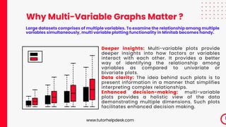
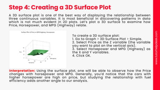


The document provides a comprehensive guide on enhancing Minitab assignments through the creation of multi-variable graphs and plots, highlighting the importance of statistical visualization for understanding complex data relationships. It includes practical steps for creating scatterplot matrices, interaction plots, and 3D surface plots using the cars93 dataset, as well as tips for graph customization. Additionally, the document promotes Tutor Help Desk's Minitab assignment help services, emphasizing the benefits of expert guidance for students seeking to improve their statistical analysis skills.