Draft for magazine front cover
•
0 likes•140 views
Report
Share
Report
Share
Download to read offline
Recommended
Evaluation
This document provides an analysis of the design elements used across the front cover, contents page, and interior pages of a magazine. Key design elements discussed include the use of bold colors like red to attract readers' attention, buzzwords to engage audiences, consistent mastheads to maintain branding, and conventional formatting choices for page numbers, titles, and text layout. The analysis notes how these techniques are employed to create a cohesive visual identity and appeal to readers while following standard publishing conventions.
Final magazine front cover
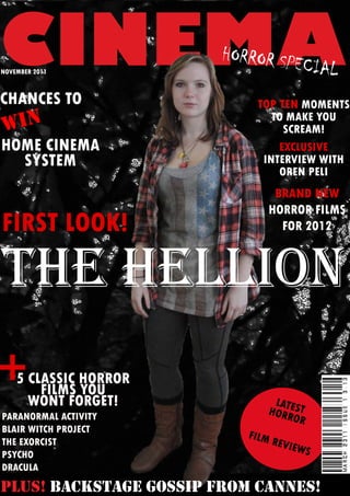
This document is a magazine article about horror films that provides a top ten list of scary movie moments, an interview with director Oren Peli, and previews of new horror films coming out in 2012. It also features reviews of 5 classic horror films like The Exorcist and Psycho as well as backstage gossip from the Cannes Film Festival.
Media pack.
According to a reader profile survey, the average person spends 2.5 hours online daily, is a member of Facebook (86%) and uses mobile internet (77%). They own an iPod (79%) and spend on average £290 per year at the cinema, £3.26 per week on music and £9.89 per month on DVDs. The target readers are mostly male (74%), single (44%) students (69%) with an average age of 19 and income of £12,451.
Media pack
According to a reader profile survey, the average person spends 2.5 hours online daily, is a member of Facebook (86%) and uses mobile internet (77%). They own an iPod (79%) and spend on average £290 per year at the cinema, £3.26 per week on music and £9.89 per month on DVDs. The target readers are mostly male (74%), single (44%) students (69%) with an average age of 19 and income of £12,451.
Charecterization techniques
The document provides information about atomic force microscopy (AFM). It describes the key components of an AFM, including a laser, photodetector, cantilever with a sharp tip, and piezoelectric crystals that control tip movement. The document explains that in AFM, the tip is brought close to the sample surface and interactions between tip and sample result in cantilever bending that is measured by reflecting a laser off the cantilever into a photodetector. Different AFM modes are also summarized, such as contact mode, non-contact mode, and tapping mode.
Atomic force microscopy
Atomic force microscopy (AFM) works by scanning a probe over a sample surface to build up a topographic map with single-atom level resolution without the need for sample preparation. It was invented in 1986 by Binning and first used a cantilever with a diamond tip. The main components are a microscope stage to move the tip and sample, control electronics, and a computer. A piezoelectric transducer moves the tip while a force transducer senses the force and feedback control maintains a set force. There are different imaging modes including contact, non-contact, and tapping modes that use repulsive or attractive forces between the probe and sample. AFM can image a variety of biological and material science samples with limitations
Surface and Materials Analysis Techniques
The document provides an overview of surface and materials analysis techniques used in nanotechnology, including why materials are characterized and examples of characterization approaches. It discusses techniques like scanning electron microscopy (SEM), x-ray photoelectron spectroscopy (XPS), Auger electron spectroscopy (AES), atomic force microscopy (AFM), and self-assembled monolayers (SAMs). The document provides details on each technique's capabilities and examples of industrial applications in areas like semiconductors, biomedicine, and thin film analysis.
Find your tribe analysis
The document analyzes the results of a "Find your tribe" test, which identifies the user as belonging to the "Smart Urban" tribe. This tribe is described as valuing good jobs and appearance. However, the user notes that Smart Urban is not one of the top three tribes in their region of southeast England, where the top tribe is identified as "Townie". The user reflects that they may have a more individual style than their assigned tribe suggests, and decides to design a magazine for the Townie tribe but with an urban twist to make it unique.
Recommended
Evaluation
This document provides an analysis of the design elements used across the front cover, contents page, and interior pages of a magazine. Key design elements discussed include the use of bold colors like red to attract readers' attention, buzzwords to engage audiences, consistent mastheads to maintain branding, and conventional formatting choices for page numbers, titles, and text layout. The analysis notes how these techniques are employed to create a cohesive visual identity and appeal to readers while following standard publishing conventions.
Final magazine front cover
This document is a magazine article about horror films that provides a top ten list of scary movie moments, an interview with director Oren Peli, and previews of new horror films coming out in 2012. It also features reviews of 5 classic horror films like The Exorcist and Psycho as well as backstage gossip from the Cannes Film Festival.
Media pack.
According to a reader profile survey, the average person spends 2.5 hours online daily, is a member of Facebook (86%) and uses mobile internet (77%). They own an iPod (79%) and spend on average £290 per year at the cinema, £3.26 per week on music and £9.89 per month on DVDs. The target readers are mostly male (74%), single (44%) students (69%) with an average age of 19 and income of £12,451.
Media pack
According to a reader profile survey, the average person spends 2.5 hours online daily, is a member of Facebook (86%) and uses mobile internet (77%). They own an iPod (79%) and spend on average £290 per year at the cinema, £3.26 per week on music and £9.89 per month on DVDs. The target readers are mostly male (74%), single (44%) students (69%) with an average age of 19 and income of £12,451.
Charecterization techniques
The document provides information about atomic force microscopy (AFM). It describes the key components of an AFM, including a laser, photodetector, cantilever with a sharp tip, and piezoelectric crystals that control tip movement. The document explains that in AFM, the tip is brought close to the sample surface and interactions between tip and sample result in cantilever bending that is measured by reflecting a laser off the cantilever into a photodetector. Different AFM modes are also summarized, such as contact mode, non-contact mode, and tapping mode.
Atomic force microscopy
Atomic force microscopy (AFM) works by scanning a probe over a sample surface to build up a topographic map with single-atom level resolution without the need for sample preparation. It was invented in 1986 by Binning and first used a cantilever with a diamond tip. The main components are a microscope stage to move the tip and sample, control electronics, and a computer. A piezoelectric transducer moves the tip while a force transducer senses the force and feedback control maintains a set force. There are different imaging modes including contact, non-contact, and tapping modes that use repulsive or attractive forces between the probe and sample. AFM can image a variety of biological and material science samples with limitations
Surface and Materials Analysis Techniques
The document provides an overview of surface and materials analysis techniques used in nanotechnology, including why materials are characterized and examples of characterization approaches. It discusses techniques like scanning electron microscopy (SEM), x-ray photoelectron spectroscopy (XPS), Auger electron spectroscopy (AES), atomic force microscopy (AFM), and self-assembled monolayers (SAMs). The document provides details on each technique's capabilities and examples of industrial applications in areas like semiconductors, biomedicine, and thin film analysis.
Find your tribe analysis
The document analyzes the results of a "Find your tribe" test, which identifies the user as belonging to the "Smart Urban" tribe. This tribe is described as valuing good jobs and appearance. However, the user notes that Smart Urban is not one of the top three tribes in their region of southeast England, where the top tribe is identified as "Townie". The user reflects that they may have a more individual style than their assigned tribe suggests, and decides to design a magazine for the Townie tribe but with an urban twist to make it unique.
Find your tribe analysis
The document analyzes the results of a "Find your tribe" personality test, which identified the respondent as belonging to the "Smart Urban" tribe. This tribe is described as valuing career success and style. However, the "Smart Urban" tribe is not one of the top three tribes in the southeast of the UK, where the respondent is located. The most common tribe in the region is "Townie". The respondent reflects that they may have a more individual style compared to others, and plans to design a magazine for the number one "Townie" tribe but add an urban twist to make it unique.
Planning
This document provides a timeline and planning details for a student media project creating an urban/RnB genre magazine called "PULSE". Key dates include photo shoots on February 12th and 24th for the front cover and contents page. Drafts are presented for the front cover, contents page, and double page spread layouts. Font, color scheme, and content ideas are discussed to match the urban genre and target 16-22 year old audience. Locations and costumes are also planned for the photo shoots.
Magazine institutions
This document lists the magazines owned by several large media companies including Future PLC, IPC Media, Bauer Media, EMap, BBC, and others. It includes magazines related to topics such as music, home and garden, lifestyle, television, photography, boating, fishing, cycling, golf, and more. The magazines are aimed at audiences ranging from children to specialists.
Uses and gratifications theory
The document discusses Uses and Gratifications Theory, which focuses on what audiences do with media rather than what media does to people. It provides examples of how readers may use a magazine to fulfill information needs, develop personal identity, enable social interaction and entertainment gratifications. Specifically, readers could learn exclusive details about celebrities, develop opinions of role models, find topics for discussion, and escape from problems by indulging in others' lives.
magazine analysing
The document summarizes the layout and design elements of the front cover of an NME magazine issue. Key elements included are the masthead in red, main image overlapping the masthead, lead article title in red, cover lines in different areas, barcode in bottom right, and price and date above the masthead. Colors used are red, white, black and images are incorporated throughout to attract different audiences. Text sizes and fonts vary across headlines and captions.
Preliminary task
The document discusses the key elements of a magazine cover including the masthead, central image, cover lines, barcode placement, and use of conventions like eye contact. It also mentions generating ideas for a college magazine targetting students, with contents including information for students. A draft front cover and mock contents page are presented for evaluation.
Question 6
The document describes the various tools and software the author used to complete a preliminary task and magazine, including a Nikon D3000 camera to take pictures, a Dell computer and laptop to do research, planning, and production, Adobe InDesign to create the magazine, Adobe Photoshop to edit pictures, Microsoft PowerPoint for research and planning, the website dafont.com for a masthead, and Paint, Slideshare, YouTube, and Blogger to share work.
Question 5
The document discusses how the author attracted and addressed their audience for a magazine. They used buzzwords, exclamation points, rhetorical questions, bold fonts and headings, and red color to grab attention. The front cover features a model making eye contact and an image of a Nintendo Wii that readers could win. The masthead uses a unique purple color. Layout follows the rule of thirds. The contents page and editor's note use large fonts and a handwritten style to feel personal. Based on research, the magazine includes musician interviews, a £3.10 price point, and music festival information to attract both males and females.
Question 4
The main audience for the music magazine would be 16-22 year old males, making up 70% of readers, with 30% females. These male readers would be laidback, casual dressers who enjoy keeping up with trends in clothing, hair, and technology. They live in urban areas and listen to R&B music, enjoying listening whenever possible via devices or online. Many of the male readers may also be interested in making their own music and reading the magazine for inspiration from successful musicians they can aspire to emulate.
Question 3
This document discusses potential media institutions to distribute a new music magazine. It suggests that Emap could be a good fit as they have sections for government, retail, environment, fashion and media but no music section, so the new magazine could fill a gap. Alternatively, Bauer Media also publishes several popular music magazines like Mojo, Q, Kerrang! and Smash Hits but none focused on urban music, the genre of the new magazine, so it could attract readers of their existing titles.
Question 2
This magazine represents an urban social group of younger adults and teenagers. The front cover image shows two males dressed similarly in jeans, baggy hoodie jackets, and a beanie hat. Their posture and facial expressions are also similar to an image on the VIBE magazine cover, representing a casual and modern lifestyle. The image has less color and duller tones than the magazine cover photo.
Question 6
The document describes the various tools and software the author used to complete a preliminary magazine task. This included a Nikon D3000 camera to take pictures, a Dell computer and laptop to do planning, research, and production work in programs like Microsoft PowerPoint and Adobe InDesign. The author also learned skills in Adobe Photoshop and used online resources for fonts and research.
Original and Edited Images
The document describes editing an original image using Adobe Photoshop. The author cut out the background of the original image using Photoshop's masking tool. They also turned down the color on a t-shirt in the image using Photoshop. The original image and the edited images are shown side by side for comparison.
Contents page planning
This document is a contents page for a music magazine listing various sections including upcoming gigs and festivals, a subscription offer, album reviews, music charts and downloads, editorial content, backstage news from concerts and festivals, and interviews. It provides the page titles and numbers for navigating to these different sections of the magazine.
Planning for front cover
The document discusses planning elements for the front cover of a magazine targeted at 16-22 year olds, including:
1) Choosing modern masthead fonts that relate to the urban genre by looking rough and ridged to appeal to the target audience.
2) Considering several font options for use in the magazine, focusing on fonts that are bold, clear, compact, handwritten-looking, or modern.
3) Establishing a color scheme using bright purple and black, with elements of red, to attract the target audience through intriguing, youthful, busy, and bold colors.
Organising Shoots
The document provides scheduling information for various photo shoots. A front cover shoot is scheduled for Saturday 12th Feb. Images for a contents page are due on 27th Feb. Additional images for a double page spread must be captured by 6th March.
Media pack
The document provides reader profile statistics for PULSE magazine, showing that the average reader spends 2.5 hours daily online, is highly engaged on social media, and owns various digital devices. It also details the reader's spending habits, showing they spend significantly each month on entertainment like cinema, music, and DVDs, as well as fashion and cosmetics. The typical PULSE reader is a 19-year old single student making £12,451 annually, with 74% being male and 36% female.
Moodboard
This document appears to be a random string of numbers and characters with no discernible meaning or message. It does not contain any essential information that can be summarized in 3 sentences or less.
欧洲杯买球-欧洲杯买球哪里可以投注-欧洲杯买球买球投注官网|【网址🎉ac123.net🎉】
【网址🎉ac123.net🎉】欧洲杯买球 Sports 与其他博彩公司相比,其独特之处在于欧洲杯买球 Sports 基于低利润和高营业额的独一无二的体育博彩模式,该模式可以为玩家开出最高的赔率。欧洲杯买球的优势在于中文界面友好,接受人民币投注。他们的开户奖金和实时体育投注界面是大陆玩家的首选。
Sara Saffari: Turning Underweight into Fitness Success at 23
Uncover the remarkable journey of Sara Saffari, whose transformation from underweight struggles to being recognized as a fitness icon at 23 underscores the importance of perseverance, discipline, and embracing a healthy lifestyle.
More Related Content
More from JessicaAmyFletcher
Find your tribe analysis
The document analyzes the results of a "Find your tribe" personality test, which identified the respondent as belonging to the "Smart Urban" tribe. This tribe is described as valuing career success and style. However, the "Smart Urban" tribe is not one of the top three tribes in the southeast of the UK, where the respondent is located. The most common tribe in the region is "Townie". The respondent reflects that they may have a more individual style compared to others, and plans to design a magazine for the number one "Townie" tribe but add an urban twist to make it unique.
Planning
This document provides a timeline and planning details for a student media project creating an urban/RnB genre magazine called "PULSE". Key dates include photo shoots on February 12th and 24th for the front cover and contents page. Drafts are presented for the front cover, contents page, and double page spread layouts. Font, color scheme, and content ideas are discussed to match the urban genre and target 16-22 year old audience. Locations and costumes are also planned for the photo shoots.
Planning
This document provides a timeline and planning details for a student media project creating an urban/RnB genre magazine called "PULSE". Key dates include photo shoots on February 12th and 24th for the front cover and contents page. Drafts are presented for the front cover, contents page, and double page spread layouts. Font, color scheme, and content ideas are discussed to match the urban genre and target 16-22 year old audience. Locations and costumes are also planned for the photo shoots.
Magazine institutions
This document lists the magazines owned by several large media companies including Future PLC, IPC Media, Bauer Media, EMap, BBC, and others. It includes magazines related to topics such as music, home and garden, lifestyle, television, photography, boating, fishing, cycling, golf, and more. The magazines are aimed at audiences ranging from children to specialists.
Uses and gratifications theory
The document discusses Uses and Gratifications Theory, which focuses on what audiences do with media rather than what media does to people. It provides examples of how readers may use a magazine to fulfill information needs, develop personal identity, enable social interaction and entertainment gratifications. Specifically, readers could learn exclusive details about celebrities, develop opinions of role models, find topics for discussion, and escape from problems by indulging in others' lives.
magazine analysing
The document summarizes the layout and design elements of the front cover of an NME magazine issue. Key elements included are the masthead in red, main image overlapping the masthead, lead article title in red, cover lines in different areas, barcode in bottom right, and price and date above the masthead. Colors used are red, white, black and images are incorporated throughout to attract different audiences. Text sizes and fonts vary across headlines and captions.
Preliminary task
The document discusses the key elements of a magazine cover including the masthead, central image, cover lines, barcode placement, and use of conventions like eye contact. It also mentions generating ideas for a college magazine targetting students, with contents including information for students. A draft front cover and mock contents page are presented for evaluation.
Question 6
The document describes the various tools and software the author used to complete a preliminary task and magazine, including a Nikon D3000 camera to take pictures, a Dell computer and laptop to do research, planning, and production, Adobe InDesign to create the magazine, Adobe Photoshop to edit pictures, Microsoft PowerPoint for research and planning, the website dafont.com for a masthead, and Paint, Slideshare, YouTube, and Blogger to share work.
Question 5
The document discusses how the author attracted and addressed their audience for a magazine. They used buzzwords, exclamation points, rhetorical questions, bold fonts and headings, and red color to grab attention. The front cover features a model making eye contact and an image of a Nintendo Wii that readers could win. The masthead uses a unique purple color. Layout follows the rule of thirds. The contents page and editor's note use large fonts and a handwritten style to feel personal. Based on research, the magazine includes musician interviews, a £3.10 price point, and music festival information to attract both males and females.
Question 4
The main audience for the music magazine would be 16-22 year old males, making up 70% of readers, with 30% females. These male readers would be laidback, casual dressers who enjoy keeping up with trends in clothing, hair, and technology. They live in urban areas and listen to R&B music, enjoying listening whenever possible via devices or online. Many of the male readers may also be interested in making their own music and reading the magazine for inspiration from successful musicians they can aspire to emulate.
Question 3
This document discusses potential media institutions to distribute a new music magazine. It suggests that Emap could be a good fit as they have sections for government, retail, environment, fashion and media but no music section, so the new magazine could fill a gap. Alternatively, Bauer Media also publishes several popular music magazines like Mojo, Q, Kerrang! and Smash Hits but none focused on urban music, the genre of the new magazine, so it could attract readers of their existing titles.
Question 2
This magazine represents an urban social group of younger adults and teenagers. The front cover image shows two males dressed similarly in jeans, baggy hoodie jackets, and a beanie hat. Their posture and facial expressions are also similar to an image on the VIBE magazine cover, representing a casual and modern lifestyle. The image has less color and duller tones than the magazine cover photo.
Question 6
The document describes the various tools and software the author used to complete a preliminary magazine task. This included a Nikon D3000 camera to take pictures, a Dell computer and laptop to do planning, research, and production work in programs like Microsoft PowerPoint and Adobe InDesign. The author also learned skills in Adobe Photoshop and used online resources for fonts and research.
Original and Edited Images
The document describes editing an original image using Adobe Photoshop. The author cut out the background of the original image using Photoshop's masking tool. They also turned down the color on a t-shirt in the image using Photoshop. The original image and the edited images are shown side by side for comparison.
Contents page planning
This document is a contents page for a music magazine listing various sections including upcoming gigs and festivals, a subscription offer, album reviews, music charts and downloads, editorial content, backstage news from concerts and festivals, and interviews. It provides the page titles and numbers for navigating to these different sections of the magazine.
Planning for front cover
The document discusses planning elements for the front cover of a magazine targeted at 16-22 year olds, including:
1) Choosing modern masthead fonts that relate to the urban genre by looking rough and ridged to appeal to the target audience.
2) Considering several font options for use in the magazine, focusing on fonts that are bold, clear, compact, handwritten-looking, or modern.
3) Establishing a color scheme using bright purple and black, with elements of red, to attract the target audience through intriguing, youthful, busy, and bold colors.
Organising Shoots
The document provides scheduling information for various photo shoots. A front cover shoot is scheduled for Saturday 12th Feb. Images for a contents page are due on 27th Feb. Additional images for a double page spread must be captured by 6th March.
Media pack
The document provides reader profile statistics for PULSE magazine, showing that the average reader spends 2.5 hours daily online, is highly engaged on social media, and owns various digital devices. It also details the reader's spending habits, showing they spend significantly each month on entertainment like cinema, music, and DVDs, as well as fashion and cosmetics. The typical PULSE reader is a 19-year old single student making £12,451 annually, with 74% being male and 36% female.
Moodboard
This document appears to be a random string of numbers and characters with no discernible meaning or message. It does not contain any essential information that can be summarized in 3 sentences or less.
More from JessicaAmyFletcher (20)
Recently uploaded
欧洲杯买球-欧洲杯买球哪里可以投注-欧洲杯买球买球投注官网|【网址🎉ac123.net🎉】
【网址🎉ac123.net🎉】欧洲杯买球 Sports 与其他博彩公司相比,其独特之处在于欧洲杯买球 Sports 基于低利润和高营业额的独一无二的体育博彩模式,该模式可以为玩家开出最高的赔率。欧洲杯买球的优势在于中文界面友好,接受人民币投注。他们的开户奖金和实时体育投注界面是大陆玩家的首选。
Sara Saffari: Turning Underweight into Fitness Success at 23
Uncover the remarkable journey of Sara Saffari, whose transformation from underweight struggles to being recognized as a fitness icon at 23 underscores the importance of perseverance, discipline, and embracing a healthy lifestyle.
一比一原版(UCSF毕业证)旧金山分校毕业证如何办理
原件一模一样【微信:95270640】【旧金山分校毕业证UCSF学位证成绩单】【微信:95270640】(留信学历认证永久存档查询)采用学校原版纸张、特殊工艺完全按照原版一比一制作(包括:隐形水印,阴影底纹,钢印LOGO烫金烫银,LOGO烫金烫银复合重叠,文字图案浮雕,激光镭射,紫外荧光,温感,复印防伪)行业标杆!精益求精,诚心合作,真诚制作!多年品质 ,按需精细制作,24小时接单,全套进口原装设备,十五年致力于帮助留学生解决难题,业务范围有加拿大、英国、澳洲、韩国、美国、新加坡,新西兰等学历材料,包您满意。
【业务选择办理准则】
一、工作未确定,回国需先给父母、亲戚朋友看下文凭的情况,办理一份就读学校的毕业证【微信:95270640】文凭即可
二、回国进私企、外企、自己做生意的情况,这些单位是不查询毕业证真伪的,而且国内没有渠道去查询国外文凭的真假,也不需要提供真实教育部认证。鉴于此,办理一份毕业证【微信:95270640】即可
三、进国企,银行,事业单位,考公务员等等,这些单位是必需要提供真实教育部认证的,办理教育部认证所需资料众多且烦琐,所有材料您都必须提供原件,我们凭借丰富的经验,快捷的绿色通道帮您快速整合材料,让您少走弯路。
留信网认证的作用:
1:该专业认证可证明留学生真实身份【微信:95270640】
2:同时对留学生所学专业登记给予评定
3:国家专业人才认证中心颁发入库证书
4:这个认证书并且可以归档倒地方
5:凡事获得留信网入网的信息将会逐步更新到个人身份内,将在公安局网内查询个人身份证信息后,同步读取人才网入库信息
6:个人职称评审加20分
7:个人信誉贷款加10分
8:在国家人才网主办的国家网络招聘大会中纳入资料,供国家高端企业选择人才
→ 【关于价格问题(保证一手价格)
我们所定的价格是非常合理的,而且我们现在做得单子大多数都是代理和回头客户介绍的所以一般现在有新的单子 我给客户的都是第一手的代理价格,因为我想坦诚对待大家 不想跟大家在价格方面浪费时间
对于老客户或者被老客户介绍过来的朋友,我们都会适当给一些优惠。
选择实体注册公司办理,更放心,更安全!我们的承诺:可来公司面谈,可签订合同,会陪同客户一起到教育部认证窗口递交认证材料,客户在教育部官方认证查询网站查询到认证通过结果后付款,不成功不收费!
办理旧金山分校毕业证毕业证offerUCSF学位证【微信:95270640 】外观非常精致,由特殊纸质材料制成,上面印有校徽、校名、毕业生姓名、专业等信息。
办理旧金山分校毕业证UCSF学位证毕业证offer【微信:95270640 】格式相对统一,各专业都有相应的模板。通常包括以下部分:
校徽:象征着学校的荣誉和传承。
校名:学校英文全称
授予学位:本部分将注明获得的具体学位名称。
毕业生姓名:这是最重要的信息之一,标志着该证书是由特定人员获得的。
颁发日期:这是毕业正式生效的时间,也代表着毕业生学业的结束。
其他信息:根据不同的专业和学位,可能会有一些特定的信息或章节。
办理旧金山分校毕业证毕业证offerUCSF学位证【微信:95270640 】价值很高,需要妥善保管。一般来说,应放置在安全、干燥、防潮的地方,避免长时间暴露在阳光下。如需使用,最好使用复印件而不是原件,以免丢失。
综上所述,办理旧金山分校毕业证毕业证offerUCSF学位证【微信:95270640 】是证明身份和学历的高价值文件。外观简单庄重,格式统一,包括重要的个人信息和发布日期。对持有人来说,妥善保管是非常重要的。
Abraham Laboriel Records ‘The Bass Walk’ at Evergreen Stage
A legendary musician records an intricate song designed to show off his expert bass guitar chops at a historical Los Angeles studio.
From Teacher to OnlyFans: Brianna Coppage's Story at 28
At 28, Brianna Coppage left her teaching career to become an OnlyFans content creator. This bold move into digital entrepreneurship allowed her to harness her creativity and build a new identity. Brianna's experience highlights the intersection of technology and personal branding in today's economy.
Anasuya Sengupta Cannes 2024 Award Winner
Anasuya Sengupta, an Indian actress and designer, won the Best Actress Award at the Cannes Film Festival for the Bulgarian film 'The Shameless'.
定制(mu毕业证书)美国迈阿密大学牛津分校毕业证学历证书原版一模一样
原版定制【微信:bwp0011】《(mu毕业证书)美国迈阿密大学牛津分校毕业证学历证书》【微信:bwp0011】成绩单 、雅思、外壳、留信学历认证永久存档查询,采用学校原版纸张、特殊工艺完全按照原版一比一制作(包括:隐形水印,阴影底纹,钢印LOGO烫金烫银,LOGO烫金烫银复合重叠,文字图案浮雕,激光镭射,紫外荧光,温感,复印防伪)行业标杆!精益求精,诚心合作,真诚制作!多年品质 ,按需精细制作,24小时接单,全套进口原装设备,十五年致力于帮助留学生解决难题,业务范围有加拿大、英国、澳洲、韩国、美国、新加坡,新西兰等学历材料,包您满意。
【业务选择办理准则】
一、工作未确定,回国需先给父母、亲戚朋友看下文凭的情况,办理一份就读学校的毕业证【微信bwp0011】文凭即可
二、回国进私企、外企、自己做生意的情况,这些单位是不查询毕业证真伪的,而且国内没有渠道去查询国外文凭的真假,也不需要提供真实教育部认证。鉴于此,办理一份毕业证【微信bwp0011】即可
三、进国企,银行,事业单位,考公务员等等,这些单位是必需要提供真实教育部认证的,办理教育部认证所需资料众多且烦琐,所有材料您都必须提供原件,我们凭借丰富的经验,快捷的绿色通道帮您快速整合材料,让您少走弯路。
留信网认证的作用:
1:该专业认证可证明留学生真实身份
2:同时对留学生所学专业登记给予评定
3:国家专业人才认证中心颁发入库证书
4:这个认证书并且可以归档倒地方
5:凡事获得留信网入网的信息将会逐步更新到个人身份内,将在公安局网内查询个人身份证信息后,同步读取人才网入库信息
6:个人职称评审加20分
7:个人信誉贷款加10分
8:在国家人才网主办的国家网络招聘大会中纳入资料,供国家高端企业选择人才
【关于价格问题(保证一手价格)】
我们所定的价格是非常合理的,而且我们现在做得单子大多数都是代理和回头客户介绍的所以一般现在有新的单子 我给客户的都是第一手的代理价格,因为我想坦诚对待大家 不想跟大家在价格方面浪费时间
对于老客户或者被老客户介绍过来的朋友,我们都会适当给一些优惠。
VR Economy
Explore Treydora's VR economy, where users can trade virtual assets, earn rewards, and build digital wealth within immersive game environments. Learn more!
Unlocking the Secrets of IPTV App Development_ A Comprehensive Guide.pdf
With IPTV apps, you can access and stream live TV, on-demand movies, series, and other content you like online. Viewers have more flexibility and customization of content to watch. To develop the best IPTV app that functions, you must combine creative problem-solving skills and technical knowledge. This post will look into the details of IPTV app development, so keep reading to learn more.
Leonardo DiCaprio Super Bowl: Hollywood Meets America’s Favorite Game
Introduction
Leonardo DiCaprio is synonymous with Hollywood stardom and acclaimed performances. has a unique connection with one of America's most beloved sports events—the Super Bowl. The "Leonardo DiCaprio Super Bowl" phenomenon combines the worlds of cinema and sports. drawing attention from fans of both domains. This article delves into the multifaceted relationship between DiCaprio and the Super Bowl. exploring his appearances at the event, His involvement in Super Bowl advertisements. and his cultural impact that bridges the gap between these two massive entertainment industries.
Follow us on: Pinterest
Leonardo DiCaprio: The Hollywood Icon
Early Life and Career Beginnings
Leonardo Wilhelm DiCaprio was born in Los Angeles, California, on November 11, 1974. His journey to stardom began at a young age with roles in television commercials and educational programs. DiCaprio's breakthrough came with his portrayal of Luke Brower in the sitcom "Growing Pains" and later as Tobias Wolff in "This Boy's Life" (1993). where he starred alongside Robert De Niro.
Rise to Stardom
DiCaprio's career skyrocketed with his performance in "What's Eating Gilbert Grape" (1993). earning him his first Academy Award nomination. He continued to gain acclaim with roles in "Romeo + Juliet" (1996) and "Titanic" (1997). the latter of which cemented his status as a global superstar. Over the years, DiCaprio has showcased his versatility in films like "The Aviator" (2004). "Start" (2010), and "The Revenant" (2015), for which he finally won an Academy Award for Best Actor.
Environmental Activism
Beyond his film career, DiCaprio is also renowned for his environmental activism. He established the Leonardo DiCaprio Foundation in 1998, focusing on global conservation efforts. His commitment to ecological issues often intersects with his public appearances. including those related to the Super Bowl.
The Super Bowl: An American Institution
History and Significance
The Super Bowl is the National Football League (NFL) championship game. is one of the most-watched sporting events in the world. First played in 1967, the Super Bowl has evolved into a cultural phenomenon. featuring high-profile halftime shows, memorable advertisements, and significant media coverage. The event attracts a diverse audience, from avid sports fans to casual viewers. making it a prime platform for celebrities to appear.
Entertainment and Advertisements
The Super Bowl is not only about football but also about entertainment. The halftime show features performances by some of the biggest names in the music industry. while the commercials are often as anticipated as the game itself. Companies invest millions in Super Bowl ads. creating iconic and sometimes controversial commercials that capture public attention.
Leonardo DiCaprio's Super Bowl Appearances
A Celebrity Among the Fans
Leonardo DiCaprio's presence at the Super Bowl has noted several times. As a high-profile celebrity. DiCaprio attracts
ℂall Girls Goa (india) +91-7426014248 Goa ℂall Girls
ℂall Girls Goa (india) +91-7426014248 Goa ℂall Girls
The Enigma of the Midnight Canvas, In the heart of Paris
In the heart of Paris, where the Seine River flowed languidly beneath the city's graceful bridges …
created with AI assistance…
Taylor Swift: Conquering Fame, Feuds, and Unmatched Success | CIO Women Magazine
From country star to global phenomenon, delve into Taylor Swift's incredible journey. Explore chart-topping hits, feuds, & her rise to billionaire status!
ℂall Girls Lucknow (india) +91-7426014248 Lucknow ℂall Girls
ℂall Girls Lucknow (india) +91-7426014248 Lucknow ℂall Girls
Gladiator 2 (Action, Adventure, Drama Movie)
Details about the highly anticipated Gladiator 2 movie, including plot, cast, production, and release information.
The Evolution and Impact of Tom Cruise Long Hair
Tom Cruise is one of Hollywood's most iconic figures, known for his versatility, charisma, and dedication to his craft. Over the decades, his appearance has been almost as dynamic as his filmography, with one aspect often drawing significant attention: his hair. In particular, Tom Cruise long hair has become a defining feature in various phases of his career. symbolizing different roles and adding layers to his on-screen characters. This article delves into the evolution of Tom Cruise long hair, its impact on his roles. and its influence on popular culture.
Follow us on: Pinterest
Introduction
Tom Cruise long hair has often been more than a style choice. it has been a significant element of his persona both on and off the screen. From the tousled locks of the rebellious Maverick in "Top Gun" to the sleek, sophisticated mane in "Mission: Impossible II." Cruise's hair has played a pivotal role in shaping his image and the characters he portrays. This article explores the various stages of Tom Cruise long hair. Examining how this iconic look has evolved and influenced his career and broader fashion trends.
Early Days: The Emergence of a Style Icon
The 1980s: The Birth of a Star
In the early stages of his career during the 1980s, Tom Cruise sported a range of hairstyles. but in "Top Gun" (1986), his hair began to gain significant attention. Though not long by later standards, his hair in this film was longer than the military crew cuts associated with fighter pilots. adding a rebellious edge to his character, Pete "Maverick" Mitchell.
Risky Business: The Transition Begins
In "Risky Business" (1983). Tom Cruise's hair was short but longer than the clean-cut styles dominant at the time. This look complemented his role as a high school student stepping into adulthood. embodying a sense of youthful freedom and experimentation. It was a precursor to the more dramatic hair transformations in his career.
The 1990s: Experimentation and Iconic Roles
Far and Away: Embracing Length
One of the first films in which Tom Cruise embraced long hair was "Far and Away" (1992). Playing the role of Joseph. an Irish immigrant in 1890s America, Cruise's long, hair added authenticity to his character's rugged and determined persona. This look was a stark departure from his earlier. more polished styles and marked the beginning of a more adventurous phase in his hairstyle choices.
Interview with the Vampire: Gothic Elegance
In "Interview with the Vampire" (1994). Tom Cruise long hair reached new lengths of sophistication and elegance. Portraying the vampire Lestat. Cruise's flowing blonde locks were integral to the character's ethereal and timeless allure. This hairstyle not only suited the gothic aesthetic of the film but also showcased Cruise's ability to transform his appearance for a role.
Mission: Impossible II: The Pinnacle of Long Hair
One of the most memorable instances of Tom Cruise long hair came in "Mission: Impossible II" (2000). His character, Ethan
HD Video Player All Format - 4k & live stream
Discover the best video playback experience with HD Video Player. Our powerful, user-friendly app supports all popular video formats and codecs, ensuring seamless playback of your favorite videos in stunning HD and 4K quality. Whether you're watching movies, TV shows, or personal videos, HD Video Player provides the ultimate viewing experience on your device. 🚀
How OTT Players Are Transforming Our TV Viewing Experience.pdf
The advent of Over-The-Top (OTT) players has brought a seismic shift in the television industry, transforming how we consume media. These digital platforms, which deliver content directly over the internet, have outpaced traditional cable and satellite television, offering unparalleled convenience, variety, and personalization. Here’s an in-depth look at how OTT players are revolutionizing the TV viewing experience.
欧洲杯赌球-欧洲杯赌球竞猜官网-欧洲杯赌球竞猜网站|【网址🎉ac10.net🎉】
【网址🎉ac10.net🎉】欧洲杯赌球是独立的博彩公司。该公司最初专门从事在线体育博彩,现在合并了在线娱乐场。该公司最初成立时以其前董事长Victor Chandler的名字命名,之后更名为欧洲杯赌球。欧洲杯赌球现由商人和赛马主,迈克尔·塔博尔拥有,运营总部设在直布罗陀。平台拥有体育博彩(沙巴)、真人娱乐场、电子游戏、金融投注等游戏项目,支持手机投注,优惠活动很丰富。
一比一原版(AUT毕业证)奥克兰理工大学毕业证如何办理
AUT毕业证假文凭【微信95270640】购买(奥克兰理工大学毕业证成绩单硕士学历)Q微信95270640代办AUT学历认证留信网伪造奥克兰理工大学学位证书精仿奥克兰理工大学本科/硕士文凭证书补办奥克兰理工大学 diplomaoffer,Transcript购买奥克兰理工大学毕业证成绩单购买AUT假毕业证学位证书购买伪造奥克兰理工大学文凭证书学位证书,专业办理雅思、托福成绩单,学生ID卡,在读证明,海外各大学offer录取通知书,毕业证书,成绩单,文凭等材料:1:1完美还原毕业证、offer录取通知书、学生卡等各种在读或毕业材料的防伪工艺(包括 烫金、烫银、钢印、底纹、凹凸版、水印、防伪光标、热敏防伪、文字图案浮雕,激光镭射,紫外荧光,温感光标)学校原版上有的工艺我们一样不会少,不论是老版本还是最新版本,都能保证最高程度还原,力争完美以求让所有同学都能享受到完美的品质服务。
办国外奥克兰理工大学奥克兰理工大学毕业证文凭证书教育部学历学位认证留信认证大使馆认证留学回国人员证明修改成绩单信封申请学校offer录取通知书在读证明offer letter。
快速办理高仿国外毕业证成绩单:
1奥克兰理工大学毕业证+成绩单+留学回国人员证明+教育部学历认证(全套留学回国必备证明材料给父母及亲朋好友一份完美交代);
2雅思成绩单托福成绩单OFFER在读证明等留学相关材料(申请学校转学甚至是申请工签都可以用到)。
3.毕业证 #成绩单等全套材料从防伪到印刷从水印到钢印烫金高精仿度跟学校原版100%相同。
专业服务请勿犹豫联系我!联系人微信号:95270640诚招代理:本公司诚聘当地代理人员如果你有业余时间有兴趣就请联系我们。
国外奥克兰理工大学奥克兰理工大学毕业证文凭证书办理过程:
1客户提供办理信息:姓名生日专业学位毕业时间等(如信息不确定可以咨询顾问:我们有专业老师帮你查询);
2开始安排制作毕业证成绩单电子图;
3毕业证成绩单电子版做好以后发送给您确认;
4毕业证成绩单电子版您确认信息无误之后安排制作成品;
5成品做好拍照或者视频给您确认;
6快递给客户(国内顺丰国外DHLUPS等快读邮寄)。蜿蜒小溪一直都是山娃和小伙伴们盛夏的天然泳场水不深碎石底石缝里总有摸不尽的鱼虾活蹦乱跳的还有乌龟和王八贼头贼脑的倒也逗人喜爱日上三竿时山娃总爱窜进自家瓜棚里跟小伙伴们坐着聊天聊着聊着便忍不住往瓜田里逡巡一番抱起一只硕大的西瓜用石刀劈开抑或用拳头砸开每人抱起一大块就啃啃得满嘴满脸猴屁股般的红艳大家一个劲地指着对方吃吃地笑瓜裂得古怪奇形怪状却丝毫不影响瓜味甜丝丝的满嘴生津遍地都是瓜横七竖八的活像掷满这
Recently uploaded (20)
Sara Saffari: Turning Underweight into Fitness Success at 23
Sara Saffari: Turning Underweight into Fitness Success at 23
Abraham Laboriel Records ‘The Bass Walk’ at Evergreen Stage
Abraham Laboriel Records ‘The Bass Walk’ at Evergreen Stage
From Teacher to OnlyFans: Brianna Coppage's Story at 28
From Teacher to OnlyFans: Brianna Coppage's Story at 28
Unlocking the Secrets of IPTV App Development_ A Comprehensive Guide.pdf
Unlocking the Secrets of IPTV App Development_ A Comprehensive Guide.pdf
Leonardo DiCaprio Super Bowl: Hollywood Meets America’s Favorite Game
Leonardo DiCaprio Super Bowl: Hollywood Meets America’s Favorite Game
ℂall Girls Goa (india) +91-7426014248 Goa ℂall Girls
ℂall Girls Goa (india) +91-7426014248 Goa ℂall Girls
The Enigma of the Midnight Canvas, In the heart of Paris
The Enigma of the Midnight Canvas, In the heart of Paris
Taylor Swift: Conquering Fame, Feuds, and Unmatched Success | CIO Women Magazine
Taylor Swift: Conquering Fame, Feuds, and Unmatched Success | CIO Women Magazine
ℂall Girls Lucknow (india) +91-7426014248 Lucknow ℂall Girls
ℂall Girls Lucknow (india) +91-7426014248 Lucknow ℂall Girls
How OTT Players Are Transforming Our TV Viewing Experience.pdf
How OTT Players Are Transforming Our TV Viewing Experience.pdf
Draft for magazine front cover
- 1. CINEMA NOVEMBER 2011 HORROR SP ECIAL CHANCES TO TOP TEN MOMENTS WIN TO MAKE YOU SCREAM! HOME CINEMA EXCLUSIVE SYSTEM INTERVIEW WITH OREN PELI BRAND NEW HORROR FILMS FIRST LOOK! FOR 2012 THE HELLION + 5 CLASSIC HORROR FILMS YOU WONT FORGET! LATE PARANORMAL ACTIVITY HORR ST OR BLAIR WITCH PROJECT FILM THE EXORCIST REVIE WS PSYCHO DRACULA PLUS! BACKSTAGE GOSSIP FROM CANNES!