The image on the left
hand side, this is
because in western
culture people read from
left to right. The image
is also ss the left page
on
so it is the first thing
the reader sees.

The main image of the
article takes up one
page of the double
page spread. This is
because it is an
important part of the
article. It is also
on the left hand
side, this is because
in western culture
people read from left
to right. The image
is also on the left
page so it is the
first thing the
reader sees.
There is a small
section with facts
about the band.

“Radar” is the title
of the article, it is
a type of article
common in the
magazine where they
look out for artists
and promote them.

The puff reads “NME
loves”, this fits in
with the article as it
is promoting the band.
The puff slightly
overlays the band’s
name so it looks like
it is part of the
title.

The band name is the
biggest text on the
entire double page
spread; this is because
they are what the
article is about.

The article is split
into two columns,
this is to make the
text fill up more
space and look like
there is more text.

There is a pull quote
to draw the reader’s
attention.

Three main colours are
used throughout the
article: turquoise,
black and white.
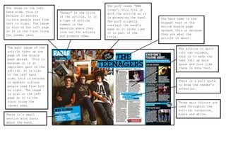
The main image takes up the entire left
page, this is because it is the first
place the reader will look, if they
recognise the artist they will be
enticed into reading the article.

The entire article is
very plain; there is
a white background
for the main article
and for the main
image. Even the band
and their clothes are
quite pale.

The title/name of the artist is the
biggest text on the entire double
page spread; this is because readers
may recognise the artist’s name.

The article is
quite small, so to
make it seem bigger
the text is split
in to three
columns; it also
has extremely large
letters to start
off the paragraphs.
Without this the
article would look
a lot smaller and
be less enticing.

Dps analysis

  • 1.
    The image onthe left hand side, this is because in western culture people read from left to right. The image is also ss the left page on so it is the first thing the reader sees. The main image of the article takes up one page of the double page spread. This is because it is an important part of the article. It is also on the left hand side, this is because in western culture people read from left to right. The image is also on the left page so it is the first thing the reader sees. There is a small section with facts about the band. “Radar” is the title of the article, it is a type of article common in the magazine where they look out for artists and promote them. The puff reads “NME loves”, this fits in with the article as it is promoting the band. The puff slightly overlays the band’s name so it looks like it is part of the title. The band name is the biggest text on the entire double page spread; this is because they are what the article is about. The article is split into two columns, this is to make the text fill up more space and look like there is more text. There is a pull quote to draw the reader’s attention. Three main colours are used throughout the article: turquoise, black and white.
  • 2.
    The main imagetakes up the entire left page, this is because it is the first place the reader will look, if they recognise the artist they will be enticed into reading the article. The entire article is very plain; there is a white background for the main article and for the main image. Even the band and their clothes are quite pale. The title/name of the artist is the biggest text on the entire double page spread; this is because readers may recognise the artist’s name. The article is quite small, so to make it seem bigger the text is split in to three columns; it also has extremely large letters to start off the paragraphs. Without this the article would look a lot smaller and be less enticing.