
More Related Content
Viewers also liked
Similar to double page spread analysis
Similar to double page spread analysis (20)
Recently uploaded
Recently uploaded (20)
double page spread analysis
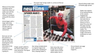
- 1. Spider-man appears to be looking directly at the camera engaging the audience. The shot also looks like an action shot and almost as if he is about the jump out the page creating excitement for the reader. The background of the image is blurred to emphasise on main image. Article begins with a large, bold, drop capital ‘w’ to begin the text and is a typical magazine convention. Mixture of red, black and white text to match the colours of spider man and the topic. This colour scheme is consistent along with the colour blue. Here you can see this sentence is slightly larger than the rest of the text showing the writer believes this information to be important, a summary of what is going on. Star rating included which is a typical image to be shown when speaking of films, drawing reader in. Overall telling reader topic of double page spread. Picture bleeds over page divide- typical of a magazine. Images, graphs added to the text to make article more attractive. The layout is in 3 columns. The word ‘new’ brings reader in, curious to find out new information. Dark, brass-like colour brings idea of danger, reader wants to know where spider man is.