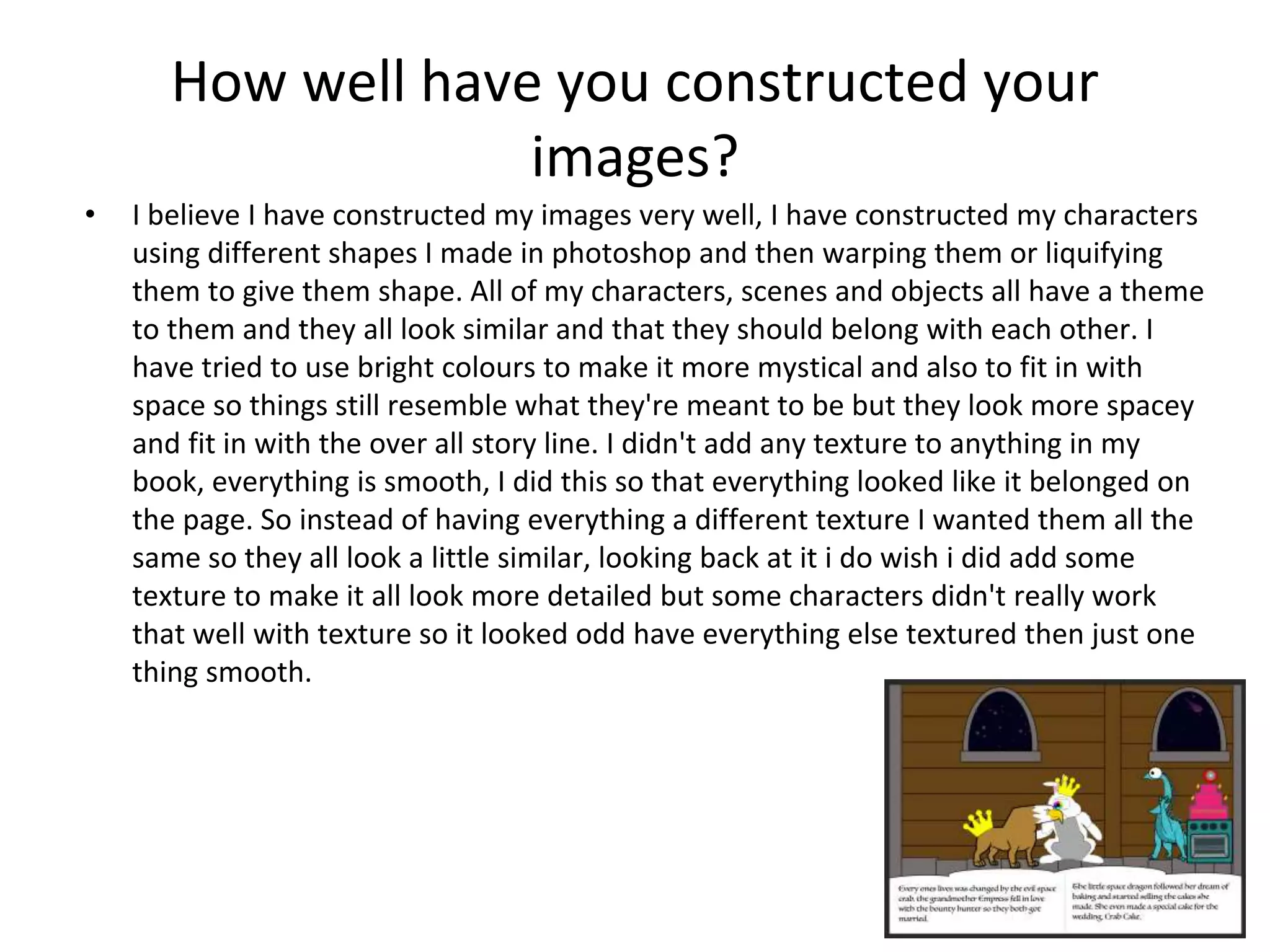
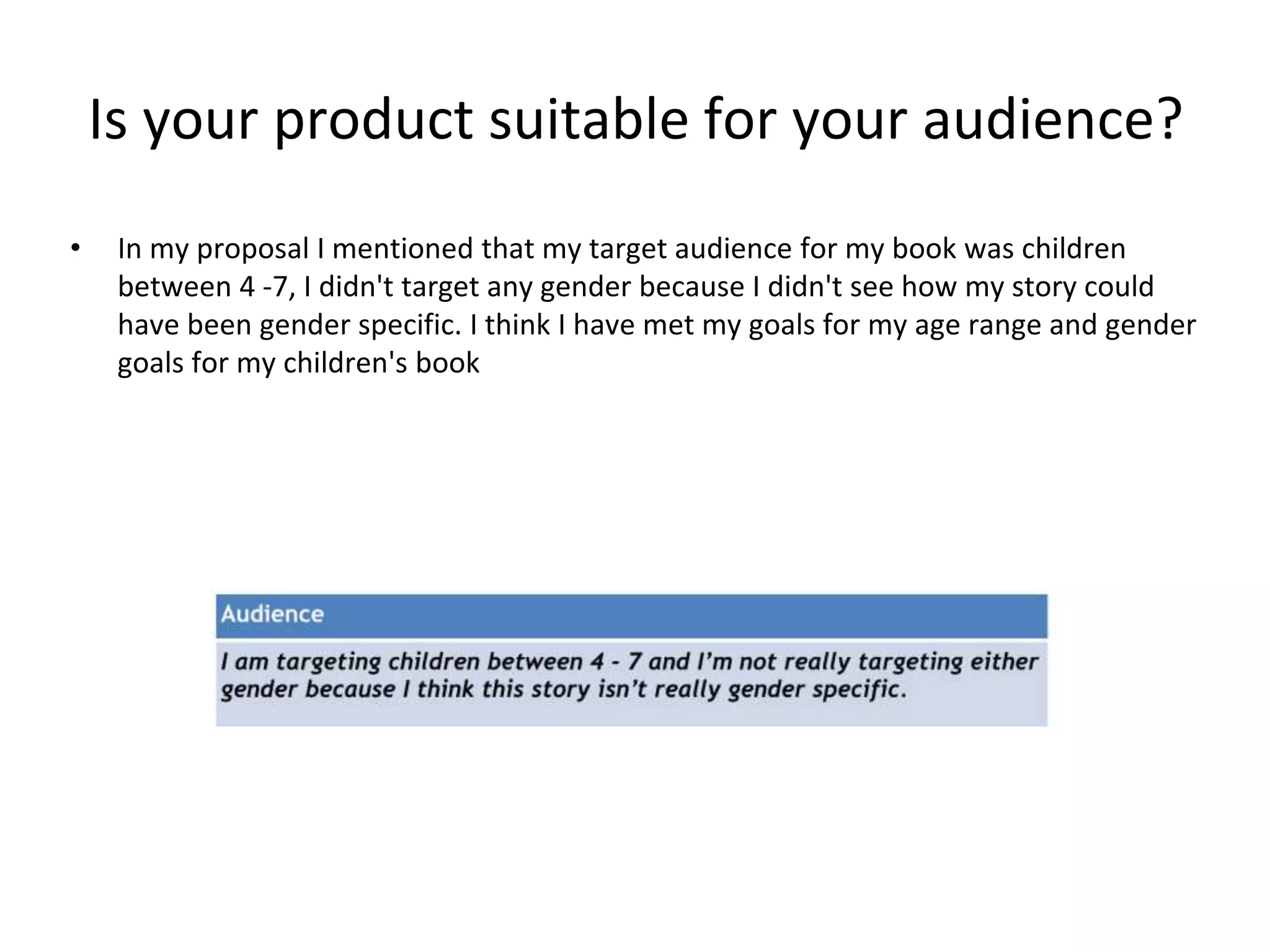
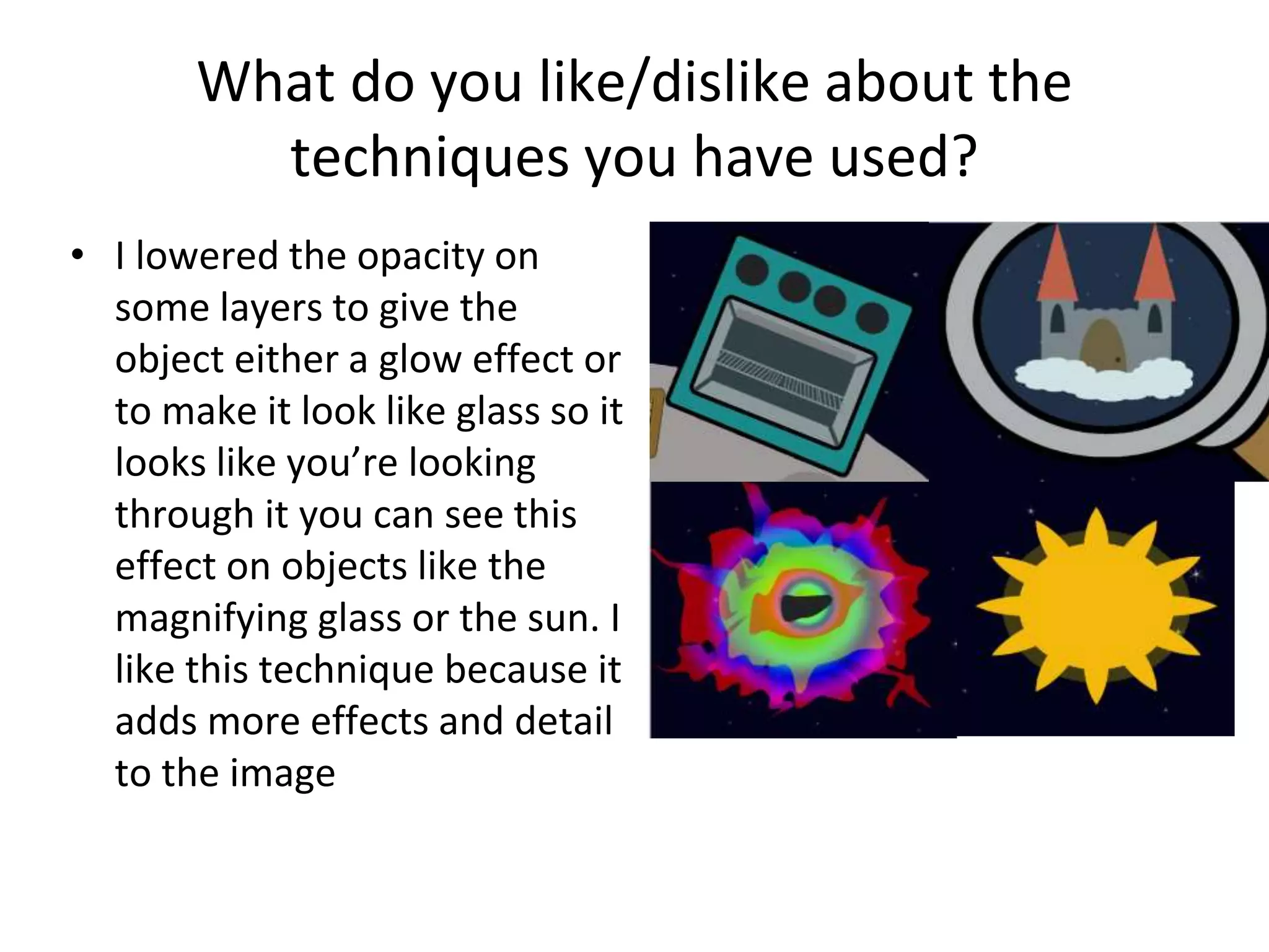
Graphic Narrative Evaluation
Use this template to help you evaluate your project.
You should give specific details about your work.
You should provide both written and visual examples to explain your project.
You should find areas to praise in your work. Be specific about why you think they are
good or why you are proud of them.
You should also find areas that could be improved. Look for areas that you could make
better if you went back to them. Be specific about what you would improve.
Add additional slides as you need to. Don’t be restricted by what is here.
Any blank slides should be deleted before submission.
Does your final product reflect your original
intentions?
• When I started my planning it didn't really have an image of what I wanted my
characters to look like, I knew what I wanted the characters to be and where the story
was set so I just used doodles and stock images off the internet of the what had in mind
just for my plan. It was only later when I sat down to design my digital flat plan I started
to get an image of what I wanted the characters to look like, but there was some
character like the empress of space and the bounty hunter I had no idea what I wanted
them to be. My finished product sticks to the same story line some characters do reflect
what they were in the plans, some characters went through minor changes e.g. changing
the colour of there skin and others changed completely.
Plan Digital Flat Plans Finished
As you can see the characters and the setting went through major changes but they stayed true t
How well have you constructed your
images?
• I believe I have constructed my images very well, I have constructed my characters
using different shapes I made in photoshop and then warping them or liquifying
them to give them shape. All of my characters, scenes and objects all have a theme
to them and they all look similar and that they should belong with each other. I
have tried to use bright colours to make it more mystical and also to fit in with
space so things still resemble what they're meant to be but they look more spacey
and fit in with the over all story line. I didn't add any texture to anything in my
book, everything is smooth, I did this so that everything looked like it belonged on
the page. So instead of having everything a different texture I wanted them all the
same so they all look a little similar, looking back at it i do wish i did add some
texture to make it all look more detailed but some characters didn't really work
that well with texture so it looked odd have everything else textured then just one
thing smooth.
How well have you used text to anchor your
images
• I put my text at the bottom of the page in a little cloud I did this to space the image
and the text away from each other I wanted it like this so whilst they are reading
the text they can also look at the whole image. I could have put the text into the
spare space of the image but I didn’t want to attract all of the attention to that
specific spot.
• I think my text describes what is going on in the story very well and it is easy to
follow my only regret is that some times I couldn't get enough information in the
images to match the text so some times more happens in the text than in shown in
the images but i don't think it is too much of a problem since the text explains it
well enough.
Is your product suitable for your audience?
• In my proposal I mentioned that my target audience for my book was children
between 4 -7, I didn't target any gender because I didn't see how my story could
have been gender specific. I think I have met my goals for my age range and gender
goals for my children's book
What do you like/dislike about the
techniques you have used?
• A lot of the landscapes,
objects and buildings were all
made with the shape tool
and then liquified them to
give them their shape as you
can see on the edges of the
moon. I like doing this
because its simple, quick and
easy the only problem I have
with this is that it doesn't
leave very detailed results.
What do you like/dislike about the
techniques you have used?
• I lowered the opacity on
some layers to give the
object either a glow effect or
to make it look like glass so it
looks like you’re looking
through it you can see this
effect on objects like the
magnifying glass or the sun. I
like this technique because it
adds more effects and detail
to the image
What do you like/dislike about how your
final product looks?
• My final product has a continuos art style that is quit simple and cartoony
it also involves many colours I like this because it would attract the
younger children's attention and its not too difficult to see and understand
what they’re looking at, the only thing I don't like about my end product is
that I didn't involve more detail into my objects, characters and
backgrounds I would have liked to do this to give my images more depth
and made them more interesting to look at.
• I also like how my text is set out through out the whole book because it is
in the same place each time and it is clear where the text box is, I think
this is good because it will make it easier for young readers to read my
book. I like my text box because it doesn't take too much space of the
page so it is not getting in the way of the images.
Why did you include the content you used?
• Images, fonts, effects, colours
• The font I used for my text is Luminari because it gives the text a Mystical /
adventure like look, some thing to make the boring text looking interesting and
inviting, for the same reasons this is why I made the text box a cloud, so it looks like
a fantasy and the children are being told more of a story.
• I used bright colours to attract the view of my audience and make the characters
and objects more appealing. I tried to avoid any dark colours on my characters and
objects because I felt that space being black there was too much dark and any
more would have made it look to droll.
What signs, symbols or codes have your
used in your work?
• I wanted to set my story in space because you don’t get that many
children’s book set in spaced also there is just something about space that
seems magical how it just goes on forever and I felt this would help to the
feel of my fantasy children book.
• I Used a lot of bright colours because of two reason the first is that
because it is set in space every thing is alien and different so there are no
restrictions on things like skin colour or physics and secondly it helps
attract the attention of the reader and makes things look more interesting.
Creative Media Production 2012
Audience Responses
Cultural competence:
Media texts require us to have a certain level of cultural understanding to
be able to interpret them.
At a basic level, this could mean being able to read the language that a
magazine is written in.
At a deeper level, it means being able to interpret signs and symbols that
we use a visual shorthand to communicate ideas.
We recognise these signs in our own culture but find it harder to
understand when looking at others.
We create and attach meaning to signs and symbols in many different
forms.
13
Creative Media Production 2012
Audience Responses
Cultural competence:
What is this?
This is a Norwegian Pine tree, covered in
snow and with a red ribbon on.
Our cultural understanding allows us to
interpret its meaning.
To us, in British society, it means
Christmas, presents and family.
This is because we share a cultural
knowledge.
14
Creative Media Production 2012
Audience Responses
Cultural competence:
There are many other signs and symbols
that we attach meaning to.
A leather jacket can imply rebellion.
A sports car can imply wealth and power.
A cross can represent religion.
15
Creative Media Production 2012
Audience Responses
Cultural competence:
Visual representations of everyday objects are often the same the world
over. A car appears as a car, no matter what country it appears in.
What that car means however, can be very different depending on your
cultural background.
16
What representations can be found in your
work?
• My main character is a woman and her skin colour is light blue, I’ve
had people look at my book and say things like “why isn't she pink,
that would help the reader understand that she is a woman” and
that is exactly what I didn't want because there is no reason that
women should be represented by one colour.
• Other than that there isn't that much representation in my book
which I don't think is a bad thing because the characters are so far
from humans it is hard for them to be relatable and represent
anything, the antagonist the space crab is never specified to be a
man or a woman or even have a religion so I fail to see how it could
represent any thing offensive, however he does represent stranger
danger.
What style have you employed in your
products?
• When I chose my visual style I looked at other
children books like ‘what the lady bird heard’ and ‘
The Bird who loved to moo’ and I liked their visual
style because they looked simple, colourful and the
animals and objects looked like they were made out
of different shapes and I really liked this and I tried
to copy it a little for my own art style. I also wanted
to use bright colours for my characters so they stick
out from the blackness of space.
What were the strengths and weaknesses of
the pre-production and planning
• A strength of my planning is that I did a lot of research before
hand so I had a clear idea of what I wanted my story to look
like, were I wanted to go with it and what my characters
were going to be called and what they were. A weakness in
my planning is that I didn't have a final idea of what I wanted
my character to look like but when I got to designing them I
decided pretty quickly.
• I managed my time pretty well because I finished the over all
book with a modest amount of time left witch meant I had
enough time to go back and fine tune some things.
Historical and cultural context
• My children's book compared to other children books
and older children’s books uses a lot more modern
styles and themes and also the art style is modern
and looks very computer generated compared to
some books that looks like it was hand drawn or
painted like ‘The cat in The Hat’.
• There is quit a bit of text on each page of my children
book witch is some thing that can be found in older
children’s book and not that many modern ones.
Peer Feedback
• Some of the responses I agree with and they are that I could
have put more detail in to my planning and mood boards also
that I could have spread the text out a little more so theres
not that much to read on each page.
• Some of the responses I don’t agree with are people who
think it is a little too weird for a children’s book and it should
be a little more normal so they could understand it more but
I feel this doesn't need to be changed because it is silly and
the whole point is that is is an adventure to some thing new
and exciting for them.

Digital graphics evaluation pro forma

  • 1.
  • 2.
    Use this templateto help you evaluate your project. You should give specific details about your work. You should provide both written and visual examples to explain your project. You should find areas to praise in your work. Be specific about why you think they are good or why you are proud of them. You should also find areas that could be improved. Look for areas that you could make better if you went back to them. Be specific about what you would improve. Add additional slides as you need to. Don’t be restricted by what is here. Any blank slides should be deleted before submission.
  • 3.
    Does your finalproduct reflect your original intentions? • When I started my planning it didn't really have an image of what I wanted my characters to look like, I knew what I wanted the characters to be and where the story was set so I just used doodles and stock images off the internet of the what had in mind just for my plan. It was only later when I sat down to design my digital flat plan I started to get an image of what I wanted the characters to look like, but there was some character like the empress of space and the bounty hunter I had no idea what I wanted them to be. My finished product sticks to the same story line some characters do reflect what they were in the plans, some characters went through minor changes e.g. changing the colour of there skin and others changed completely.
  • 4.
    Plan Digital FlatPlans Finished As you can see the characters and the setting went through major changes but they stayed true t
  • 5.
    How well haveyou constructed your images? • I believe I have constructed my images very well, I have constructed my characters using different shapes I made in photoshop and then warping them or liquifying them to give them shape. All of my characters, scenes and objects all have a theme to them and they all look similar and that they should belong with each other. I have tried to use bright colours to make it more mystical and also to fit in with space so things still resemble what they're meant to be but they look more spacey and fit in with the over all story line. I didn't add any texture to anything in my book, everything is smooth, I did this so that everything looked like it belonged on the page. So instead of having everything a different texture I wanted them all the same so they all look a little similar, looking back at it i do wish i did add some texture to make it all look more detailed but some characters didn't really work that well with texture so it looked odd have everything else textured then just one thing smooth.
  • 6.
    How well haveyou used text to anchor your images • I put my text at the bottom of the page in a little cloud I did this to space the image and the text away from each other I wanted it like this so whilst they are reading the text they can also look at the whole image. I could have put the text into the spare space of the image but I didn’t want to attract all of the attention to that specific spot. • I think my text describes what is going on in the story very well and it is easy to follow my only regret is that some times I couldn't get enough information in the images to match the text so some times more happens in the text than in shown in the images but i don't think it is too much of a problem since the text explains it well enough.
  • 7.
    Is your productsuitable for your audience? • In my proposal I mentioned that my target audience for my book was children between 4 -7, I didn't target any gender because I didn't see how my story could have been gender specific. I think I have met my goals for my age range and gender goals for my children's book
  • 8.
    What do youlike/dislike about the techniques you have used? • A lot of the landscapes, objects and buildings were all made with the shape tool and then liquified them to give them their shape as you can see on the edges of the moon. I like doing this because its simple, quick and easy the only problem I have with this is that it doesn't leave very detailed results.
  • 9.
    What do youlike/dislike about the techniques you have used? • I lowered the opacity on some layers to give the object either a glow effect or to make it look like glass so it looks like you’re looking through it you can see this effect on objects like the magnifying glass or the sun. I like this technique because it adds more effects and detail to the image
  • 10.
    What do youlike/dislike about how your final product looks? • My final product has a continuos art style that is quit simple and cartoony it also involves many colours I like this because it would attract the younger children's attention and its not too difficult to see and understand what they’re looking at, the only thing I don't like about my end product is that I didn't involve more detail into my objects, characters and backgrounds I would have liked to do this to give my images more depth and made them more interesting to look at. • I also like how my text is set out through out the whole book because it is in the same place each time and it is clear where the text box is, I think this is good because it will make it easier for young readers to read my book. I like my text box because it doesn't take too much space of the page so it is not getting in the way of the images.
  • 11.
    Why did youinclude the content you used? • Images, fonts, effects, colours • The font I used for my text is Luminari because it gives the text a Mystical / adventure like look, some thing to make the boring text looking interesting and inviting, for the same reasons this is why I made the text box a cloud, so it looks like a fantasy and the children are being told more of a story. • I used bright colours to attract the view of my audience and make the characters and objects more appealing. I tried to avoid any dark colours on my characters and objects because I felt that space being black there was too much dark and any more would have made it look to droll.
  • 12.
    What signs, symbolsor codes have your used in your work? • I wanted to set my story in space because you don’t get that many children’s book set in spaced also there is just something about space that seems magical how it just goes on forever and I felt this would help to the feel of my fantasy children book. • I Used a lot of bright colours because of two reason the first is that because it is set in space every thing is alien and different so there are no restrictions on things like skin colour or physics and secondly it helps attract the attention of the reader and makes things look more interesting.
  • 13.
    Creative Media Production2012 Audience Responses Cultural competence: Media texts require us to have a certain level of cultural understanding to be able to interpret them. At a basic level, this could mean being able to read the language that a magazine is written in. At a deeper level, it means being able to interpret signs and symbols that we use a visual shorthand to communicate ideas. We recognise these signs in our own culture but find it harder to understand when looking at others. We create and attach meaning to signs and symbols in many different forms. 13
  • 14.
    Creative Media Production2012 Audience Responses Cultural competence: What is this? This is a Norwegian Pine tree, covered in snow and with a red ribbon on. Our cultural understanding allows us to interpret its meaning. To us, in British society, it means Christmas, presents and family. This is because we share a cultural knowledge. 14
  • 15.
    Creative Media Production2012 Audience Responses Cultural competence: There are many other signs and symbols that we attach meaning to. A leather jacket can imply rebellion. A sports car can imply wealth and power. A cross can represent religion. 15
  • 16.
    Creative Media Production2012 Audience Responses Cultural competence: Visual representations of everyday objects are often the same the world over. A car appears as a car, no matter what country it appears in. What that car means however, can be very different depending on your cultural background. 16
  • 17.
    What representations canbe found in your work? • My main character is a woman and her skin colour is light blue, I’ve had people look at my book and say things like “why isn't she pink, that would help the reader understand that she is a woman” and that is exactly what I didn't want because there is no reason that women should be represented by one colour. • Other than that there isn't that much representation in my book which I don't think is a bad thing because the characters are so far from humans it is hard for them to be relatable and represent anything, the antagonist the space crab is never specified to be a man or a woman or even have a religion so I fail to see how it could represent any thing offensive, however he does represent stranger danger.
  • 18.
    What style haveyou employed in your products? • When I chose my visual style I looked at other children books like ‘what the lady bird heard’ and ‘ The Bird who loved to moo’ and I liked their visual style because they looked simple, colourful and the animals and objects looked like they were made out of different shapes and I really liked this and I tried to copy it a little for my own art style. I also wanted to use bright colours for my characters so they stick out from the blackness of space.
  • 19.
    What were thestrengths and weaknesses of the pre-production and planning • A strength of my planning is that I did a lot of research before hand so I had a clear idea of what I wanted my story to look like, were I wanted to go with it and what my characters were going to be called and what they were. A weakness in my planning is that I didn't have a final idea of what I wanted my character to look like but when I got to designing them I decided pretty quickly. • I managed my time pretty well because I finished the over all book with a modest amount of time left witch meant I had enough time to go back and fine tune some things.
  • 20.
    Historical and culturalcontext • My children's book compared to other children books and older children’s books uses a lot more modern styles and themes and also the art style is modern and looks very computer generated compared to some books that looks like it was hand drawn or painted like ‘The cat in The Hat’. • There is quit a bit of text on each page of my children book witch is some thing that can be found in older children’s book and not that many modern ones.
  • 21.
    Peer Feedback • Someof the responses I agree with and they are that I could have put more detail in to my planning and mood boards also that I could have spread the text out a little more so theres not that much to read on each page. • Some of the responses I don’t agree with are people who think it is a little too weird for a children’s book and it should be a little more normal so they could understand it more but I feel this doesn't need to be changed because it is silly and the whole point is that is is an adventure to some thing new and exciting for them.