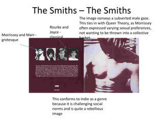
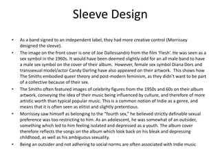
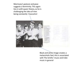
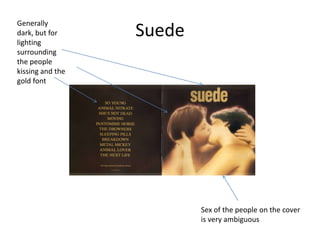
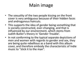
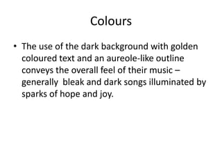
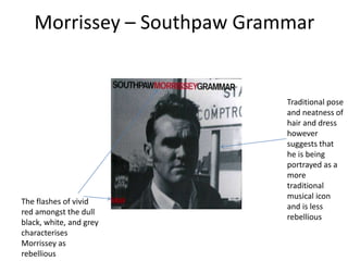
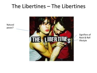
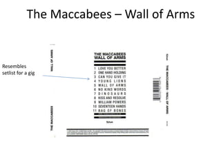
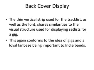
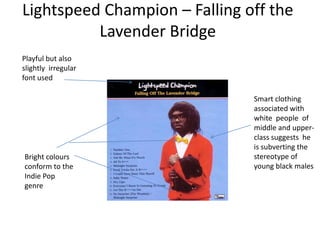
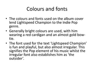
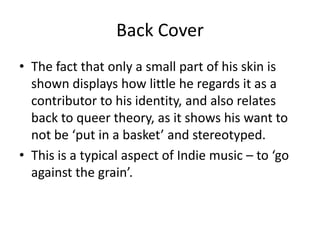
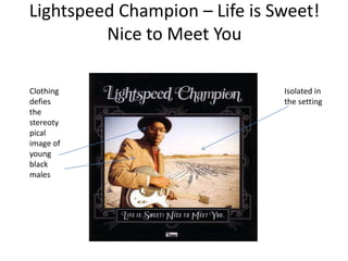
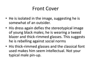
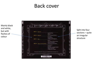
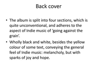
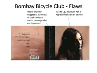
Digipaks


A digipak is a patented style of CD
       and DVD packaging
Joy Division – Love Will Tear Us Apart


Unclean and
raw
Working-Class Roots
• The unclean look of the front cover portrays
  their music as raw , but also slightly
  disturbing.
• It also conveys the working-class roots of the
  band. A lot of Indie bands , more so in the
  1970s and 80s, played in small and dingy
  venues to begin with.
The Smiths – The Smiths
                                        The image conveys a subverted male gaze.
                                        This ties in with Queer Theory, as Morrissey
                       Rourke and       often expressed varying sexual preferences,
                       Joyce -          not wanting to be thrown into a collective
Morrissey and Marr -
                       classical        basket.
grotesque


                        This conforms to Indie as a genre
                        because it is challenging social
                        norms and is quite a rebellious
                        image
Pictures of Band Members

• Morrissey and Marr are deemed more important
  to the band (being the frontman and lead
  guitarist), and perhaps the band members who
  are more appealing to the audience.
• Therefore, in their photos, the poses are
  grotesque. This is because the audience is likely
  to have more interest in them as people
• Contrary to this, the photos of Rourke and Joyce
  are natural.
Sleeve Design
•   As a band signed to an independent label, they had more creative control (Morrissey
    designed the sleeve).
•   The image on the front cover is one of Joe Dallessandro from the film ‘Flesh’. He was seen as a
    sex symbol in the 1960s. It would have been deemed slightly odd for an all male band to have
    a male sex symbol on the cover of their album. However, female sex symbol Diana Dors and
    transsexual model/actor Candy Darling have also appeared on their artwork. This shows how
    The Smiths embodied queer theory and post-modern feminism, as they didn’t want to be part
    of a collective because of their sex.
•   The Smiths often featured images of celebrity figures from the 1950s and 60s on their album
    artwork, conveying the idea of their music being influenced by culture, and therefore of more
    artistic worth than typical popular music. This is a common notion of Indie as a genre, and
    means that it is often seen as elitist and slightly pretentious.
•   Morrissey saw himself as belonging to the “fourth sex,” he believed strictly definable sexual
    preference was too restricting to him. As an adolescent, he was somewhat of an outsider,
    something which led to him feeling isolated and depressed as a youth. The album cover
    therefore reflects the songs on the album which look back on his bleak and depressing
    childhood, as well as his ambiguous sexuality.
•   Being an outsider and not adhering to social norms are often associated with Indie music
Morrissey’s posture and pose
suggests a femininity. This again
ties in with queer theory, as he is
challenging the idea of men
being constantly ‘masculine’.


                                Black and white image creates a
                                melancholic feel; this is associated
                                with The Smiths’ music and Indie
                                music in general
Lyrics

• Lyrics to all of the songs are featured in a booklet
  inside the digipak.
• Morrissey was aggravated by the meaningless songs in
  the charts, as he expresses in The Smiths’ song ‘Panic’
  – “Because the music that they constantly play / It says
  nothing to me about my life.”
• The choice to include the image of the band beside the
  lyrics of arguably the most depressing song on the
  album (‘Suffer Little Children’, which is about the
  Moors Murders) and also to have the image in black
  and white illustrates the generally bleak outlook of the
  lyrics on the album.
Generally
dark, but for
lighting
                  Suede
surrounding
the people
kissing and the
gold font


                          Sex of the people on the cover
                          is very ambiguous
Main image
• The sexuality of the two people kissing on the front
  cover is very ambiguous because of their hidden faces
  and androgynous haircuts.
• This supports the idea of gender being something that
  is socially constructed, ever-changing, and that is
  influenced by our environment, which stems from
  Judith Butler’s theory in ‘Gender Trouble’.
• In not conforming to the typical separate depictions of
  men and women with regards to gender and sex, they
  are being quite rebellious as a band with this album
  cover, and therefore embody the characteristic of Indie
  music to “stick it to the man”.
Colours
• The use of the dark background with golden
  coloured text and an aureole-like outline
  conveys the overall feel of their music –
  generally bleak and dark songs illuminated by
  sparks of hope and joy.
Morrissey – Southpaw Grammar


                            Traditional pose
                            and neatness of
                            hair and dress
                            however
                            suggests that
                            he is being
                            portrayed as a
                            more
                            traditional
                            musical icon
The flashes of vivid
                            and is less
red amongst the dull
                            rebellious
black, white, and grey
characterises
Morrissey as
rebellious
Solo

• Never appeared on any of The Smiths’ artwork, but
  always appears on the front of his own albums.
  Suggests the focus moved away from the actual music
  when he started recording without the rest of The
  Smiths, and was placed more upon himself as an icon.
• However, the artwork still has similarities with The
  Smiths’ artwork and conforms to conventions of Indie
  as a genre. Black and white are the only colours used,
  apart from the red for the text of his name and the
  record label. Red is a colour associated with passion,
  and therefore reflects Morrissey’s strong views and
  rebellious nature.
Refuses to conform
                         to the glamorous
                         celebrity culture by
                         using his CD as a
                         marketing tool.
                         Instead chooses a
                         very classical and
                         plain design.


Imitation of an LP
record, perhaps
suggesting he is still
making ‘real’ music
and doesn’t conform
to trends
The Libertines – The Libertines

Natural
poses?

                                Signifiers of
                                Rock & Roll
                                lifestyle
‘Rock and Roll’

• Although the photo is clearly posed, the way
  in which Carl Barat and Peter Doherty are
  stood suggests a naturalness. Additionally,
  Peter Doherty’s glance is far from towards the
  camera, suggesting a disorderliness associated
  with the ‘Rock & Roll’ lifestyle.
• Furthermore, their tattoos and the cigarette
  that Peter is holding are also signifiers of a
  ‘Rock & Roll’ lifestyle.
CD Design
CD Design

• The font used resembles that on some
  promotional posters for gigs. This links to the
  origins of Indie music, where gigs contributed
  a significant amount to a band’s income
  because of them having a loyal fan base.
• The Libertines often used to offer small,
  intimate gigs to dedicated fans; sometimes in
  their own house.
Arctic Monkeys - Working-class roots
• Arctic Monkeys convey the working-class roots
  of the genre through their CD design.
Whatever People Say I Am, That’s
        What I’m Not


The working-class roots are conveyed through
the design of this album through it appearing
as almost a massive ash tray. Furthermore,
cigarettes are a signifier of a ‘Rock & Roll’
lifestyle.
Humbug


Their working-class roots are illustrated by
the CD design here, as it is made to resemble
a pie, and pies are a food which is associated
with the working-class.
The Maccabees – Wall of Arms


Resembles
setlist for a gig
Back Cover Display

• The thin vertical strip used for the tracklist, as
  well as the font, shares similarities to the
  visual structure used for displaying setlists for
  a gig.
• This again conforms to the idea of gigs and a
  loyal fanbase being important to Indie bands.
Lightspeed Champion – Falling off the
          Lavender Bridge
Playful but also
slightly irregular
font used

                               Smart clothing
                               associated with
                               white people of
                               middle and upper-
                               class suggests he
                               is subverting the
Bright colours                 stereotype of
conform to the                 young black males
Indie Pop
genre
Queer theory
• This theory states that identity is not fixed, and therefore cannot be
  categorised and labelled. It argues that people should not be
  thrown into a collective basket because of their sexuality.
• Although this isn’t directly applicable to Devonte Hynes (Lightspeed
  Champion) through sexuality, it is applicable through the stereotype
  in Britain of young black males. The completely contrasting typical
  white middle to upper-class attire that he is sporting establishes
  himself as challenging the general image of young black British
  males. It ties in with the conventions of the Indie genre, as it is
  characterised as rebellious and challenges social norms.
• He often voices how he feels he doesn’t fit in with the expectations
  society in general might have of himself because of his race through
  his lyrics; “I’ve turned my back on my race,” “I feel the n**ger eyes,
  they’re staring / makes me want to rip off my skin.”
Colours and fonts
• The colours and fonts used on the album cover
  lend Lightspeed Champion to the Indie Pop
  genre.
• Generally bright colours are used, with him
  wearing a red cardigan and an almost gold bow-
  tie.
• The font used for the text ‘Lightspeed Champion’
  is fun and playful, but also almost irregular. This
  signifies the Pop element of his music whilst the
  irregular font also establishes him as ‘the
  outsider’.
Back cover
Back Cover
• The fact that only a small part of his skin is
  shown displays how little he regards it as a
  contributor to his identity, and also relates
  back to queer theory, as it shows his want to
  not be ‘put in a basket’ and stereotyped.
• This is a typical aspect of Indie music – to ‘go
  against the grain’.
Lightspeed Champion – Life is Sweet!
         Nice to Meet You

Clothing                       Isolated in
defies                         the setting
the
stereoty
pical
image of
young
black
males
Front Cover
• He is isolated in the image, suggesting he is
  somewhat of an outsider.
• His dress again defies the stereotypical image
  of young black males; he is wearing a tweed
  blazer and thick-rimmed glasses. This suggests
  he is rebelling against social norms
• His thick-rimmed glasses and the classical font
  used makes him seem intellectual. Not your
  typical male pin-up.
Back cover


Mainly black
and white,
                            Split into four
but with
                            sections – quite
flashes of
                            an irregular
colour
                            structure
Back cover

• The album is split into four sections, which is
  quite unconventional, and adheres to the
  aspect of Indie music of ‘going against the
  grain’.
• Wholly black and white, besides the yellow
  colour of some text, conveying the general
  feel of Indie music: melancholy, but with
  sparks of joy and hope.
Bombay Bicycle Club - Flaws
    Heavy shadow          Made-up, however not a
    suggests a darkness   typical depiction of beauty.
    to their acoustic
    music, amongst the
    earthy colours
• Being a wholly acoustic album, the colours are different;
  generally being more earthy and natural.
• However, the image on the front cover still carries
  conventions of the genre. The person is clearly made-up,
  however does not conform to the traditional depiction of
  beauty. The image ties in with the idea of the “iron
  maiden” from ‘The Beauty Myth’ because she is clearly
  trying to reach an unattainable standard of beauty, but is
  being punished psychologically – the heavy shadow
  suggests depression.
• The presentation of an alternative form of beauty conforms
  to the ides of Indie music challenging social norms, whilst
  also tying in with the title of the album: ‘Flaws’.

Digipaks

  • 1.
    Digipaks A digipak isa patented style of CD and DVD packaging
  • 2.
    Joy Division –Love Will Tear Us Apart Unclean and raw
  • 3.
    Working-Class Roots • Theunclean look of the front cover portrays their music as raw , but also slightly disturbing. • It also conveys the working-class roots of the band. A lot of Indie bands , more so in the 1970s and 80s, played in small and dingy venues to begin with.
  • 4.
    The Smiths –The Smiths The image conveys a subverted male gaze. This ties in with Queer Theory, as Morrissey Rourke and often expressed varying sexual preferences, Joyce - not wanting to be thrown into a collective Morrissey and Marr - classical basket. grotesque This conforms to Indie as a genre because it is challenging social norms and is quite a rebellious image
  • 5.
    Pictures of BandMembers • Morrissey and Marr are deemed more important to the band (being the frontman and lead guitarist), and perhaps the band members who are more appealing to the audience. • Therefore, in their photos, the poses are grotesque. This is because the audience is likely to have more interest in them as people • Contrary to this, the photos of Rourke and Joyce are natural.
  • 6.
    Sleeve Design • As a band signed to an independent label, they had more creative control (Morrissey designed the sleeve). • The image on the front cover is one of Joe Dallessandro from the film ‘Flesh’. He was seen as a sex symbol in the 1960s. It would have been deemed slightly odd for an all male band to have a male sex symbol on the cover of their album. However, female sex symbol Diana Dors and transsexual model/actor Candy Darling have also appeared on their artwork. This shows how The Smiths embodied queer theory and post-modern feminism, as they didn’t want to be part of a collective because of their sex. • The Smiths often featured images of celebrity figures from the 1950s and 60s on their album artwork, conveying the idea of their music being influenced by culture, and therefore of more artistic worth than typical popular music. This is a common notion of Indie as a genre, and means that it is often seen as elitist and slightly pretentious. • Morrissey saw himself as belonging to the “fourth sex,” he believed strictly definable sexual preference was too restricting to him. As an adolescent, he was somewhat of an outsider, something which led to him feeling isolated and depressed as a youth. The album cover therefore reflects the songs on the album which look back on his bleak and depressing childhood, as well as his ambiguous sexuality. • Being an outsider and not adhering to social norms are often associated with Indie music
  • 7.
    Morrissey’s posture andpose suggests a femininity. This again ties in with queer theory, as he is challenging the idea of men being constantly ‘masculine’. Black and white image creates a melancholic feel; this is associated with The Smiths’ music and Indie music in general
  • 8.
    Lyrics • Lyrics toall of the songs are featured in a booklet inside the digipak. • Morrissey was aggravated by the meaningless songs in the charts, as he expresses in The Smiths’ song ‘Panic’ – “Because the music that they constantly play / It says nothing to me about my life.” • The choice to include the image of the band beside the lyrics of arguably the most depressing song on the album (‘Suffer Little Children’, which is about the Moors Murders) and also to have the image in black and white illustrates the generally bleak outlook of the lyrics on the album.
  • 9.
    Generally dark, but for lighting Suede surrounding the people kissing and the gold font Sex of the people on the cover is very ambiguous
  • 10.
    Main image • Thesexuality of the two people kissing on the front cover is very ambiguous because of their hidden faces and androgynous haircuts. • This supports the idea of gender being something that is socially constructed, ever-changing, and that is influenced by our environment, which stems from Judith Butler’s theory in ‘Gender Trouble’. • In not conforming to the typical separate depictions of men and women with regards to gender and sex, they are being quite rebellious as a band with this album cover, and therefore embody the characteristic of Indie music to “stick it to the man”.
  • 11.
    Colours • The useof the dark background with golden coloured text and an aureole-like outline conveys the overall feel of their music – generally bleak and dark songs illuminated by sparks of hope and joy.
  • 12.
    Morrissey – SouthpawGrammar Traditional pose and neatness of hair and dress however suggests that he is being portrayed as a more traditional musical icon The flashes of vivid and is less red amongst the dull rebellious black, white, and grey characterises Morrissey as rebellious
  • 13.
    Solo • Never appearedon any of The Smiths’ artwork, but always appears on the front of his own albums. Suggests the focus moved away from the actual music when he started recording without the rest of The Smiths, and was placed more upon himself as an icon. • However, the artwork still has similarities with The Smiths’ artwork and conforms to conventions of Indie as a genre. Black and white are the only colours used, apart from the red for the text of his name and the record label. Red is a colour associated with passion, and therefore reflects Morrissey’s strong views and rebellious nature.
  • 14.
    Refuses to conform to the glamorous celebrity culture by using his CD as a marketing tool. Instead chooses a very classical and plain design. Imitation of an LP record, perhaps suggesting he is still making ‘real’ music and doesn’t conform to trends
  • 15.
    The Libertines –The Libertines Natural poses? Signifiers of Rock & Roll lifestyle
  • 16.
    ‘Rock and Roll’ •Although the photo is clearly posed, the way in which Carl Barat and Peter Doherty are stood suggests a naturalness. Additionally, Peter Doherty’s glance is far from towards the camera, suggesting a disorderliness associated with the ‘Rock & Roll’ lifestyle. • Furthermore, their tattoos and the cigarette that Peter is holding are also signifiers of a ‘Rock & Roll’ lifestyle.
  • 17.
  • 18.
    CD Design • Thefont used resembles that on some promotional posters for gigs. This links to the origins of Indie music, where gigs contributed a significant amount to a band’s income because of them having a loyal fan base. • The Libertines often used to offer small, intimate gigs to dedicated fans; sometimes in their own house.
  • 19.
    Arctic Monkeys -Working-class roots • Arctic Monkeys convey the working-class roots of the genre through their CD design.
  • 20.
    Whatever People SayI Am, That’s What I’m Not The working-class roots are conveyed through the design of this album through it appearing as almost a massive ash tray. Furthermore, cigarettes are a signifier of a ‘Rock & Roll’ lifestyle.
  • 21.
    Humbug Their working-class rootsare illustrated by the CD design here, as it is made to resemble a pie, and pies are a food which is associated with the working-class.
  • 22.
    The Maccabees –Wall of Arms Resembles setlist for a gig
  • 23.
    Back Cover Display •The thin vertical strip used for the tracklist, as well as the font, shares similarities to the visual structure used for displaying setlists for a gig. • This again conforms to the idea of gigs and a loyal fanbase being important to Indie bands.
  • 24.
    Lightspeed Champion –Falling off the Lavender Bridge Playful but also slightly irregular font used Smart clothing associated with white people of middle and upper- class suggests he is subverting the Bright colours stereotype of conform to the young black males Indie Pop genre
  • 25.
    Queer theory • Thistheory states that identity is not fixed, and therefore cannot be categorised and labelled. It argues that people should not be thrown into a collective basket because of their sexuality. • Although this isn’t directly applicable to Devonte Hynes (Lightspeed Champion) through sexuality, it is applicable through the stereotype in Britain of young black males. The completely contrasting typical white middle to upper-class attire that he is sporting establishes himself as challenging the general image of young black British males. It ties in with the conventions of the Indie genre, as it is characterised as rebellious and challenges social norms. • He often voices how he feels he doesn’t fit in with the expectations society in general might have of himself because of his race through his lyrics; “I’ve turned my back on my race,” “I feel the n**ger eyes, they’re staring / makes me want to rip off my skin.”
  • 26.
    Colours and fonts •The colours and fonts used on the album cover lend Lightspeed Champion to the Indie Pop genre. • Generally bright colours are used, with him wearing a red cardigan and an almost gold bow- tie. • The font used for the text ‘Lightspeed Champion’ is fun and playful, but also almost irregular. This signifies the Pop element of his music whilst the irregular font also establishes him as ‘the outsider’.
  • 27.
  • 28.
    Back Cover • Thefact that only a small part of his skin is shown displays how little he regards it as a contributor to his identity, and also relates back to queer theory, as it shows his want to not be ‘put in a basket’ and stereotyped. • This is a typical aspect of Indie music – to ‘go against the grain’.
  • 29.
    Lightspeed Champion –Life is Sweet! Nice to Meet You Clothing Isolated in defies the setting the stereoty pical image of young black males
  • 30.
    Front Cover • Heis isolated in the image, suggesting he is somewhat of an outsider. • His dress again defies the stereotypical image of young black males; he is wearing a tweed blazer and thick-rimmed glasses. This suggests he is rebelling against social norms • His thick-rimmed glasses and the classical font used makes him seem intellectual. Not your typical male pin-up.
  • 31.
    Back cover Mainly black andwhite, Split into four but with sections – quite flashes of an irregular colour structure
  • 32.
    Back cover • Thealbum is split into four sections, which is quite unconventional, and adheres to the aspect of Indie music of ‘going against the grain’. • Wholly black and white, besides the yellow colour of some text, conveying the general feel of Indie music: melancholy, but with sparks of joy and hope.
  • 33.
    Bombay Bicycle Club- Flaws Heavy shadow Made-up, however not a suggests a darkness typical depiction of beauty. to their acoustic music, amongst the earthy colours
  • 34.
    • Being awholly acoustic album, the colours are different; generally being more earthy and natural. • However, the image on the front cover still carries conventions of the genre. The person is clearly made-up, however does not conform to the traditional depiction of beauty. The image ties in with the idea of the “iron maiden” from ‘The Beauty Myth’ because she is clearly trying to reach an unattainable standard of beauty, but is being punished psychologically – the heavy shadow suggests depression. • The presentation of an alternative form of beauty conforms to the ides of Indie music challenging social norms, whilst also tying in with the title of the album: ‘Flaws’.