The document discusses principles that web designers can learn from print designers. It suggests using larger font sizes, different font faces, and more color in typography. For whitespace, it recommends using it to create structure, letting content breathe, and giving visitors rest. It also advises against limiting designs to small browser canvases and to think bigger. Composition principles include dividing text into columns, incorporating copy into layouts, and creating contrast. The document stresses designing content and surrounding elements as a unified visual language to communicate and tell a story.
What web designers could learn from print designersErlend Debast
This presentation is about what we (as web designers) could learn from print designers.
This presentation covers; typography, white space, composition, thinking bigger & visual language.
If you’re a creative or technical professional, odds are you need a great portfolio website. What makes a good portfolio? What if you’re a writer, or a developer, and don’t have a lot of visual work to show? We’ll go over how to navigate the intimidating world of personal portfolio websites, using WordPress as our guide.
Presentation by Andy Wibbels from Six Apart about the impact of blogging to business. At an Atlanta Tribune conference for entrepreneurs and small business.
How to Pick a WordPress Theme - A Guide for BeginnersChristina Hills
In this presentation first given at WordCamp LAX, Christina Hills is going to show you, in an easy-to-understand, non-techie way, the things you should look at when choosing a WordPress theme for your website. And how you can do it yourself without being a designer!
Let’s be honest. Rails is hard. Many people have begun the Rails journey, to fall short of developing anything outside of a tutorial.
The bright side is that Rails starts to become your best friend, your swiss-army knife of web solutions, when you get past the initial hurdle of your first production application.
What separates those that make the cut from the wannabes? Get some insight into harnessing the Rails beast.
Web Design Teaching - Sharing Effective Tools and TechniquesShelley Bartlette
Sharing Effective Tools and Techniques in Undergraduate Web Design Teaching. This is my talk given at this years Web Teaching Day @webteachingday at Greenwich University, London on 22nd May 2015.
Inclusive design: real accessibility for everyoneChris Mills
This presentation gives an introduction to inclusive design, including 10 principles of inclusive design, where it came from, and how to implement it in a project. Code examples include media queries and viewport.
Every year these fast paced Ignite presentations offer teaching tips and projects that bring new ideas to the Media classroom. Presentations from BEA Ignite, April 2018 in Las Vegas.
Minnesota Timberwolves - Digital Media Web Design Creative PresentationBob Stanke
Presentation from the Minnesota Timberwolves Creative Meeting on June 19, 2014, as presented by Digital Media team members Bob Stanke, Sam Flood, and Kelly Pedersen. Presentation was about where our team find inspiration and resources around web design. The presentation also included some humorous memes and GIFs.
An introduction to web design aimed at bloggers. I run through my design process, take a quick look at design theory, review potential design apps and share plenty of links for further reading. This was presented at BlogConf on Saturday 4th October.
Better User Experience for WordPress Sitesaungstad
An introduction to a handful of universal principles of User Experience (UX) design with tips on how to implement them on a WordPress site. Many of the ideas are easy to implement and will be useful for any site really - large or small, wordpress or not.
Presented to the WordPress Geneva group on April 23, 2013. Thanks & enjoy!
6 Things to Think About Before Building Your WebsiteFloown
Building a website can be a daunting task. Without preparation even more so. Thinking about the following 6 actionable and practical topics will however make the task much easier to digest. In this Floown Slideshare we will be handling goals, design, technical solutions, styleguides, coding and debugging. 6 topics that are truly worth thinking about before building.
During a time when 10% of the country is out of work (and presumably looking for a new job), how do you stand out from the crowd to get noticed and land an interview?
Apply marketing tips and tricks to:
* Find jobs before they ever even exist
* Manage your resume and portfolio in a way that makes it quick and easy to customize for every job
* Build a consistent look and feel for your resume and portfolio
* Add that extra WOW factor with cheap (or free) and easy technology tools
2016 NTC Conference - Design on a BudgetAaron Welch
Advomatic and Teal Media presentation at NTC 2016 on the drawbacks of traditional website design processes, and an alternative, more agile approach called Component-Based design.
Designing better user interfaces sets out to teach interface design by talking through concrete examples: what works, what doesn’t work. A good interface consists of a thousand details done right. This presentation is all about those details.
Brad Frost
Web designer
Style Guide Best Practices
We’re tasked with creating experiences that look and function beautifully across a dizzying array of devices and environments. That’s a tall order in and of itself, but once you factor in other team members, clients, stakeholders, and organizational quirks, things start looking downright intimidating. With so many variables to consider, we need solid ground to stand on. Style guides are quickly proving to be foundational tools for tackling this increasingly-diverse web landscape while still maintaining your sanity. Style guides promote consistency, establish a shared vocabulary, make testing easier, and lay a future-friendly foundation. This session will detail best practices and considerations for creating and maintaining style guides, so you can set up your organization for success.
Similar to Designbarcampmedium 1227979648416782-9 (20)
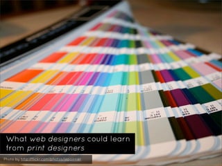
23. ‣ Don’t get stuck in that
tiny browser canvas
‣ Your design should be
part of something bigger
24. ‣ Don’t get stuck in that
tiny browser canvas
‣ Your design should be
part of something bigger
‣ Don’t create a limiting
environment
25. ‣ Don’t get stuck in that
tiny browser canvas
‣ Your design should be
part of something bigger
‣ Don’t create a limiting
environment
‣ Don’t stair through a
window, just look at the
sky directly!
30. ‣ Experiment with columns,
text in multiple columns?
‣ Your copy should be
part of the lay-out
31. ‣ Experiment with columns,
text in multiple columns?
‣ Your copy should be
part of the lay-out
‣ Stop designing boring
websites
32. ‣ Experiment with columns,
text in multiple columns?
‣ Your copy should be
part of the lay-out
‣ Stop designing boring
websites
‣ Create contrast using
composition
37. ‣ Your design should
communicate something
‣ Design & content need
to become “one”
38. ‣ Your design should
communicate something
‣ Design & content need
to become “one”
‣ There’s no such thing as;
“One template to rule
them all”
39. ‣ Your design should
communicate something
‣ Design & content need
to become “one”
‣ There’s no such thing as;
“One template to rule
them all”
‣ Design your content, not
only the surrounding
elements
40. ‣ Your design should
communicate something
‣ Design & content need
to become “one”
‣ There’s no such thing as;
“One template to rule
them all”
‣ Design your content, not
only the surrounding
elements
‣ Your header & footer
shouldn’t be the only
Climax
46. “My complaint, right now, is that the majority of
storytelling that happens on the Web is based in
the interactively rich environment made possible
by Flash”
...not enough Web standards-minded
designers are thinking narratively in the
way that our Flash-fluent colleagues are...
Khoi Vinh