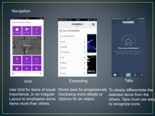
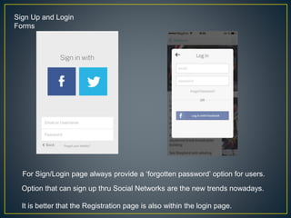
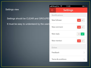
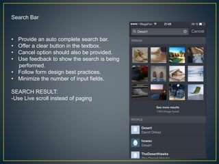
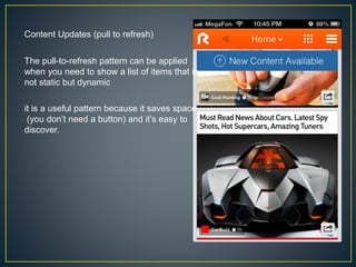
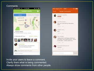
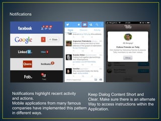
Prepared by: Catherine Dionisio
• Navigation
• Forms
• Settings
• Search Bar
• Content Updates
• Comment Box
• Notifications
Navigation
Grid Expanding Tabs
Use Grid for items of equal
Importance, or an irregular
Layout to emphasize some
Items more than others.
To clearly differentiate the
selected items from the
others. Tabs must use easy
to recognize icons
Works best for progressively
Disclosing more details or
Options for an object.
Sign Up and Login
Forms
For Sign/Login page always provide a ‘forgotten password’ option for users.
Option that can sign up thru Social Networks are the new trends nowadays.
It is better that the Registration page is also within the login page.
Settings view
Settings should be CLEAR and GROUPED
It must be easy to understand by the users.
Search Bar
• Provide an auto complete search bar.
• Offer a clear button in the textbox.
• Cancel option should also be provided.
• Use feedback to show the search is being
performed.
• Follow form design best practices.
• Minimize the number of input fields.
SEARCH RESULT:
-Use Live scroll instead of paging
Content Updates (pull to refresh)
The pull-to-refresh pattern can be applied
when you need to show a list of items that is
not static but dynamic
it is a useful pattern because it saves space
(you don’t need a button) and it’s easy to
discover.
Comments
Invite your users to leave a comment.
Clarify them what is being commented.
Always show comments from other people.
Notifications
Keep Dialog Content Short and
Clear. Make sure there is an alternate
Way to access instructions within the
Application.
Notifications highlight recent activity
and actions.
Mobile applications from many famous
companies have implemented this pattern
in different ways.
Design pattern of mobile application

Design pattern of mobile application

  • 1.
  • 2.
    • Navigation • Forms •Settings • Search Bar • Content Updates • Comment Box • Notifications
  • 3.
    Navigation Grid Expanding Tabs UseGrid for items of equal Importance, or an irregular Layout to emphasize some Items more than others. To clearly differentiate the selected items from the others. Tabs must use easy to recognize icons Works best for progressively Disclosing more details or Options for an object.
  • 4.
    Sign Up andLogin Forms For Sign/Login page always provide a ‘forgotten password’ option for users. Option that can sign up thru Social Networks are the new trends nowadays. It is better that the Registration page is also within the login page.
  • 5.
    Settings view Settings shouldbe CLEAR and GROUPED It must be easy to understand by the users.
  • 6.
    Search Bar • Providean auto complete search bar. • Offer a clear button in the textbox. • Cancel option should also be provided. • Use feedback to show the search is being performed. • Follow form design best practices. • Minimize the number of input fields. SEARCH RESULT: -Use Live scroll instead of paging
  • 7.
    Content Updates (pullto refresh) The pull-to-refresh pattern can be applied when you need to show a list of items that is not static but dynamic it is a useful pattern because it saves space (you don’t need a button) and it’s easy to discover.
  • 8.
    Comments Invite your usersto leave a comment. Clarify them what is being commented. Always show comments from other people.
  • 9.
    Notifications Keep Dialog ContentShort and Clear. Make sure there is an alternate Way to access instructions within the Application. Notifications highlight recent activity and actions. Mobile applications from many famous companies have implemented this pattern in different ways.