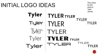
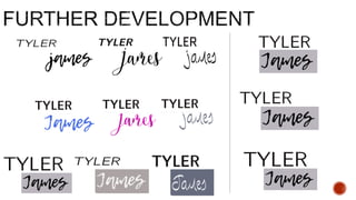
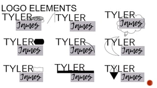
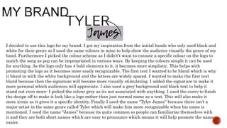
(Task 23)
The name
for the
artist is
Tyler
James
I decided to use this logo for my brand. I got my inspiration from the initial bands who only used black and
white for their genre so I used the same colours in mine to help show the audience visually the genre of my
band. Furthermore I picked the colour scheme as I didn't’t want to connote a specific colour on the logo to
match the song as pop can be impropriated in various ways. By keeping the colours simple it can be used
for anything. As the logo only has 4 bold elements to it, it becomes more simplistic. This helps with
promoting the logo as it becomes more easily recognizable. The first text I wanted to be bland which is why
it blend in with the white background and the letters are widely spaced. I wanted to make the first text
bland because then the signature will become more visually stimulating. I added the signature to make it
more personal which audiences will appreciate. I also used a grey background and black text to help it
stand out even more- I picked the colour grey as its not associated with anything. I used the curve to finish
the design off to make it look like a logo rather than just normal name as a text. This will also make it
more iconic as it gives it a specific identity. Finally I used the name “Tyler James” because there isn't a
major artist in the same genre called Tyler which will make him more recognizable when his name is
mentioned. I used the name “James” because its quite common so people can familiarize themselves with
it and they are both short names which are easy to pronounce which means it will help promote the name
easier.

Creating a Brand (23)

  • 1.
  • 4.
  • 7.
    I decided touse this logo for my brand. I got my inspiration from the initial bands who only used black and white for their genre so I used the same colours in mine to help show the audience visually the genre of my band. Furthermore I picked the colour scheme as I didn't’t want to connote a specific colour on the logo to match the song as pop can be impropriated in various ways. By keeping the colours simple it can be used for anything. As the logo only has 4 bold elements to it, it becomes more simplistic. This helps with promoting the logo as it becomes more easily recognizable. The first text I wanted to be bland which is why it blend in with the white background and the letters are widely spaced. I wanted to make the first text bland because then the signature will become more visually stimulating. I added the signature to make it more personal which audiences will appreciate. I also used a grey background and black text to help it stand out even more- I picked the colour grey as its not associated with anything. I used the curve to finish the design off to make it look like a logo rather than just normal name as a text. This will also make it more iconic as it gives it a specific identity. Finally I used the name “Tyler James” because there isn't a major artist in the same genre called Tyler which will make him more recognizable when his name is mentioned. I used the name “James” because its quite common so people can familiarize themselves with it and they are both short names which are easy to pronounce which means it will help promote the name easier.