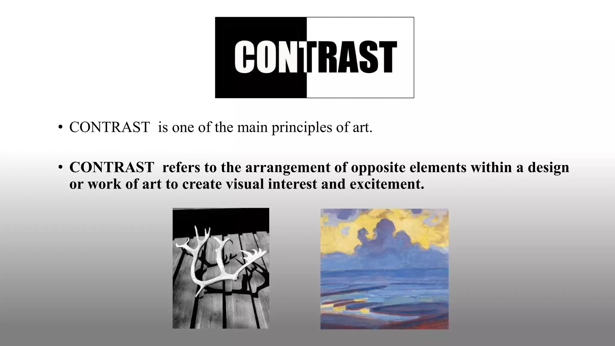
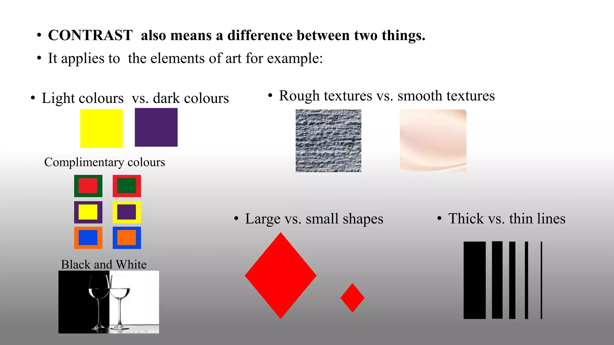
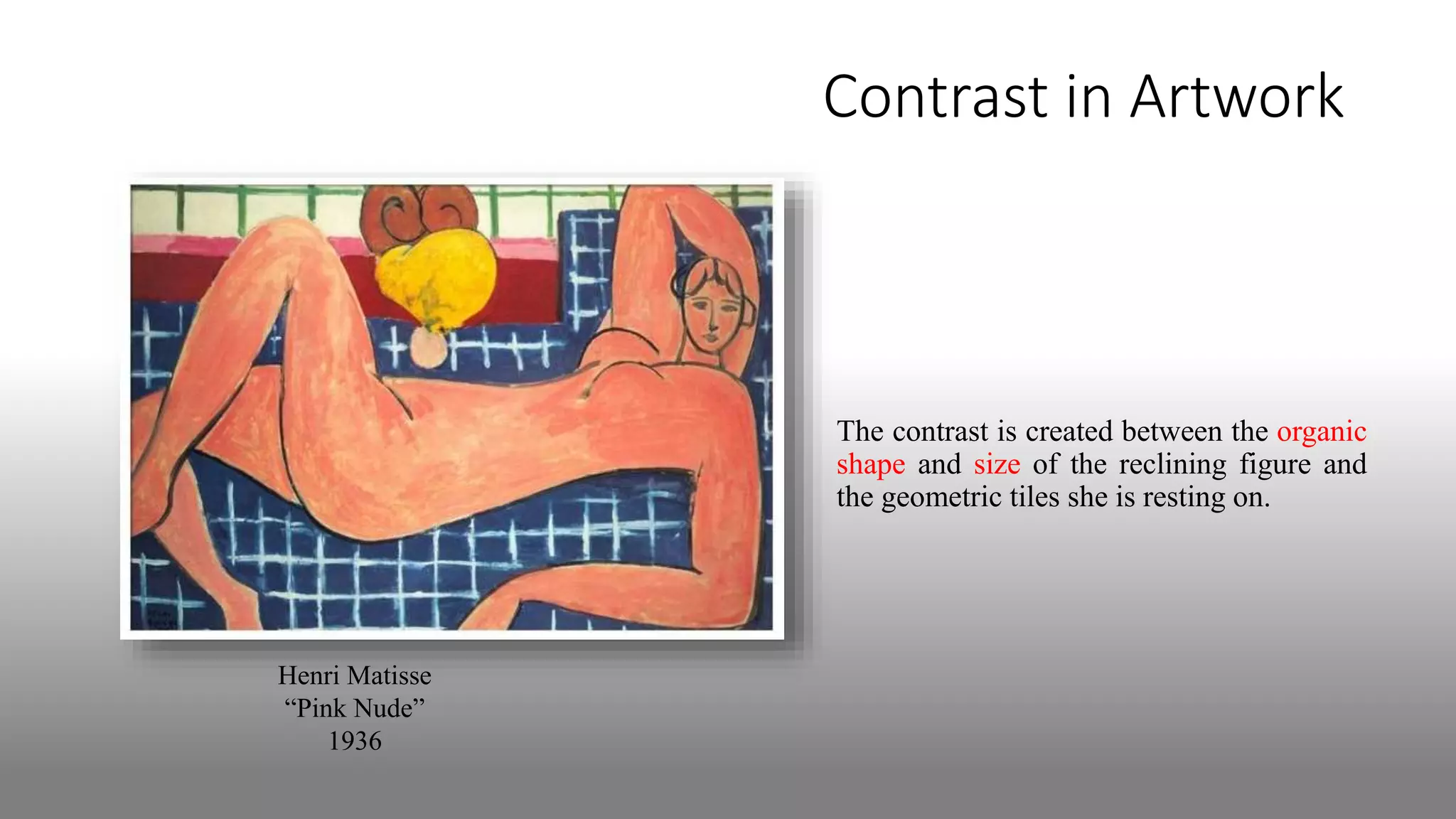
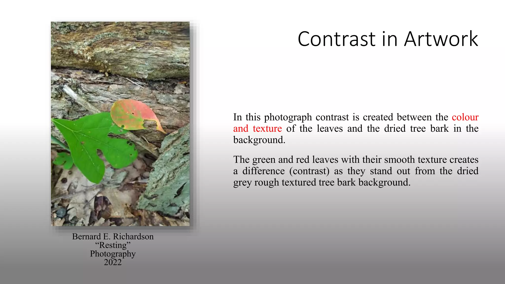
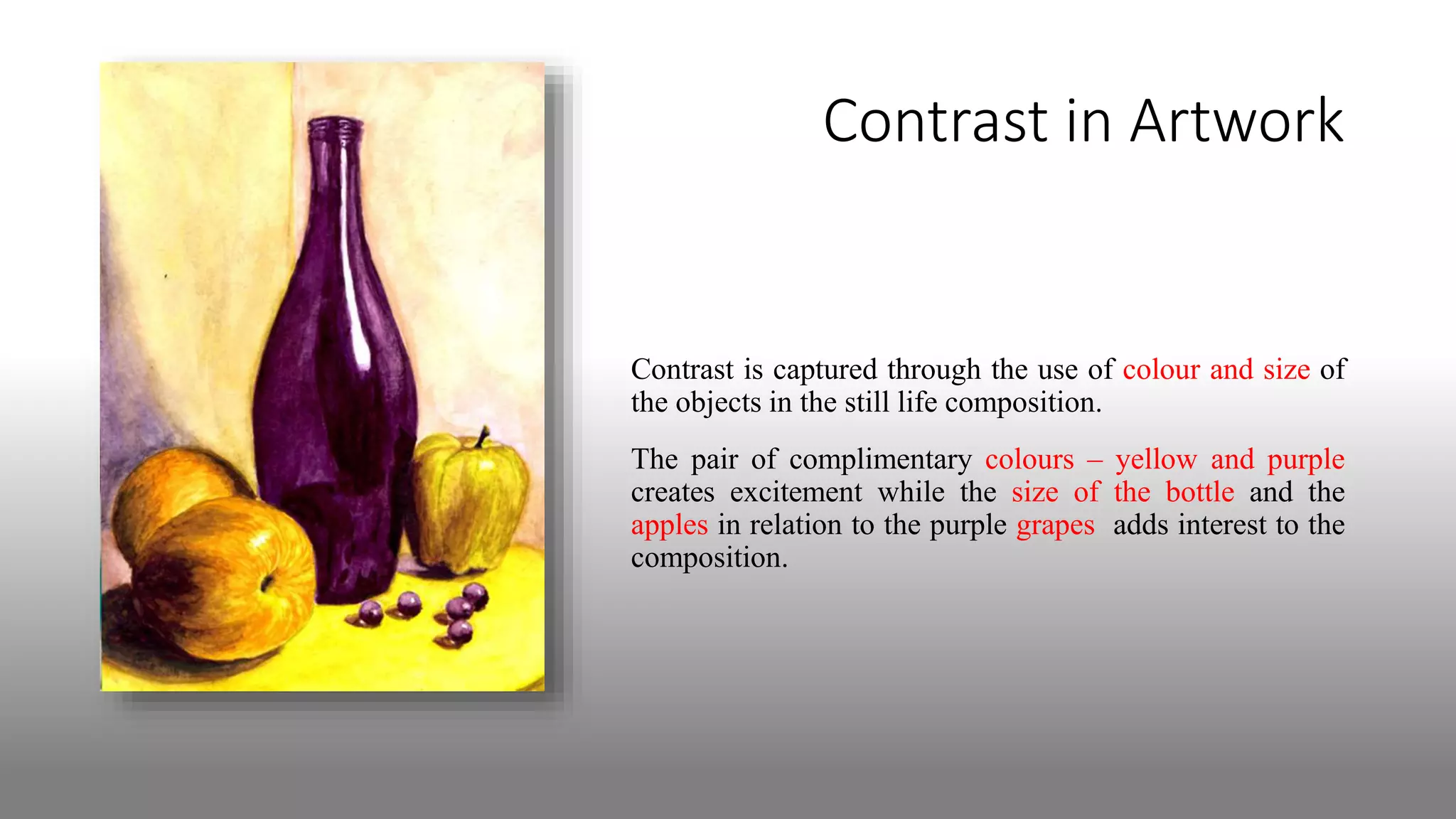
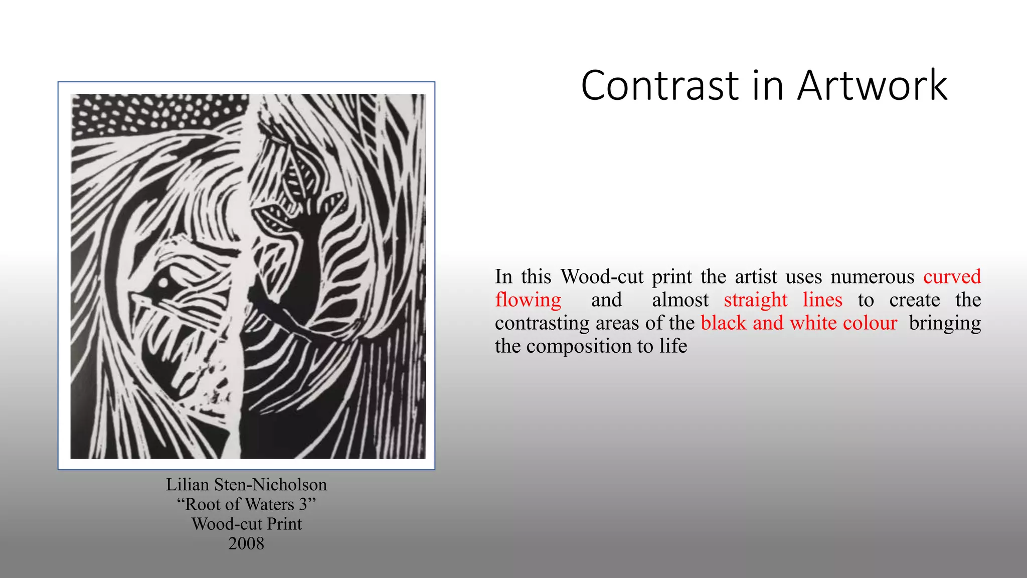
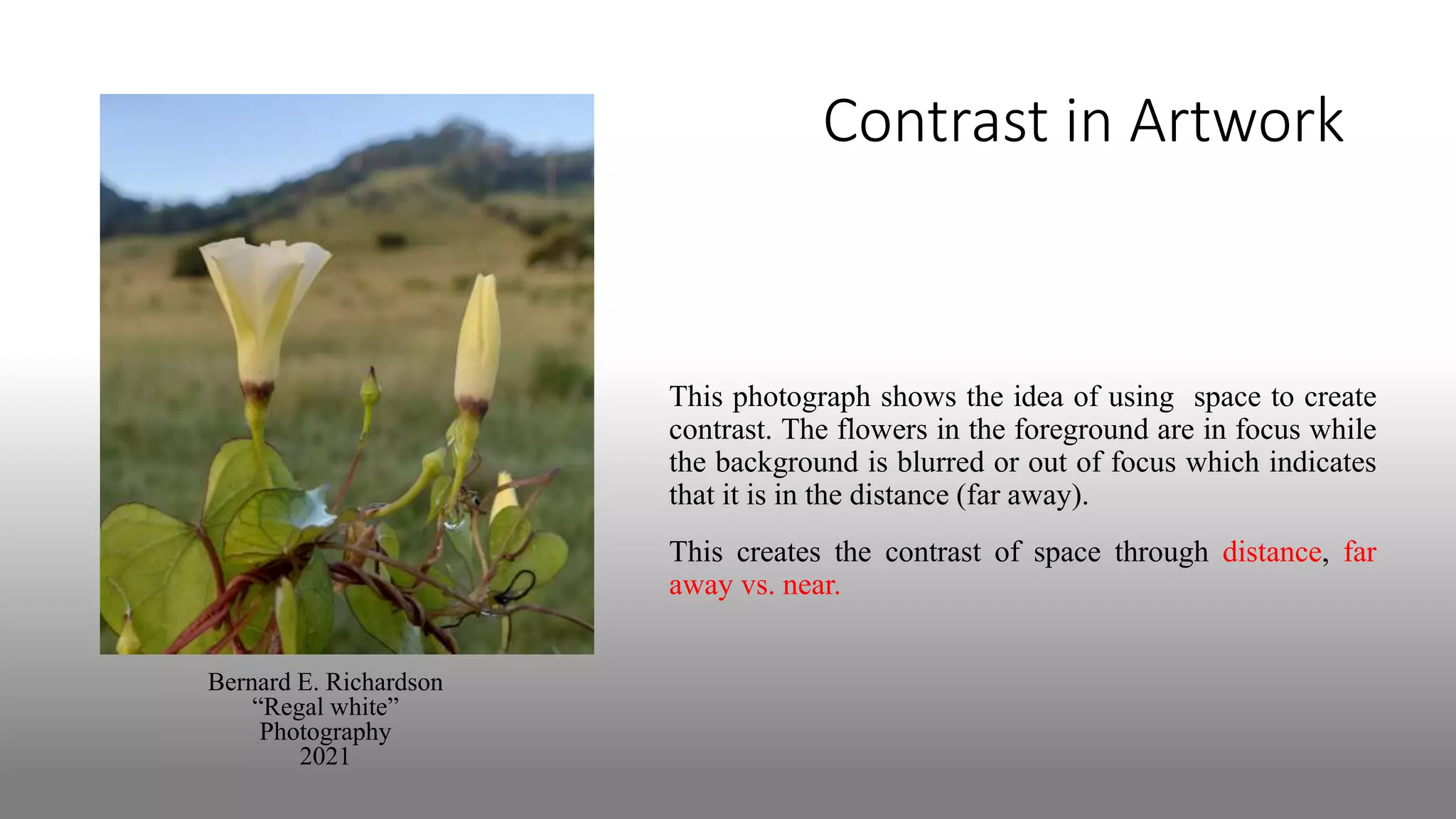
PRINCIPLE OF ART:
By Bernard E. Richardson | Master Teacher & Art Educator | 2022
© Bernard E. Richardson | 2022
• CONTRAST is one of the main principles of art.
• CONTRAST refers to the arrangement of opposite elements within a design
or work of art to create visual interest and excitement.
• CONTRAST also means a difference between two things.
• It applies to the elements of art for example:
• Light colours vs. dark colours • Rough textures vs. smooth textures
• Large vs. small shapes • Thick vs. thin lines
Black and White
Complimentary colours
Contrast in Artwork
Henri Matisse
“Pink Nude”
1936
The contrast is created between the organic
shape and size of the reclining figure and
the geometric tiles she is resting on.
Contrast in Artwork
In this photograph contrast is created between the colour
and texture of the leaves and the dried tree bark in the
background.
The green and red leaves with their smooth texture creates
a difference (contrast) as they stand out from the dried
grey rough textured tree bark background.
Bernard E. Richardson
“Resting”
Photography
2022
Contrast in Artwork
Contrast is captured through the use of colour and size of
the objects in the still life composition.
The pair of complimentary colours – yellow and purple
creates excitement while the size of the bottle and the
apples in relation to the purple grapes adds interest to the
composition.
Contrast in Artwork
In this Wood-cut print the artist uses numerous curved
flowing and almost straight lines to create the
contrasting areas of the black and white colour bringing
the composition to life
Lilian Sten-Nicholson
“Root of Waters 3”
Wood-cut Print
2008
Contrast in Artwork
Bernard E. Richardson
“Regal white”
Photography
2021
This photograph shows the idea of using space to create
contrast. The flowers in the foreground are in focus while
the background is blurred or out of focus which indicates
that it is in the distance (far away).
This creates the contrast of space through distance, far
away vs. near.
Image Courtesies
• http://stephthesteve.weebly.com/uploads/5/2/4/6/52464809/9994191_orig.jpg
• Whittle, Janice (editor). 2008. QPG Annual 2008. Barbados:National Cultural Foundation
• http://whsdesignandphoto.weebly.com/uploads/2/4/5/2/24522864/editor/9732814_1.jpg?15192389
54
The End

Contrast a principle of art

  • 1.
    PRINCIPLE OF ART: ByBernard E. Richardson | Master Teacher & Art Educator | 2022 © Bernard E. Richardson | 2022
  • 2.
    • CONTRAST isone of the main principles of art. • CONTRAST refers to the arrangement of opposite elements within a design or work of art to create visual interest and excitement.
  • 3.
    • CONTRAST alsomeans a difference between two things. • It applies to the elements of art for example: • Light colours vs. dark colours • Rough textures vs. smooth textures • Large vs. small shapes • Thick vs. thin lines Black and White Complimentary colours
  • 4.
    Contrast in Artwork HenriMatisse “Pink Nude” 1936 The contrast is created between the organic shape and size of the reclining figure and the geometric tiles she is resting on.
  • 5.
    Contrast in Artwork Inthis photograph contrast is created between the colour and texture of the leaves and the dried tree bark in the background. The green and red leaves with their smooth texture creates a difference (contrast) as they stand out from the dried grey rough textured tree bark background. Bernard E. Richardson “Resting” Photography 2022
  • 6.
    Contrast in Artwork Contrastis captured through the use of colour and size of the objects in the still life composition. The pair of complimentary colours – yellow and purple creates excitement while the size of the bottle and the apples in relation to the purple grapes adds interest to the composition.
  • 7.
    Contrast in Artwork Inthis Wood-cut print the artist uses numerous curved flowing and almost straight lines to create the contrasting areas of the black and white colour bringing the composition to life Lilian Sten-Nicholson “Root of Waters 3” Wood-cut Print 2008
  • 8.
    Contrast in Artwork BernardE. Richardson “Regal white” Photography 2021 This photograph shows the idea of using space to create contrast. The flowers in the foreground are in focus while the background is blurred or out of focus which indicates that it is in the distance (far away). This creates the contrast of space through distance, far away vs. near.
  • 9.
    Image Courtesies • http://stephthesteve.weebly.com/uploads/5/2/4/6/52464809/9994191_orig.jpg •Whittle, Janice (editor). 2008. QPG Annual 2008. Barbados:National Cultural Foundation • http://whsdesignandphoto.weebly.com/uploads/2/4/5/2/24522864/editor/9732814_1.jpg?15192389 54
  • 10.