The brand statement defines everything about what a brand means to consumers and should include three elements: the target audience, a compelling benefit, and a reason why. The document provides examples of both strong and weak brand statements for various products to demonstrate how to effectively communicate to the target audience.
The document discusses how the creator used various media technologies at different stages of their project. They used Photoshop extensively to edit and manipulate images, such as changing colors, blurring, merging layers, and cropping. Photoshop allowed them to imitate magazine and film poster layouts by combining multiple images into composite images. They also used YouTube tutorials to help position elements like birds at different angles in their film poster design. Overall, media technologies like Photoshop were crucial tools for the planning, construction, and evaluation of the creator's project at various stages.
This document provides a breakdown of cast members and the shot numbers they appear in for the production of Red Riding Hood. It lists the character Red Riding Hood appearing in shots 5, 9, 10, 15, 20 and 25. Grandma appears in shots 11 and 12. Red Riding Hood's Mother appears in shot 15. The Huntsman appears in shots 7, 8, 18 and 19 and 27. The Witch appears in shots 13, 16, 26 and 29.
During their first week of production, the film crew faced several obstacles. They were forced to change locations after being threatened by a group at their original shooting spot. They also had to alter their shot list and find new locations due to the change in location. Additionally, they had to change their main cast due to availability issues and sought to add more diversity to the roles of Red Riding Hood and others in order to modernize and relate to a wider audience.
Mary Nzeh documented several potential filming locations in London for a motorbike scene and forest scenes. The locations included Camberwell Road, Streatham Common, and Forest Hill Honor Oak for their practicality, proximity to public transportation, and suitability for the scenes. However, some locations like Forest Hill posed more practical and safety challenges due to being difficult to navigate. Brixton Library and two churches - St. Matthews in Brixton and St. Leonards in Streatham - were also documented as potential locations for their convenience and amenities to support filming.
This production budgeting form is for the film "Red Riding Hood" and lists expenses for pre-production and production. Pre-production expenses total £40 and include costs for costumes, props, and actor fees. Production expenses total £25 and include transportation, camera crew, and equipment rental. The total budget for the film is £65. Any additional costs will come from the remainder of the budget.
The document discusses how the media product challenges conventions of real magazines by displaying coverlines on both the left and right of pages and placing images on top of other images. It also notes that audience feedback indicated creativity with images and text is important for attracting audiences. The document describes using media technologies for construction, research, planning, and evaluation of the media product.
This document appears to be a casting sheet for a production of "Red Riding Hood". It lists the producer, director, and other crew members. The sheet collects contact and physical description information from actors to help determine appropriate roles and costumes for the production. Fields include name, address, phone, age, height, hair and eye color, and clothing items needed or provided.
This film poster analyzes a poster for a dark fantasy film. The poster prominently features an evil-looking witch holding a knife with black birds emerging from her cape, emphasizing her as the villain. It uses dark colors and imagery to portray a scary atmosphere and draw in an older audience interested in horror and thriller aspects. While ambiguous about the genre, the poster effectively draws attention through its use of layered characters and levels that make the audience examine each character closely.
The magazine masthead is in larger font to draw attention. It uses the alarming color red and celebrity images to attract audiences. A medium shot of Daniel Radcliffe creates familiarity with the Harry Potter films and draws the audience in. The magazine uses a structured layout with text on the left and images on the right, suggesting it targets younger audiences. It shouts information in alarming colors to attract their attention.
The document discusses locations scouting for a modern thriller adaptation of Little Red Riding Hood. The producer assigned an editor to find locations including a forest with a path for the opening scene. Streatham Hill forest was chosen for its large size and grand trees. A Victorian house was also needed, with Brixton having suitable options. Brixton Library was initially considered for its older feel but lacked a room for the grandma scene. Streatham St Leonard's Church was ultimately selected for its small size, gravestones, and architecture that would help create a gothic atmosphere for filming.
Nuestros centros de datos se encuentran en todo el mundo para brindar la mejor experiencia a nuestros clientes. Contamos con instalaciones en Europa, Asia, África, América del Norte y América del Sur para almacenar y procesar datos de manera segura las 24 horas del día los 7 días de la semana. Nuestro objetivo es brindar servicios en la nube de manera confiable desde cualquier lugar.
This call sheet outlines the scenes, locations, cast, costumes, props, and dates for shooting a film adaptation of Little Red Riding Hood. Scene numbers 5, 8, 12, 27, and 15 will feature Little Red Riding Hood portrayed by Natalie in a red dress and handbag/bag. Scenes 6, 7, 18, 20, 21, 29 will feature the Huntsman portrayed by Irwin on a motorbike wearing a biker jacket and black jeans. Scene 28 will feature the Witch portrayed by Helen wearing a black cloak.
This document discusses shot choices and sequencing for a film trailer remixing Little Red Riding Hood. It begins with an establishing shot of a forest to set the mood and genre. Subsequent shots include low-angle shots of an old house to maintain creepiness. Sound choices like a remix of a lullaby are meant to intrigue audiences. Transitions like fades aim to develop the narrative and fantasy atmosphere. Character introductions and a company logo are also explained to hook viewers into the reimagined fairy tale thriller trailer.
The document provides explanations for shots in a trailer for a modern adaptation of Little Red Riding Hood. It describes using establishing shots of a forest and house to set the scene and mood. Character shots introduce Red Riding Hood and the huntsman. Intertitles and a voiceover are used to develop the narrative. Shots of the witch's shadow and Red Riding Hood being warned build mystery and suspense. The trailer incorporates a church setting and religious symbols to further adapt the fairy tale while leaving the story ambiguous and teasing the audience. Straight cuts between shots maintain a quickening pace to heighten tension as the trailer concludes.
Little Red Riding Hood takes a basket of goods to her grandmother's house in the forest. Along the way, she is followed by a witch who intends to harm her. When Little Red Riding Hood arrives at her grandmother's house, she discovers that the witch has taken her grandmother's place in bed. The witch reveals herself and threatens to eat Little Red Riding Hood.
The document discusses a production meeting focused on identifying the target audience of Huntsman and their place and influence in the production process. It also mentions inter-titles and taglines will be discussed at an upcoming production meeting on 09.10.12.
- The document discusses creative decisions made for a thriller trailer adapting a fairy tale. It was decided to hide the identity of the witch to add mystery and suspense. The genre was changed to thriller to heighten these elements.
- A red dress was chosen instead of a cape to modernize and make the character more relatable. The landscape and lighting will be used to further the mystery.
- A sinister fairytale soundtrack was selected to intrigue the target audience who enjoy thrill and excitement. Representations of women as weaker and unable to defend themselves were kept to challenge audience perspectives. An all-white cast was chosen to relate to common stereotypes.
The document discusses planning for adapting the fairy tale "Little Red Riding Hood" into a thriller genre film trailer. It outlines deciding to use the thriller genre and lists elements to explore like representations, props, mise-en-scene, and camera angles. Key changes to the narrative include using a non-linear structure and replacing the wolf with a witch. The roles of producer and director are discussed in overseeing the project from conceptualization through completion.
The document discusses creative decisions, representations, genre, and audience considerations for a thriller film trailer that modernizes a fairy tale. Some key points:
1) The identity of the witch will be hidden to add mystery and suspense, drawing from Red Riding Hood where the wolf's identity is unknown.
2) The fairy tale will be updated by changing the red cape to a red dress to seem more modern.
3) Changing the genre to thriller will allow adding more suspense through hiding the witch's identity and using lighting and landscape techniques.
The group has chosen to adapt the fairy tale "Little Red Riding Hood" as a thriller genre film. They will modernize aspects like using a red dress instead of a cape but keep main characters the same. The producer will oversee the project from concept to completion, ensuring they have proper equipment and follow storyboards. They intend to use a nonlinear narrative and voiceover narration to heighten suspense. Lighting, costumes, camera shots and locations were selected intentionally to create mood and focus audience attention in ways aligned with the thriller genre.
This trailer summarizes the key elements of the thriller film "Little Red Riding Hood" in 3 sentences or less:
The trailer begins with establishing the fairy tale setting of the film about Valerie, a young woman torn between her love for Peter and her arranged marriage to Henry, as a werewolf starts killing people in their village. Scenes show the tension and fear gripping the town as the death toll rises each full moon. The trailer hints that Valerie may have a connection to the werewolf and leaves the audience wondering who the beast could be that lurks in the dark forest.
The document discusses the student's media product which challenges conventions of real media. The student used varied fonts on the contents page instead of consistent left or right alignment. Only one image was used on the cover rather than multiple images. The student aimed to represent younger audiences aged 17-24 as artistic rather than focusing on wealth. The intended audience would be this age range since they prefer visuals over text. Subscriptions and clubs selling music would be suitable distribution channels. The student learned skills like airbrushing images in Photoshop and laying out pages in InDesign to construct their media product.
This document provides a summary of the research and planning done for a media studies foundation portfolio on AS Media Studies. It discusses researching target audiences and how that impacted visual design choices. It also reviews what was learned about using Adobe Photoshop and InDesign to construct artifacts. Examples are provided of original photographs taken and how they were modified. Research models of music magazine contents pages are shown, and the creator's own contents page and double-page spread with explanations of design choices. Feedback on the work is discussed along with re-drafted pages. An evaluation blog is referenced.
The document provides guidance for a student creating a contents page for a music magazine. It discusses choosing a two-column layout to keep it simple. Images of editors and celebrities will be included to engage readers. Convention will be broken by adding an editor's talk. Stories will include fashion tips and profiles of music stars. Images will preview articles and reflect the magazine's genre. A simple black and red color scheme without backgrounds will be used. Essential information like features and gossip will be arranged on the right side for easy reading.
The document provides guidelines for a student to develop a double page spread for a music magazine.
The student plans to use a single background image with text in two columns around the image. This challenges conventions and portrays a flow of ideas. Only one image will be used to avoid distraction from the text.
A simple color scheme of pink, white and blue will be used to focus on the artist's personality rather than appearance. The main story will be an interview to create a relationship between artist and audience. Font size and style will also promote simplicity and accessibility.
The document describes the design choices for a music magazine called "The Rhythm". It will focus on R&B music. The designer chose bold red or black fonts to match conventions of Vibe magazine. An image of artist Ebonie will be on the cover to represent the main article. Articles will include how to create your own R&B look and top upcoming artists. Multiple fonts in red, black, and navy blue were selected to match the genre while providing visual interest.
The document discusses the design elements of a magazine cover for an R&B genre magazine. It analyzes the use of color, images, text placement and sizing to attract readers. The main elements include a bold red masthead, a large cover line about Beyoncé in red and black font, and a seductive central image of Beyoncé that draws the eye without being distracting.
This presentation was provided by Rebecca Benner, Ph.D., of the American Society of Anesthesiologists, for the second session of NISO's 2024 Training Series "DEIA in the Scholarly Landscape." Session Two: 'Expanding Pathways to Publishing Careers,' was held June 13, 2024.
Leveraging Generative AI to Drive Nonprofit InnovationTechSoup
In this webinar, participants learned how to utilize Generative AI to streamline operations and elevate member engagement. Amazon Web Service experts provided a customer specific use cases and dived into low/no-code tools that are quick and easy to deploy through Amazon Web Service (AWS.)
THE SACRIFICE HOW PRO-PALESTINE PROTESTS STUDENTS ARE SACRIFICING TO CHANGE T...indexPub
The recent surge in pro-Palestine student activism has prompted significant responses from universities, ranging from negotiations and divestment commitments to increased transparency about investments in companies supporting the war on Gaza. This activism has led to the cessation of student encampments but also highlighted the substantial sacrifices made by students, including academic disruptions and personal risks. The primary drivers of these protests are poor university administration, lack of transparency, and inadequate communication between officials and students. This study examines the profound emotional, psychological, and professional impacts on students engaged in pro-Palestine protests, focusing on Generation Z's (Gen-Z) activism dynamics. This paper explores the significant sacrifices made by these students and even the professors supporting the pro-Palestine movement, with a focus on recent global movements. Through an in-depth analysis of printed and electronic media, the study examines the impacts of these sacrifices on the academic and personal lives of those involved. The paper highlights examples from various universities, demonstrating student activism's long-term and short-term effects, including disciplinary actions, social backlash, and career implications. The researchers also explore the broader implications of student sacrifices. The findings reveal that these sacrifices are driven by a profound commitment to justice and human rights, and are influenced by the increasing availability of information, peer interactions, and personal convictions. The study also discusses the broader implications of this activism, comparing it to historical precedents and assessing its potential to influence policy and public opinion. The emotional and psychological toll on student activists is significant, but their sense of purpose and community support mitigates some of these challenges. However, the researchers call for acknowledging the broader Impact of these sacrifices on the future global movement of FreePalestine.
Gender and Mental Health - Counselling and Family Therapy Applications and In...PsychoTech Services
A proprietary approach developed by bringing together the best of learning theories from Psychology, design principles from the world of visualization, and pedagogical methods from over a decade of training experience, that enables you to: Learn better, faster!
A Visual Guide to 1 Samuel | A Tale of Two HeartsSteve Thomason
These slides walk through the story of 1 Samuel. Samuel is the last judge of Israel. The people reject God and want a king. Saul is anointed as the first king, but he is not a good king. David, the shepherd boy is anointed and Saul is envious of him. David shows honor while Saul continues to self destruct.
This presentation was provided by Racquel Jemison, Ph.D., Christina MacLaughlin, Ph.D., and Paulomi Majumder. Ph.D., all of the American Chemical Society, for the second session of NISO's 2024 Training Series "DEIA in the Scholarly Landscape." Session Two: 'Expanding Pathways to Publishing Careers,' was held June 13, 2024.
Andreas Schleicher presents PISA 2022 Volume III - Creative Thinking - 18 Jun...EduSkills OECD
Andreas Schleicher, Director of Education and Skills at the OECD presents at the launch of PISA 2022 Volume III - Creative Minds, Creative Schools on 18 June 2024.
Andreas Schleicher presents PISA 2022 Volume III - Creative Thinking - 18 Jun...
Contents Page Statement Of Intent
1. DEPARTMENT OF MEDIA & FILM STUDIES
AS Media Studies
Foundation Portfolio Production Brief (G321)
Main Task Music Magazine
Contents Page Statement of Intent Guide
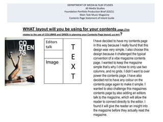
WHAT layout will you be using for your contents page (This
relates to the use of COLUMNS and GRIDS in planning your Contents Page layout) and WHY?
Editors I have decided to have my contents page
in this way because I really found that this
talk T design was very simple. I also choose this
Image
Image
E
design because it challenged the typical
convention of a vibe magazine contents
page. I wanted to keep the magazine
X simple that’s why I chose to only use two
columns, and no grids. I didn’t want to over
T power the contents page. I have also
decided not to have any colour on the
contents page again to make it simple. I
wanted to also challenge this magazines
contents page by also adding an editors
talk to the magazine, which will allow the
reader to connect directly to the editor. I
found it will give the reader an insight into
the magazine before they actually read the
magazine.
2. WHAT codes and conventions will you be using from your CONTENTS PAGE
RESEARCH and WHY
This article breaks the rules of codes and
conventions; it uses a feature well, which is a
mixture of articles, and information which feeds
off information from the front page. In this
contents page, they have used two columns.
One consisting of text and the other consisting
of a singular image. This isn’t the normal way in
which magazines do their contents page, they
would normally stick to three columns, one
column will be a comment from the
editor, images usually central and articles left. I
have decided to break the norms of codes and
conventions and copying this way of presenting
a contents page. I have decided to manipulate
this codes and conventions instead of one
image; I have decided to use various
images, similar to this magazine. With text on
the right and images on the left. I have also
decided to add an editors talk to the contents
page. Again breaking the typical codes and
conventions in magazines.
3. Will you be using for your Contents Page and WHY will they appeal to your potential target
audience?
It will appeal to my target audience who are late teens to mid twenties. I have researched on my
target audience and found out that the prefer simple contents page, with a variety of images, and
some also said that they liked the contents page to have a comment from the editor, which will
break the fourth wall. So in my contents page I have included all of these things, to again pin point
my target audience. It will appeal to them because the articles which are featured on the contents
page, all consist of gossip, fashion and personal articles of celebrities. This will create a relationship
between the celebrities and the readers. The target audience of the magazine are very simple
females, that’s why I didn’t over bear the contents page with too much colour or images. Which
doesn’t make the magazine less appealing, or less eye-catching. It is rather straight to the point.
My contents page will consist of a four shot types, extreme close ups, close up, cut in’s, this will be
useful when I am trying to show off certain images for my which will relate to my article.
4. WHAT stories will you be including in your Contents Page and
HOW will they be related to the images?
The stories that will be included in my contents page are
articles about the kind of instruments which are popularly
used within the RnB genre. It will also feature an article
Editors talk
T
targeting the female audience about how to create your
own glamorous look from home. Which most females are
eager to do, with a very cheap price tag with it. There will
be a ‘peak’ of how to create this look, luring the female
audience into the article. This will be related to the image
because there will be a medium shot, of a glamorous
photo-shoot which will feature how the final look is created.
In the article it will give step by step advice on how to
1 2
E
create this look. Another article which will be featured in
the magazine will be an article about a young RnB
superstar who has made it to the top. This will attract
readers who aspire to be RnB superstars; it will give them
image
of
glamour
shoot
Image of a
Celebrity in
the studio
X
an insight to stardom. With words of wisdom directly from
the celebrity. This will be related to the image, because it
will be an image of the celebrity. The mock up on the right
is something I want to follow, if not completely the same, I
3
Image of
Ebonie
playing
the
4
Image of
another
glamour
shoot
T
would like the images to take this format. Also I will indicate piano
above the image the number of where the article can be
found above the image, making a direct link
5. WHAT do you want these images to tell your audience and WHY?
I want the images to tell the audience a mini story; I want it to give previews of what the articles
will be about. I want to describe to the audience visually about what the magazine will be about.
I want the images to reflect what the articles are about. I also want the audience to be able to
connect to the images on the contents page. I want the images on the contents page to also
reflect what kind of magazine it is. I want the images to inform the reader about the genre of the
magazine they are reading. Through the VIBE magazine I have decided to follow, there aren’t
any instruments featured on the contents page, I plan on challenging this typical convention of
VIBE.
In this image I Editors talk
have decided
to place an
T
instrument, wh
ich will allow
me to break
E
the typical
conventions of X
VIBE’s contents
page layout.
3
Image of
Ebonie
playing
T
the
piano
6. WHAT colour scheme (shades, tints and colours) will you be using and WHY?
I will be sticking to a very plain colour scheme of black and red, which will mainly be seen in the format of
text. I will like to keep the colours very simple, so it will not distract the audience from the articles or to
make the contents page to look too clumsy. As I will be following the VIBE contents page layout it uses
simple colour schemes for the contents page, sticking only to a black or white occasionally which can be
seen in the above contents pages. I feel that this is very effective because it doesn’t allow the image to be
too dominant, but shares the power between both the image and the contents page. It creates a balance
between both the image and the text. I will also be sticking to a simple white background, I didn’t want to
over bear my contents page with so many things at one time. As I will be using various images inside my
contents page, I thought about adding colour to the background, but decided not to, because it will be to
distracting, and as my target audience prefer a much simpler magazine, I thought no colour will capture
their desired effect. I only broke the normal convention when I added pink to the text to create a much
feminine vibe to the magazine.
7. WHAT essential information will be included in your Contents
Page e.g. Features, reviews, commentary and WHY?
The features that will be included in the contents page which I see as essential
information are the most important articles in the magazine. I will number them so
that it will be easier for the reader to find the article in the magazine. The editors talk
will also be essential information because it creates a sense of friendship between the
reader and the editor. The gossip articles I also see as essential information, when I
asked my target audience they complained that other magazine didn’t really give them
the dirty gossip, I would like to please my target audience, so I have decide to make
this a key feature in my magazine.
8. HOW will you be arranging the information on your
contents page and WHY?
I will be aligning the text to the right, and place the
T
information on the right column of the contents All the
page, similar to the magazine below, I don’t really like information
the fact the magazines name is very small. So I have will be on
decided to make the masthead, ‘The Rhythm’ medium this side of
sized at the top of the contents page, followed by
the contents
E
‘contents’ underneath. So the name of the magazine will
be remembered by the reader. It will create a house page, with
style for the magazine, in all the contents page to follow very clear
the contents page will take this format. I have decided to headings
follow the way in which the VIBE magazine places the and also
X
text on the right because it is the magazine I wish to show the
copy. page
number, to
indicate
where the
T reader can
find the
article in the
magazine.
9. HOW will you make your Contents Page easy for your audience to find the major cover
story or other stories?
I will make it easy for my audience to find the major cover story on the contents page, by making the
text of that article bigger and bolder than the rest of the other stories. I have also decided to keep it
consistent with the front cover, which also make the main article bolder than the rest of the cover
lines. I have also decided to indicate using a page number where the article can be found in the
magazine.
By doing this the reader will be
Ebonie able to find the main article
‘My rise to quicker. It is bolder than the rest of
the top’ the other articles in the magazine
Pg. 5
<Candae>
How to create
By doing this using page numbers
your glamour look in the article it will be much easier
for less
Pg. 7
for the reader to find the article in
the magazine. rather than flicking
<Marques> through aimlessly. It will point out
Brawl in night
club where the article can be found.
Pg. 11
10. WHAT type of fonts and font sizes (style of lettering used) will
you be using for your Contents Page and WHY?
I will be using various font sizes in the magazine, a medium sized font for the masthead
and strap line. Larger font for the main article, with smaller font for the other articles
in the magazine. I will also be sticking to a simple colour scheme of red and black, with
a slight touch of pink, to draw in that feminine aura to the magazine, this will act as my
soothing colour, in order not to bombard the reader with alarming colours. It will keep
the contents page simple, because I will not be using a background colour therefore I
will like the contents page to be colourful regardless. This will be breaking the typical
convention of the VIBE contents page, I wanted to challenge this contents page, to see
whether my target audience will be pleased with the final outcome.