Report
Share
Download to read offline

Recommended
Images That I Used
The document discusses images chosen for a front cover and contents page. The front cover image is a medium close-up of a student to make it relevant. The main entrance of Priestley College is used as a wide shot for the contents page because it draws the eye to the building and creates curiosity about what's inside, mirroring a contents page.
Survey Results
The document summarizes the results of a survey about music magazine preferences. It shows that the majority of respondents were male, aged 16-20, from a working class background, and enjoyed indie music. Most would be convinced to buy a magazine if it featured an artist they liked or offered incentives like free gifts. Respondents expected posters or CDs and said they would pay £2-£4 for a monthly magazine with informal writing about bands like Foo Fighters or Biffy Clyro.
Screenshots For Photoshop
The document describes the steps taken to create the canvas for a magazine cover, including inserting images of a student and masthead, a JPEG barcode, a yellow peeling sticker with "FREE CD" text, the magazine logo, additional cover lines, and duplicating and adjusting layers to add shadows and depth.
Questionaire conclusions
The majority of respondents to a survey were teenagers or young adults aged 16-20. Most respondents also identified as working or middle class. Based on survey responses, the magazine will aim to attract this demographic group by featuring popular rock bands like Arctic Monkeys and Slipknot in interviews and articles. It will also offer free gifts and keep the price reasonably low to encourage purchases. Most readers expressed interest in interviews, so those will be a key part of the magazine's content.
Plan For Magazine Front Cover
This document outlines a plan for the front cover of a magazine about Priestley Center. It specifies using a medium or close up image of a student, with the masthead "LIFE AT PRIESTLEY" in bold sans serif font in the middle. Cover lines on stories and regular/new features would be placed on the sides, along with a barcode and logo of Priestley quay.
Images That I Took
The document describes several photos taken of students and a college building to showcase the educational environment. The first photo was a medium close-up of a student but lacked professional quality. The next two photos showed more of each student's body through varying degrees of zoom. All student photos were taken in front of a brick wall. The final photo presented a wide shot of the college entrance to draw focus to the building's appearance.
Front Cover Analysis
This document analyzes the design elements of a magazine cover, including the masthead, coverlines, main image, barcode, color scheme, and positioning of elements. The masthead is bold and recognizable without seeing all the letters. The main image is of a musician looking at the camera to create a personal connection with readers. The coverlines use high-contrast colors to catch the eye, and the simple color scheme looks clean and professional. Elements are strategically positioned so as not to clutter the cover.
DPS
The size of images depends on the size of the articles, with larger articles featured more prominently. Inserts must be facts or competitions relevant to articles. Some images bleed across pages to look like one large page and stand out more. Bold text and fonts are used throughout to ensure everything stands out and looks important. Captions provide information about who is featured to encourage readers to learn more. The color scheme uses around 3 colors to keep things simple and recognizable while retaining the iconic red color. The main image stands alone to draw more attention than text. Body text is organized into columns for easier reading to persuade audiences to read more. The background remains bold but not complicated to focus on the main image. Drop caps are used
Evaluation
The document discusses the cover design of a magazine for Priestley College. For the main image, the designer used a photo of a student or the Priestley campus to represent the magazine's focus on the college. The masthead prominently displays the magazine title in the center. Other design elements include the college logo, a splash graphic to draw attention, and cover lines advertising deals to entice readers. The designer discusses using Adobe Photoshop and QuarkXPress software and adjusting fonts, images, and layout. Strengths include the professional look and use of images while weaknesses include similar fonts, image quality, and potential for more filled space.
Screenshots For Quark
This document outlines the steps taken to create a canvas including adding text to the masthead in Corbel font, duplicating text layers to create shadows, inserting and adjusting images, adding subheaders, stories and more text, and finally changing the text color to blue for better visibility against the white background.
Kerrang Media Pack
Kerrang! is a multi-platform brand that includes a magazine, website, TV channel, and radio station focused on rock music. It has been publishing for over 34 years and breaks new rock bands. The magazine has the biggest exclusives and is the highest selling music magazine in the UK. The website attracts millions of monthly visitors and social media followers. Kerrang! TV and radio also have large audiences among youth aged 16-34 who are loyal fans of rock music.
Front Cover Analysis
The document summarizes the key elements of a magazine cover. It explains that the masthead contains the magazine's name in bold text at the top. Below this is a barcode and identifying information. The main image is usually a celebrity to attract readers' attention. Additional coverlines and headlines are included to entice readers with snippets about the magazine's contents. Elements like splashes and headers use shapes and text to further engage readers.
You’ve been framed
This document provides a list of different camera shots and angles that could be used in filmmaking, including low angle medium close ups, high angle long shots, extreme close ups, close ups of using a mobile phone and being in nature, medium long shots, over the shoulder shots, long shots conveying isolation, medium close ups, and long shots showing friendship and stress through body language.
Plan For Magazine Contents
This document outlines a plan for the contents page of a magazine. It specifies using a wide-shot image of the Priestley entrance as the main image. The text should include the masthead "LIFE AT PRIESTLEY" in a bold sans-serif font in a different color scheme than the front cover. It also lists potential story topics to highlight in the magazine, such as bands, enrichments, and new apps.
Rock Sound Media Pack
The document discusses the benefits of exercise for mental health. Regular physical activity can help reduce anxiety and depression and improve mood and cognitive functioning. Exercise causes chemical changes in the brain that may help boost feelings of calmness and well-being.
Contents Page Analysis
The document discusses including issue numbers and page numbers in magazines so readers can identify and locate specific articles. It also recommends using some images throughout the magazine and a main image on the cover to give readers a sense of what to expect in the issue, particularly anything involving the person in the main cover image. Context in the form of short descriptions of features are also suggested to help guide readers to stories on particular pages.
Contents Page Codes And Conventions
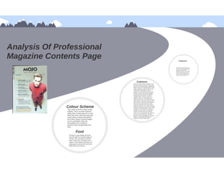
The document summarizes the layout and design elements of a magazine contents page. It notes that the main image promotes the main story about Metallica. The color scheme uses a limited palette of bold colors to make the text and images stand out. Key information like the issue number, page number and magazine name are consistently located in the same spots issue to issue. The use of columns and multiple smaller images suggests there are many diverse stories rather than one dominant feature.
Survey 20170226 02 57-26
The document summarizes the results of an online survey about a music magazine. Most respondents were between 16-20 years old (61.54%) and male (76.92%). The most popular genres of music among respondents were rock (38.46%) and indie (15.38%). When asked about the magazine cover, most respondents mentioned the main image. Regarding the contents, respondents liked the images and colors. On double page spreads, respondents liked the images and articles. Most respondents said they would buy the magazine if they saw it in a shop.
.
This document describes the design elements of a mock rock music magazine cover and contents page created by the author. For the cover, it discusses the bold masthead design in the center, a mid-close up main image of a rock artist holding a guitar, bold yellow coverlines featuring band names, and location of additional information in the bottom corner. For the contents page, it highlights the bold color scheme, images relating to the genre, centered title with drop shadow, featured and regular article categories, 3-column layout, and bolded article headings in black boxes.
Trtrtr
The document discusses various new technologies and design tools learned, including:
- Using the drop shadow and stroke tools in Adobe Photoshop CC to make elements stand out visually and catch attention.
- Utilizing the shape tool to create boxes and containers for elements.
- Learning to select and cut out elements using the wand tool.
- Understanding layers to organize elements so text appears above boxes.
- Importing articles from Microsoft Word into QuarkXpress.
- Working with columns and shapes to structure content attractively.
- Rotating and placing images, and using text features like drop caps to guide readers.
g
The document discusses improvements made from a preliminary task to a full music magazine product. Some key improvements included using a higher quality main image where the person is engaging with the audience, having a cleaner and bolder masthead, and adding more details and stories. Overall, the full product looked more professional with a simpler color scheme and consistent formatting across pages like columns on the contents page. The document also notes learning codes and conventions like using drop caps and paragraph spacing for double page spreads.
How to Manage Your Lost Opportunities in Odoo 17 CRM
Odoo 17 CRM allows us to track why we lose sales opportunities with "Lost Reasons." This helps analyze our sales process and identify areas for improvement. Here's how to configure lost reasons in Odoo 17 CRM
How to Build a Module in Odoo 17 Using the Scaffold Method
Odoo provides an option for creating a module by using a single line command. By using this command the user can make a whole structure of a module. It is very easy for a beginner to make a module. There is no need to make each file manually. This slide will show how to create a module using the scaffold method.
The simplified electron and muon model, Oscillating Spacetime: The Foundation...
Discover the Simplified Electron and Muon Model: A New Wave-Based Approach to Understanding Particles delves into a groundbreaking theory that presents electrons and muons as rotating soliton waves within oscillating spacetime. Geared towards students, researchers, and science buffs, this book breaks down complex ideas into simple explanations. It covers topics such as electron waves, temporal dynamics, and the implications of this model on particle physics. With clear illustrations and easy-to-follow explanations, readers will gain a new outlook on the universe's fundamental nature.
More Related Content
Viewers also liked
Images That I Took
The document describes several photos taken of students and a college building to showcase the educational environment. The first photo was a medium close-up of a student but lacked professional quality. The next two photos showed more of each student's body through varying degrees of zoom. All student photos were taken in front of a brick wall. The final photo presented a wide shot of the college entrance to draw focus to the building's appearance.
Front Cover Analysis
This document analyzes the design elements of a magazine cover, including the masthead, coverlines, main image, barcode, color scheme, and positioning of elements. The masthead is bold and recognizable without seeing all the letters. The main image is of a musician looking at the camera to create a personal connection with readers. The coverlines use high-contrast colors to catch the eye, and the simple color scheme looks clean and professional. Elements are strategically positioned so as not to clutter the cover.
DPS
The size of images depends on the size of the articles, with larger articles featured more prominently. Inserts must be facts or competitions relevant to articles. Some images bleed across pages to look like one large page and stand out more. Bold text and fonts are used throughout to ensure everything stands out and looks important. Captions provide information about who is featured to encourage readers to learn more. The color scheme uses around 3 colors to keep things simple and recognizable while retaining the iconic red color. The main image stands alone to draw more attention than text. Body text is organized into columns for easier reading to persuade audiences to read more. The background remains bold but not complicated to focus on the main image. Drop caps are used
Evaluation
The document discusses the cover design of a magazine for Priestley College. For the main image, the designer used a photo of a student or the Priestley campus to represent the magazine's focus on the college. The masthead prominently displays the magazine title in the center. Other design elements include the college logo, a splash graphic to draw attention, and cover lines advertising deals to entice readers. The designer discusses using Adobe Photoshop and QuarkXPress software and adjusting fonts, images, and layout. Strengths include the professional look and use of images while weaknesses include similar fonts, image quality, and potential for more filled space.
Screenshots For Quark
This document outlines the steps taken to create a canvas including adding text to the masthead in Corbel font, duplicating text layers to create shadows, inserting and adjusting images, adding subheaders, stories and more text, and finally changing the text color to blue for better visibility against the white background.
Kerrang Media Pack
Kerrang! is a multi-platform brand that includes a magazine, website, TV channel, and radio station focused on rock music. It has been publishing for over 34 years and breaks new rock bands. The magazine has the biggest exclusives and is the highest selling music magazine in the UK. The website attracts millions of monthly visitors and social media followers. Kerrang! TV and radio also have large audiences among youth aged 16-34 who are loyal fans of rock music.
Front Cover Analysis
The document summarizes the key elements of a magazine cover. It explains that the masthead contains the magazine's name in bold text at the top. Below this is a barcode and identifying information. The main image is usually a celebrity to attract readers' attention. Additional coverlines and headlines are included to entice readers with snippets about the magazine's contents. Elements like splashes and headers use shapes and text to further engage readers.
You’ve been framed
This document provides a list of different camera shots and angles that could be used in filmmaking, including low angle medium close ups, high angle long shots, extreme close ups, close ups of using a mobile phone and being in nature, medium long shots, over the shoulder shots, long shots conveying isolation, medium close ups, and long shots showing friendship and stress through body language.
Plan For Magazine Contents
This document outlines a plan for the contents page of a magazine. It specifies using a wide-shot image of the Priestley entrance as the main image. The text should include the masthead "LIFE AT PRIESTLEY" in a bold sans-serif font in a different color scheme than the front cover. It also lists potential story topics to highlight in the magazine, such as bands, enrichments, and new apps.
Rock Sound Media Pack
The document discusses the benefits of exercise for mental health. Regular physical activity can help reduce anxiety and depression and improve mood and cognitive functioning. Exercise causes chemical changes in the brain that may help boost feelings of calmness and well-being.
Contents Page Analysis
The document discusses including issue numbers and page numbers in magazines so readers can identify and locate specific articles. It also recommends using some images throughout the magazine and a main image on the cover to give readers a sense of what to expect in the issue, particularly anything involving the person in the main cover image. Context in the form of short descriptions of features are also suggested to help guide readers to stories on particular pages.
Contents Page Codes And Conventions
The document summarizes the layout and design elements of a magazine contents page. It notes that the main image promotes the main story about Metallica. The color scheme uses a limited palette of bold colors to make the text and images stand out. Key information like the issue number, page number and magazine name are consistently located in the same spots issue to issue. The use of columns and multiple smaller images suggests there are many diverse stories rather than one dominant feature.
Survey 20170226 02 57-26
The document summarizes the results of an online survey about a music magazine. Most respondents were between 16-20 years old (61.54%) and male (76.92%). The most popular genres of music among respondents were rock (38.46%) and indie (15.38%). When asked about the magazine cover, most respondents mentioned the main image. Regarding the contents, respondents liked the images and colors. On double page spreads, respondents liked the images and articles. Most respondents said they would buy the magazine if they saw it in a shop.
.
This document describes the design elements of a mock rock music magazine cover and contents page created by the author. For the cover, it discusses the bold masthead design in the center, a mid-close up main image of a rock artist holding a guitar, bold yellow coverlines featuring band names, and location of additional information in the bottom corner. For the contents page, it highlights the bold color scheme, images relating to the genre, centered title with drop shadow, featured and regular article categories, 3-column layout, and bolded article headings in black boxes.
Trtrtr
The document discusses various new technologies and design tools learned, including:
- Using the drop shadow and stroke tools in Adobe Photoshop CC to make elements stand out visually and catch attention.
- Utilizing the shape tool to create boxes and containers for elements.
- Learning to select and cut out elements using the wand tool.
- Understanding layers to organize elements so text appears above boxes.
- Importing articles from Microsoft Word into QuarkXpress.
- Working with columns and shapes to structure content attractively.
- Rotating and placing images, and using text features like drop caps to guide readers.
g
The document discusses improvements made from a preliminary task to a full music magazine product. Some key improvements included using a higher quality main image where the person is engaging with the audience, having a cleaner and bolder masthead, and adding more details and stories. Overall, the full product looked more professional with a simpler color scheme and consistent formatting across pages like columns on the contents page. The document also notes learning codes and conventions like using drop caps and paragraph spacing for double page spreads.
Viewers also liked (19)
Recently uploaded
How to Manage Your Lost Opportunities in Odoo 17 CRM
Odoo 17 CRM allows us to track why we lose sales opportunities with "Lost Reasons." This helps analyze our sales process and identify areas for improvement. Here's how to configure lost reasons in Odoo 17 CRM
How to Build a Module in Odoo 17 Using the Scaffold Method
Odoo provides an option for creating a module by using a single line command. By using this command the user can make a whole structure of a module. It is very easy for a beginner to make a module. There is no need to make each file manually. This slide will show how to create a module using the scaffold method.
The simplified electron and muon model, Oscillating Spacetime: The Foundation...
Discover the Simplified Electron and Muon Model: A New Wave-Based Approach to Understanding Particles delves into a groundbreaking theory that presents electrons and muons as rotating soliton waves within oscillating spacetime. Geared towards students, researchers, and science buffs, this book breaks down complex ideas into simple explanations. It covers topics such as electron waves, temporal dynamics, and the implications of this model on particle physics. With clear illustrations and easy-to-follow explanations, readers will gain a new outlook on the universe's fundamental nature.
Natural birth techniques - Mrs.Akanksha Trivedi Rama University
Natural birth techniques - Mrs.Akanksha Trivedi Rama UniversityAkanksha trivedi rama nursing college kanpur.
Natural birth techniques are various type such as/ water birth , alexender method, hypnosis, bradley method, lamaze method etcIntroduction to AI for Nonprofits with Tapp Network
Dive into the world of AI! Experts Jon Hill and Tareq Monaur will guide you through AI's role in enhancing nonprofit websites and basic marketing strategies, making it easy to understand and apply.
Exploiting Artificial Intelligence for Empowering Researchers and Faculty, In...
Exploiting Artificial Intelligence for Empowering Researchers and Faculty, In...Dr. Vinod Kumar Kanvaria
Exploiting Artificial Intelligence for Empowering Researchers and Faculty,
International FDP on Fundamentals of Research in Social Sciences
at Integral University, Lucknow, 06.06.2024
By Dr. Vinod Kumar KanvariaPollock and Snow "DEIA in the Scholarly Landscape, Session One: Setting Expec...
Pollock and Snow "DEIA in the Scholarly Landscape, Session One: Setting Expec...National Information Standards Organization (NISO)
This presentation was provided by Steph Pollock of The American Psychological Association’s Journals Program, and Damita Snow, of The American Society of Civil Engineers (ASCE), for the initial session of NISO's 2024 Training Series "DEIA in the Scholarly Landscape." Session One: 'Setting Expectations: a DEIA Primer,' was held June 6, 2024.বাংলাদেশ অর্থনৈতিক সমীক্ষা (Economic Review) ২০২৪ UJS App.pdf
বাংলাদেশের অর্থনৈতিক সমীক্ষা ২০২৪ [Bangladesh Economic Review 2024 Bangla.pdf] কম্পিউটার , ট্যাব ও স্মার্ট ফোন ভার্সন সহ সম্পূর্ণ বাংলা ই-বুক বা pdf বই " সুচিপত্র ...বুকমার্ক মেনু 🔖 ও হাইপার লিংক মেনু 📝👆 যুক্ত ..
আমাদের সবার জন্য খুব খুব গুরুত্বপূর্ণ একটি বই ..বিসিএস, ব্যাংক, ইউনিভার্সিটি ভর্তি ও যে কোন প্রতিযোগিতা মূলক পরীক্ষার জন্য এর খুব ইম্পরট্যান্ট একটি বিষয় ...তাছাড়া বাংলাদেশের সাম্প্রতিক যে কোন ডাটা বা তথ্য এই বইতে পাবেন ...
তাই একজন নাগরিক হিসাবে এই তথ্য গুলো আপনার জানা প্রয়োজন ...।
বিসিএস ও ব্যাংক এর লিখিত পরীক্ষা ...+এছাড়া মাধ্যমিক ও উচ্চমাধ্যমিকের স্টুডেন্টদের জন্য অনেক কাজে আসবে ...
ISO/IEC 27001, ISO/IEC 42001, and GDPR: Best Practices for Implementation and...
Denis is a dynamic and results-driven Chief Information Officer (CIO) with a distinguished career spanning information systems analysis and technical project management. With a proven track record of spearheading the design and delivery of cutting-edge Information Management solutions, he has consistently elevated business operations, streamlined reporting functions, and maximized process efficiency.
Certified as an ISO/IEC 27001: Information Security Management Systems (ISMS) Lead Implementer, Data Protection Officer, and Cyber Risks Analyst, Denis brings a heightened focus on data security, privacy, and cyber resilience to every endeavor.
His expertise extends across a diverse spectrum of reporting, database, and web development applications, underpinned by an exceptional grasp of data storage and virtualization technologies. His proficiency in application testing, database administration, and data cleansing ensures seamless execution of complex projects.
What sets Denis apart is his comprehensive understanding of Business and Systems Analysis technologies, honed through involvement in all phases of the Software Development Lifecycle (SDLC). From meticulous requirements gathering to precise analysis, innovative design, rigorous development, thorough testing, and successful implementation, he has consistently delivered exceptional results.
Throughout his career, he has taken on multifaceted roles, from leading technical project management teams to owning solutions that drive operational excellence. His conscientious and proactive approach is unwavering, whether he is working independently or collaboratively within a team. His ability to connect with colleagues on a personal level underscores his commitment to fostering a harmonious and productive workplace environment.
Date: May 29, 2024
Tags: Information Security, ISO/IEC 27001, ISO/IEC 42001, Artificial Intelligence, GDPR
-------------------------------------------------------------------------------
Find out more about ISO training and certification services
Training: ISO/IEC 27001 Information Security Management System - EN | PECB
ISO/IEC 42001 Artificial Intelligence Management System - EN | PECB
General Data Protection Regulation (GDPR) - Training Courses - EN | PECB
Webinars: https://pecb.com/webinars
Article: https://pecb.com/article
-------------------------------------------------------------------------------
For more information about PECB:
Website: https://pecb.com/
LinkedIn: https://www.linkedin.com/company/pecb/
Facebook: https://www.facebook.com/PECBInternational/
Slideshare: http://www.slideshare.net/PECBCERTIFICATION
ANATOMY AND BIOMECHANICS OF HIP JOINT.pdf
it describes the bony anatomy including the femoral head , acetabulum, labrum . also discusses the capsule , ligaments . muscle that act on the hip joint and the range of motion are outlined. factors affecting hip joint stability and weight transmission through the joint are summarized.
BÀI TẬP BỔ TRỢ TIẾNG ANH 8 CẢ NĂM - GLOBAL SUCCESS - NĂM HỌC 2023-2024 (CÓ FI...
BÀI TẬP BỔ TRỢ TIẾNG ANH 8 CẢ NĂM - GLOBAL SUCCESS - NĂM HỌC 2023-2024 (CÓ FI...Nguyen Thanh Tu Collection
https://app.box.com/s/y977uz6bpd3af4qsebv7r9b7s21935vdSouth African Journal of Science: Writing with integrity workshop (2024)
South African Journal of Science: Writing with integrity workshop (2024)Academy of Science of South Africa
A workshop hosted by the South African Journal of Science aimed at postgraduate students and early career researchers with little or no experience in writing and publishing journal articles.PCOS corelations and management through Ayurveda.
This presentation includes basic of PCOS their pathology and treatment and also Ayurveda correlation of PCOS and Ayurvedic line of treatment mentioned in classics.
Digital Artifact 1 - 10VCD Environments Unit
Digital Artifact 1 - 10VCD Environments Unit - NGV Pavilion Concept Design
Recently uploaded (20)
How to Manage Your Lost Opportunities in Odoo 17 CRM
How to Manage Your Lost Opportunities in Odoo 17 CRM
How to Build a Module in Odoo 17 Using the Scaffold Method
How to Build a Module in Odoo 17 Using the Scaffold Method
The simplified electron and muon model, Oscillating Spacetime: The Foundation...
The simplified electron and muon model, Oscillating Spacetime: The Foundation...
Natural birth techniques - Mrs.Akanksha Trivedi Rama University
Natural birth techniques - Mrs.Akanksha Trivedi Rama University
Introduction to AI for Nonprofits with Tapp Network
Introduction to AI for Nonprofits with Tapp Network
Pride Month Slides 2024 David Douglas School District
Pride Month Slides 2024 David Douglas School District
Exploiting Artificial Intelligence for Empowering Researchers and Faculty, In...
Exploiting Artificial Intelligence for Empowering Researchers and Faculty, In...
Pollock and Snow "DEIA in the Scholarly Landscape, Session One: Setting Expec...
Pollock and Snow "DEIA in the Scholarly Landscape, Session One: Setting Expec...
বাংলাদেশ অর্থনৈতিক সমীক্ষা (Economic Review) ২০২৪ UJS App.pdf
বাংলাদেশ অর্থনৈতিক সমীক্ষা (Economic Review) ২০২৪ UJS App.pdf
ISO/IEC 27001, ISO/IEC 42001, and GDPR: Best Practices for Implementation and...
ISO/IEC 27001, ISO/IEC 42001, and GDPR: Best Practices for Implementation and...
Liberal Approach to the Study of Indian Politics.pdf
Liberal Approach to the Study of Indian Politics.pdf
BÀI TẬP BỔ TRỢ TIẾNG ANH 8 CẢ NĂM - GLOBAL SUCCESS - NĂM HỌC 2023-2024 (CÓ FI...
BÀI TẬP BỔ TRỢ TIẾNG ANH 8 CẢ NĂM - GLOBAL SUCCESS - NĂM HỌC 2023-2024 (CÓ FI...
South African Journal of Science: Writing with integrity workshop (2024)
South African Journal of Science: Writing with integrity workshop (2024)