1. Contents page analysis
House Style
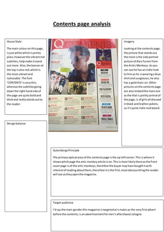
The main colouron thispage,
isjust white whichispretty
plain,howeverthe vibrantred
subtitles,helpmake itstand
out more.Also,the bannerat
the top isalso red,whichis
the most vibrantand
noticeable.The font
‘CONTENTS’isverythin,
whereasthe subtitlesgoing
downthe right handside of
the page are quite boldand
thickand reallystandsoutto
the reader.
Imagery
Lookingat the contentspage,
the picture that standsout
the most isthe side portrait
picture of Alex Turnerfrom
the Arctic Monkeys.Asyou
can see he has an indie look
to himas he iswearinga blue
shirtand sunglasses,he also
has a goldchain on. Other
pictureson the contentspage
are alsorelatedthe mainone
as the that is prettycentral of
the page,is of girlsall dressed
inblack andleatherjackets,
so it’squite indie rockbased.
Designbalance
GutenbergsPrinciple
The primaryoptical area of the contentspage isthe op leftcorner.This iswhere it
showswhichpage the artic monkeyarticle ison.Thisismost likelythereasthe front
coverpage isof the artic monkeys,therefore the buyer may have boughtitwith
interestof readingaboutthem, therefore itisthe first,mostobviousthingthe reader
will see astheyopenthe magazine.
Target audience
I’dsay the main genderthismagazine istargetedatismalesas the veryfirstadvert
before the contents,isanadvertisementformen’saftershave/cologne.