
Recommended
More Related Content
Viewers also liked
Similar to Contents page analysis 1
Similar to Contents page analysis 1 (20)
Recently uploaded
Recently uploaded (20)
Contents page analysis 1
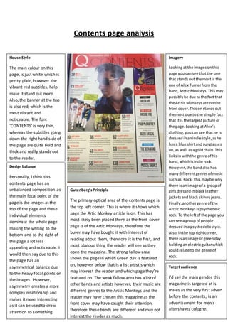
- 1. Contents page analysis House Style The main colour on this page, is just white which is pretty plain, however the vibrant red subtitles, help make it stand out more. Also, the banner at the top is also red, which is the most vibrant and noticeable. The font ‘CONTENTS’ is very thin, whereas the subtitles going down the right hand side of the page are quite bold and thick and really stands out to the reader. Imagery Lookingat the imagesonthis page you can see thatthe one that standsout the mostis the one of Alex Turnerfromthe band,Arctic Monkeys.Thismay possiblybe due tothe fact that the Arctic Monkeysare on the frontcover.This onstandsout the most due to the simple fact that itis the largestpicture of the page. Lookingat Alex’s clothing,youcan see thathe is dressedinanindie style,ashe has a blue shirtandsunglasses on,as well asa goldchain.This linksinwiththe genre of his band,whichisindie rock. However,the bandalsohas manydifferentgenresof music such as; Rock.This maybe why there is an image of a groupof girlsdressedinblackleather jacketsand black skinnyjeans. Finally,anothergenre of the Arctic monkeysis psychedelic rock. To the leftof the page you can see a group of people dressed ina psychedelicstyle. Also,inthe top rightcorner, there is an image of greenday holdinganelectricguitarwhich couldrelate tothe genre of rock. Designbalance Personally, I think this contents page has an unbalanced composition as the main focal point of the page is the images at the top of the page and these individual elements dominate the whole page making the writing to the bottom and to the right of the page a lot less appealing and noticeable. I would then say due to this the page has an asymmetrical balance due to the heavy focal points on the images. However, asymmetry creates a more complex relationship and makes it more interesting as it can be used to draw attention to something. Gutenberg’sPrinciple The primary optical area of the contents page is the top left corner. This is where it shows which page the Artic Monkey article is on. This has most likely been placed there as the front cover page is of the Artic Monkeys, therefore the buyer may have bought it with interest of reading about them, therefore it is the first, and most obvious thing the reader will see as they open the magazine. The strong fallow area shows the page in which Green day is featured on, however below that is a list artist’s which may interest the reader and which page they’re featured on. The weak fallow area has a list of other bands and artists however, their music are different genres to the Arctic Monkeys and the reader may have chosen this magazine as the front cover may have caught their attention, therefore these bands are different and may not interest the reader as much. Target audience I’d say the main gender this magazine is targeted at is males as the very first advert before the contents, is an advertisement for men’s aftershave/ cologne.