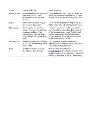
1. Areas College Magazine Music Magazine
Colour Scheme The colours I used on the college I used colours like black, grey, red, white and
page were ok, but I hadn't yellow because the reader can relate to those
planned the colours before I colours, and it matches a rock magazine well.
made it.
Layout The coverlines are too long, so The coverlines do not cover the picture, and
they go over the picture. the layout is really tidy on the contents page.
Photograpgy I took a picture of a college I used free transform on all the pictures to
student because it was a college make them fit the pages. I used the lazotool
magazine, and then I free on the frontpage to get «Matt Ward's» hand
transformed it, and that was it over the masterhead. The locations of the
really. The picture quality is very pictures was also more thought through and
bad. the locations are also variated.
Writing style I had not planned the coverlines The language is informal, and written
at all, I just made them up while especially for the target audience. I have used
I made them. words the audience can relate to.
Fonts Used the same font on every Downloaded different fonts on
coverline on the frontpage www.dafont.com. And then I evaluated wich
ones that would suit my magazine. I also used
«noise» in photoshop to edit my masterhead.