
Recommended
More Related Content
What's hot
What's hot (18)
Viewers also liked
Similar to Coldplay album
Similar to Coldplay album (20)
More from Jackwright100
Coldplay album
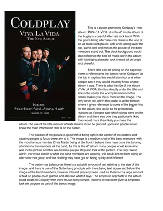
- 1. This is a poster promoting Coldplay’s new album ‘VIVA LA VIDA’ it is the 4th studio album of the hugely successful alternate rock band. With the genre being alternate rock I believe the use of an all black background with white writing over the top, works well and makes the picture of the band members stand out. The black background could also reference the kind of music within the album with it bringing alternate rock it won’t all be bright and cheerful. There isn’t a lot of writing on the page but there is reference to the bands name ‘Coldplay’ at the top in capitals this would stand out and when people saw it they would instantly know whose album it was. There is also the title of the album VIVA LA VIDA, this lies directly under the title and sits in the center the word placement on this poster makes you focus more on the image. The only other text within the poster is at the bottom where it gives reference to some of the bigger hits on the album, this could be for promotional reasons as if people saw which songs were on the album and there was one they particularly liked they would more than likely purchase the album.The use of the little amount of texts means it can be glanced upon and people would know the main information that is on the poster. The position of the picture is good with it being right in the center of the posters and causing people to focus there aim to it. The image is a medium shot of the band members with the most famous member Chris Martin being at the front. I believe they have done this to bring attention to the members of the band. As this is the 4th album many people would know who was in the picture and this would make people stop and look at the picture. The only colour within the whole poster is what the band members are wearing, this could link to them being an alternate rock group and the clothing they have got on being quirky and different. The poster has balance as there is a suitable amount of text relating to the size of the image and there is use of the Guttenberg principle with there being text above and below the image of the band members, however it hasn’t properly been used as there isn’t a large amount of text so people could glance and still read what it says. The simplistic approach to this album could relate to Coldplay with there music being simple. I believe it has been given a simplistic look on purpose as part of the bands image.