SlideShare a Scribd company logo
1 of 3
Colour Scheme  Colour Scheme – The colour scheme of the background for Cold Play’s website could be improved. The black background is stereotypical of an indie band website from my research it relates to the type of music they make for example fairly slow, sad and depressing. However the blue and pink typography are not clear contrasting colours therefore they are hard for the audience to see the writing.
Typography The font used on the Cold Play website is extremely difficult to read as you can see from the pictures. The blue and pink typography is in an artistic, creative text which does not flow clearly with the audience eye. The writing does not look professional, it may be different and interesting however there is too much of this type of writing in too small size to make it accessible for the audience. They may get frustrated or skip straight past any information in this type of font.
Layout However, I think the layout over all in extremely messy, the writing is spaced out all over the page which does not read easy to the eye from left to right. It is hard to understand which part of test is linked with what picture. There is a variety of bullet points to arrows and again with the typography being hard to read  The layout of the website in particular is not very clear or organised. The links/titles at the top of the page are fairly clear and creative I like the idea of the pictures to symbolise which each part of the website means.

More Related Content

Similar to Cold Play website analysis

Planning For The Album Cover
Planning For The Album CoverPlanning For The Album Cover
Planning For The Album Coverrachael swan
 
Design portfolio waugh
Design portfolio waughDesign portfolio waugh
Design portfolio waughpatricktwaugh
 
Assignment 32 ancillary mood boards
Assignment 32 ancillary mood boards Assignment 32 ancillary mood boards
Assignment 32 ancillary mood boards pamelayounes
 
Becky double page spread magazine analysis
Becky double page spread  magazine analysisBecky double page spread  magazine analysis
Becky double page spread magazine analysisCharis Creber
 
Ray Gun magazine dps
Ray Gun magazine dpsRay Gun magazine dps
Ray Gun magazine dpshollie98
 
Final Design Portfolio
Final Design PortfolioFinal Design Portfolio
Final Design Portfoliodeawou
 
Mood board and flat plan
Mood board and flat planMood board and flat plan
Mood board and flat planamyrobb7
 
Mag feedback
Mag feedbackMag feedback
Mag feedbackMSiddiqa
 
Planning 2
Planning 2Planning 2
Planning 2amyrobb7
 
Planning: mood board and flat plan
Planning: mood board and flat planPlanning: mood board and flat plan
Planning: mood board and flat planamyrobb7
 
Analysing double page
Analysing double pageAnalysing double page
Analysing double pageSophieBurch
 
Ancillary Presentation
Ancillary PresentationAncillary Presentation
Ancillary Presentationguest22b433f0
 
Ancillary Presentation
Ancillary PresentationAncillary Presentation
Ancillary Presentationblarmonster
 
Double page spread annlysis number 2
Double page spread annlysis number 2Double page spread annlysis number 2
Double page spread annlysis number 2reeceC
 
Planning 2
Planning 2Planning 2
Planning 2amyrobb7
 

Similar to Cold Play website analysis (20)

Planning For The Album Cover
Planning For The Album CoverPlanning For The Album Cover
Planning For The Album Cover
 
Design portfolio waugh
Design portfolio waughDesign portfolio waugh
Design portfolio waugh
 
Assignment 32 ancillary mood boards
Assignment 32 ancillary mood boards Assignment 32 ancillary mood boards
Assignment 32 ancillary mood boards
 
Becky double page spread magazine analysis
Becky double page spread  magazine analysisBecky double page spread  magazine analysis
Becky double page spread magazine analysis
 
Ray Gun magazine dps
Ray Gun magazine dpsRay Gun magazine dps
Ray Gun magazine dps
 
Final Design Portfolio
Final Design PortfolioFinal Design Portfolio
Final Design Portfolio
 
Mood board and flat plan
Mood board and flat planMood board and flat plan
Mood board and flat plan
 
Mag feedback
Mag feedbackMag feedback
Mag feedback
 
Planning 2
Planning 2Planning 2
Planning 2
 
Planning: mood board and flat plan
Planning: mood board and flat planPlanning: mood board and flat plan
Planning: mood board and flat plan
 
Fonts for Fonts
Fonts for FontsFonts for Fonts
Fonts for Fonts
 
Font Analysis
Font AnalysisFont Analysis
Font Analysis
 
Analysing double page
Analysing double pageAnalysing double page
Analysing double page
 
Ancillary Presentation
Ancillary PresentationAncillary Presentation
Ancillary Presentation
 
Ancillary Presentation
Ancillary PresentationAncillary Presentation
Ancillary Presentation
 
Two Page Spreads
Two Page SpreadsTwo Page Spreads
Two Page Spreads
 
Website deconstructions
Website deconstructions Website deconstructions
Website deconstructions
 
Double page spread annlysis number 2
Double page spread annlysis number 2Double page spread annlysis number 2
Double page spread annlysis number 2
 
Planning 2
Planning 2Planning 2
Planning 2
 
5. pre production (1)
5. pre production (1)5. pre production (1)
5. pre production (1)
 

Cold Play website analysis

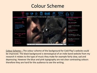
  • 1. Colour Scheme Colour Scheme – The colour scheme of the background for Cold Play’s website could be improved. The black background is stereotypical of an indie band website from my research it relates to the type of music they make for example fairly slow, sad and depressing. However the blue and pink typography are not clear contrasting colours therefore they are hard for the audience to see the writing.
  • 2. Typography The font used on the Cold Play website is extremely difficult to read as you can see from the pictures. The blue and pink typography is in an artistic, creative text which does not flow clearly with the audience eye. The writing does not look professional, it may be different and interesting however there is too much of this type of writing in too small size to make it accessible for the audience. They may get frustrated or skip straight past any information in this type of font.
  • 3. Layout However, I think the layout over all in extremely messy, the writing is spaced out all over the page which does not read easy to the eye from left to right. It is hard to understand which part of test is linked with what picture. There is a variety of bullet points to arrows and again with the typography being hard to read The layout of the website in particular is not very clear or organised. The links/titles at the top of the page are fairly clear and creative I like the idea of the pictures to symbolise which each part of the website means.