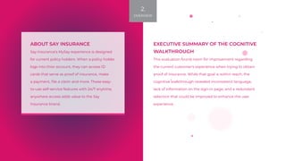
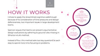
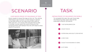
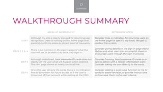
The cognitive walkthrough evaluated a policyholder's experience obtaining proof of insurance on the Say Insurance website. While the goal could be achieved, the evaluation found inconsistencies in language, lack of information on sign-in pages, and redundant selections that could confuse users. Recommendations included adding context to homepage links and sign-in pages, clarifying call-to-action buttons, and enabling saving of insurance ID cards for easier future access. The summary proposes general clarification of terminology to ensure it matches users' needs when accessing proof of insurance on mobile.

