1º ANO REALIZA FESTA DO DIA DAS BRUXAS NA ESCOLA JOÃO BERALDO!Escola João Beraldo
Introdução
O Halloween é uma festa comemorativa celebrada todo ano no dia 31 de outubro, véspera do dia de Todos os Santos. Ela é realizada em grande parte dos países ocidentais, porém é mais representativa nos Estados Unidos. Neste país, levada pelos imigrantes irlandeses, ela chegou em meados do século XIX.
História do Dia das Bruxas
A história desta data comemorativa tem mais de 2500 anos. Surgiu entre o povo celta, que acreditavam que no último dia do verão (31 de outubro), os espíritos saiam dos cemitérios para tomar posse dos corpos dos vivos. Para assustar estes fantasmas, os celtas colocavam, nas casas, objetos assustadores como, por exemplo, caveiras, ossos decorados, abóboras enfeitadas entre outros.Por ser uma festa pagã foi condenada na Europa durante a Idade Média, quando passou a ser chamada de Dia das Bruxas. Aqueles que comemoravam esta data eram perseguidos e condenados à fogueira pela Inquisição.
Com o objetivo de diminuir as influências pagãs na Europa Medieval, a Igreja cristianizou a festa, criando o Dia de Finados (2 de novembro).
Halloween no Brasil
No Brasil a comemoração desta data é recente. Chegou ao nosso país através da grande influência da cultura americana, principalmente vinda pela televisão. Os cursos de língua inglesa também colaboram para a propagação da festa em território nacional, pois valorização e comemoram esta data com seus alunos: uma forma de vivenciar com os estudantes a cultura norte-americana.
Críticas
Muitos brasileiros defendem que a data nada tem a ver com nossa cultura e, portanto, deveria ser deixada de lado. Argumentam que o Brasil tem um rico folclore que deveria ser mais valorizado. Para tanto, foi criado pelo governo, em 2005, o Dia do Saci (comemorado também em 31 de outubro).
A comemoração da data também recebe fortes críticas dos setores religiosos, principalmente das religiões cristãs. O argumento é que a festa de origem pagã dissemina, principalmente entre crianças e jovens, ideias e imagens que não correspondem aos princípios e valores cristãos. De acordo ainda com estes religiosos, as imagens valorizadas no Halloween são negativas e contrárias à pratica do bem.
TITULAR: Les retallades als familliars de dependents de Lleida ciutat serà de 80.000 euros mensuals
FOTO: El retaule de la Verge dels Paers de l'Ajuntament de Lleida torna a la sala de plens
Responsivt - Inte bara för mobilen + Webbdagarna Växjö, 04 Dec 2014Anna Dahlström
Slides from my talk at Webbdagarna Växjö on the 4 December 2014.
http://www.webbdagarna.se/vaxjo-2014/program
Video (in Swedish): http://internetworld.idg.se/2.1006/1.600683/responsivt---inte-bara-for-mobilen
Abstract:
Responsiv design ses av många som ett sätt att anpassa sina sajter till att användare surfar på mobilen eller surfplattan. Men responsivt är mycket mer än så. Det är ett sätt att framtidssäkra sina digitala tjänster för en framtid med nya enheter av alla olika storlekar.
"Vi gör tillsammans en mobil resa där vi pratar design, interaktion och teknik. Vad är skillnaderna på en app & en mobilsajt? Och vad är de viktigaste sakerna man ska tänka på när man jobbar mobilt."
5 UX-trender som kan lyfta ditt intranätIntranätverk
Åsa presenterar 5 trender inom User Experience i webbvärlden, och resonerar kring hur dessa skulle kunna appliceras på ett intranät.
User Experience (UX) är ett samlingsbegrepp för allt som påverkar en användares upplevelse av en digital tjänst eller produkt. Webben har alltid gått före intranät och interna applikationer när det UX. Eftersom dina användare även är aktiva på internet och ser hur bra publika webbtjänster kan fungera så ökar förväntningarna och kraven på hur ett intranät ska se ut och fungera. Om intranätet inte tillgodoser användarnas behov är risken stor att besökarna sviker och hittar andra lösningar. För att bibehålla ett levande intranät som används och uppskattas gäller det att hela tiden hålla sig uppdaterad kring vad som pågår utanför det egna företaget. Inte minst när det gäller UX.
Presenterad av Åsa Wendel, inUse Experience den 21 maj på Intranätverk 2013.
Optimising Landing Pages Through Narrative Structure - Digital Growth Unleash...Anna Dahlström
Slides from my talk at Digital Growth Unleashed in London on the 17 October 2018.
ABSTRACT
In all good stories things happen for a reason. Every prop and character that is present, every line that is spoken and song that is played has a role to play in making the story come together. In this talk Anna takes us on a journey of what we can learn from traditional storytelling methods when it comes to optimising landing pages and how narrative structure is key in ensuring we're telling the right story to the right audience, at the right time.
https://digitalgrowthunleashed.co.uk/agenda/?rmid=session57101#s-session57101
Using Storytelling to Create Experiences that Convert - Conversion Elite, Lon...Anna Dahlström
Slides from my 'Using Storytelling to Create Experience that Convert' talk at Conversion Elite on 6 June 2018
https://www.conversion-elite.co.uk/the-programme/
---
ABSTRACT
As users’ paths to conversion are becoming increasingly diverse understanding the context of our users, and the products and services we create, is ever more important. In this talk, Anna walks us through how storytelling principles and tools combined with UX and traditional conversion and optimisation approaches can be used to create better experiences for our users and healthier bottom lines for the business.
How To Use Storytelling To Craft Experiences That Engage - IIeX EU, Amsterda...Anna Dahlström
Slides from my talk at IIeX EU 2018 in Amsterdam
225331
ABSTRACT
To every great story there's a bit of magic involved. The same applies to experiences that just work and deliver the right content, interactions and notifications at the right time, and on the right device.
Drawing on tried and tested storytelling principles from film, fiction, and music and applying them to the context of UX design and business, in this talk Anna shares how we can instill a bit of magic in the work we do and thereby ensuring that we create better multi-device experiences for our users and healthier bottom lines for our businesses.
Beyond The Hamburger Menu - UX In The City Oxford, 21 Apr 2017Anna Dahlström
Slides from my talk Beyond the Hamburger Menu at UX In The City Oxford
http://uxinthecity.net/2017/oxford/sessions/index.php?session=109
ABSTRACT
From myths to trends and best practice, actual usage, engagement, design patterns and interactions - in this session, I will go through the insights behind the stats and take a look at the reality behind mobile and what really matters when designing for multiple devices.
Using Storytelling To Craft Multi-device Experiences That Convert - CXL Live,...Anna Dahlström
Slides from my talk 'Using Storytelling To Craft Multi-device Experiences' at CXL Live
https://live.conversionxl.com/
ABSTRACT
As the number of devices that we use, when, where and how we use them becomes increasingly complex, understanding and optimising the experience for what matters to the specific user, at specific points in time, is ever more important. In this talk, we’ll look at how storytelling principles and tools can be used together with traditional conversion and growth optimisation approaches to create better experiences for our customers and healthier bottom lines.
The talk will cover:
✓ how storytelling in design will help you set the right KPIs and measure the right metrics
✓ how it can help you define and assess hypotheses
✓ how it can guide you to the right data and connect it back to the experience
✓ how storytelling in design can help create the right multi-device experience and content, from the beginning
Storytelling In Design - SXSW, 13 March 2017Anna Dahlström
Slides from my two talks at SXSW 2017 about my upcoming book 'Storytelling in design'.
http://schedule.sxsw.com/2017/events/PP65833
ABSTRACT
To every great story there's a bit of magic involved and so there is to experiences that just work and deliver the right content, interactions and notifications at the right time, and on the right device.
Drawing on tried and tested storytelling principles from film, fiction, and music and applying them to the context of UX design and business, in this talk Ms. Dahlstrom shares how we can instil a bit of magic in the work we do and hereby ensure that we create better multi-device experiences for our users and healthier bottom lines for our businesses.
Storytelling In Design - DXN, Nottingham, 8 Feb 2017Anna Dahlström
Slides from my talk about Storytelling In Design at Design Exchange Nottingham on 8 Feb 2017.
http://dxnevent.com/
ABSTRACT
To every great story there's a bit of magic involved and so there is to experiences that just work and deliver the right content, interactions and nudges at the right time, and on/via the right device. Drawing on tried and tested storytelling principles from film, fiction, and music and applying them to the context of UX design, in this talk Anna shares how the increasingly complex world we’re designing for is our biggest asset and how storytelling in design can help us instil a bit of everyday magic in the work we do, for our users, and for us.
Storytelling In Design - Conversion Hotel, Texel NL, 20 Nov 2016Anna Dahlström
Slides from my talk at Conversion Hotel on 20th November 2016 about how we can apply principles from traditional storytelling to our design process to help define and create better multi-device experiences.
http://conversionhotel.com/
Beyond The Hamburger Menu, UX Ireland, 10 Nov 2016Anna Dahlström
Slides from my talk at UX Ireland on 10 November 2016
http://uxireland.net/sessions/index.php?session=108
Abstract:
From myths to trends and best practice, actual usage, engagement, design patterns and interactions - in this session, I will go through the insights behinds the stats and take a look at the reality behind mobile and what really matters when designing for multiple devices.
Slides from my talk at Generate London on the 23 September 2016 http://www.generateconf.com/london-2016 #generateconf
ABSTRACT
There was a time when we did glossy page designs and those designs were pretty much what we saw in our desktop browsers. With the rise of smartphones, tablets and smartwatches, there isn’t one view of our designs any more.
With further developments in technology and screens, our content could go anywhere. As a result we need to move away from designing for specific devices to solutions that are device-agnostic. For UX designers that means means letting content guide layouts, and moving away from designing pages to focusing on the modules that those views are made up of.
In this talk Anna will walk through why device-agnostic design matters, what it means and how we go about it.
Storytelling In Design - Funkas Tillgänglighetsdagar, 12 Apr 2016Anna Dahlström
Slides from my talk at Funkas Tillgänglighetsdagar 12 April 2016
http://www.funka.com/vi-erbjuder/funkas-tillganglighetsdagar/
ABSTRACT
As the number of devices we use on a daily basis grows, considering each device's role at different times, situations and contexts is becoming increasingly important. Our ability to control where a user is coming from and how they get around the experiences we design is fading. Yet our need to ensure we understand where they are in their journey, so that we can deliver the right content and interactions at the right time, and on the right device, is ever more important. In this talk I will look a the principles behind storytelling in design and how they can be translated onto a multi device landscape to help ensure we create better multi-device experiences for our users and healthier bottom lines for our businesses.
Storytelling For Multi-device Design - Bulgaria Web Summit, 20 Feb 2016Anna Dahlström
Slides from my talk at The Bulgaria Web Summit on 20 Feb 2016
http://bulgariawebsummit.com/
ABSTRACT
As the number of devices we use on a daily basis grows, considering each device's role at different times, situations and contexts is becoming increasingly important. Our ability to control where a user is coming from and how they get around the experiences we design is fading. Yet our need to ensure we understand where they are in their journey, so that we can deliver the right content and interactions at the right time, and on the right device, is ever more important. In this talk Anna will look a the principles behind storytelling in design and how they can be translated onto a multi device landscape to help ensure we create better multi-device experiences for our users and healthier bottom lines for our businesses.
Storytelling In A Multi Device Landscape - Amuse, Budapest 30 Oct 2015Anna Dahlström
Slides from my talk at the Amuse conference in Budapest 28 - 30 October 2015. http://amuseconf.com/ #amuseconf
ABSTRACT
As the number of devices we use are increasing, considering each device's role at different times, situations and context is becoming increasingly important. Our ability to control where a user is coming from and how they get around the experiences we design are becoming less and less. But the one we can still understand is what a user wants, and needs. In this talk I will look a the principles behind storytelling in design and how they can be translated onto a multi device landscape.
Designing Around Storytelling - Breaking Borders, Reading 18 August 2015Anna Dahlström
Slides from my talk at Breaking Borders on the 18 August. http://breakingborde.rs/past-events/engagement/
Storytelling has always played an important part in our societies throughout history. In the last few years it's gained attention as an important aspect in communicating and building engagement with a brand’s customer base. But storytelling is also an integral part of the design process. It’s a tool that not only can help us define our content and messaging, but the experience as a whole. Both across platforms and screens, and how we interact with it.
Beyond the hamburger menu - Digital Doughnut, London 25 Nov 2014Anna Dahlström
Slides from my talk at Digital Doughnut on the 25th of November in London where I talked about 10 things you need to know about mobile.
http://events.digitaldoughnut.com/Meetups/1500/161/other/0/false
Device Agnostic Design - UCD2014, London 25 Oct 2014Anna Dahlström
Slides from my Device Agnostic Design talk at UCD London
http://2014.ucduk.org/session/device-agnostic-design-how-to-get-your-content-to-go-anywhere/
ABSTRACT:
There was a time when we did glossy page designs and when those designs were pretty much what we saw in our desktop browsers. With the introduction and rise of smartphones, tablets, phablets there isn’t one view of our designs anymore.
Instead, what we create needs to be able to adapt in a way that is suitable for the device as well as where and how it’s being used.
With responsive design we’ve learnt the basics of how to adapt content, interactions and layouts so that it works across devices. But with further developments in technology and screens, our content is going to go anywhere. As a result we need to move away from designing for specific devices to solutions that are device agnostic. For us as UX designers this means means letting content rather than devices guide layouts, and also increasingly moving away from designing and wireframing pages to focusing on the modules that those views are made up of. But there are other aspects to consider in device agnostic design.
In this talk I walk through why device agnostic design matters, what it means and how we go about it.
Beyond The Hamburger Menu - MOBX, 13 Sep 2014Anna Dahlström
Slides from my talk at MOBX in Berlin on 13 Sep 2014 - http://2014.mobxcon.com/
Beyond the hamburger menu - What you need to know about designing for multiple devices.
Abstract: From myths to trends and best practice, actual usage, engagement, design patterns and interactions, we’ll go through the insights behinds the stats and take a look at the reality behind mobile and what really matters when designing for multiple devices.
Slides from my talk at Cambridge Usability Group on the 12th of May 2014
http://www.eventbrite.co.uk/e/designing-better-ux-deliverables-tickets-11542298325
Needing to produce some kind of deliverables throughout a project is inevitable: it might be user research reports to inform senior stakeholder; usability test results to communicate to developers; sketches and wireframes to pass on to web designers.
Just as we make the products and services we design easy to use, the UX of UX is about communicating your thinking in a way that ensures that what you've defined is easy to understand for the reader. It's about adapting the work you do to the project in question and finding the right balance of making people want to look through your work whilst not spending unnecessary time on making it pretty.
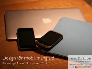
1. Design för mobil mångfald Anna Dahlström
co-founder byflock
Bouvet Syd, Malmö 30:e augusti 2012 www.annadahlstrom.com
annadahlstrom
2. Hej!
IA & UX DESIGNER | BOR I LONDON |
FÖRKÄRLEK FÖR CITAT & UTMANINGAR |
FRILANSAR & JOBBAR PÅ EN STARTUP
Det här är jag på mitt favoritställe, Knäbäckshusen
Photo curtesy of my sister
3. MOBIL ENHET: ett föremål gjort för
ett specifikt ändamål eller syfte & som
kan kopplas upp på nätet
http://desktopwallpaper-s.com/19-Computers/-/Future/
4. FOKUS FÖR IDAG
SMARTPHONES | DESKTOP ( SURFPLATTOR) - iOS & ANDROID
http://desktopwallpaper-s.com/19-Computers/-/Future/
5. AGENDA
1. FÖRSTÅELSE FÖR ANVÄNDNINGS-
& BETEENDEMÖNSTER AV MOBILA
ENHETER
2. RIKTLINJER FÖR VAL AV MOBIL SITE
vs. RESPONSIVE SITE vs. EN APP
3. TITTA NÄRMARE PÅ RESPONSIVE
DESIGN
4.UX PRINCIPER FÖR APPAR & OLIKA
PLATFORMAR
www.flickr.com/photos/marfis75/2939337382
6. FÖRST UT...
ANVÄNDNINGS
& BETEENDE-
MÖNSTER
www.flickr.com/photos/publicenergy/1846375599
7. 29 JUNI 2007
DEN FÖRSTA iPHONEN
www.flickr.com/photos/lori_greig/2202727502
8. 03 APRIL 2010
DEN FÖRSTA iPADEN
www.flickr.com/photos/scobleizer/4317207778
9. År 2011 använde mer än en tredjedel av
jordens 7 miljarder invånare internet.
En ökning med 17% sedan 2010.*
* Source: www.itu.int/ITU-D/ict/facts/2011/index.htmll
www.flickr.com/photos/jamescridland/613445810
10. Vid slutet av 2012 kommer antalet internet-
uppkopplade mobila enheter att överträffa
antalet personer på jorden & år 2016
kommer det finnas 1.4 enheter per invånare.*
* Source: www.cisco.com/en/US/solutions/collateral/ns341/ns525/ns537/ns705/ns827/white_paper_c11-520862.html
www.flickr.com/photos/nasamarshall/6289116940
11. Den genomsnittlige svensken använder
internet 2 timmar & 13 minuter om dagen &
2 av 3 använder internet på mobiltelefonen.*
* Source; www.internetstatistik.se/artiklar/2-timmar-och-13-minuter-om-dagenl
www.flickr.com/photos/jsolomon/612237912
12. Hälften av alla treåringar i Sverige
använder internet.*
* Source; www.iis.se/docs/SOI2011-en.pdf
www.flickr.com/photos/tocaboca/5523596357
13. I genomsnitt tittar vi på vår telefon
150 gånger om dagen.*
* Source: www.textually.org/textually/archives/2012/02/030229.htm
www.flickr.com/photos/jorgeq82/4732700819
14. 40% erkänner att de använder sin
telefon på toaletten
* Source: http://www.lukew.com/ff/entry.asp?1500
www.flickr.com/photos/exlibris/2552107635
15. MOBILA ENHETER
ANVÄNDS ÖVERALLT
& NÄRSOMHELST
” The best computer is
the one you have with
you when you want
something done. “
- JACOB NIELSEN
www.flickr.com/photos/yahnyahn/2996454839
16. 20% av alla emails öppnas
på mobila enheter.*
* Source: www.campaignmonitor.com/guides/mobile
www.flickr.com/photos/25228175@N08/5127055942
17. ANVÄNDAR-
MÖNSTER FÖR
MOBILA ENHETER
“...as devices become
more mobile, it’s not
only changing where
we read, but when. ”
- POCKET (formerly Read it Later)
www.flickr.com/photos/brandoncwarren/4236278556
18. POCKETS STATISTIK
FÖR DESKTOP
Source: http://readitlaterlist.com/blog/2011/01/is-mobile-affecting-when-we-read
www.flickr.com/photos/brandoncwarren/4236278556
19. POCKETS STATISTIK
FÖR iPHONE
Source: http://readitlaterlist.com/blog/2011/01/is-mobile-affecting-when-we-read
www.flickr.com/photos/brandoncwarren/4236278556
20. POCKETS STATISTIK
FÖR iPAD
Source: http://readitlaterlist.com/blog/2011/01/is-mobile-affecting-when-we-read
www.flickr.com/photos/brandoncwarren/4236278556
21. HÖGSTA
TOPPARNA
•När vi går upp
•På väg eller just kommit till jobbet
•På väg hem
•Efter kvällsmaten
Source: http://readitlaterlist.com/blog/2011/01/is-mobile-affecting-when-we-read
22. “ MOBILA ANVÄNDARE HAR
BRÅTTOM & ÄR ALLTID PÅ VÄG ”
INTE SANT. DETTA ÄR EN MYT
www.flickr.com/photos/yahnyahn/2996453841/in/photostream
23. EN STOR DEL AV
ANVÄNDANDET
SKER NÄR VI HAR
TID ATT DÖDA
VÄNTAR, RESER, SOFTAR
www.flickr.com/photos/s8an/7303973840
24. SAMMA UPPGIFTER
UTFÖRS ALLTMER
PÅ SMARTPHONES
SOM PÅ DATORN
JU MER OPTIMERADE MOBILA ENHETER
SAMT LÖSNINGAR BLIR DESTO MER
KOMMER DETTA BETEENDE ÖKA
www.flickr.com/photos/edduddiee/4307943164
25. 3 köp görs varje sekund genom
eBays mobila lösningar
Source: www.juniperresearch.com/reports/mobile_payments_for_digital_&_physical_goods
www.flickr.com/photos/stuckincustoms/440157748
26. 2. DETTA HAR...
BETYDELSE FÖR
UX & DESIGN
http://www.flickr.com/photos/eyesore9/3206408088/
27. BEGRÄNSNINGAR MED MOBILA
ENHETER BRUKADE MEDFÖRA
BEGRÄNSAT ANVÄNDANDE
T.E.X FOKUS VAR PÅ SÖKNINGAR, ÖPPETTIDER, MENYER,
www.flickr.com/photos/possan/5401428913 RECENSIONER
28. VILKET I SIG RESULTERADE I
BEGRÄNSADE MOBILA SITER
MINDRE INNEHÅLL & LÄNKAR TILLBAKA TILL WEBBVERSIONEN
HELA HÄRLIGHETEN
EN
LITEN
DEL
EN LITEN
DEL
http://desktopwallpaper-s.com/19-Computers/-/Future/
29. MEN...
FOLK KLICKAR
‘WEBBVERSION’
LÄNKAR
& DET FINNS DET EN
ANLEDNING TILL
www.flickr.com/photos/demandaj/7287174776
30. EN ENHETLIG &
KONTINUERLIG
UPPLEVELSE OAVSETT ENHET
DENNA FÖRVÄNTNING & ÖNSKAN
www.flickr.com/photos/joachim_s_mueller/7110473339 KOMMER ENDAST BLI STARKARE
31. 3. EN NÄRMARE TITT PÅ...
SPECIFIKA
MOBILA SITER vs.
RESPONSIVE
DESIGN vs. APPAR
http://www.flickr.com/photos/young_einstein/74097753/
32. PRIMÄRA GRUNDER
FÖR EN SPECIFIK
MOBIL SITE
• BEHÖVS FÖR MÅLGRUPPEN
• TEKNISKA BEGRÄNSNINGAR MED CMS
www.flickr.com/photos/st3f4n/3476036180
33. BÄST ATT
UNDVIKA
OM DET GÅR
LÄTT ATT BRÄNNA
FINGRARNA
http://www.flickr.com/photos/edenandjosh/2892956576/
34. VAFFÖDÅDÅ?
” Today's popular devices are
not tomorrow's so building
something which works on any
device is better than building
something which works on
today's devices “
- KOMBINERAD VISDOM FRÅN @ONEXTRAPIXEL &
@TRENTWALTON
www.flickr.com/photos/lastquest/1472794031
35. ALTERNATIVET ÄR
RÖRIGT & KOSTSAMT
UNDERHÅLLNING AV OLIKA
VERSIONER
SVÅRT FÖR ANVÄNDARE ATT
HITTA DET DE SÖKER
www.flickr.com/photos/ericconstantineau/5618576278
36. BIBEHÅLL HUVUD-
INNEHÅLLET MEN
OPTIMERA FÖR MOBILA
ENHETER & TOUCH
GÄLLER PRESENTATION & ANVÄNDNING
AV ENHETENS INBYGGDA FUNKTIONALITET
www.flickr.com/photos/jmtimages/2883279193
37. OPTIMERAD SITE vs. EN APP?
ANVÄND WEBBANALYTICS SOM EN FÖRSTA GUIDE
•MEST DIREKT TRAFIK
POTENTIELLT ARUGUMENT FÖR EN APP
•MEST VIA DELADE LÄNKAR
EN APP RÄCKER INTE. MOBILOPTIMERAD SITE BEHÖVS.
•EN BIT AV BÅDA
TÄNK DÅ PÅ ATT....
www.flickr.com/photos/andwhynot/2946734025
38. GÖRA EN APP
ELLER INTE BEROR PÅ...
• SYFTET & VISION (ANVÄNDAR & FÖRETAGETS)
• OM TILLGÅNG TILL SPECIFIK ENHETSFUNKTIONALITET KRÄVS
• OM OFFLINE ANVÄNDNING ÄR ETT KRAV
• & SJÄLVKLART VILKEN BUDGET SOM FINNS
www.flickr.com/photos/aidanmorgan/2327622517
39. OLIKA TYPER
AV APPAR
DE TVÅ STÖRSTA ÄR
NATIVE (t ex. Instagram)
• DEN MEST OPTIMERADE ANVÄNDARUPPLEVELSEN
• TILLGÅNG TILL ENHETSFUNKTIONALITET & APIs
• MEN KRÄVER PLATFORMSSPECIFIK KODBAS
HYBRID (t ex Facebook)
• ANVÄNDER HTML5 & JAVASRIPT
• EN “WRAPPER” SOM GER TILLGÅNG TILL NATIVE FUNKTIONALITET
• FÄRRE VERSIONER ATT HÅLLA UPPDATERADE
• KAN VARA TIDSKRÄVANDE ATT SKAPA APPLIKNANDE FUNKTIONALITET
• MÅSTE HA APPLIKNANDE FUNKTIONALITET
40. ” Money spent developing a pretty but limited
iPhone app only benefits...the few, but money
spent on the website UI would have benefitted
everyone “
- Gary Marshall on ‘The app trap’ in .net Magaizine
www.flickr.com/photos/cristiano_betta/2909483129
41. 4. DET FINNS NÅGOT SOM
HETER...
RESPONSIVE
DESIGN
http://www.flickr.com/photos/paperpariah/4301471586/
42. “ Design & development should respond to
the user’s behaviour & environment based on
screen size, platform & orientation.
[It’s]...a mix of flexible grids & layouts, images
& an intelligent use of media queries. ”
- SMASHING MAGAZINE
www.flickr.com/photos/adactio/5818096043
43. GRID &
BREAK
POINTS
• ANVÄND SOM BAS
FÖR SIDLAYOUTS
• GUIDE FÖR
MODULSTORLEKAR &
VARIATIONER
• FIXED ELLER FLUID
• DEFINERAR HUR
INNEHÅLLET KOMMER
BETE SIG PÅ OLIKA
ENHETER
http://foundation.zurb.com/docs/layout.php
44. DEFINERA DIN CONTENT
STACKING STRATEGI
FÖR OLIKA ENHETER SAMT ORIENTERING
Smartphone
1
2 Header
“ Content needs to be
Logo
3
Nav
choreographed to Desktop & surfplattor
4
Bath
section
intro
5
Ad
ensure the intended 1
Logo
2
Header
message is preserved 4
Bath section intro
5
Ad
6
on any device and at
Types of baths
3
Nav
any width ” 6
Types of baths
7
Related 7
products Related products
- TRENT WALTON
8 Store
locator
9 Tools 8 Store
9 Tools
locator
10 10
Footer Footer
45. MOBILE FIRST VS. DESKTOP FIRST
• BÖRJA SMÅTT ELLER STORT
DET SOM FUNGERAR BÄST FÖR DIG
• FOKUS ÄR PÅ INNEHÅLLET, HUR DETTA PRIORITERAS SAMT
VISAS PÅ OLIKA ENHETER
www.flickr.com/photos/cedrouille/3312593086
46. WEBBEN ÄR
FYLLD MED
EXEMPEL
MEN VAR INTE RÄDD FÖR
ATT UTMANA ELLER KOMMA
UPP MED NÅGOT... BÄTTRE
http://mediaqueri.es/popular/
47. TÄNK PÅ NAVIGERING
OLIKA SÄTT ATT OPTIMERA SAMT FÖR- & NACKDELAR
www.flickr.com/photos/tim_norris/2789759648
51. 5. MEN VAD GÄLLER NÄR
MAN SKA GÖRA...
EN APP?
http://www.flickr.com/photos/tomitapio/4053123799/in/photostream/
52. APPAR ÄR FOKUSERADE
& PERSONLIGA
” Small, downloadable chunks
of software, they give people
access to information in a
neatly packaged format “
- Apps on tap, The Economist Oct 8th 2011
www.flickr.com/photos/elwillo/5247084642
53. VARJE
PLATTFORM
ÄR ETT EGET
LITET
SAMHÄLLE
SPECIFIKA UI
GUIDELINES SOM
ANVÄNDARNA
ÄR VANA VID
www.flickr.com/photos/gadl/3570118243
54. INTE SÅ
ENKELT
SOM BARA
ANDROID
ELLER iOS
FRAGMENTERING
MELLAN VERSIONER &
BAKÅT-KOMPABILITET
SKA HÅLLAS I ÅTANKE
www.flickr.com/photos/nrkbeta/3906687294/in/photostream
55. FÖRDELNING AV AKTIVA
ANDROID ENHETER
Source: http://forums.macrumors.com/showthread.php?t=1347559&forceMobile=1
www.flickr.com/photos/blakespot/4773693893
56. EXEMPEL PÅ ADOPTION AV iOS 5.1
Source: http://forums.macrumors.com/showthread.php?t=1347559&forceMobile=1
www.flickr.com/photos/blakespot/4773693893
57. HUVUDSKILLNADERNA MELLAN
ATT DESIGNA FÖR ANDROID & iOS
ANDROID iOS
FRAGMENTERAD Design ENHETLIG
OLIKA MELLAN OLIKA VERSIONER & UI element & ENHETLIGHET MELLAN VERSIONER
ENHETER riktlinjer & ENHETER
LÅNGSAMMARE IMPLEMENTERING & Version adoption SNABB ADOPTION AV NYA
ADOPTION AV NYA VERSIONER VERSIONER
HANTERAS ANTINGEN MED SYSTEM Bakåt navigering BACK KNAPP
BACK (TIDIGARE VERSIONER) ELLER
BACK & UP KNAPPEN (SENASTE)
APP INSTÄLLNINGAR & INFORMATION Inställningar INSTÄLLNINGSMENY ELLER 'MORE'
FINNS I OPTIONS MENYN FÖR ATT FÅ TILLGÅNG TILL APP
etc. INSTÄLLNINGAR & INFORMATION
www.flickr.com/photos/nrkbeta/3906687294/in/photostream
60. iPhone 12:15 PM More
iOS
Customise
APP NAME
IMG Item
NAVIGERING
IMG Item
IMG Item
IMG Item
KONSEKVENT MELLAN OLIKA IMG Item
VERSIONER Content area
IMG Item
IMG Item
NAVIGATION BAR IMG Item
Möjliggör navigering genom app IMG
hierarkin. Håller back knappen, titleln Home Item Item Item More
samt funktioner för att manipulera innehållet
Home Item Item Item More
BACK
Bör alltid ta användaren ett steg bakåt baserat
på var de kom from samt vara deskriptiv.
TAB BAR
Kan oftas anpassas. Håller huvudsektionerna av
appen
‘MORE’
Används till att ge tillgång till alla andra delar av
appen samt de sektioner som inte fick plats i
tab baren
Source: http://developer.android.com/design/patterns/new-4-0.html
61. ANDROID
NAVIGERING
OLIKA MELLAN OLIKA
VERSIONER. MED
ICE CREAM SANDWICH:
NAVIGATION BAR
För enheter som inte har hårdvara-
knappear Håller 'Back', 'Home'
och 'Recents'
ACTION BAR
Håller de viktigaste ‘action buttons’ för din app
(3 + overflow menu)
UP VS. BACK
‘Up’ tar användaren ett nivå upp i app
strukturhierarkin.
‘Back’ används för att gå ett steg bakåt till var
användaren kom ifrån
Source: http://developer.android.com/design/patterns/new-4-0.html
62. HUR GRIPER
MAN NU AN
DET HÄR?
JO, SOM ALLTID...
www.flickr.com/photos/jojoneil/6359536591
63. 6.ÖVNING GER
FÄRDIGHET
NÅGOT ATT SÄTTA TÄNDERNA I
http://www.flickr.com/photos/kalexanderson/6302660289/
64. SPECIFIK MOBIL SITE
vs RESPONSIVE vs
EN APP
BEGRUNDA FÖLJANDE FIKTIVA SITUATION ELLER
ANVÄND ETT EGET PROJECT:
Som en del av förberedelserna inför Eurovision Song
Contest i Malmö 2013 i överväger fiktiva Malmö Stad att
ÖVNING ETT skapa en specifik sektion av sin site fokuserad på Eurovision
Song Contest samt Öresundsregionen.
Vad rekommenderar du i förhållande till vad de borde satsa
på, framför allt med tanke på mobila enheter, samt varför?
10 MINUTER
www.flickr.com/photos/jojoneil/6359536591
65. DESIGNA EN
RESPONSIVE SITE
FIKTIVA MALMÖ STAD VILL INKLUDERA FÖLJANDE:
• Fakta om länderna • Kalender
• Anknytning till regionen • Social media feeds
• Reseplanerare • Restaurang guide
• Tips om vad som • Länkar till partner siter
händer i regionen (SVT, Eurovision Song Contest)
ÖVNING TVÅ DEL 1
Välj antingen smartphone eller desktop & gör en skiss på hur
hemsidan ska se ut & vad den ska innehålla, samt hur
innehållet ska prioriteras. Där du anser det relevant inkludera
referenser till där bilder ska finnas.
DEL 2
Med hjälp av content stacking methodologin definera hur
innehållet ska prioritieras & anpassas för desktop samt olika
mobila enheter.
www.flickr.com/photos/jojoneil/6359536591
15 MINUTER
66. DESIGNA EN APP
FIKTIVA MALMÖ STAD VILL DESSUTOM GÖRA EN APP.
BASERAT PÅ INNEHÅLLET AV SITEN & VAD DU
KÄNNER TILL OM ÖRESUNDSREGIONEN, VAD TYCKER
DU ATT MALMÖ STAD SKA INKLUDERA?
• Fakta om länderna • Kalender
• Anknytning till regionen • Social media feeds
• Reseplanerare • Restaurang guide
• Tips om vad som • Länkar till partner siter
händer i regionen (SVT, Eurovision Song Contest)
ÖVNING TRE DEL 1
Definera huvudsektionerna av appen
DEL 2
Hur skulle du strukturera dessa sektioner i din app, både vad
gäller iOS & Android. Fokusera på Tab bar elementen
respektive Action bar elementen på Android & vad du skulle
placera i ‘More’ respektive ‘Overflow’ menyn.
www.flickr.com/photos/jojoneil/6359536591 15 MINUTER
67. 7. FÖR ATT...
SUMMERA
http://www.flickr.com/photos/martinteschner/4569495912/
68. ANVÄNDNINGS-
& BETEENDE
MÖNSTER
FRAMTIDA ENHETER
Antalet olika enheter kommer endast
öka & vi vet inte vad som kommer
ANVÄNDS VARSOMHELST &
NÄRSOMHELST
Och inte endast när vi är ute men
alltmer när vi har dötid eller sitter i
soffan.
HUR VI ANVÄNDER DEM
Vad vi använder mobila enheter till blir
mer & mer detsamma som på
www.flickr.com/photos/thecaucas/2597813380 desktops
69. INVERKAN PÅ
UX & DESIGN
TÄNKANDE
EN ENHETLIG & KONTINUERLIG
UPPLEVELSE
Ju mer sofistikerade dessa enheter &
det vi desingar blir desto mer kommer
vi förvänta av de enheter vi använder.
BIBEHÅLL HUVUDINNEHÅLLET
MEN OPTIMERA
Tänk på begränsningarna med mobilt
men också på möjligheterna.
www.flickr.com/photos/thecaucas/2597813380
70. NÄR MAN SKA
GÖRA VAD
SPECIFIK MOBIL SITE
Försök att undvika det om det går
RESPONSIVE DESIGN
Den mest adaptiva & “framtidsäkra”
lösningen just nu. Använd om det går
men utmana hur innehållet
presenteras.
APP
Använd om offline eller enhetsspecifik
funktionalitet krävs. Basera besluten på
syfte, mål och statistik
www.flickr.com/photos/thecaucas/2597813380
71. FÖR
RESPONSIVE
DEFINERA DIN GRID &
BREAKPOINTS
Detta är ryggraden för responsive
design & hur innehållet kommer
visas på olika enheter.
GLÖM INTE BORT NAVIGERING
Tänk på för & nackdelar samt olika
metoder
TESTA & SAMARBETA
Detta är ny mark & vi lär allihop hur
bäst man löser de utmaningarna det
www.flickr.com/photos/thecaucas/2597813380 medför. Jobba tvärs över discipliner
72. FÖR APPAR
TA HÄNSYN TILL PLATFORMS-
SPECIFIKA RIKTLINJER
Håller du dig till dem blir din app
lättare att använda för din målgrupp
TÄNK PÅ BAKÅTKOMPABILITET
Bara för att en ny version är ute
innebär inte att alla har den. Se till
att du tar han om majoriteten av din
målgrupp
TA HJÄLP AV INTERNET
Till inspiration & lärdom men också
för vad som kan göras ännu bättre.
www.flickr.com/photos/thecaucas/2597813380
73. OCH KOM IHÅG ATT
DESIGNA FÖR MÅNGFALD...
www.flickr.com/photos/iscene/6713283751
74. ...INTE ENBART HANDLAR
OM DE SMÅ SKÄRMARNA
www.flickr.com/photos/jolives/2889944573/ UTAN OCKSÅ DE STORA
75. DET HANDLAR OM
ATT TÄNKA FRAMÅT
PLANERA 5 ÅR FRAMÅT I TIDEN & MED
“FUTURE PROOFING” I ÅTANKE
www.flickr.com/photos/jolives/2889944573/
76. UTMANA DET SOM
FINNS IDAG & VAR KREATIV
DET BEHÖVER INTE VARA DYRT & KOMPLICERAT
www.flickr.com/photos/oter/5090592214
77. TÄTARE & MER
GIVANDE SAMARBETE
MELLAN DISCIPLINER SAMT KUNDER
www.flickr.com/photos/stevendepolo/3378152784
78. HÅLL I ÅTANKE
“ We’re not just making pretty
interfaces. We’re actually in the process of
making an environment where we’ll spend
most of our time, for the rest of our lives.
We’re the designers.We’re the builders.
What do we want that environment to feel
like? What do we want to feel like. ”
- Wilson Minor
http://www.flickr.com/photos/funch/4679422945/