
Recommended
More Related Content
Similar to Blog work
Similar to Blog work (20)
More from rhiannonbescoby
More from rhiannonbescoby (20)
Blog work
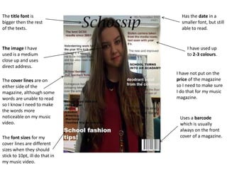
- 1. The title font is Has the date in a bigger then the rest smaller font, but still of the texts. able to read. The image I have I have used up used is a medium to 2-3 colours. close up and uses direct address. I have not put on the The cover lines are on price of the magazine either side of the so I need to make sure magazine, although some I do that for my music words are unable to read magazine. so I know I need to make the words more noticeable on my music Uses a barcode video. which is usually always on the front The font sizes for my cover of a magazine. cover lines are different sizes when they should stick to 10pt, ill do that in my music video.
- 2. Uses ‘contents’ as Weekly content has the main heading, been used to allow the which I have done. readers to show what is in every issue of the magazines. The cover lines I have used are in the font of 11pt, and have used 9 cover lines although we had to do 10, The structure of the but I know to do that for content is not set out at my music magazine. the ‘L’ shape which it usually is so I now know to do it in my music magazine. I have put the cover lines next to there page number, never The images relate write ‘page’. with the cover lines which are used.