Downloaded 23 times

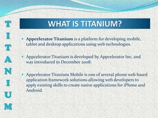


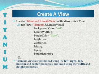
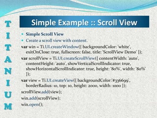
![T Basic of Interface::Table
The table element is created using
I Titanium.UI.createTableView function. This function accepts
an object as argument like we are used to – with the different
T settings we might want to give to the table. Besides the usual
properties ( like top, left, etc) we have a very important one
A named data.
The data property will hold the rows of the table as an array. The
N below code will show an example:
var win1 = Titanium.UI.createWindow({ backgroundColor:"#fff" });
I
var table1 = Titanium.UI.createTableView({
data:[ {title:"Row 1 - simple row"},
{title:"Row 2 - with child", hasChild:true},
U {title:"Row 3 - with detail", hasDetail:true},
{title:"Row 4 - with check", hasCheck:true},
M {title:"Row 5 - red background", backgroundColor:"#f00"} ]
win1.add(table1);
});
win1.open();](https://image.slidesharecdn.com/basicoftianium-130108022616-phpapp02/85/Basic-of-tianium-19-320.jpg)
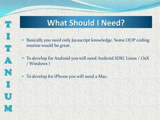
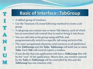
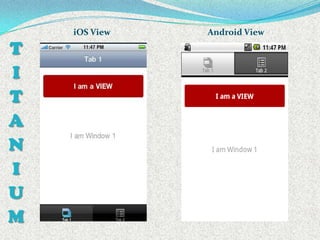
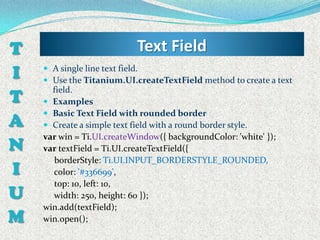
![T Table :: Group Table
var table1 = Titanium.UI.createTableView({
I style:Titanium.UI.iPhone.TableViewStyle.GROUPED });
var section1 = Titanium.UI.createTableViewSection();
section1.headerTitle = "Hello";
T var row1 = Titanium.UI.createTableViewRow({title:"Hello 1"});
var row2 = Titanium.UI.createTableViewRow({title:"Hello 2"});
A var section2 = Titanium.UI.createTableViewSection();
section2.headerTitle = "Hello2";
N var row3 = Titanium.UI.createTableViewRow({title:"Hello 3"});
var row4 = Titanium.UI.createTableViewRow({title:"Hello 4"});
I section1.add(row1);
U section1.add(row2);
section2.add(row3);
section2.add(row4);
M table1.setData([section1,section2]);](https://image.slidesharecdn.com/basicoftianium-130108022616-phpapp02/85/Basic-of-tianium-21-320.jpg)
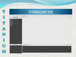
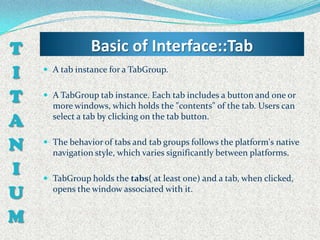
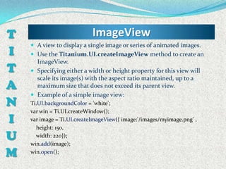
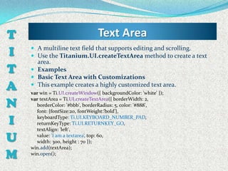
![T Picker View
The pickers are the equivalent of the select tag in html. The
I only difference is that you can create a multicolumn picker.
The function that creates a picker is
T Titanium.UI.createPicker.
The type property of the picker lets you chose the predefined
A types but you always can create your own multicolumn picker.
Titanium.UI.PICKER_TYPE_PLAIN (default),
Titanium.UI.PICKER_TYPE_DATE_AND_TIME,
N Titanium.UI.PICKER_TYPE_DATE,
Titanium.UI.PICKER_TYPE_TIME or
Titanium.UI.PICKER_TYPE_COUNT_DOWN_TIMER.
I A simple picker code example:
var picker = Titanium.UI.createPicker();
U var data = []; data.push(Titanium.UI.createPickerRow({title:'Bananas'}));
data.push(Titanium.UI.createPickerRow({title:'Strawberries'}));
M
data.push(Titanium.UI.createPickerRow({title:'Mangos'}));
data.push(Titanium.UI.createPickerRow({title:'Grapes'}));
picker.add(data);](https://image.slidesharecdn.com/basicoftianium-130108022616-phpapp02/85/Basic-of-tianium-23-320.jpg)
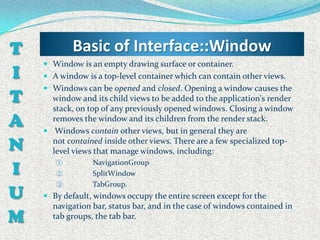
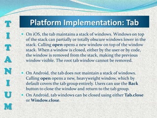
![T Titanium.App.Properties
The App Properties module is used for storing application-
I related data in property/value pairs that persist beyond
application sessions and device power cycles.
T Examples: Store a string property
Ti.App.Properties.setString(‘presenterName', ‘Dip');
A var name = Ti.App.Properties.getString('presenterName ');
Ti.API.info('The value of the givenName property is: ' + name);
N Output all saved properties to the console
I var props = Ti.App.Properties.listProperties();
for (var i=0, ilen=props.length; i<ilen; i++){
U var value = Ti.App.Properties.getString(props[i]);
Ti.API.info(props[i] + ' = ' + value); }
M](https://image.slidesharecdn.com/basicoftianium-130108022616-phpapp02/85/Basic-of-tianium-35-320.jpg)


The document provides information on developing mobile applications using Appcelerator Titanium, including an overview of Titanium, how it works, the tools and platforms it supports, and examples of creating basic user interface elements like windows, tabs, labels, views and tables. Code samples are presented to demonstrate creating and working with these common Titanium components.