Download to read offline


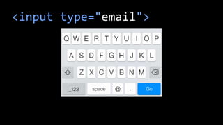
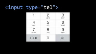
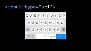
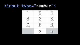
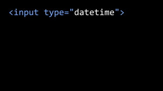

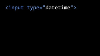
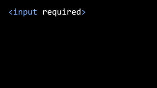


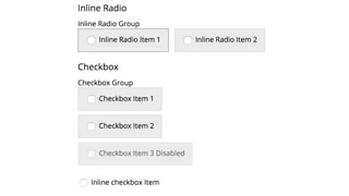


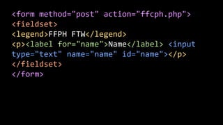

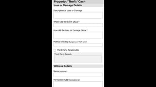
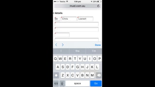


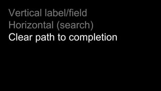
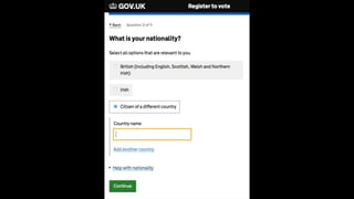
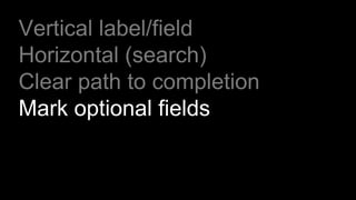
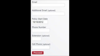


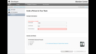
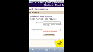


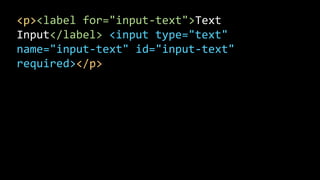
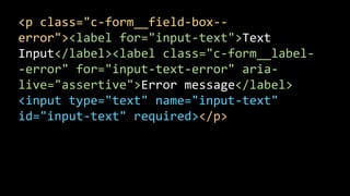
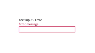
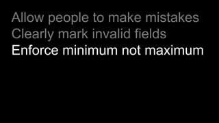

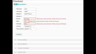


The document discusses best practices for creating web forms, emphasizing user experience by allowing mistakes, clearly marking invalid fields, and enforcing minimum field requirements. It includes various HTML input types and layout suggestions to enhance form usability. Additionally, it references resources and quotes that advocate for thoughtful design and care in web development.