Download to read offline

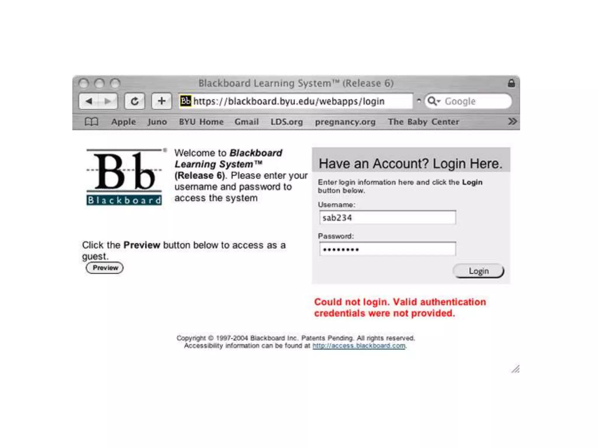
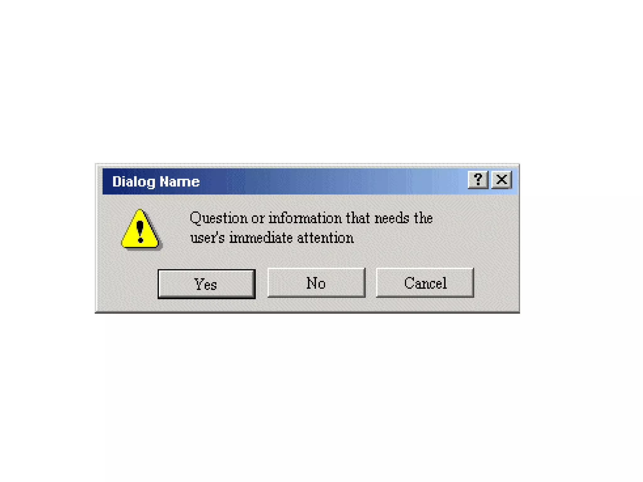

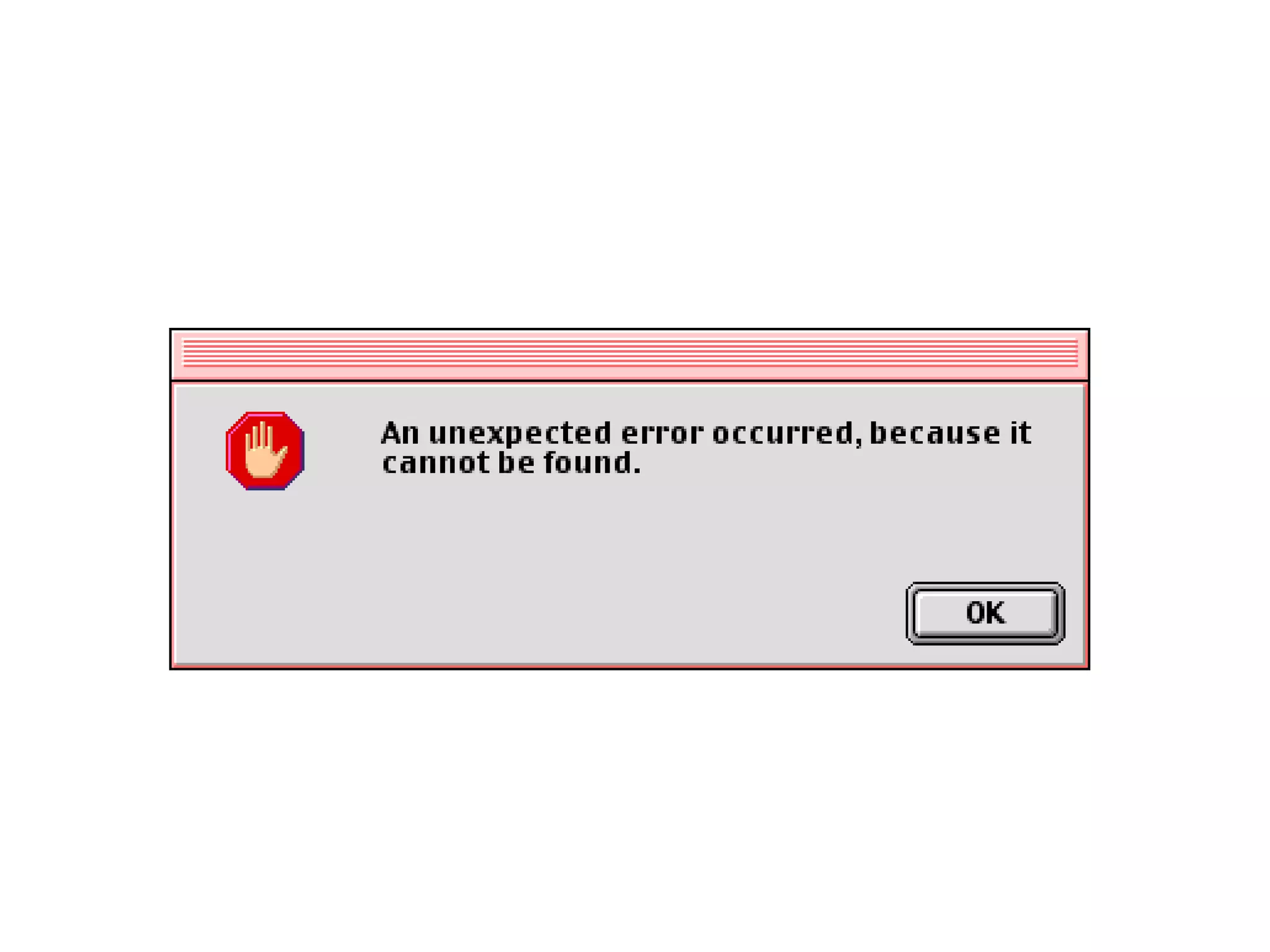
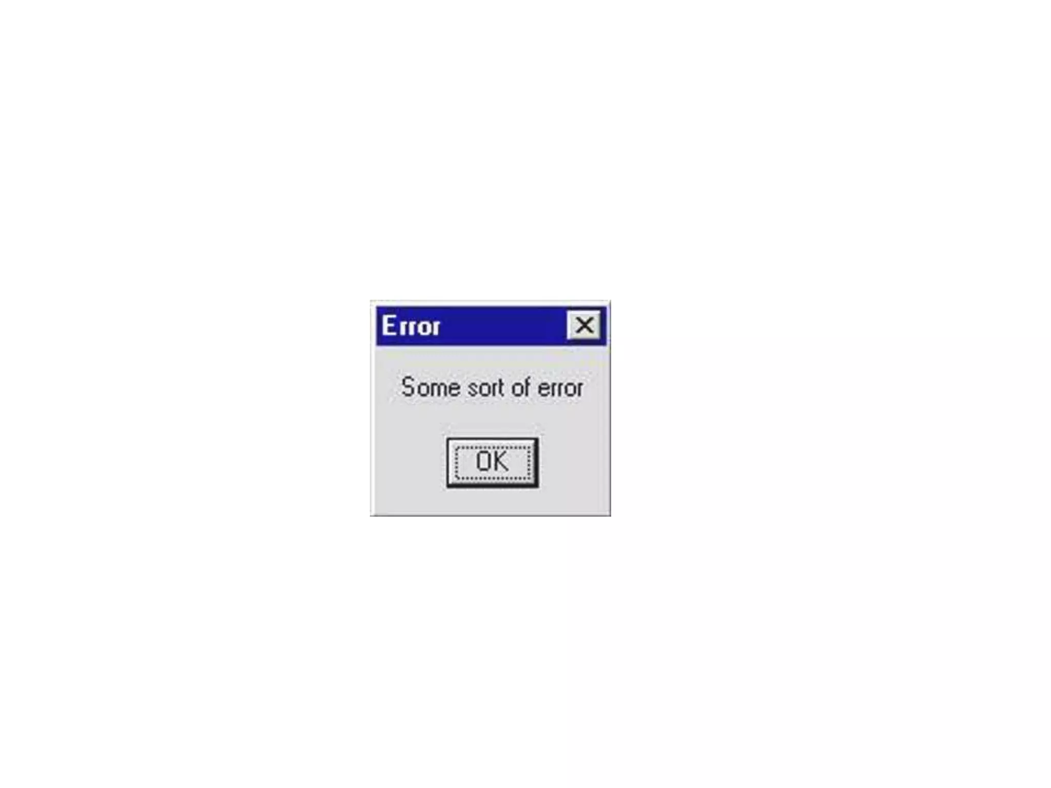
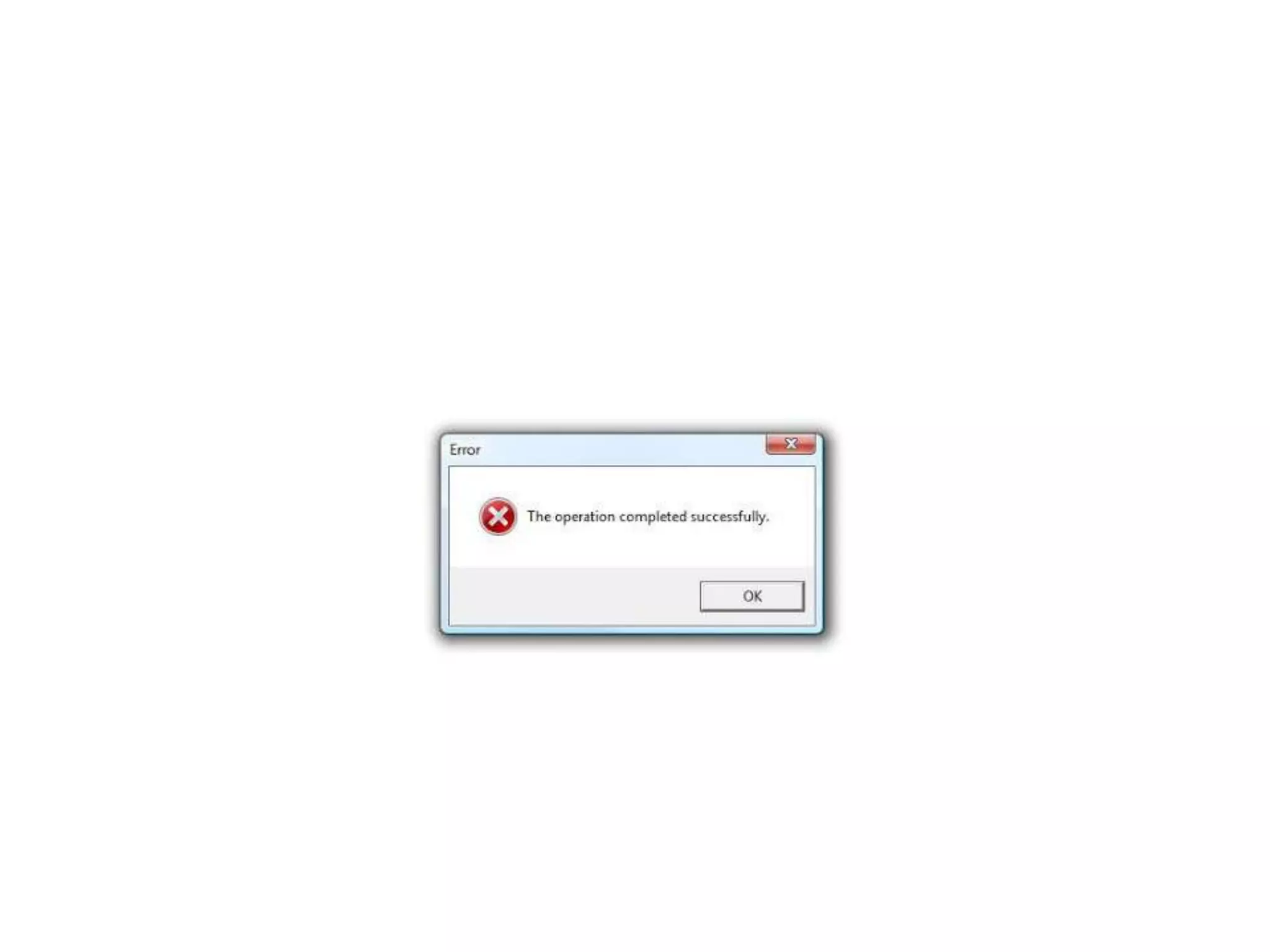
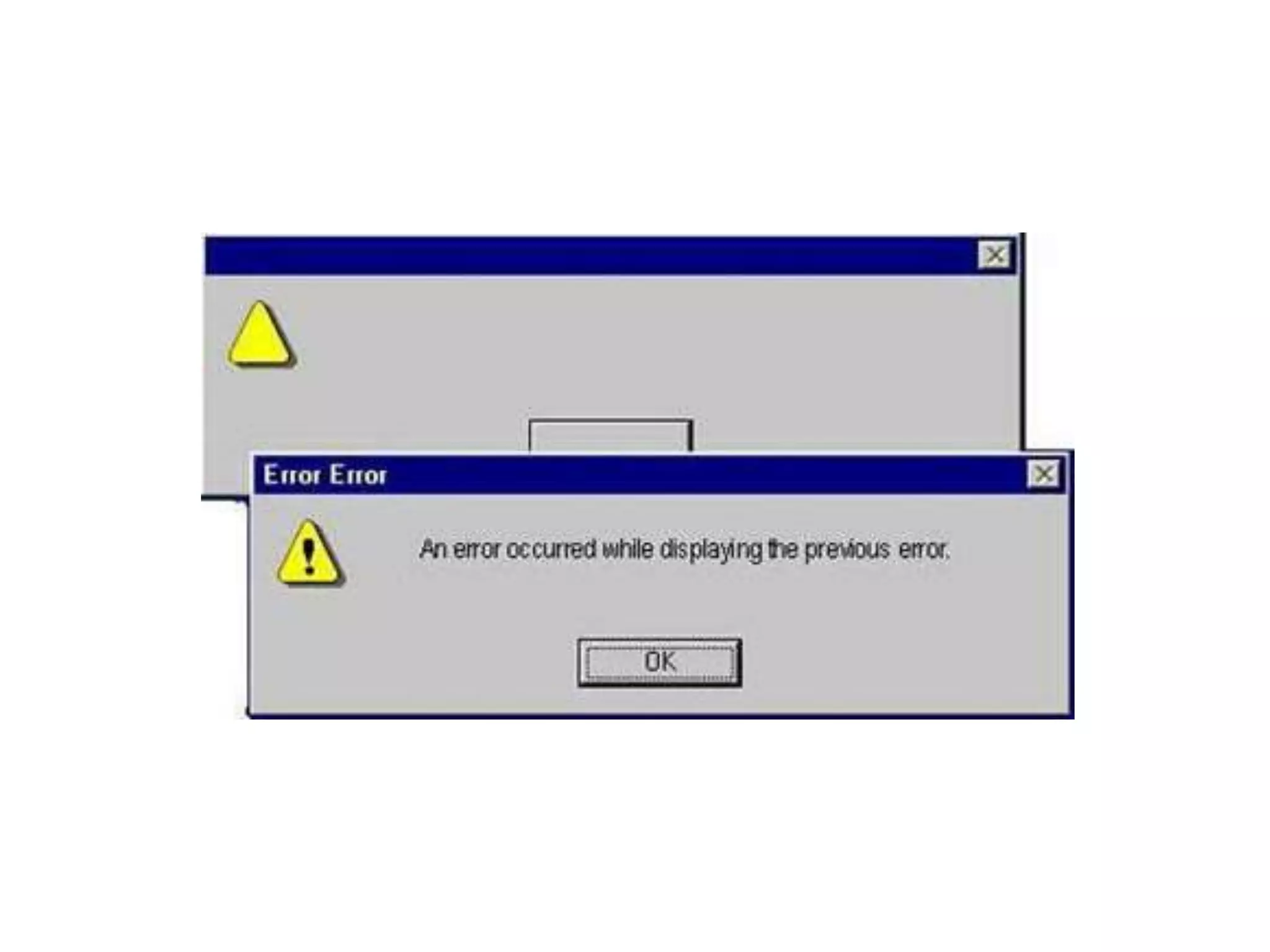
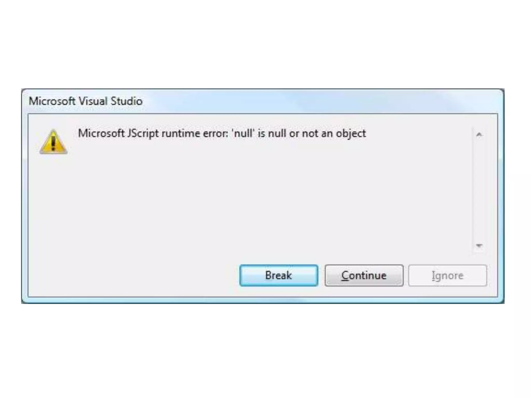
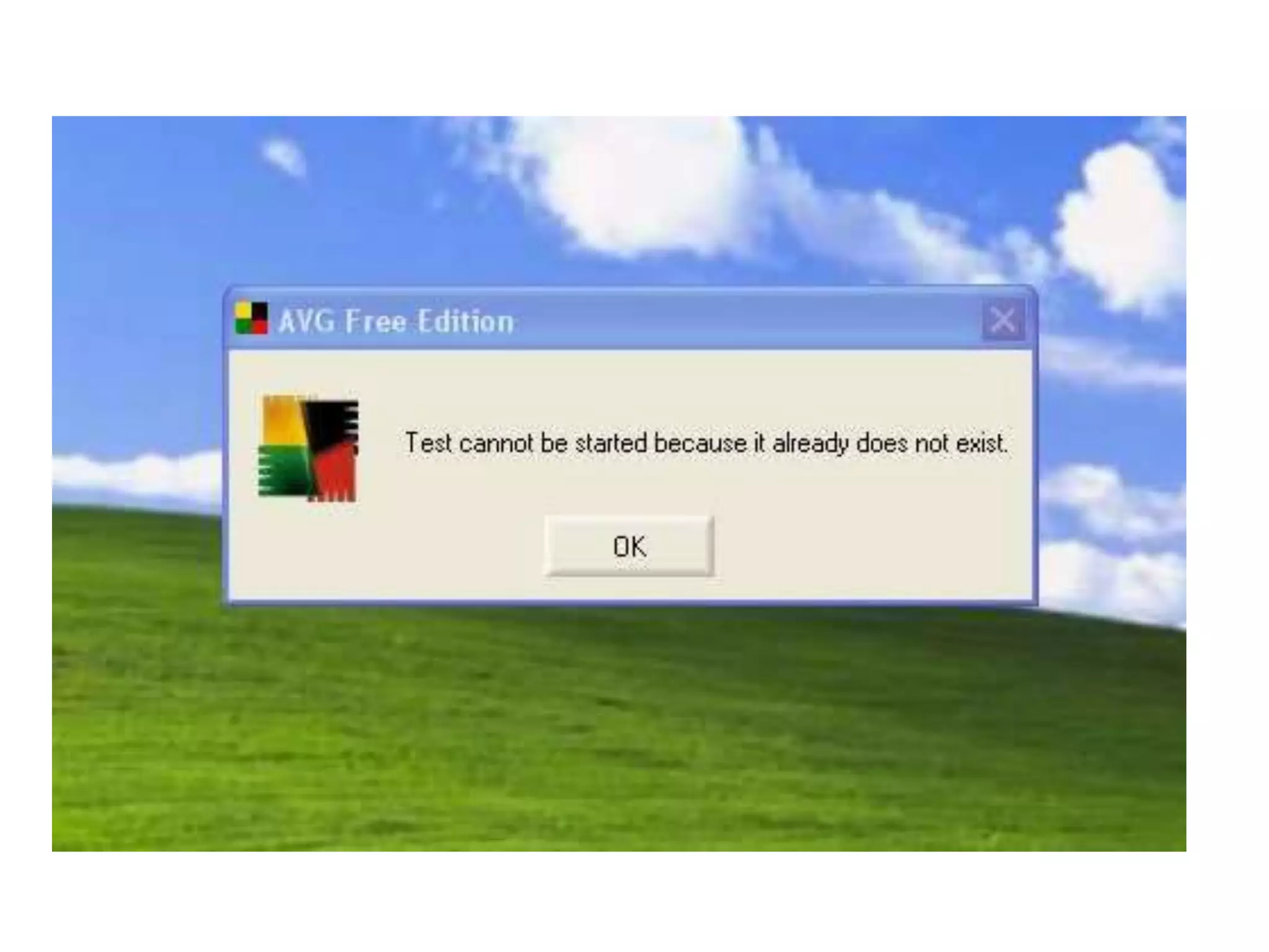
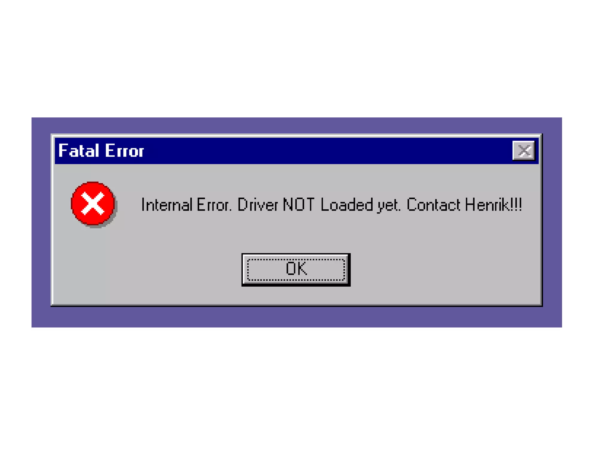
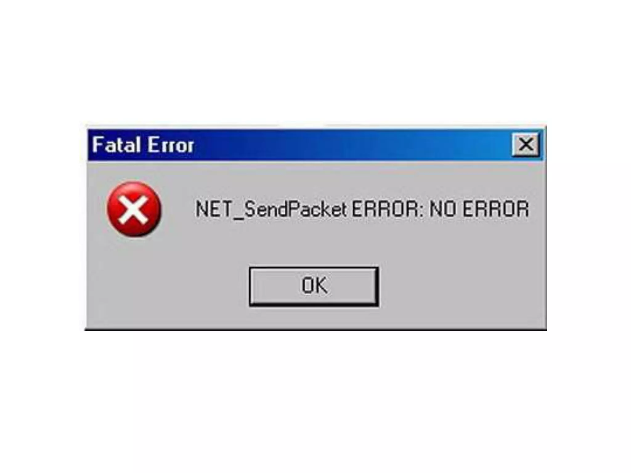
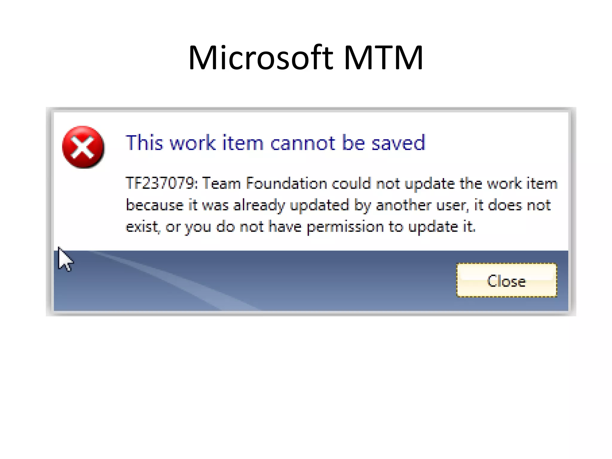
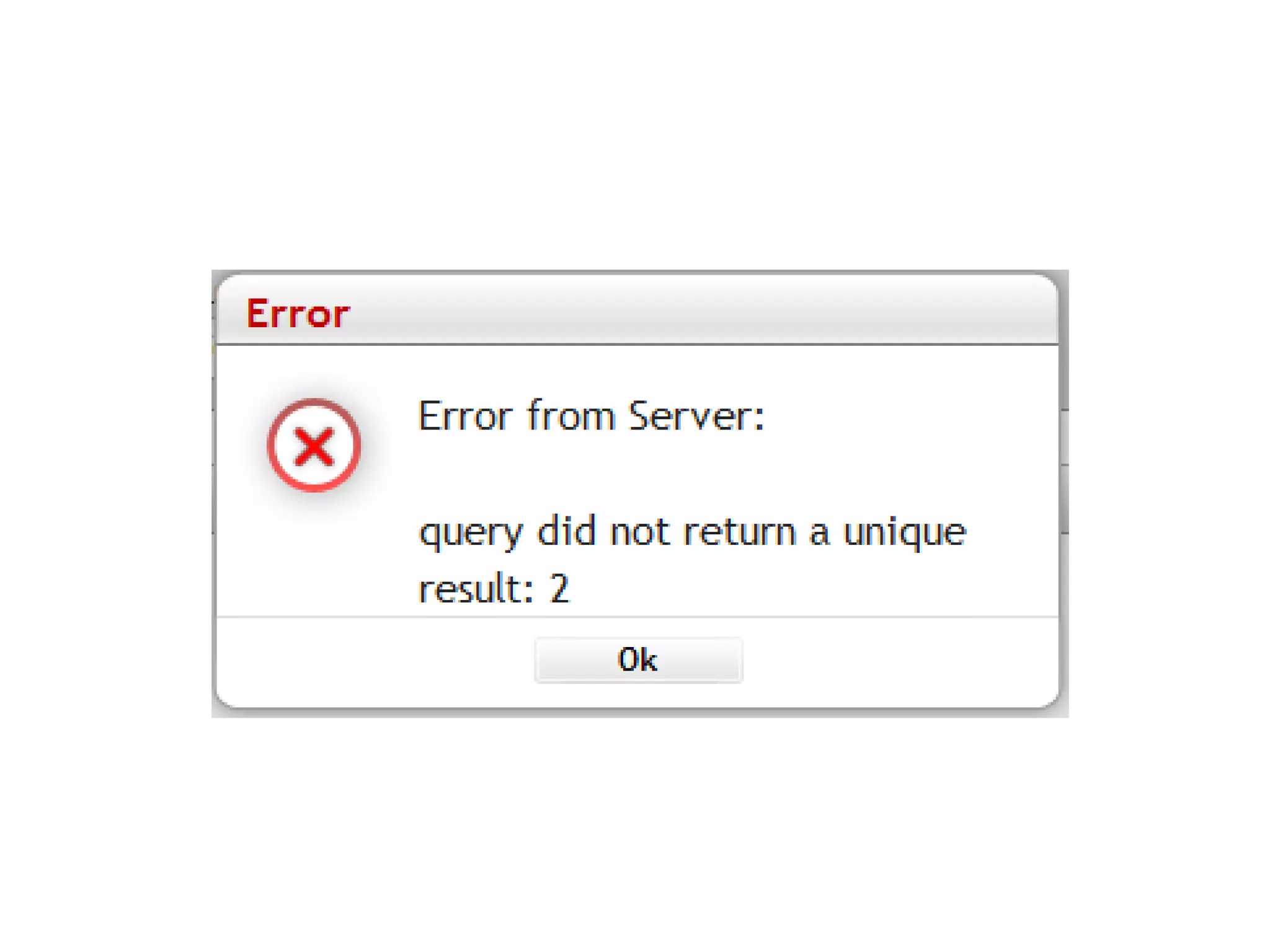
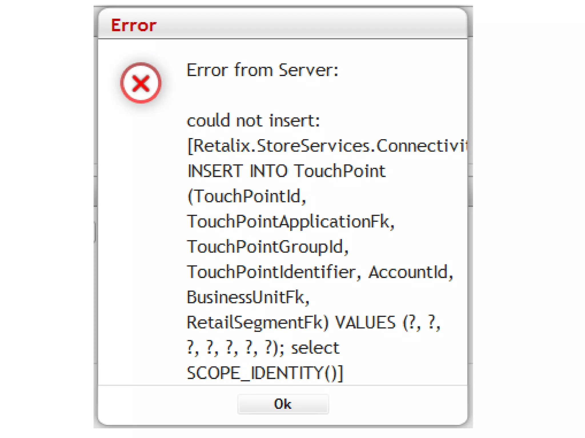
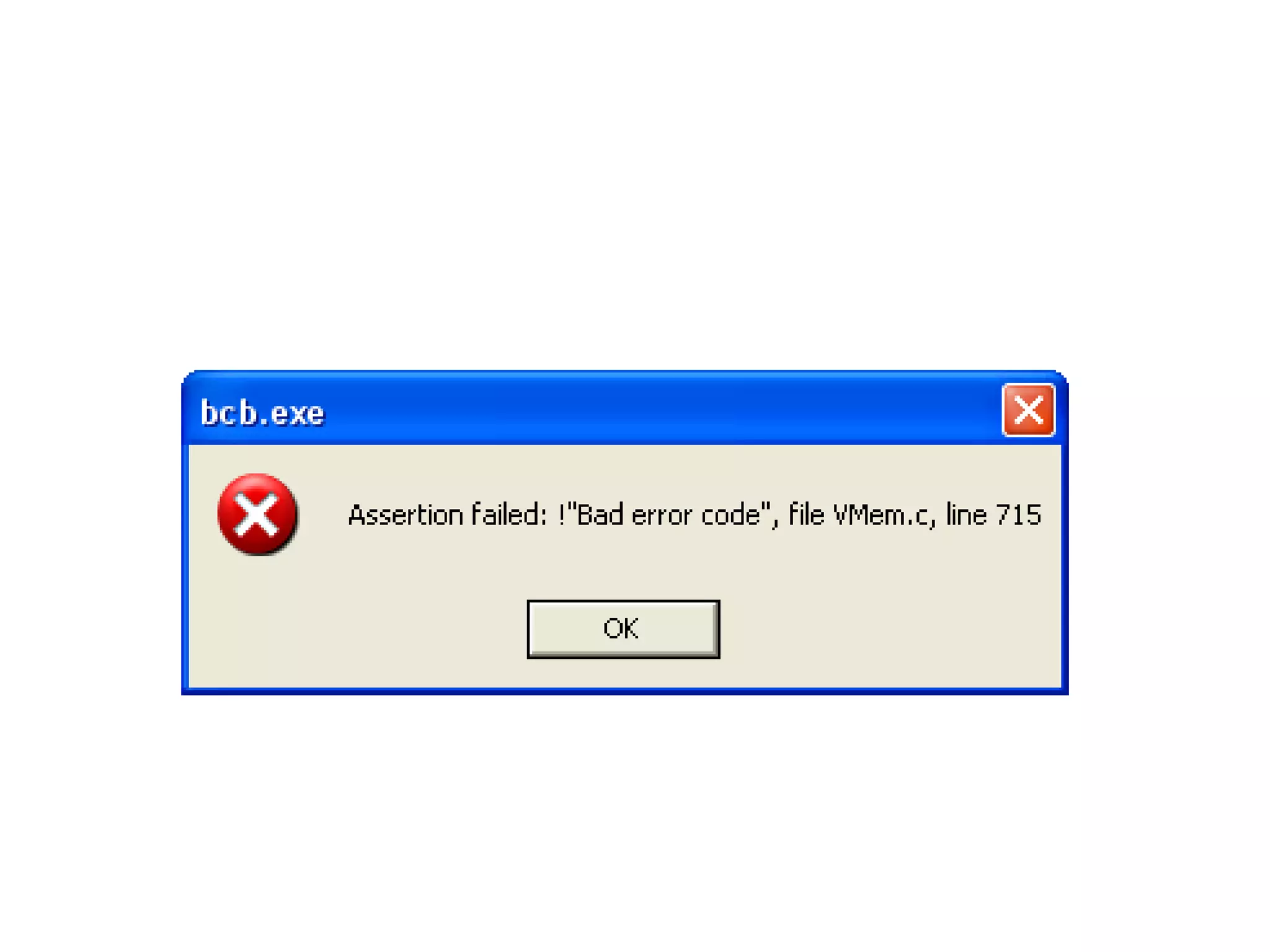
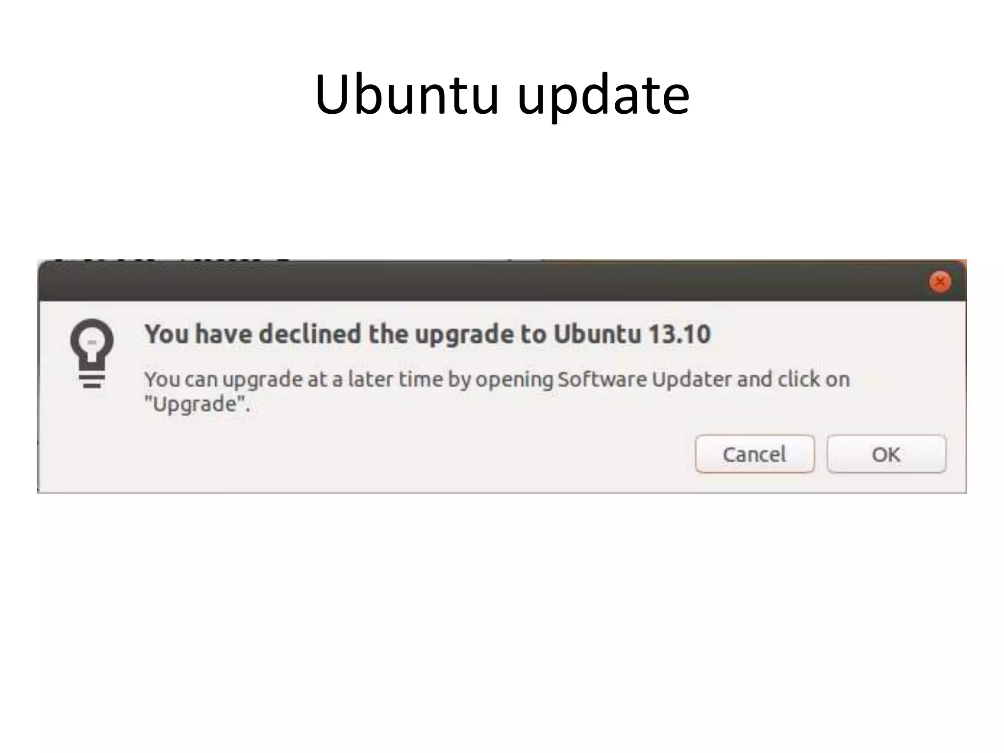
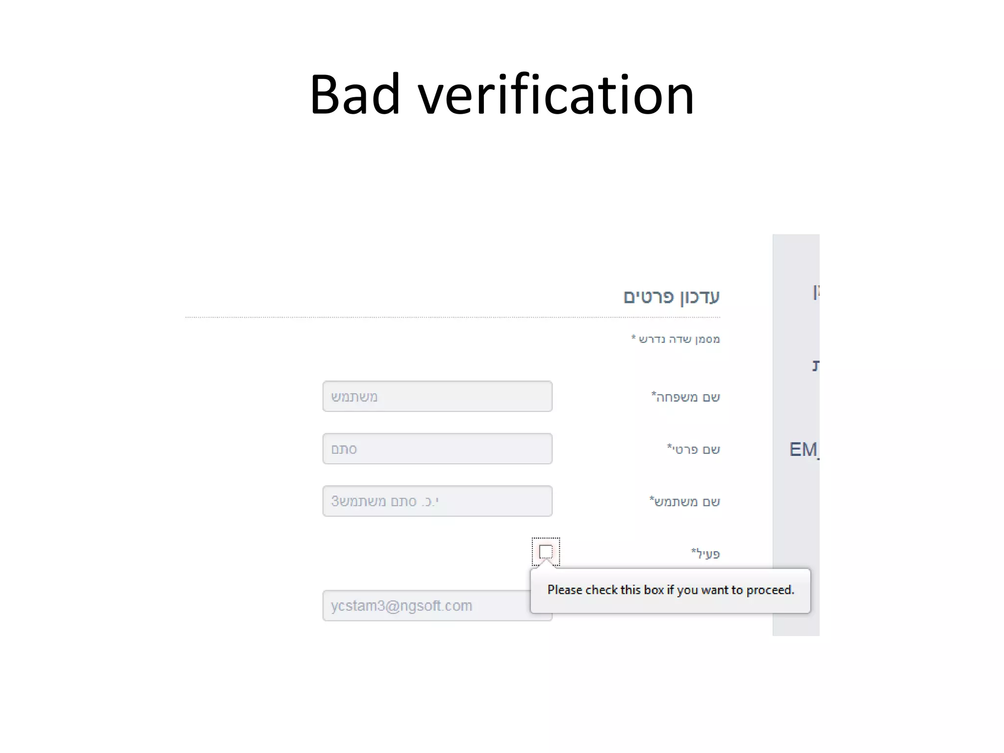
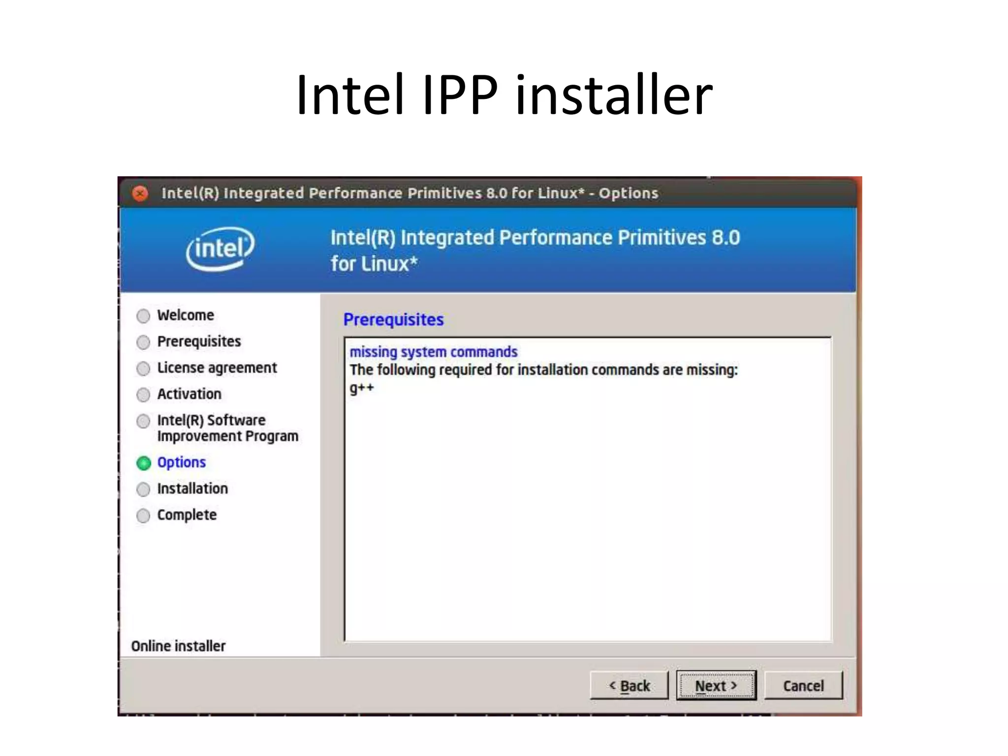
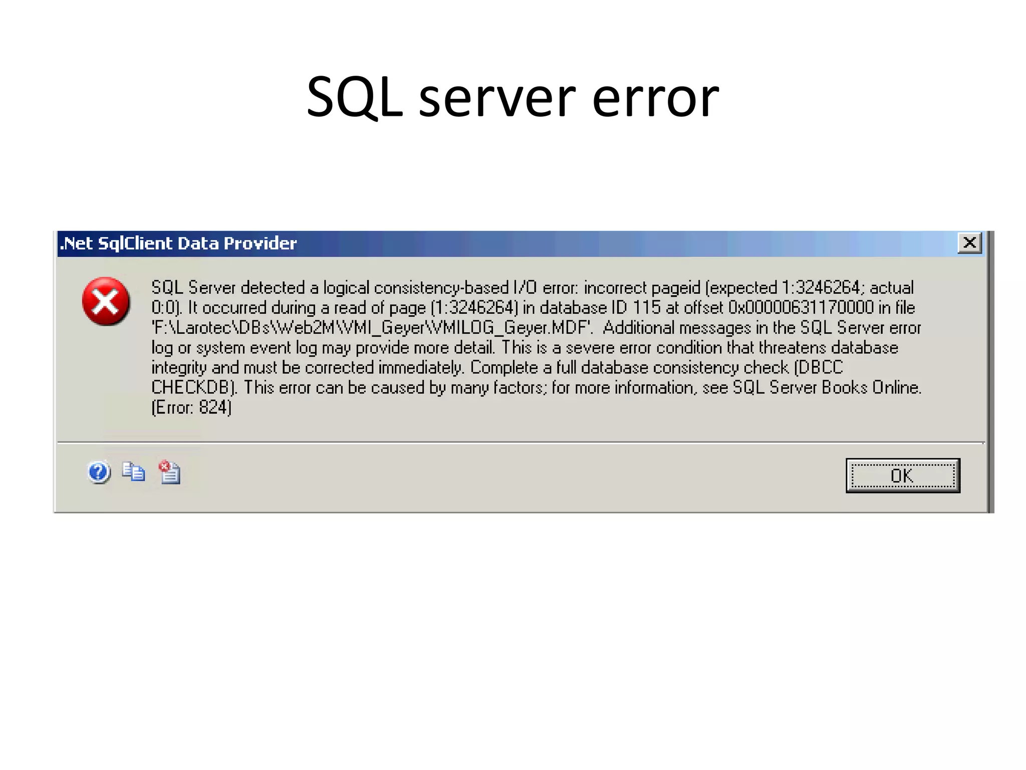
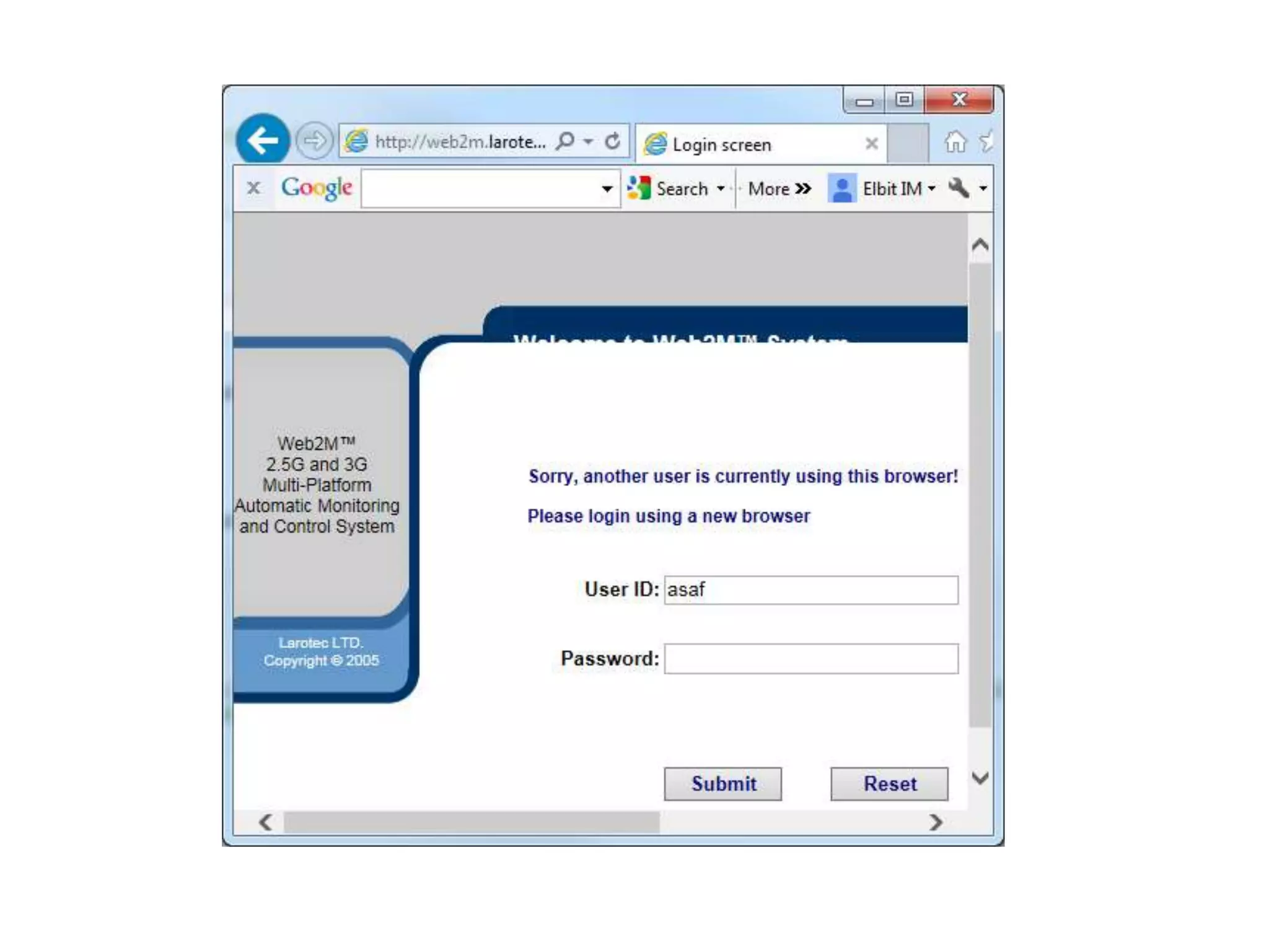
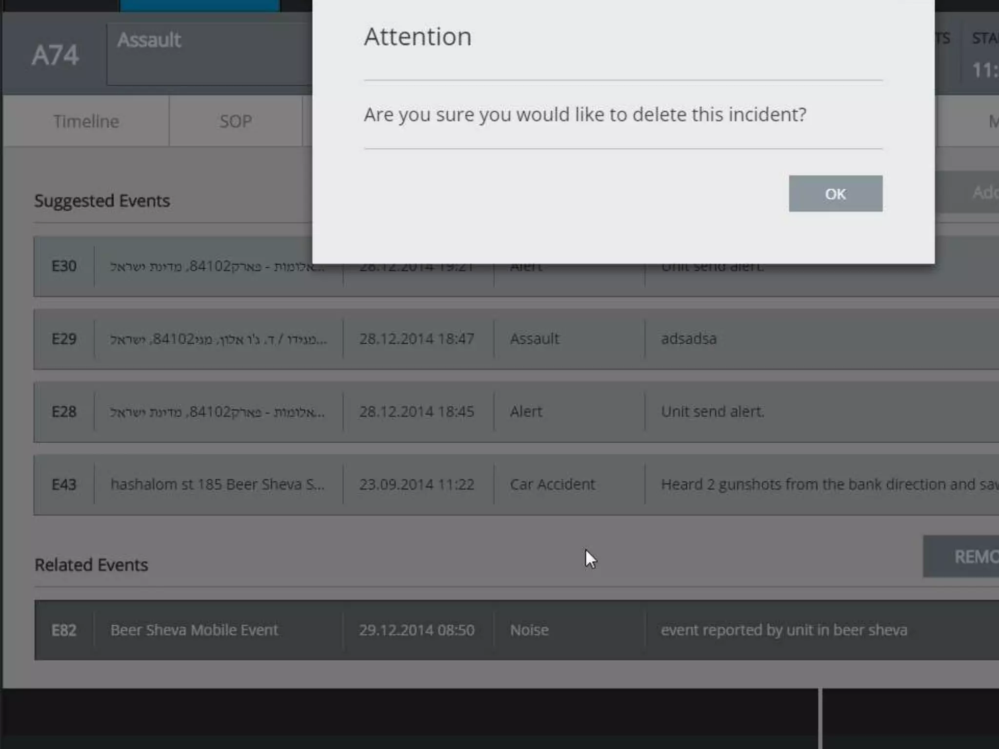
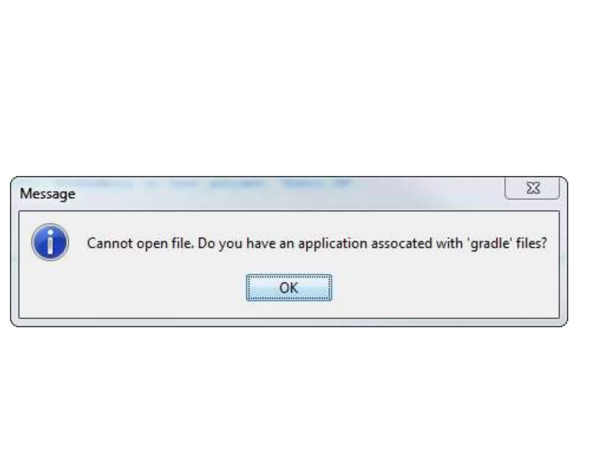
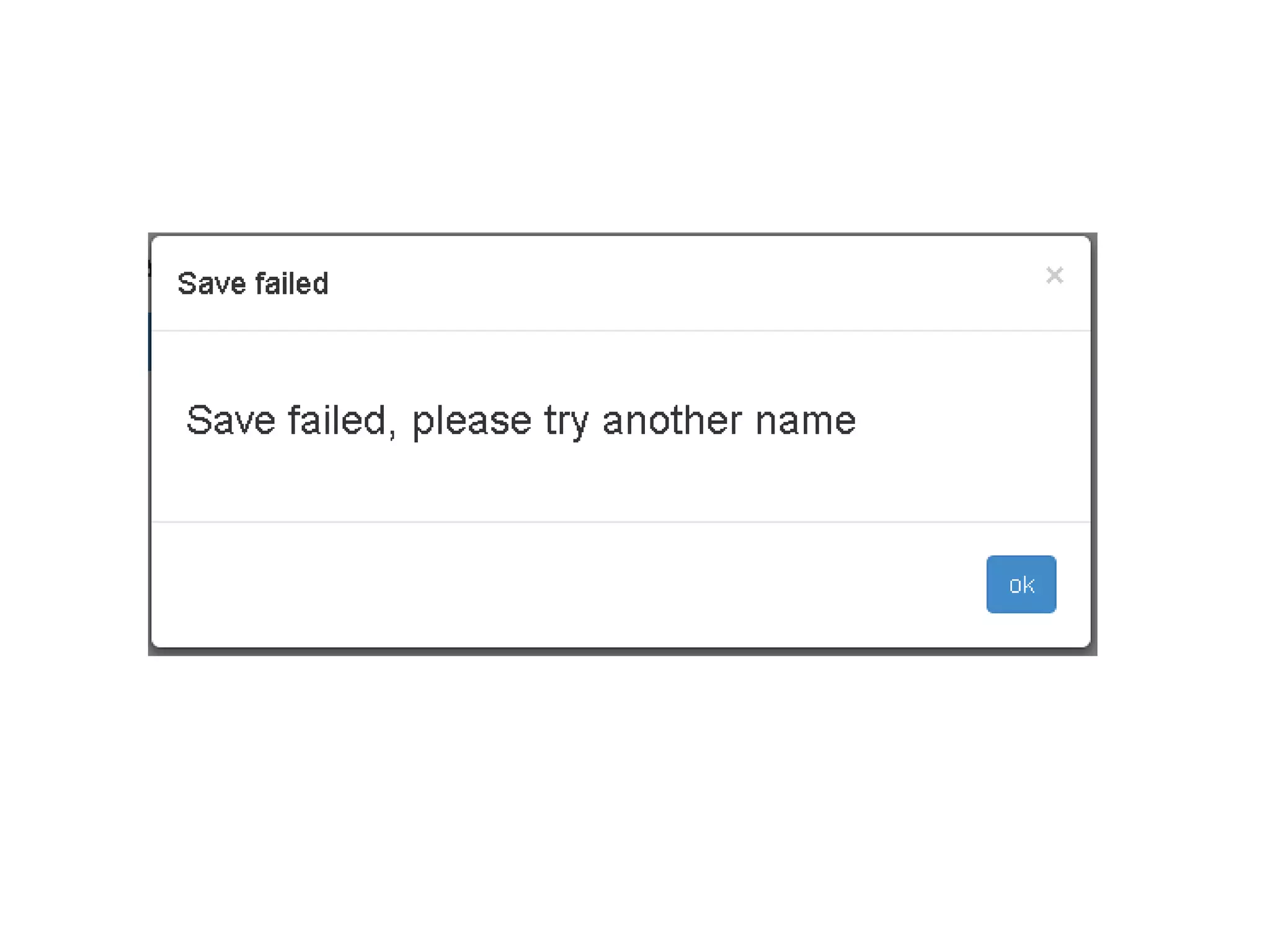
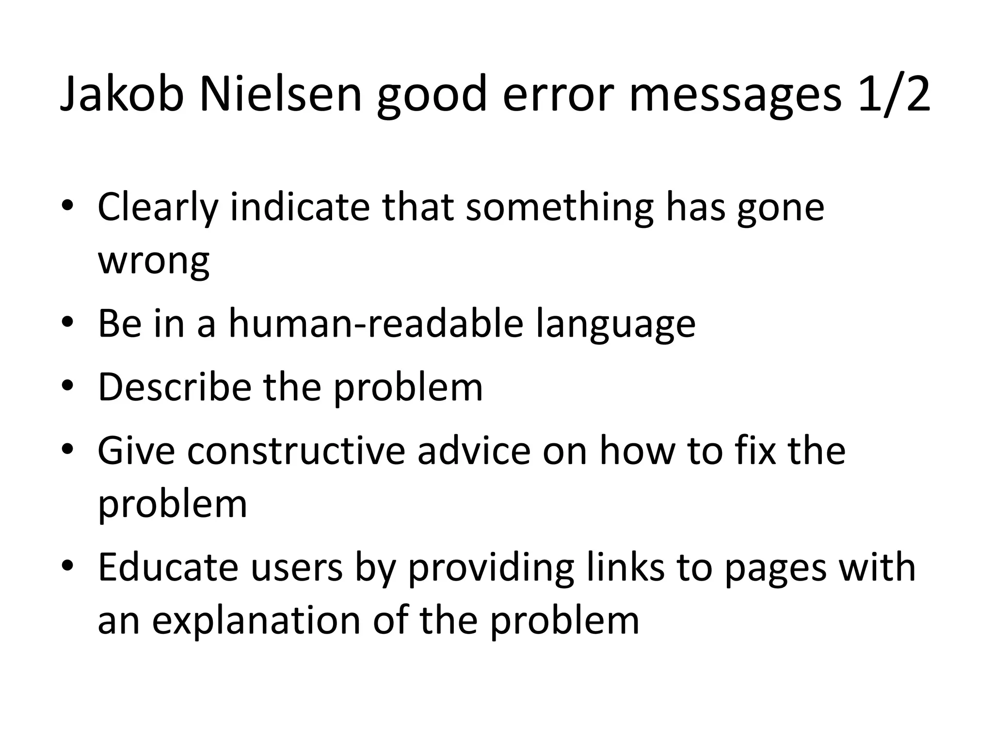
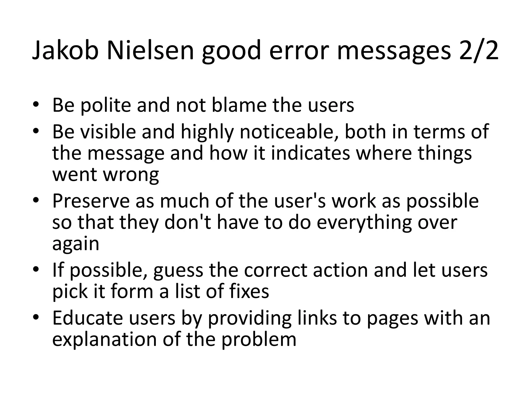

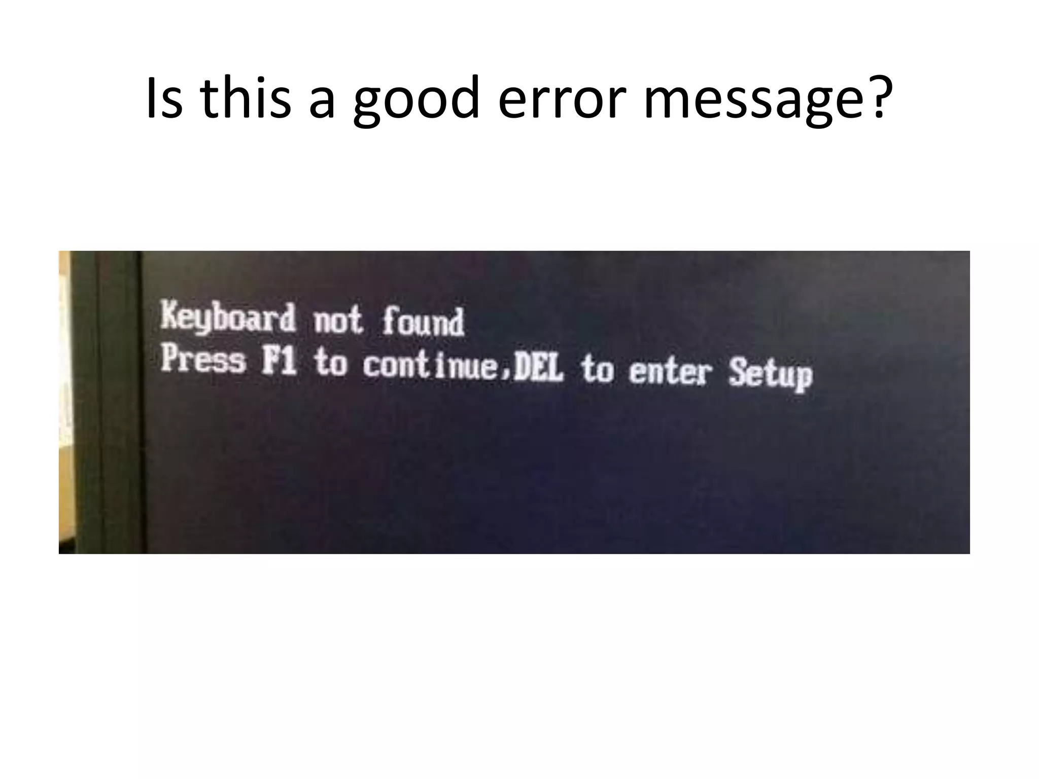

A bad error message is one that does not clearly explain the problem to users. Good error messages indicate something went wrong, describe the problem in plain language, provide advice to fix it, and educate users by linking to explanatory pages. They are also polite, visible, and preserve user work as much as possible. The basic rules for a good error message are to describe what went wrong, explain how to avoid it, and provide steps to solve the error or examples for correct use.